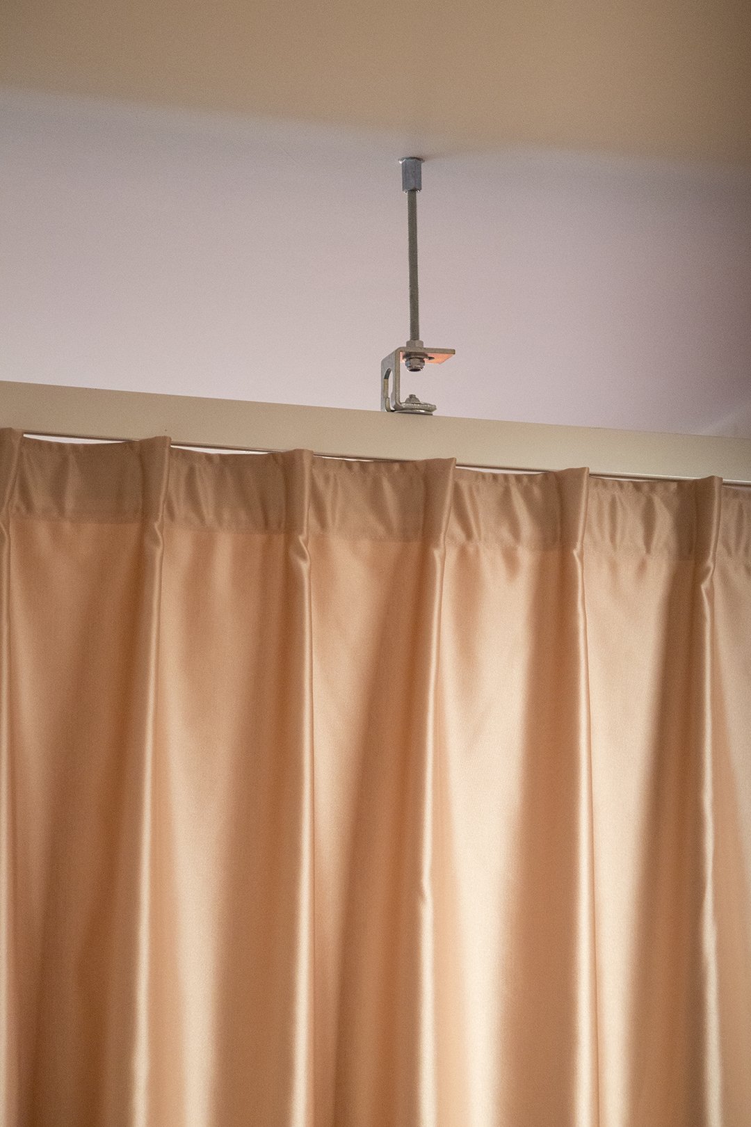
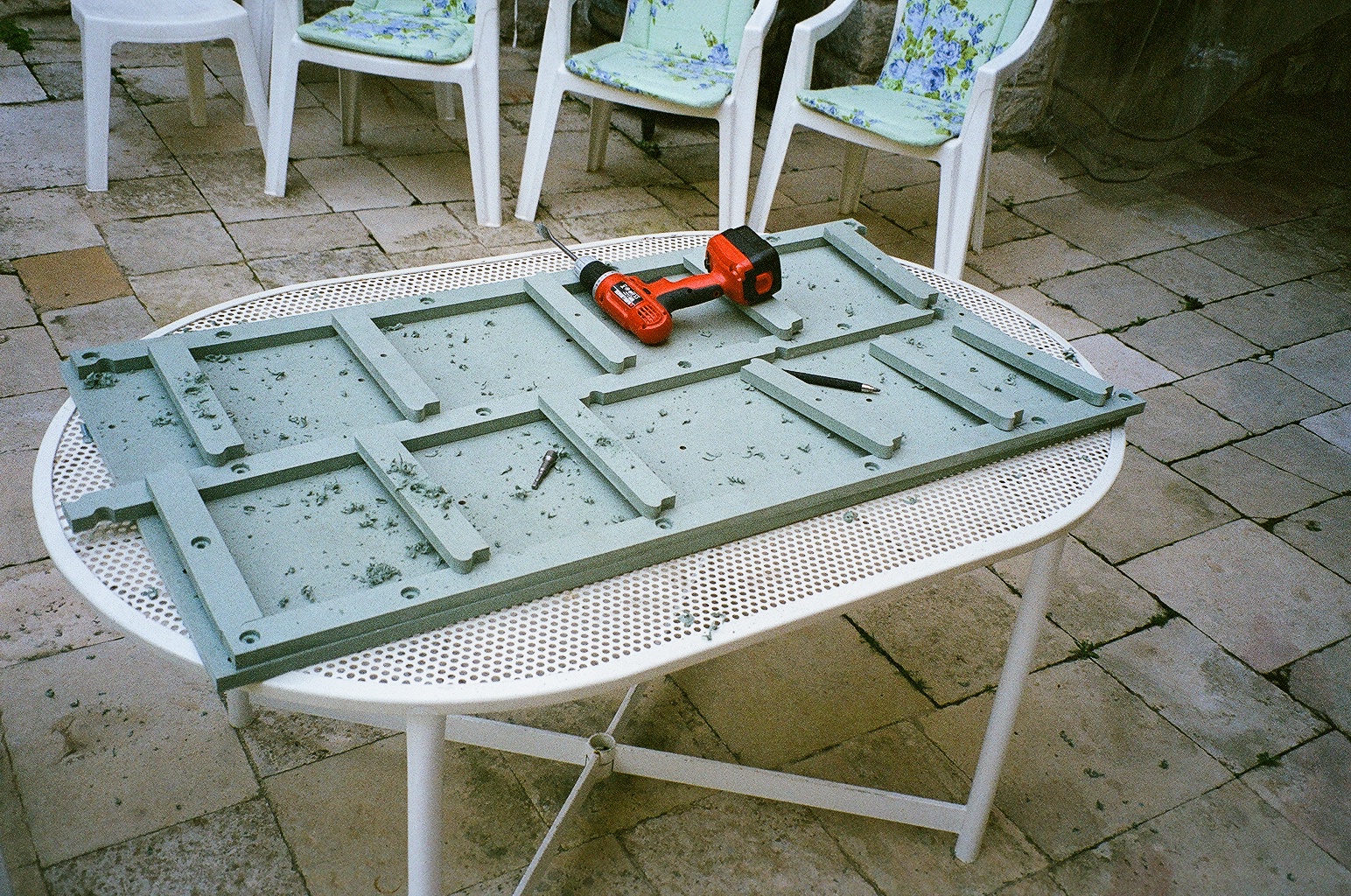
SO POOL!
Ville de Tournai swimming pool. Project coordination led by us, artwork and painting by @marinebonamy
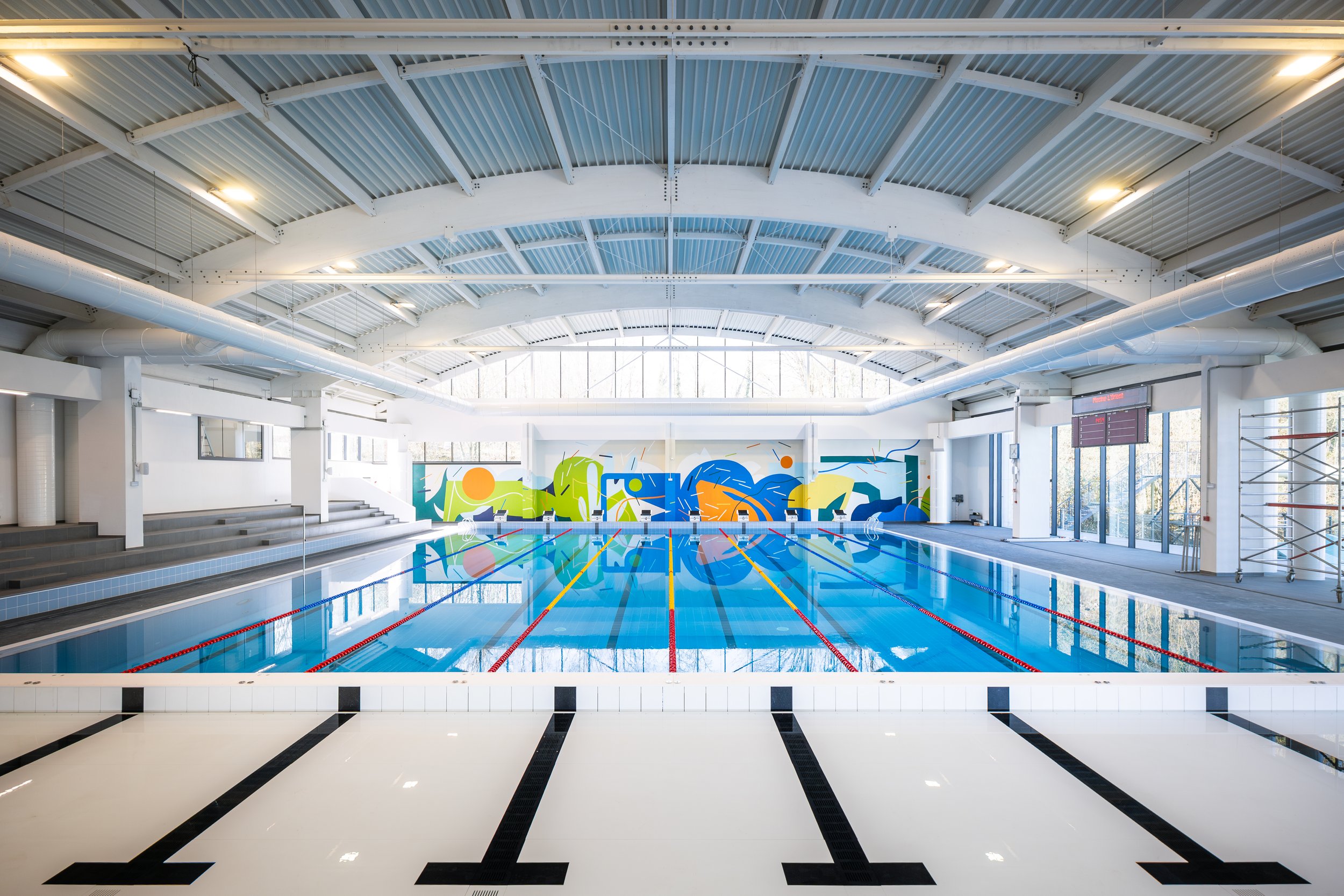
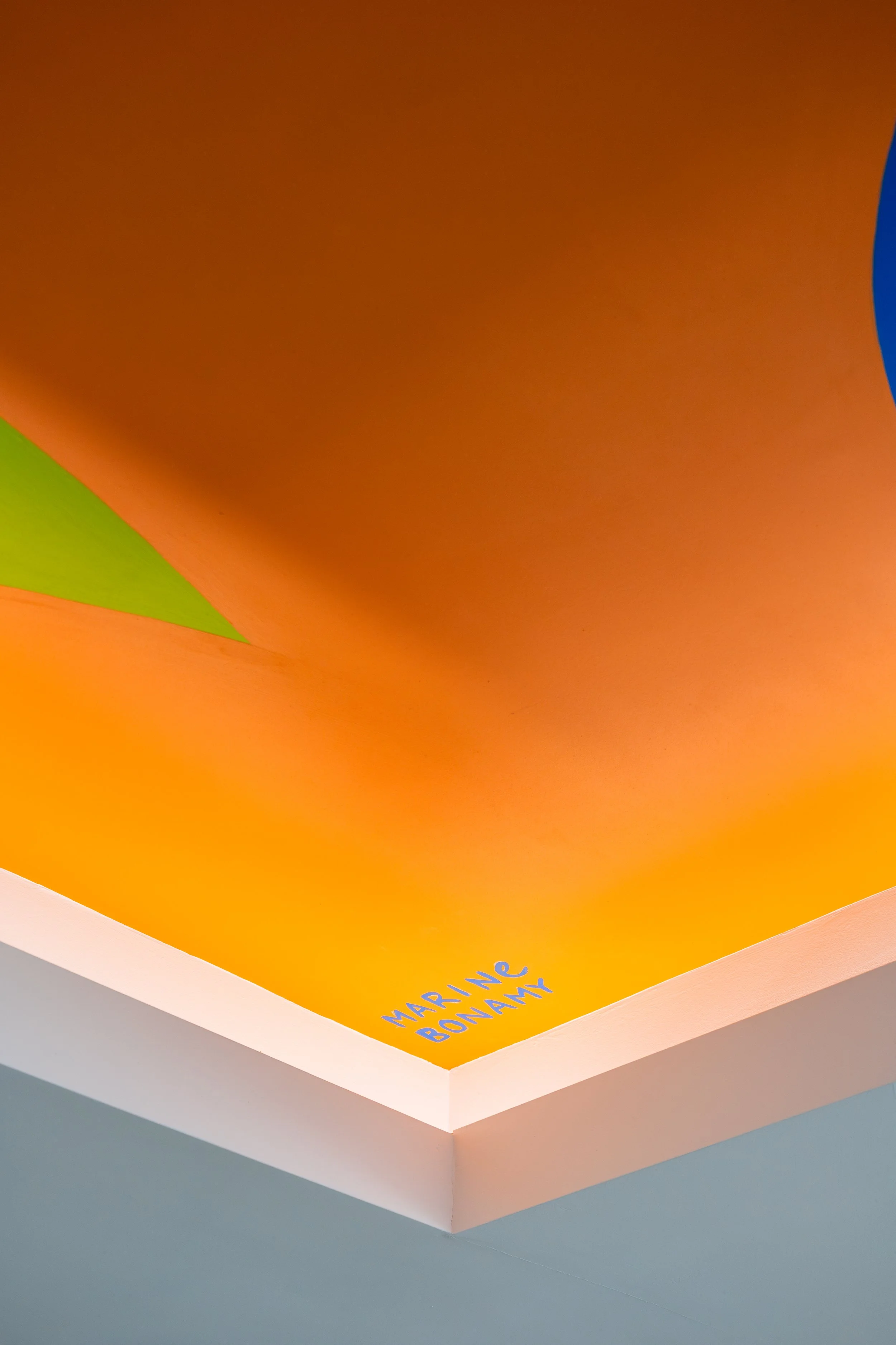
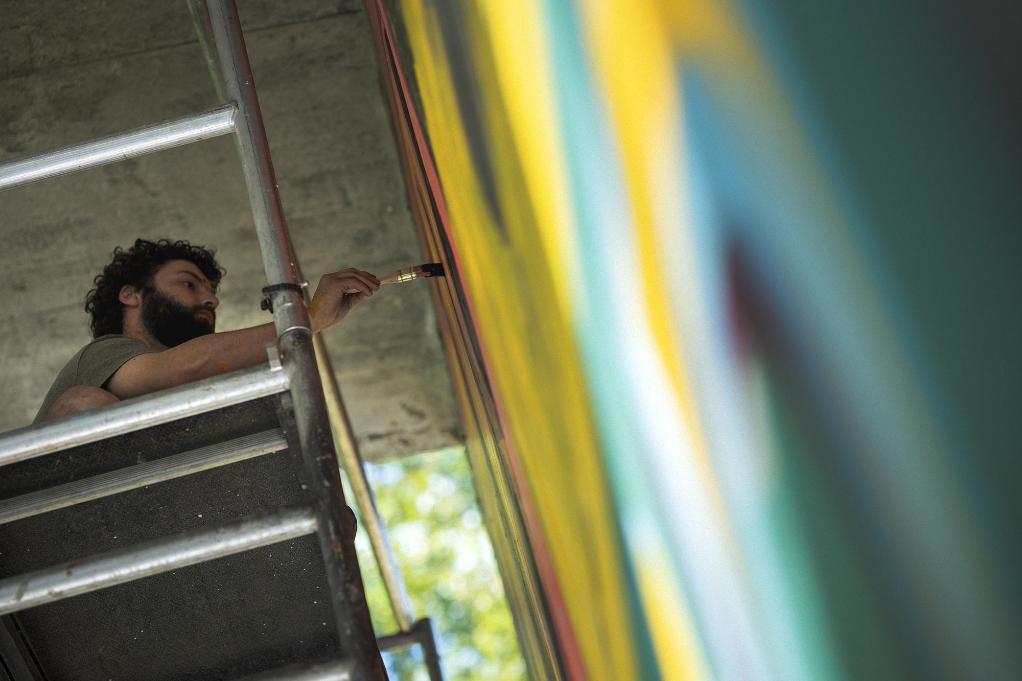
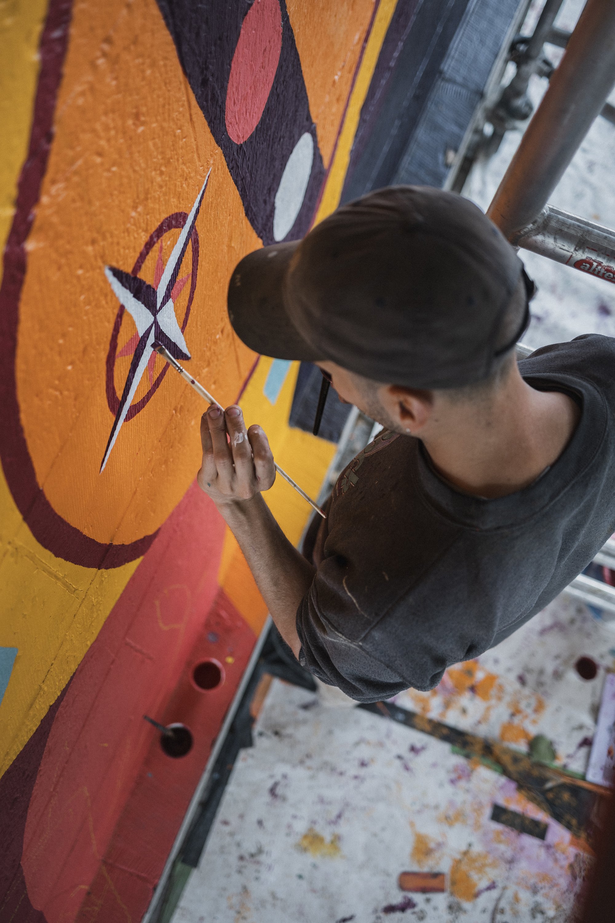
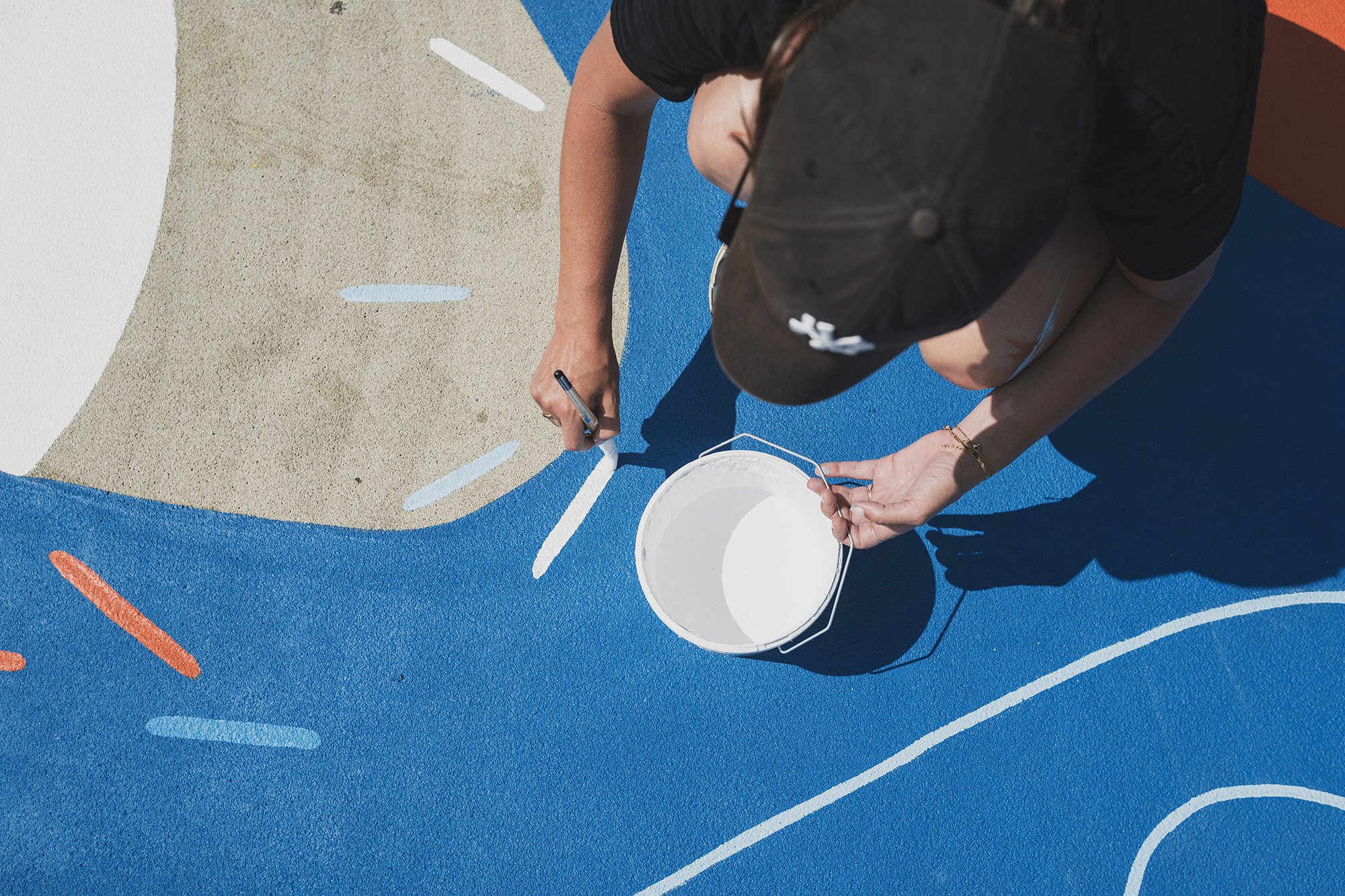
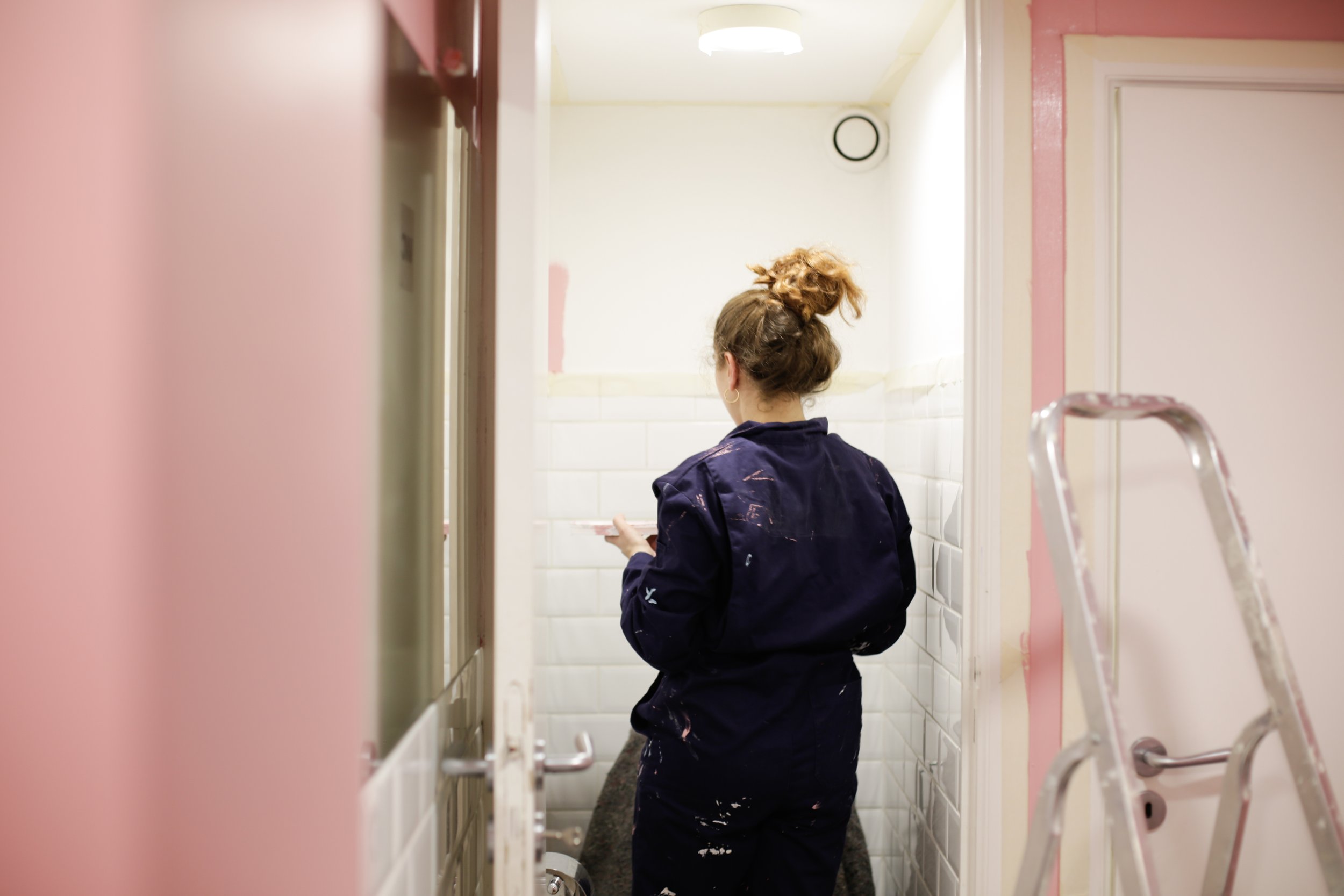
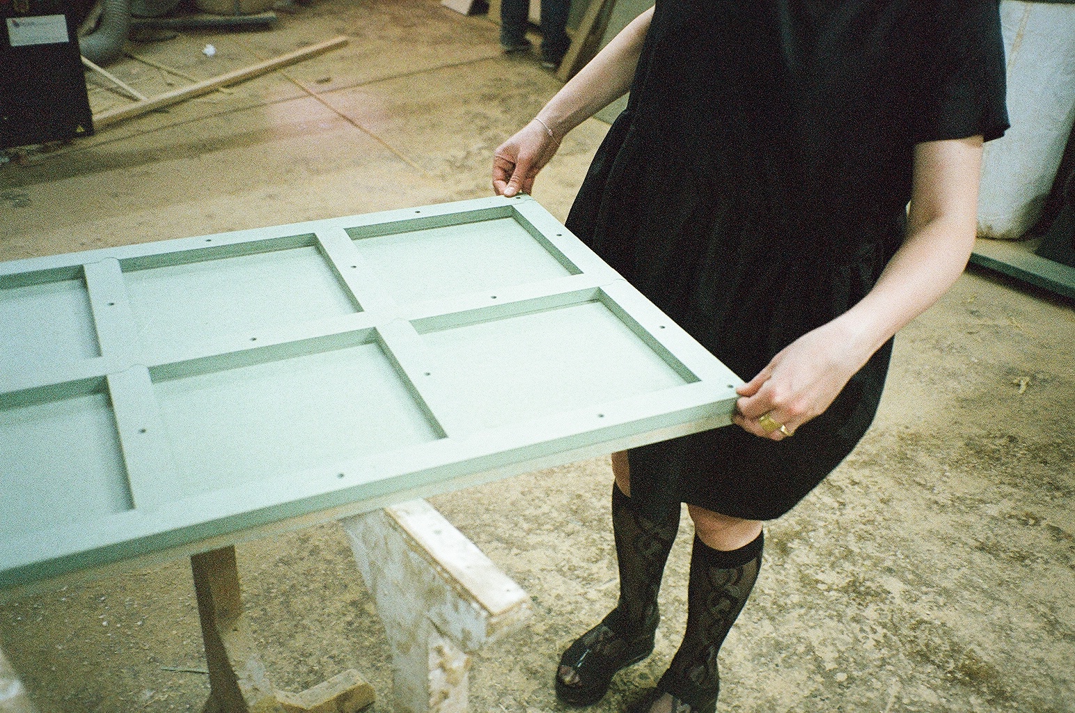
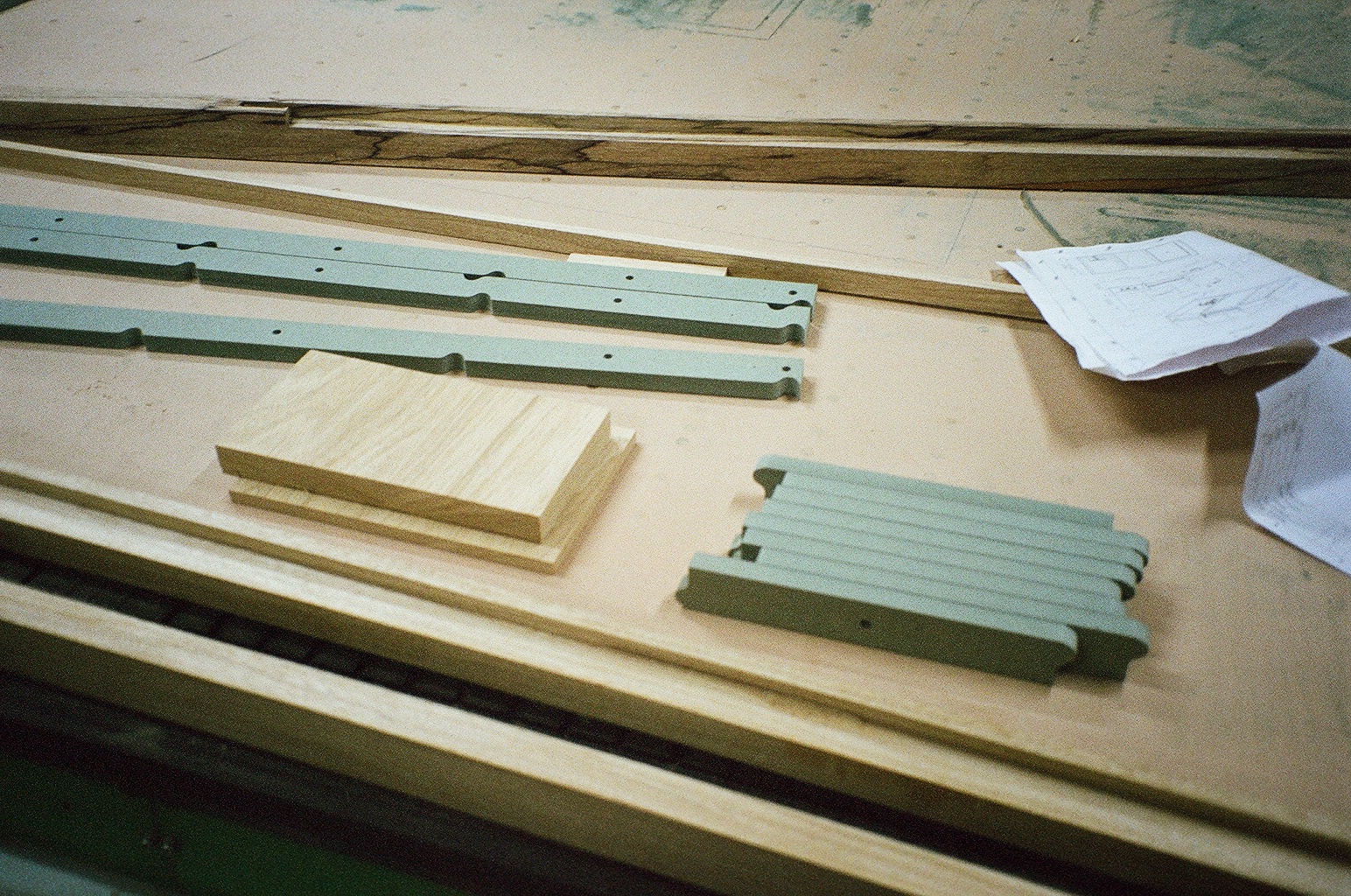
In Tournai, another season, another lieu, another mural. This time, it is the newly renovated swimming pool of Tournai, with a mural by the artist, Marine Bonamy, and us, HIER, managing, following-up and helping with the execution.
The idea was to have a colorful mural, that accompanies the visitors while swimming. With organic and floral shapes, with a graphic style using small lines to energize and give rhythm to the whole.
This story was told and painted with the help of an incredible set of hands of Hedi Baka and Wenc from Les Îles Mardi, and @emilie_delarbre.
Marine Bonamy, the artist, works around the themes of the organic, the mineral, and the aquatic. Her work is based on texture, superposition, and movement.


Thanks to @IDETA @TRADECO and @w_e_n_c @hedi_baka @emilie_delarbre for the help
Photos and video by @jules_cesure

DOGUERIE – Canine XL
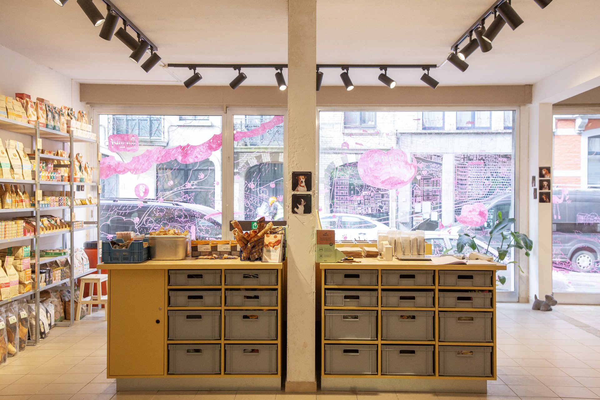
Where dogs and cats feel home. Our story with Canine started with a Bone, then another Bone facing it, to sign their cool presence in Saint-Gilles. The collaboration then expanded to cover the design of their new second store in Flagey.
Where dogs and cats feel home
Our story with Canine started with a Bone, then another Bone facing it, to sign their cool presence in Saint-Gilles.
The collaboration then expanded to cover the design of their new second store in Flagey.
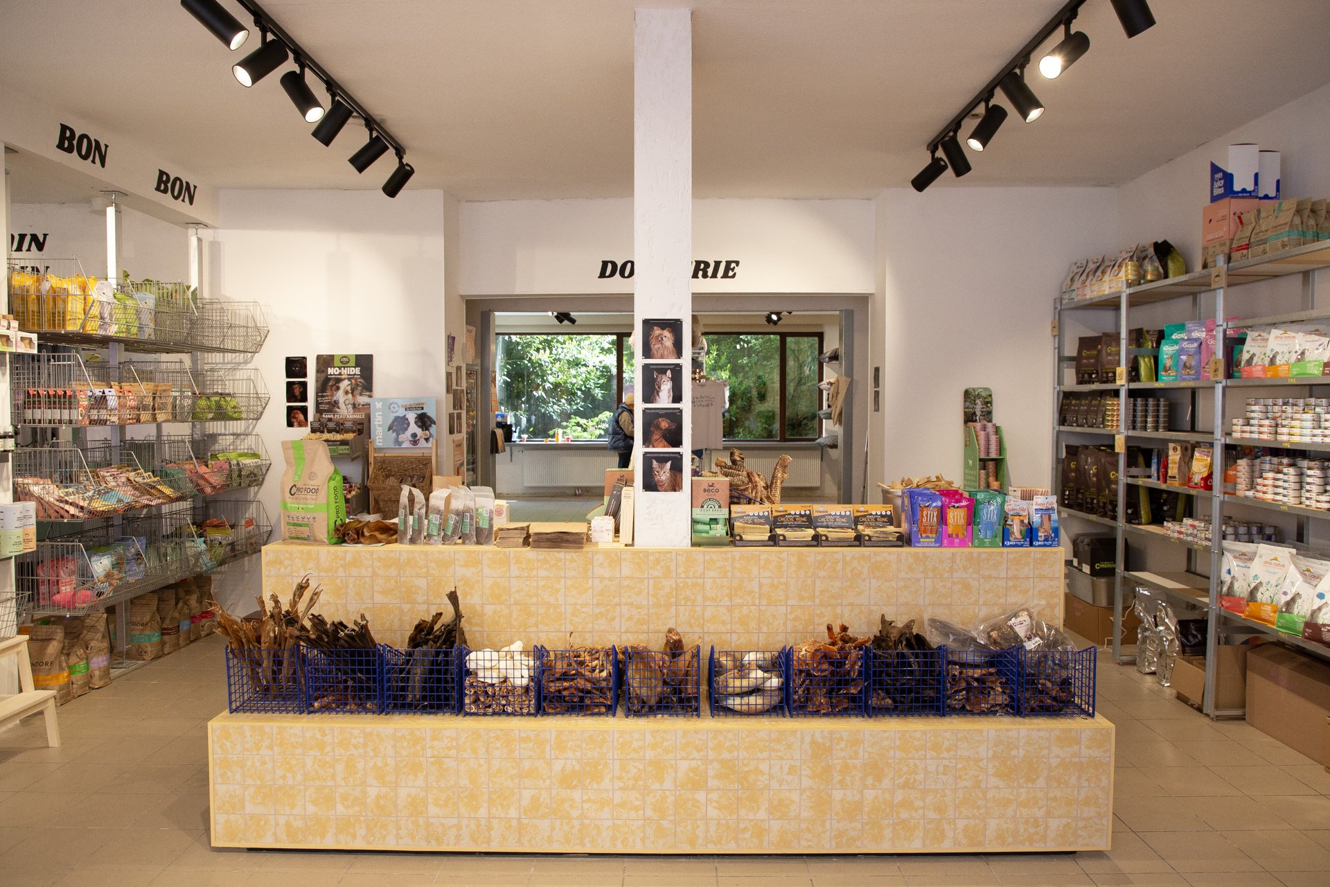
From identity to furniture to signage. And we had joy and we had fun, and with the yellow color we hoped to get the sun, to dog/cat paradise.
As for the shelving systems we placed, one system, s.alu, is rented from Rayon Belge for the back store. As for the shelves in the front, they are made from steel and reused scraps of wood.
And to pimp the store even more, decoratively speaking, and to add a touch of personal/animal to it, we went building customer loyalty approach. For that, a photoshoot of the clients was organized, their feedback on Canine was noted, and the result is proudly exhibited in the different corners of the Canine No.02 store in Flagey.


Photos & Video by Luciana L. Schütz AKA Lulu.

New / Nouveau
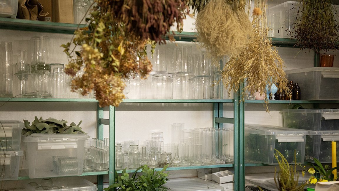
It’s new, c’est Nouveau! Well, not all of it. Only the part we designed, the one that lies in the backstage: the kitchen and the workshop. The main piece of the project is a chandelier piece roaming over the main atelier space, watching over it, with flowers hanging upside down, also a source of light.
It’s new, c’est Nouveau!
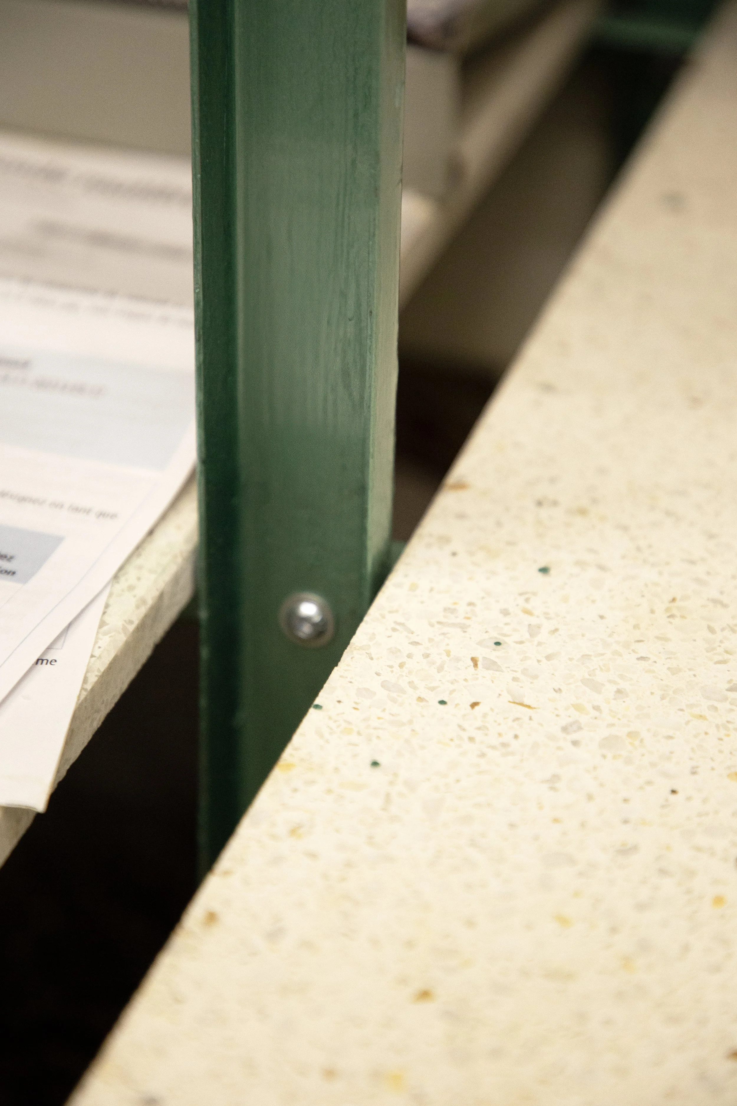
Well, not all of it. Only the part we designed, the one that lies in the backstage: the kitchen and the workshop. Green is the stem, the structure of the flower. And so is the new shelving structure we designed. The shelves made from galvanised steel, present in flower buckets. As for the tabletops, we reused terrazzo tiles for being cleanable, waterproof, and bringing a mix of colours.
Afterall, it is a place of flowers. Were they are cut but then live. Detached, filed, hung, dried or freshly assembled, composed, reunited, in a bucket of joy. Regardless the occasion, they bring light to it, like a chandelier. The main piece of the project is a chandelier piece roaming over the main atelier space, watching over it, with flowers hanging upside down, also a source of light. An analogy is drawn between meat and flowers. Both hanging, drying, waiting to be consumed. One for the greedy belly, and one for the needy soul.


In this work space, hier are the needs that were addressed:
a surface for hanging tools
a space for storing materials: a functional library, with shelves and boxes
a space for hanging flowers with hooks
a space to store containers
a surface for working, movable or flexible
and lighting
Photos by Luciana L. Schutz.

Revisit.Brussels
We have refreshed, revisited, updated and ugraded, the shop and info office scenography for Visit Brussels. We have added in place of an older system, a shelving design that is both colourful and playful, while being practical and functional.
We have refreshed, revisited, updated and ugraded, the shop and info office scenography for Visit.Brussels. We have added in place of an older system, a shelving design that is both colorful and playful, while being practical and functional. What could be renovated in the space was simply renovated. The new additions reflect needs that developed over time, and that needed care and new solutions.


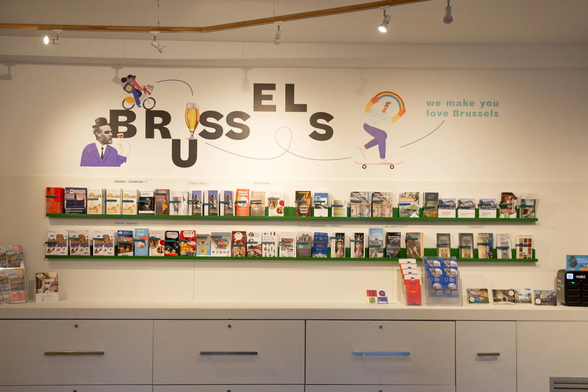
Photos by Luciana L. Schütz AKA Lulu.

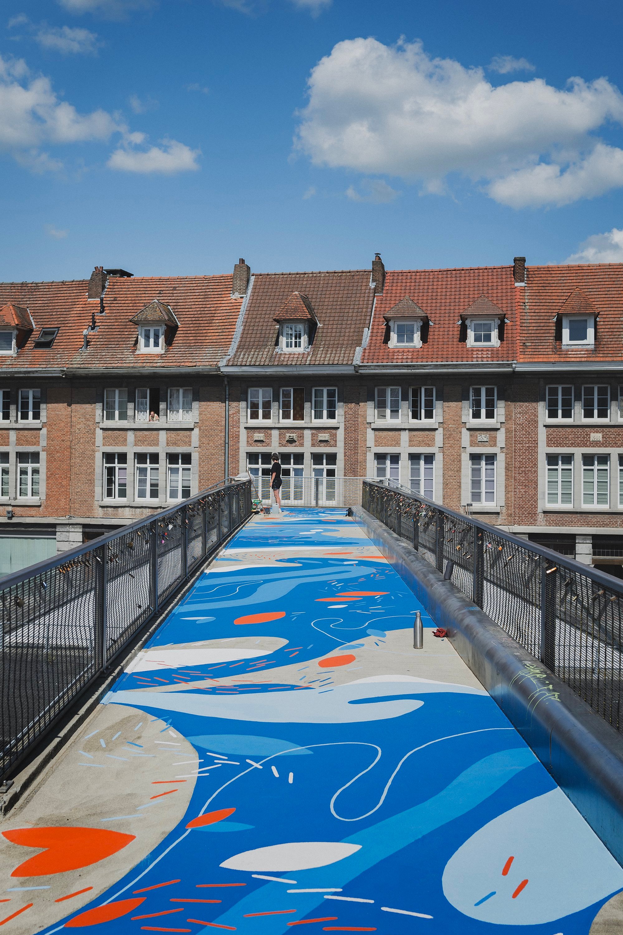
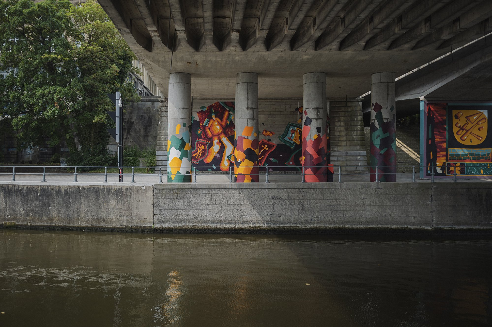
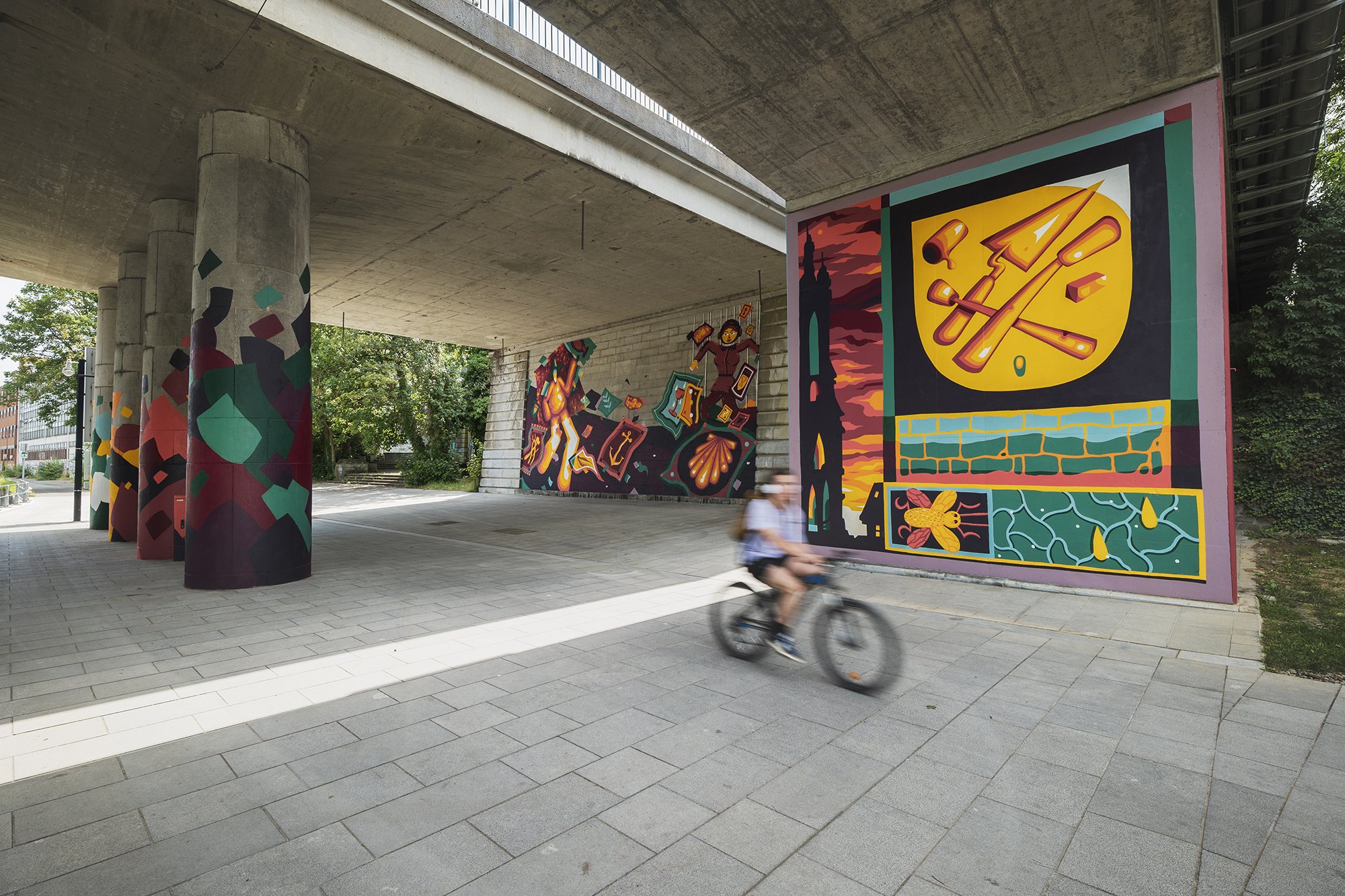
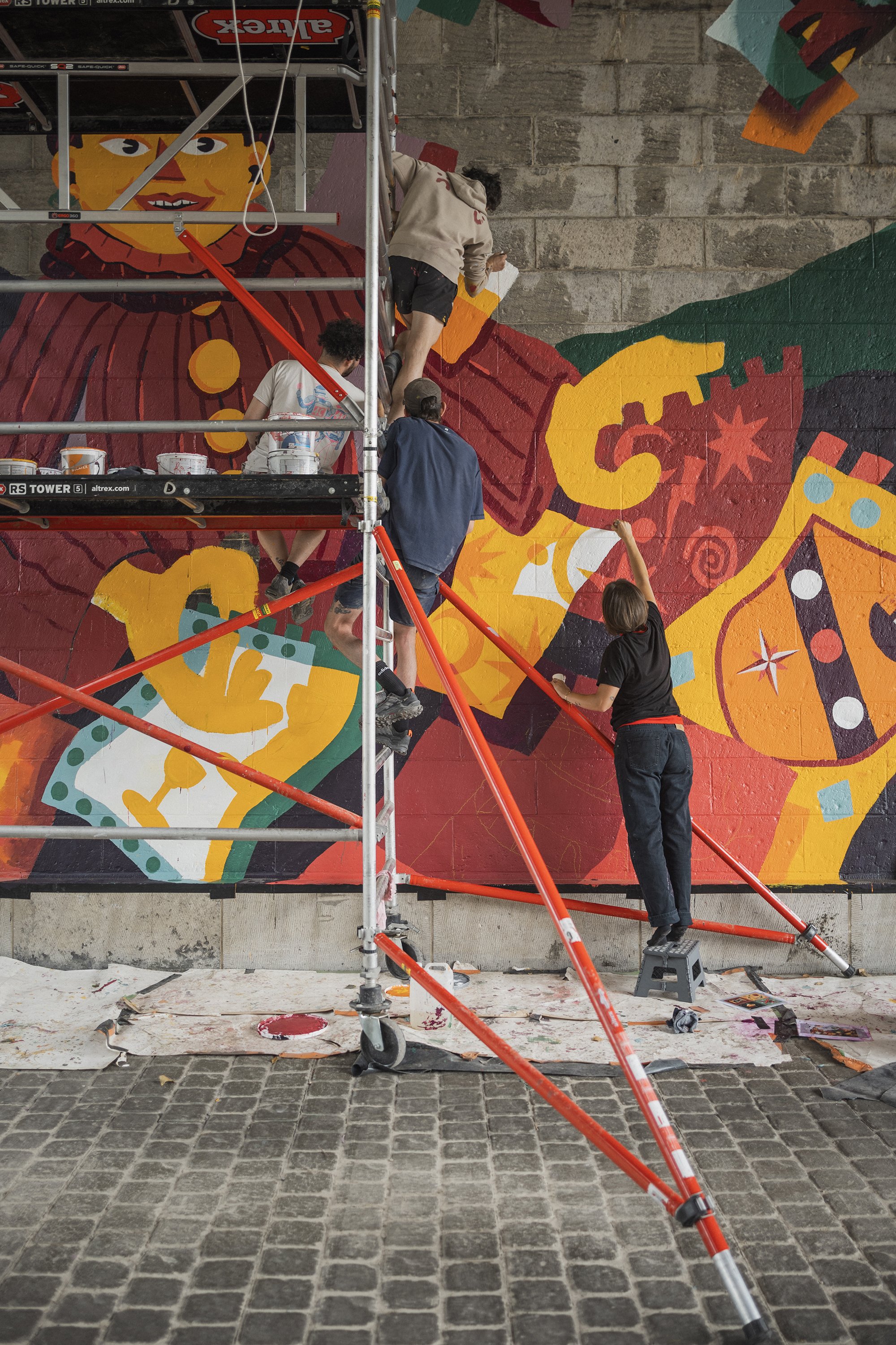
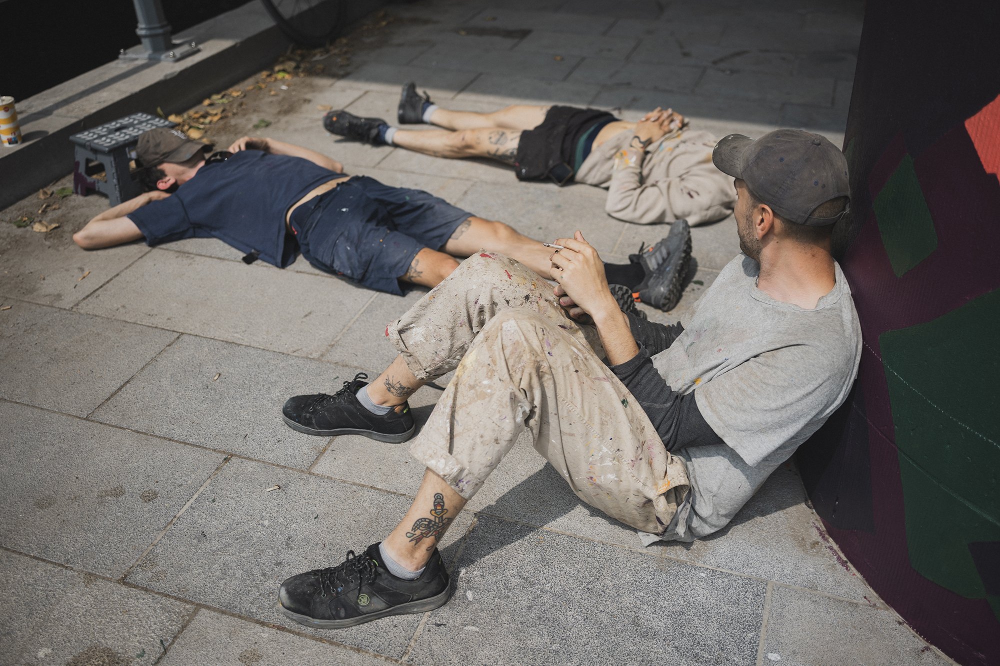
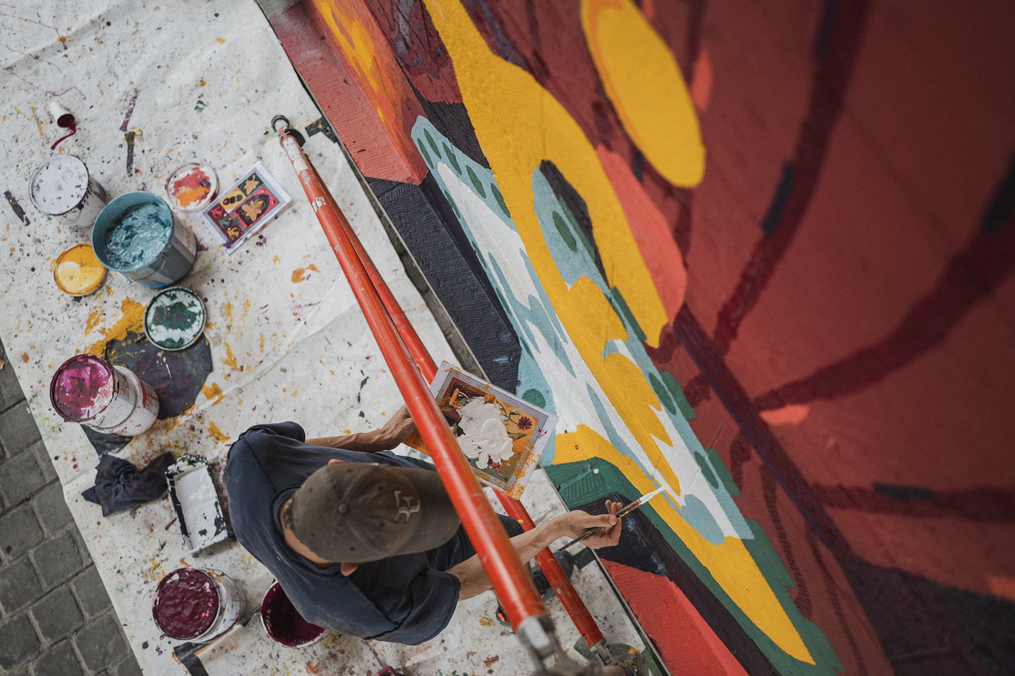
Tournai Général
One city. Two interventions. Three artists, and HIER, us.
Branding Tournai this time, branding both sides under a bridge, and one over another, both alongside the canal de l’Escault.
One city. Two interventions. Three artists, and HIER, us.
Branding Tournai this time, branding both sides under a bridge, and one over another, both alongside the canal de l’Escault.
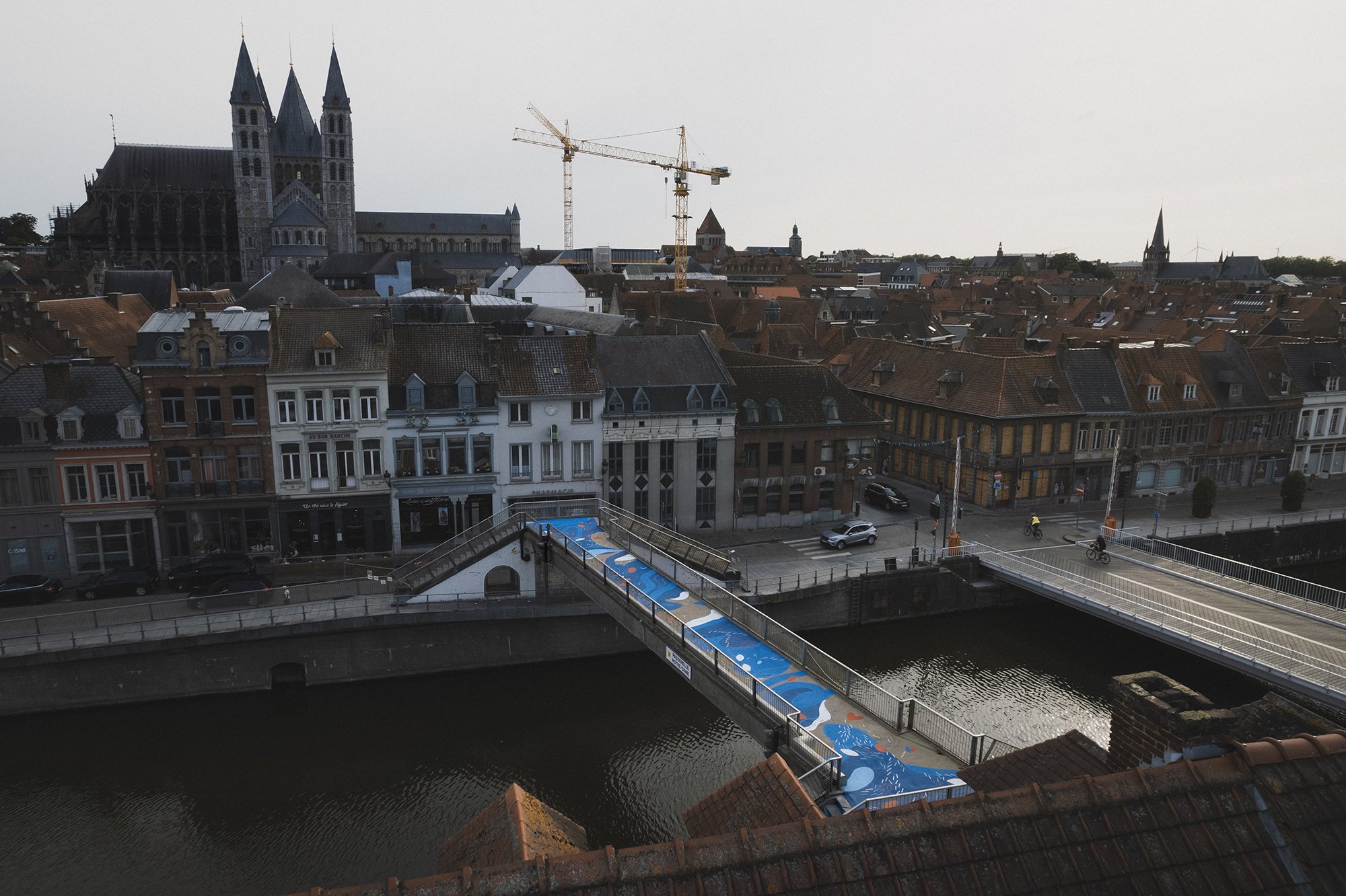
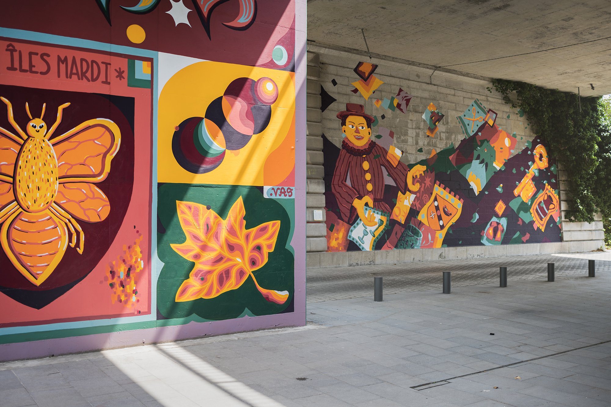
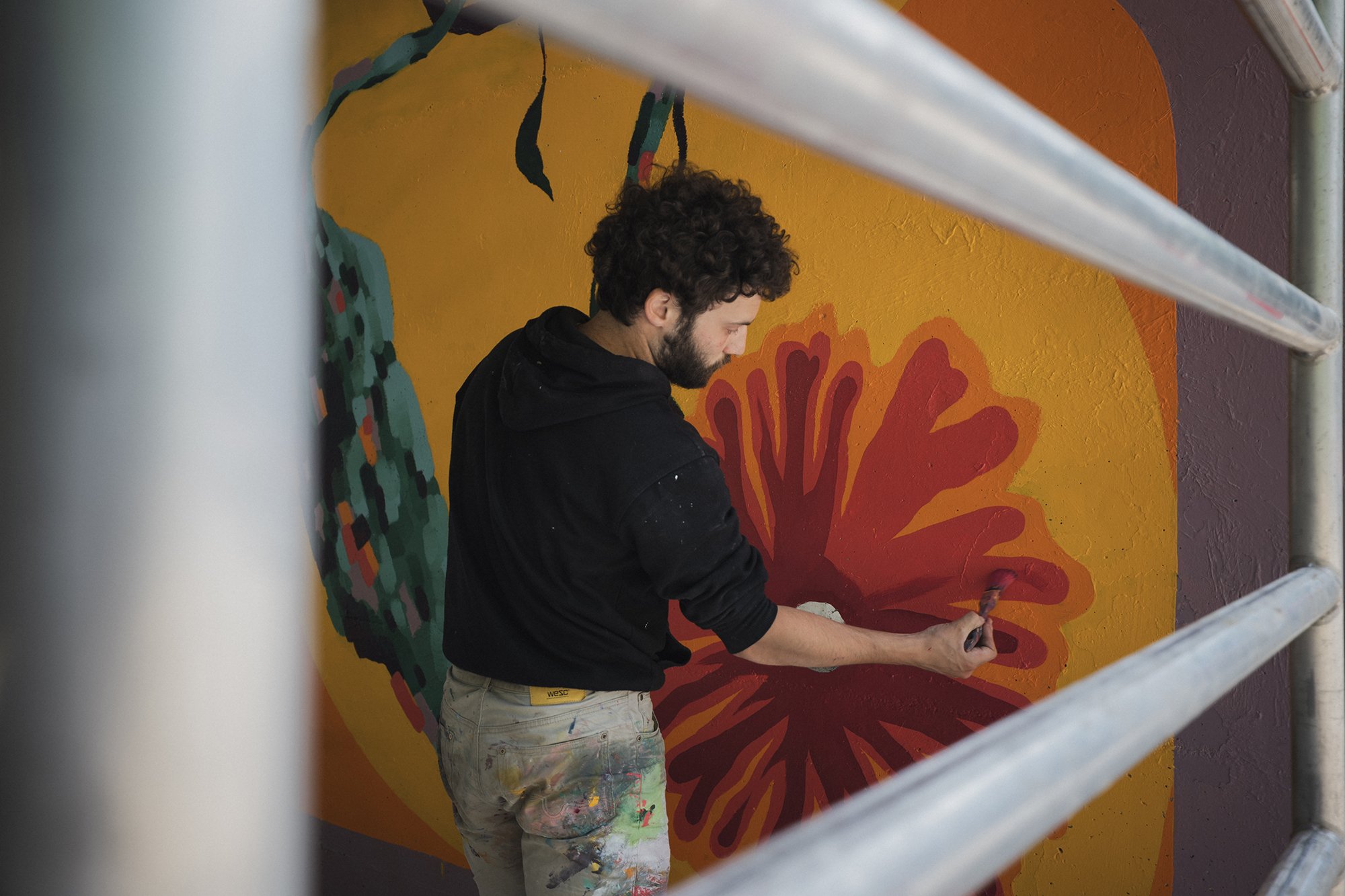
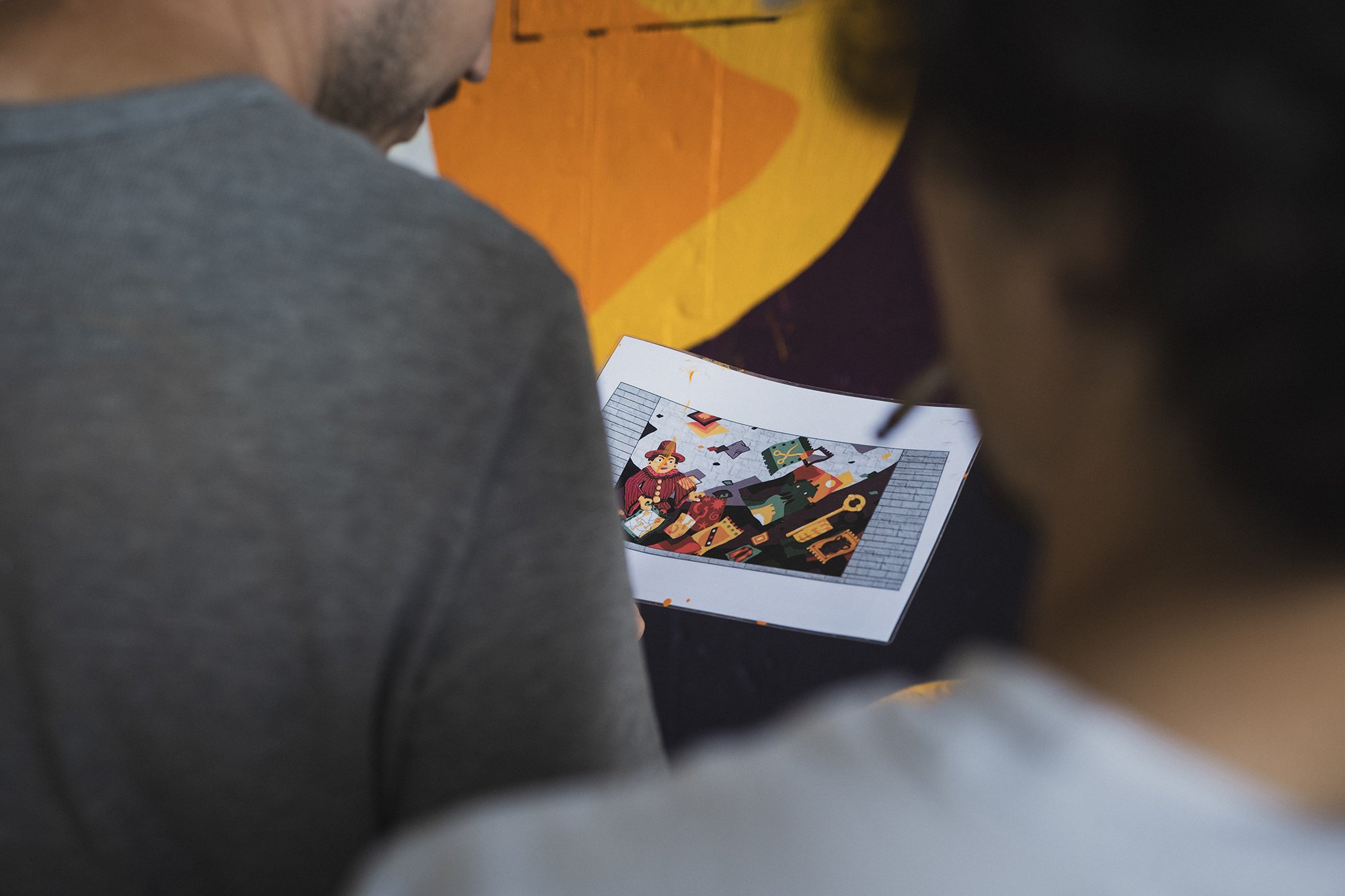
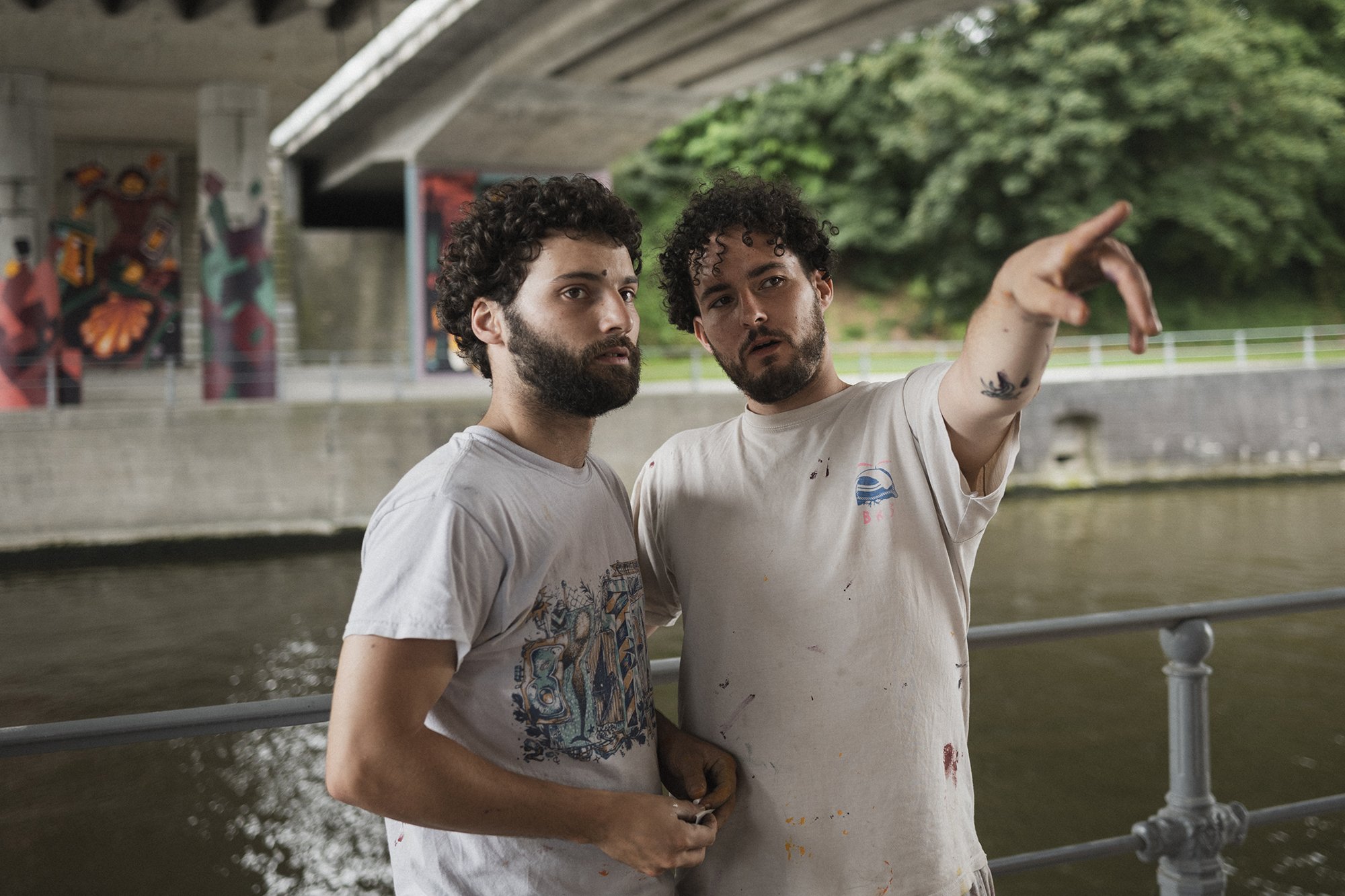
Murals telling the story of the city, of its architecture, folklore, and personas, under Pont A. Devallée. A story told by two different artists: Hedi Baka and Wenc part of the collective Les Îles Mardi.
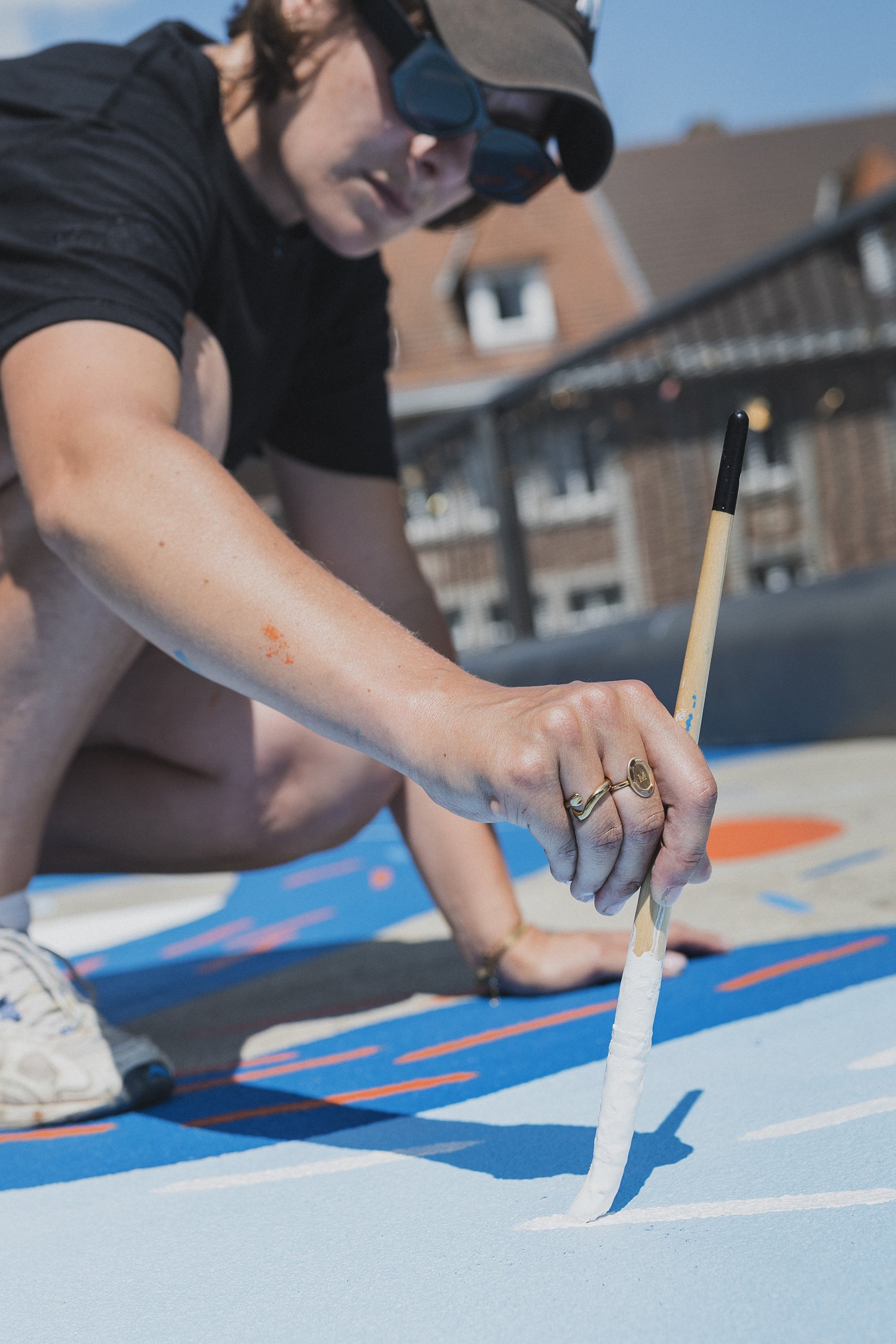
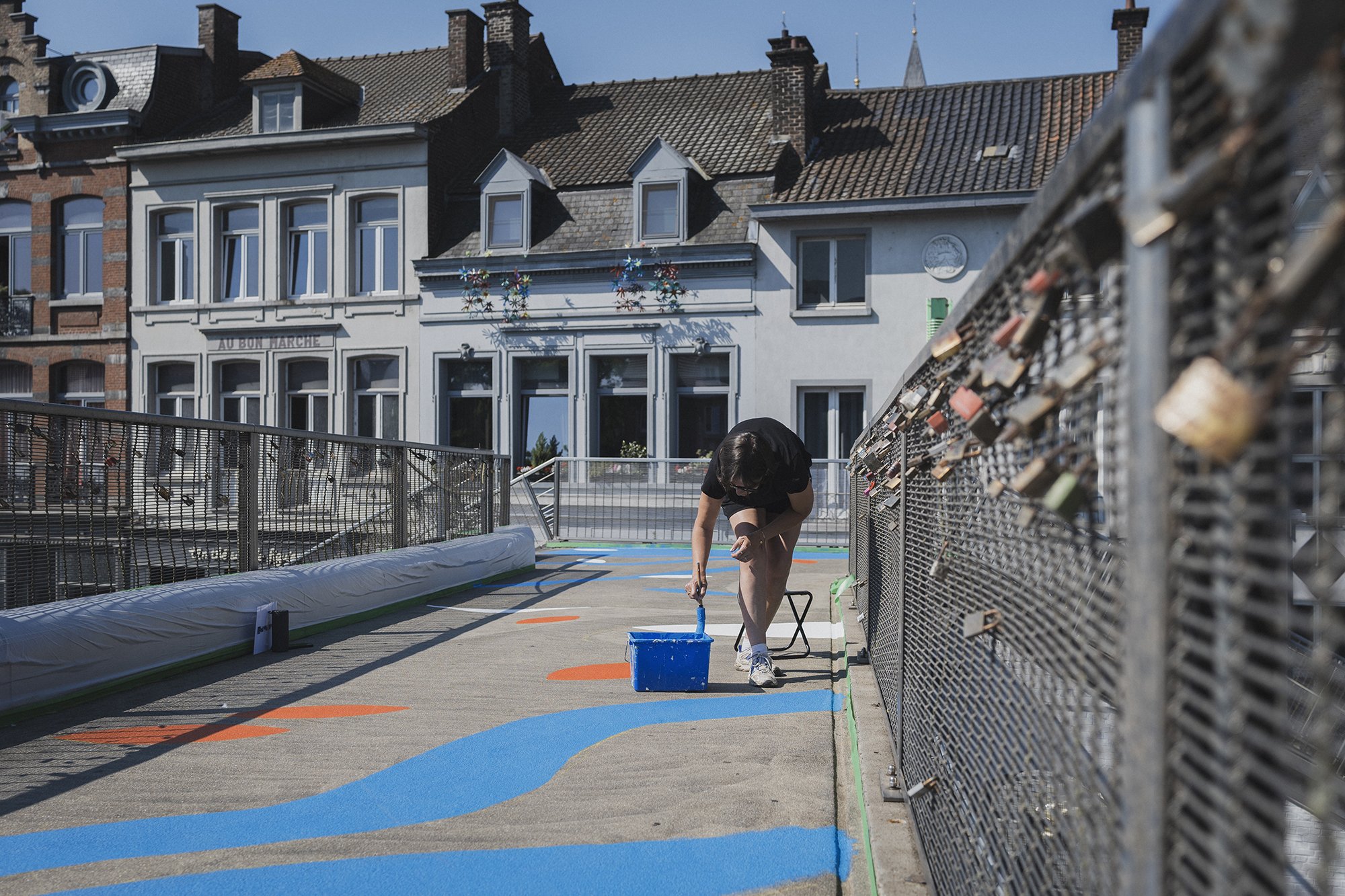
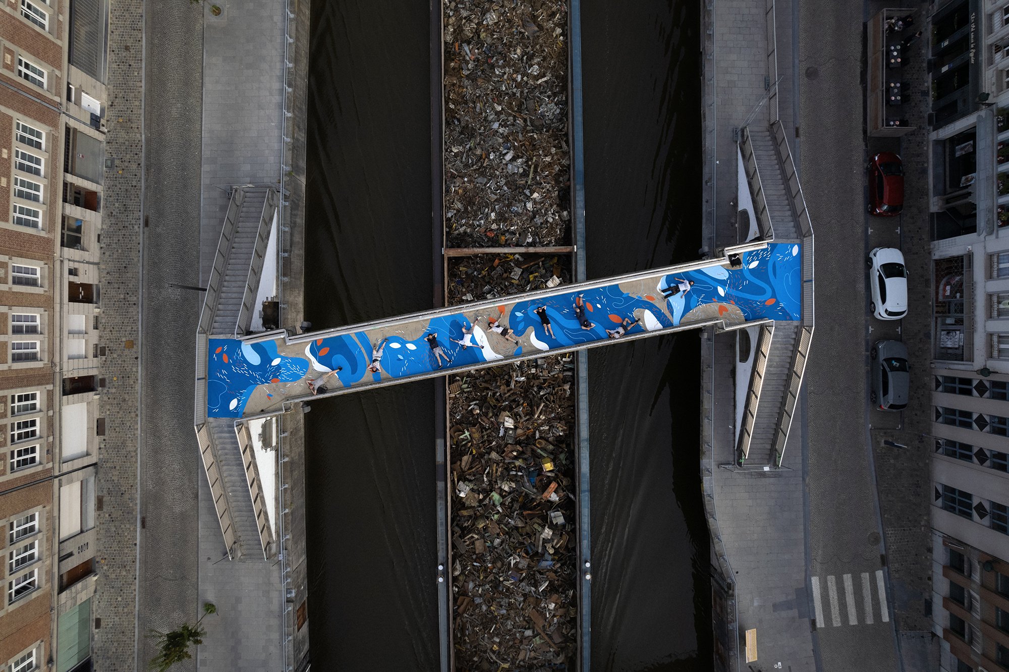
A ground mural telling the story of the intersection between water, earth and stone, over the passerelle Notre Dame, by the artist Marine Bonamy.
These stories were told and painted with the help of an incredible set of hands @cocolaurens @olwesto_paobar @antoine_moustie @octaviolimaa @rammouk

Les clés de la ville - Pont A.Devallée
This mural is an invitation to discover the story of the city and its heritage through flags, pictograms, iconic characters. Its content is inspired by local craftsmanship, folklore, and the architecture of the city.
The artwork here is a collaboration between two who collaborate a lot: Wenc and Hedi Baka. A lover of architecture and captured instances, and the other passionate about energetic and vivacious characters.
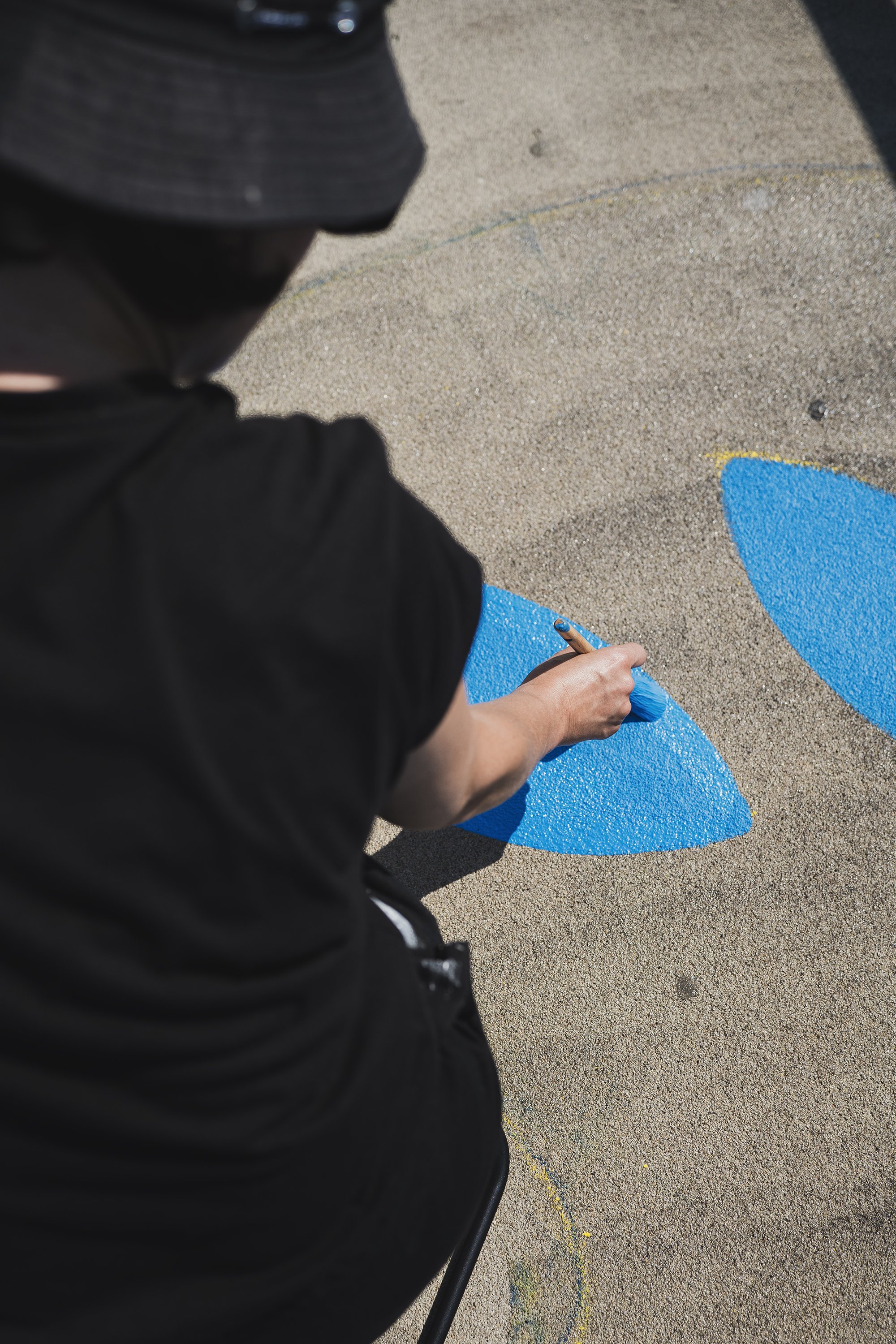

La passerelle aux reflets - Passerelle Notre Dame
This floor mural echoes with the canal, with the passers by and with the boats crossing beneath it. It aims to create a social link, a place for exchange of words, of love, of looks towards the city. The painted shapes and their colors reference the worlds of water, of earth and of stone.
Marine Bonamy, is the artist of this work. Her universe is organic, mineral, and aquatic. Her work is based on texture, superposition, and movement.
Project powered by Colora Zaventem
Video and photos by Jules Cesure, the only one.
So happy and proud with this collaboration.
And if you drive by Tournai, take a Tournai by the canal and wander through a graphic novel of the city.

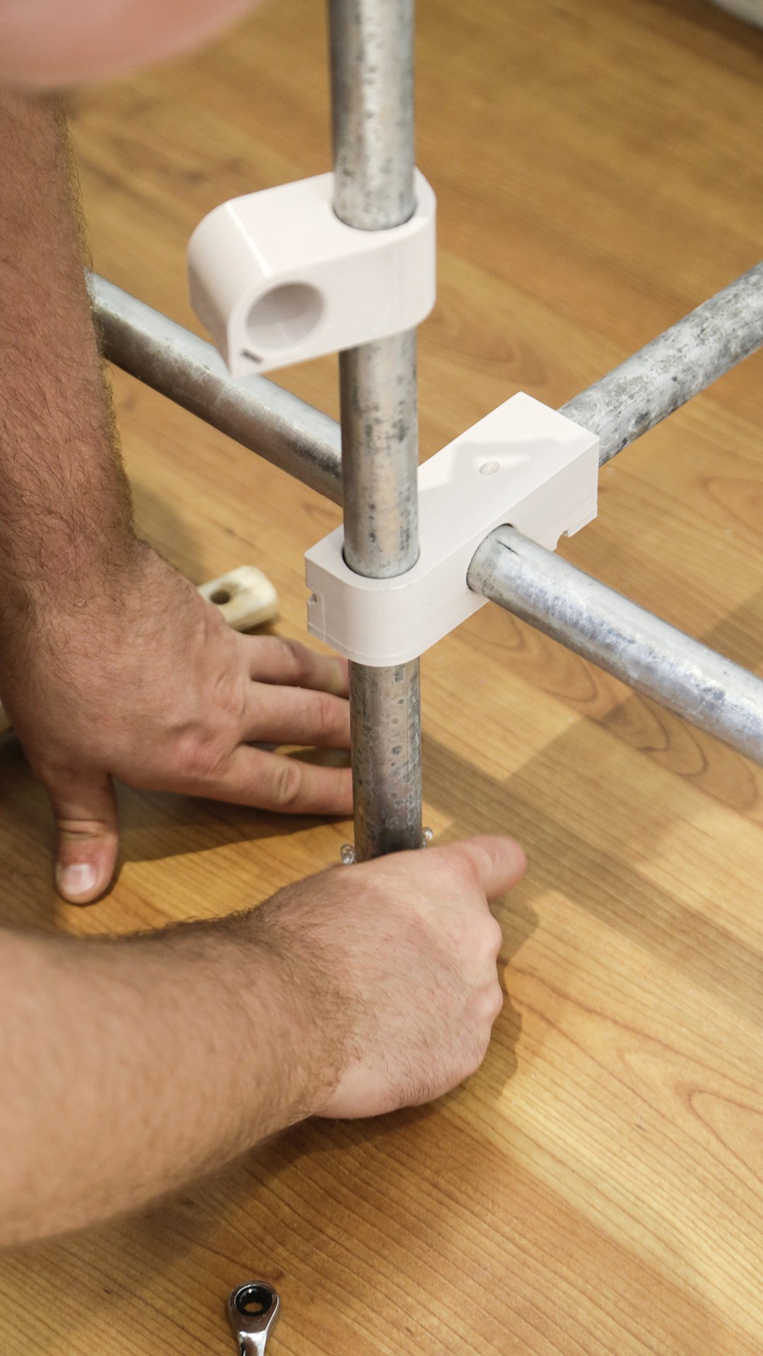
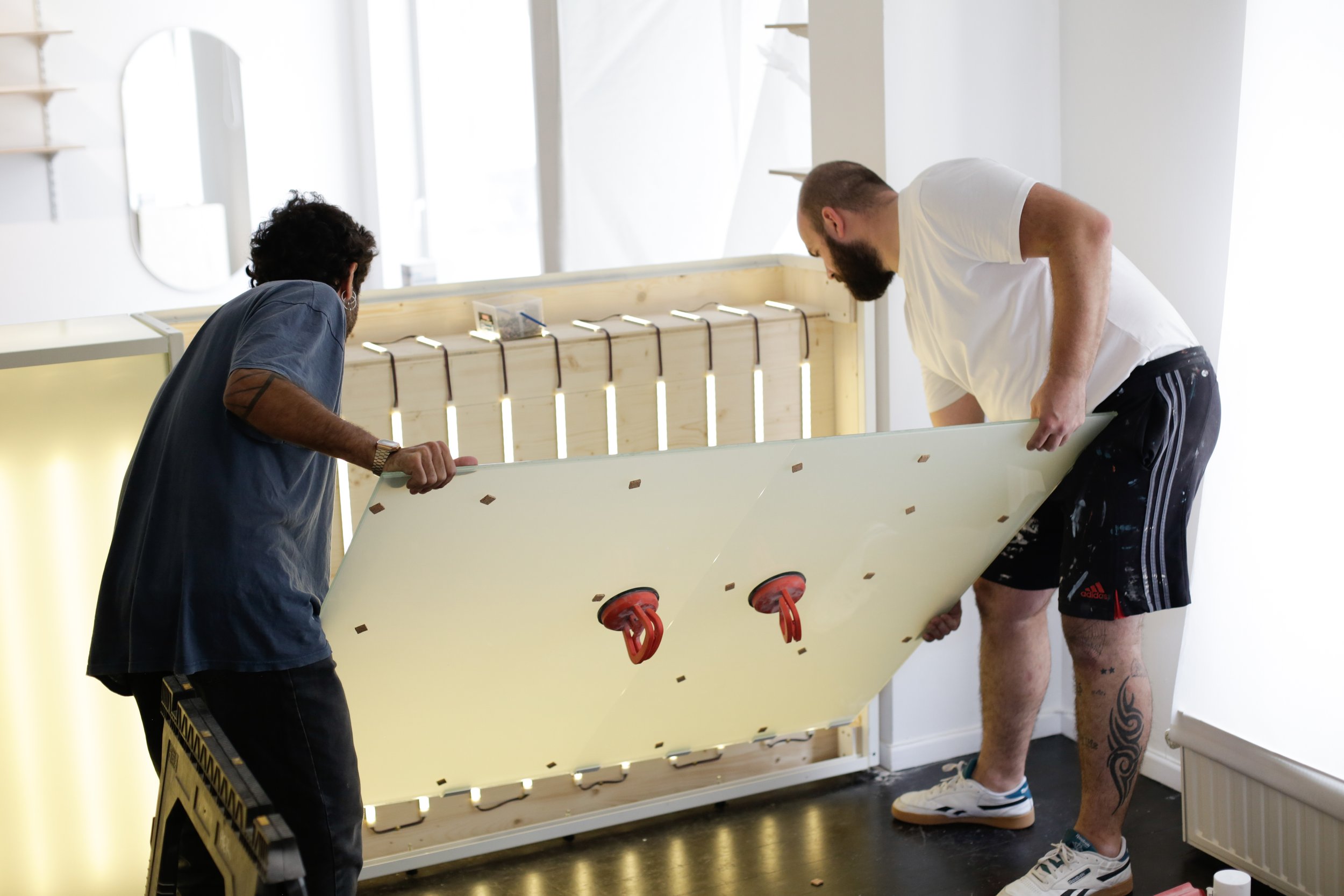
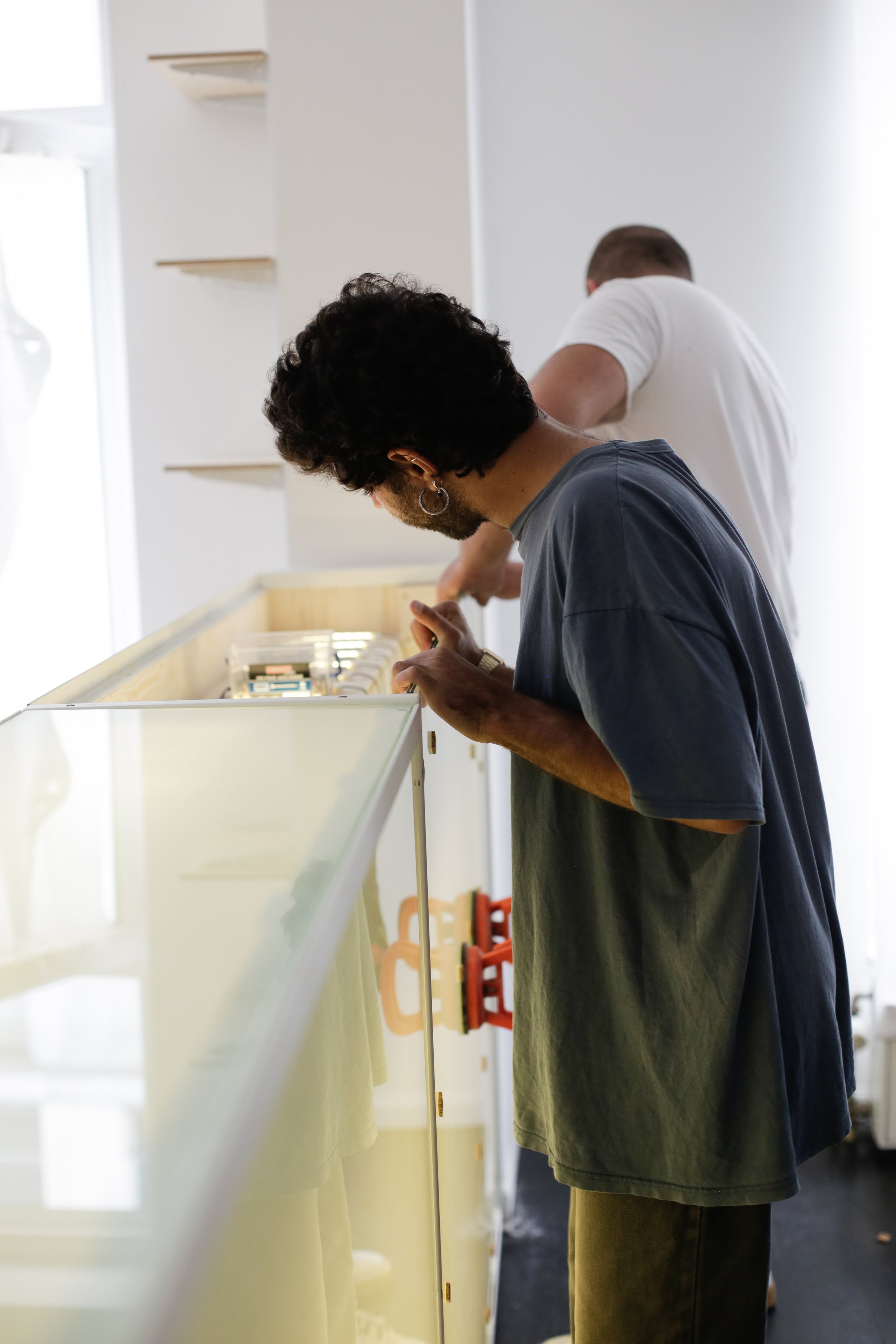
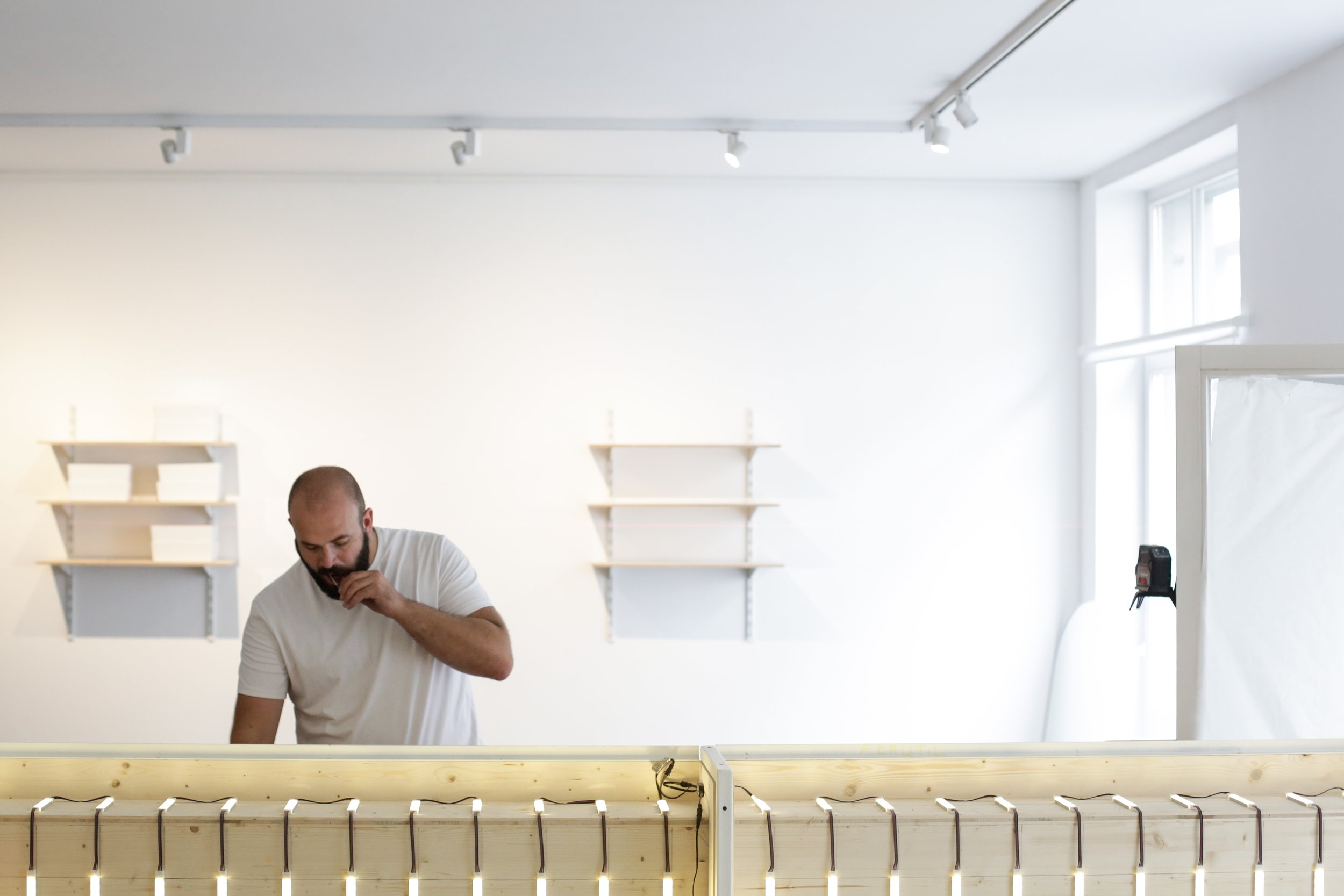
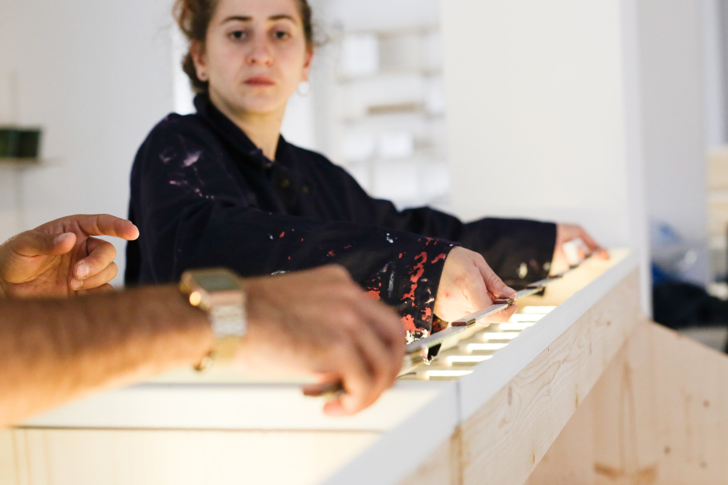
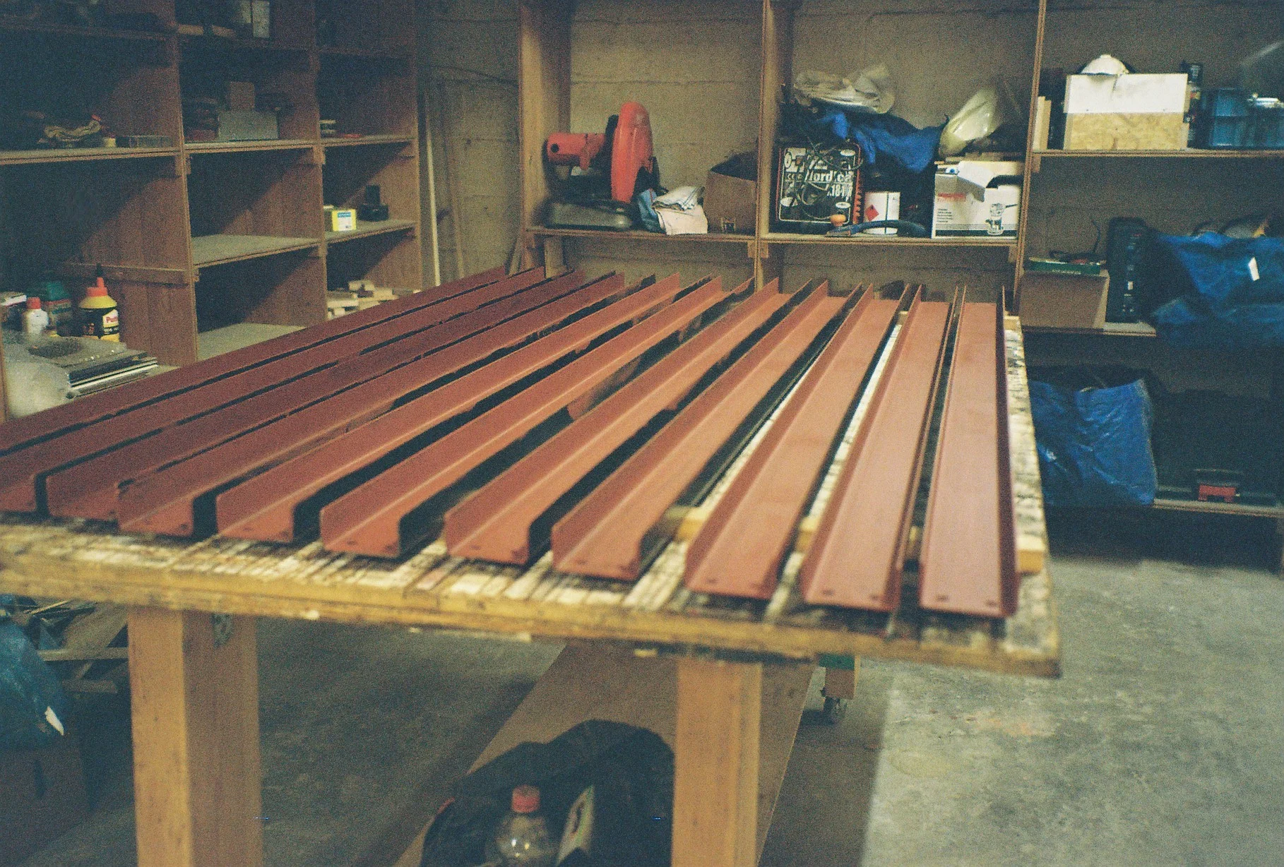
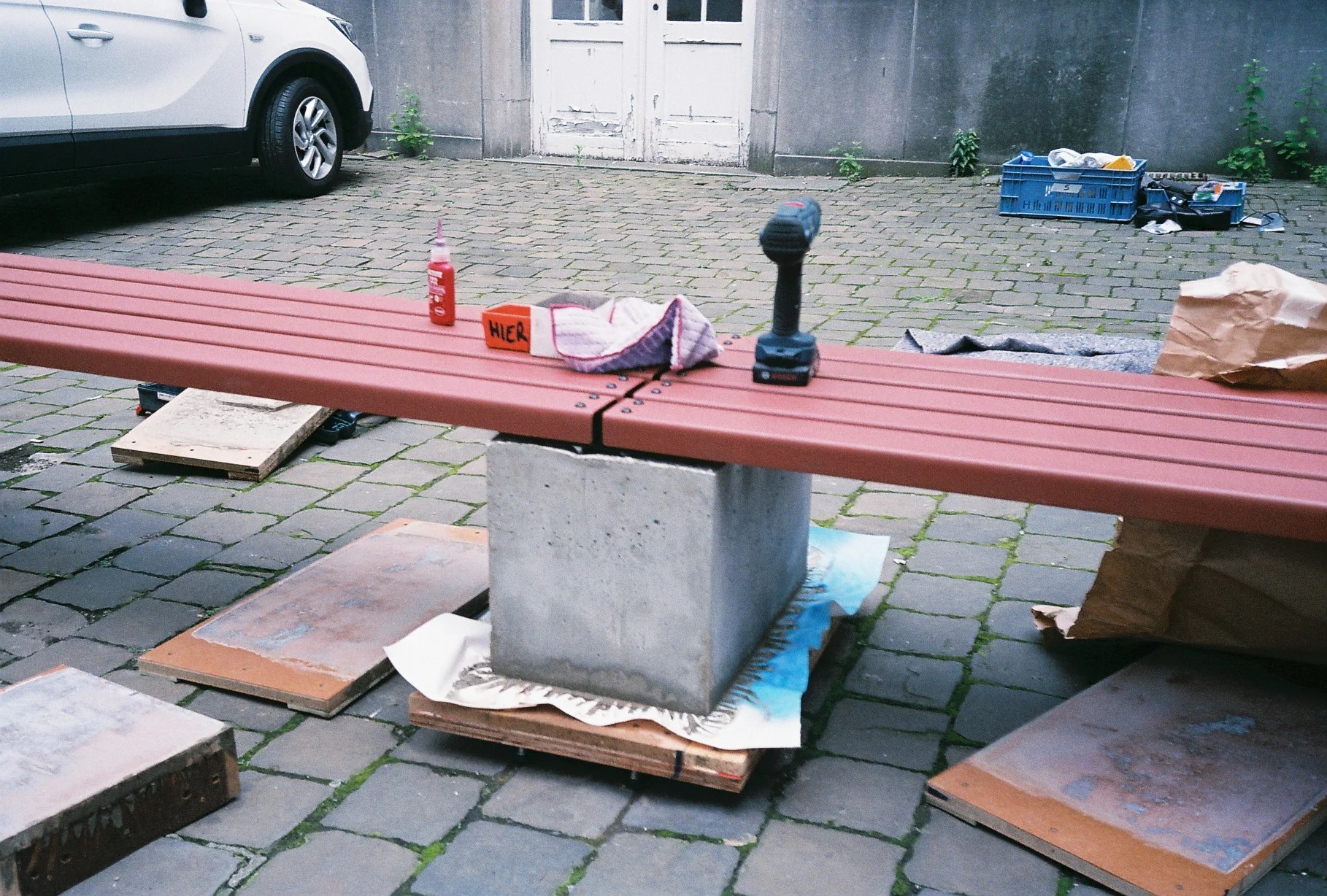
Another sample in the wall - Firmax
We were commissioned by Firmax to design, produce, and install, an acoustic wall, separating the office from the showroom space, and serving as a sample library.

We were commissioned by Firmax to design, produce, and install, an acoustic wall, separating the office from the showroom space, and serving as a sample library.
We took as a reference the sizes of the kitchen cabinet doors to compose a grid, built with square steel tubes and u-channels, carefully and minimally assembled, with the u-channels inviting the different samples to rest in them.

Materials: square steel tubes and a u-channels, Archisonic acoustic panels made from the upcycling of single-used plastic bottles
Pics by the greatest Eline Willaert

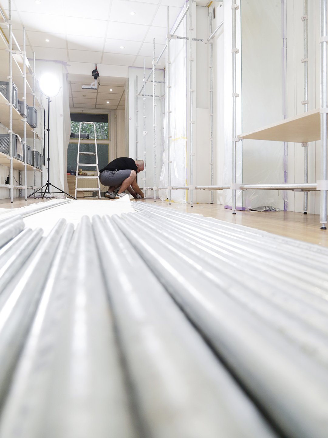
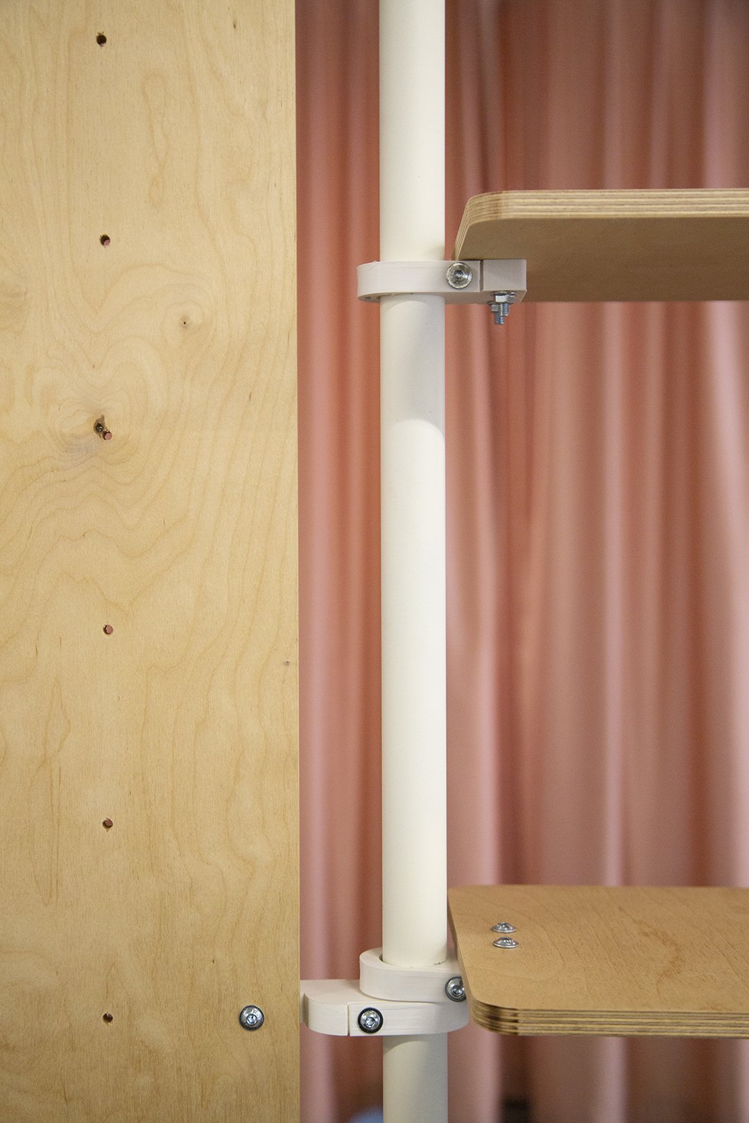
The NeverEnding Story - L'Auberge Espagnole
A modular system for a flexible shop.
A shelf. A pegboard. A hanger.
Assemble. Dismantle. Re-mantle.
HUB-TOP-POP!
ONE SHOP FOR ALL.
Assemble. Dismantle. Re-mantle.

We were commissioned by hub.brussels to design, adapt and install, a system for a series of 12 pop-up stores, in different neighbourhoods in Brussels.
A modular system for a flexible shop.
And so we thought, defined the rules to the system, drew, developed and prototyped, to finally reach a first version, suitable for all:
A shelf. A pegboard. A hanger.
1 Structure. 3 Connectors with 5 add-on details. # Types of Merchants. 3 Display possibilities. In 1 Shop.
1 pop-up built. 11 more to go.
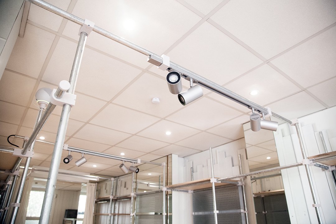
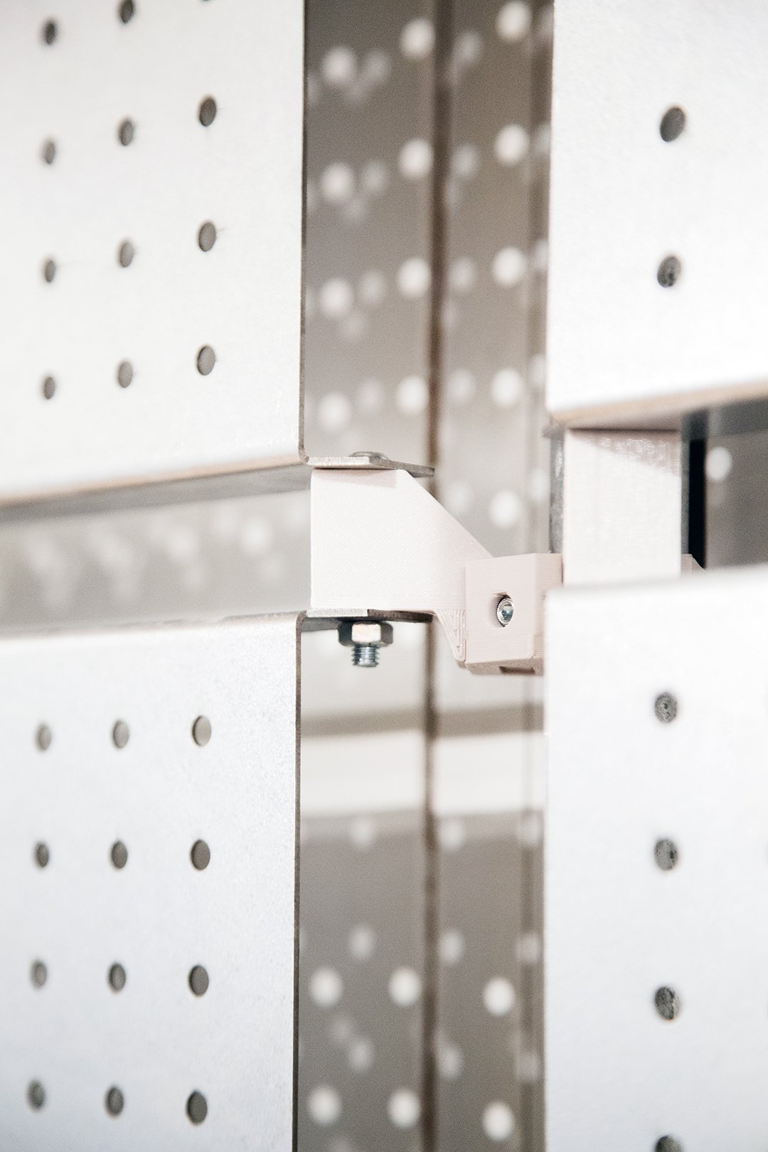

In POP-UP #1, structure is made with galvanised tubes, connectors and details printed with recycled PET, shelves are made of birch plywood, and pegboards out of laser cut and folded galvanised sheets.


For POP-UP #2, we left room for modifications. After all, we learn from POP-UP #, to then adjust, and improve.
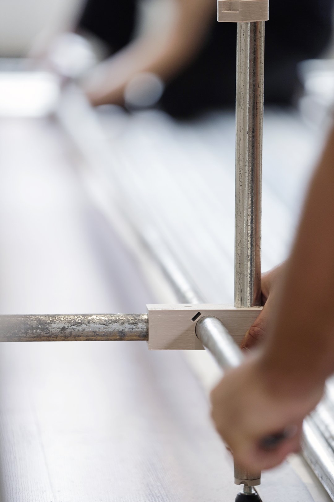


In POP-UP 3 #, L'auberge Espagnol in Forest.


Pictures by Joe Khoury Studio and Luciana L. Schutz, video by Joe Khoury Studio

Rose Mécanique - Tattoo Studio Because
Pink is for fabric. White is for metal. Wood are for surfaces. And green are the plants and pots.
Pink is for fabric. White is for metal. Wood is for surfaces. And green are the plants and pots.
Because we wanted a friendlier tattoo studio. Because it is an open space with a visibility on the whole. Because there are five tattoo artists on the ground floor and two on the lower floor. Because it needs to be neat and clean. Because the concept is the Rose Mécanique. Because it suits the place and because it is a different tattoo experience. One of slickness and refinement.


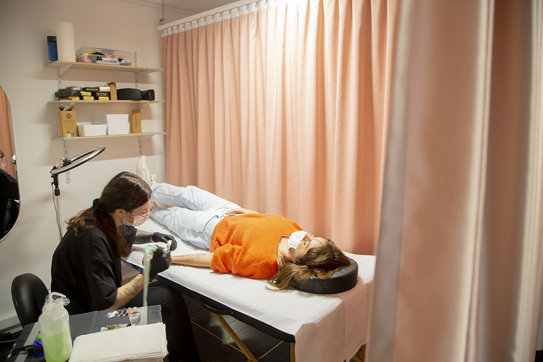

Pics and video by Joe Khoury Studio


Route de la Laine - Mouscron
Branding Mouscron, branding the wool road, the new road.
Weaving the story of the city with a blue thread of wool. Hier an exciting 1700sqm journey, with two amazing illustrators: Hedi Baka and Wenc.
Branding Mouscron, branding the wool road, the new road.
Weaving the story of the city with a blue thread of wool. Hier an exciting 1700sqm journey, with two amazing illustrators: Hedi Baka and Wenc.
And an incredible set of hands @cocolaurens @bks_ttt @oresto_paobar @dzi_smooth @beata_kwasnica @anais_neo @colombine____


Project powered by Colora Zaventem
So happy and proud with this collaboration.
And if you drive by Moumou, slow down, and dive in the colours.
Video by Jules Cesure, the only one.
Extra thanks to Vedett for the daily fuel


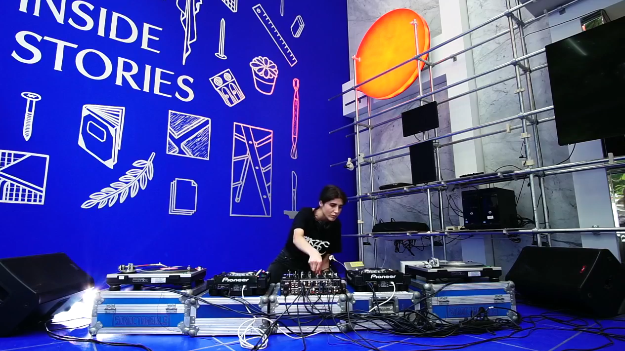
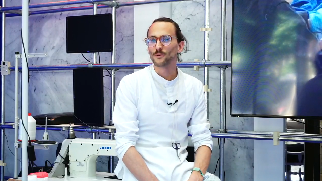
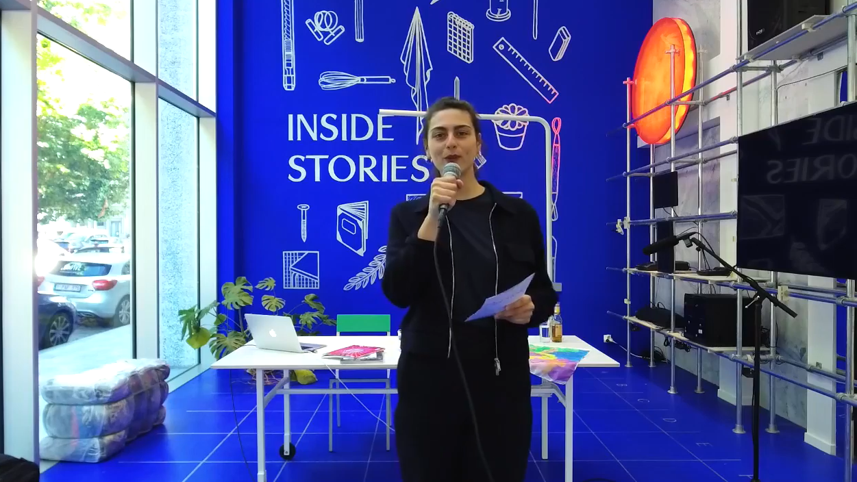
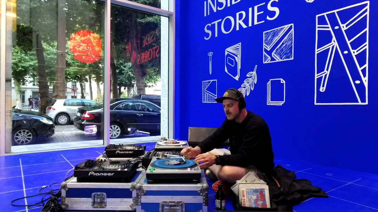
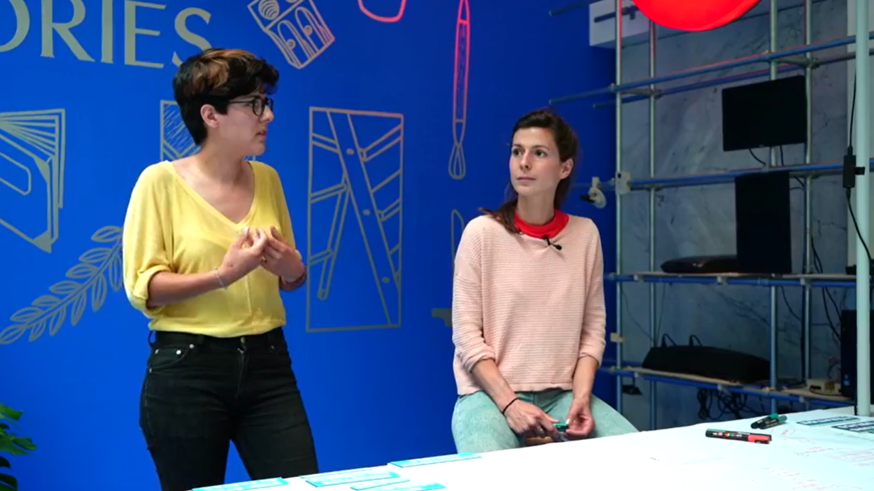
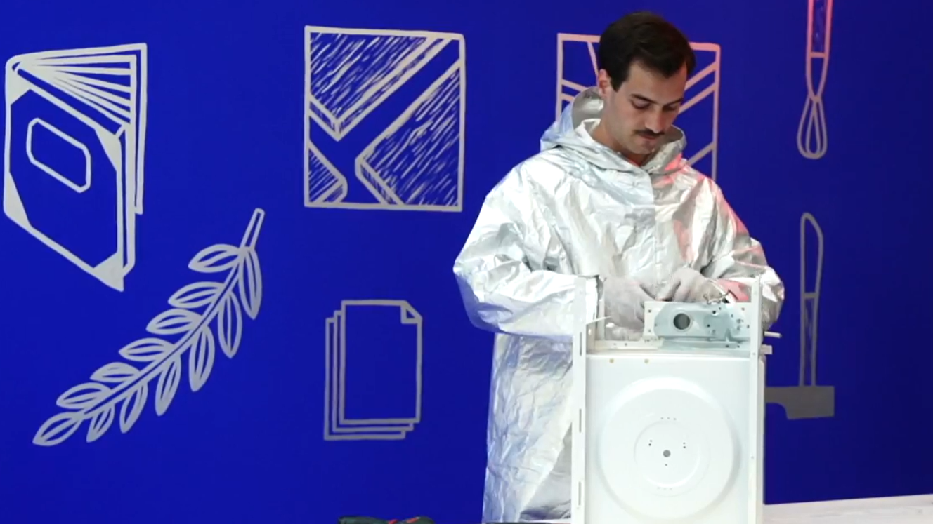
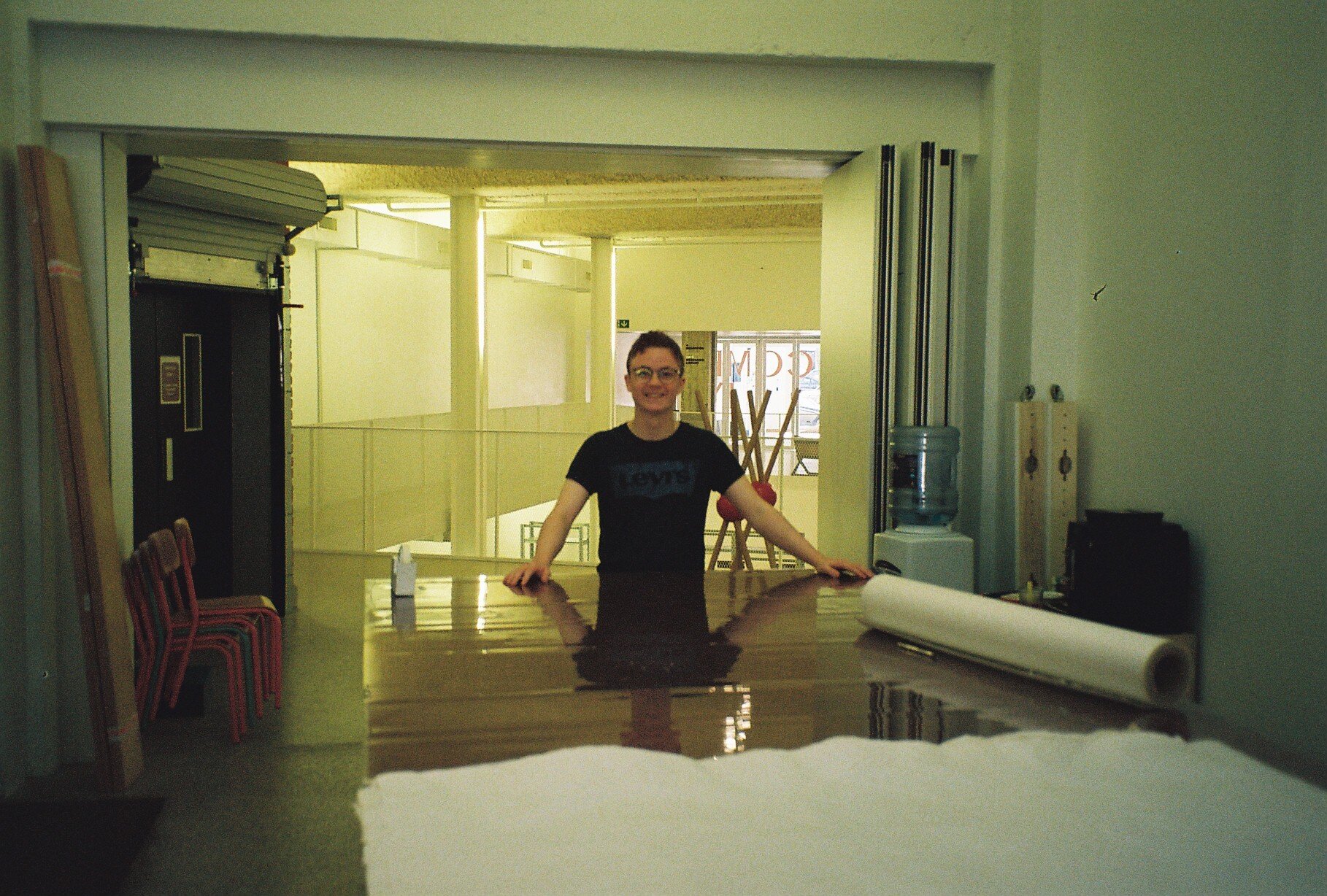
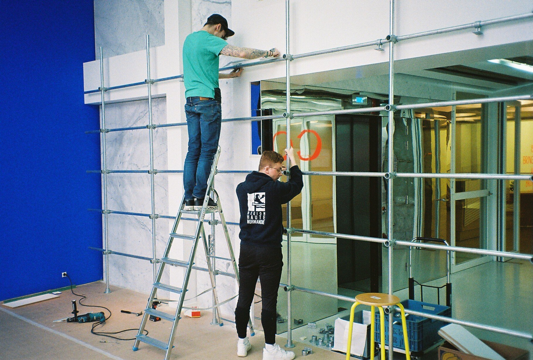
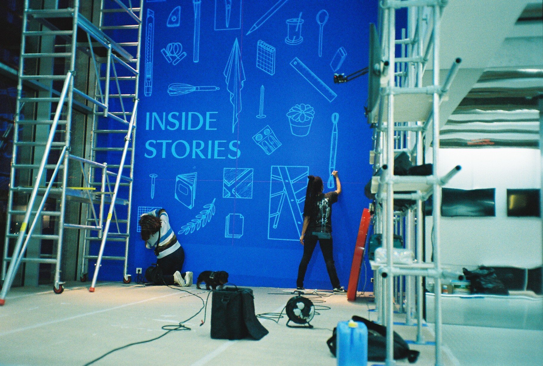
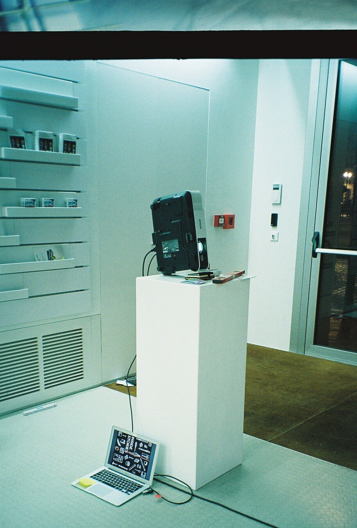
Inside Stories
A window of windows, of Inside Stories.
One of translation, transcription and essentially transmission.
This scenography, commissioned by MAD Home of Creators, is designed to host a series of fortunate events, from master classes to conferences and workshops.
A window of windows, of Inside Stories.
One of translation, transcription and essentially transmission.
This scenography, commissioned by MAD Home of Creators, is designed to host a series of fortunate events, from master classes to conferences and workshops.

We looked at the theatre as a space of transmission. From theatre to curtain. From a separating curtain to a technical curtain. A curtain of transmission. A frame of transmission. With one lighting element: the red mascot light that we previously conceived for MAD Home of Creators for the pop-up shop 100th Territory.
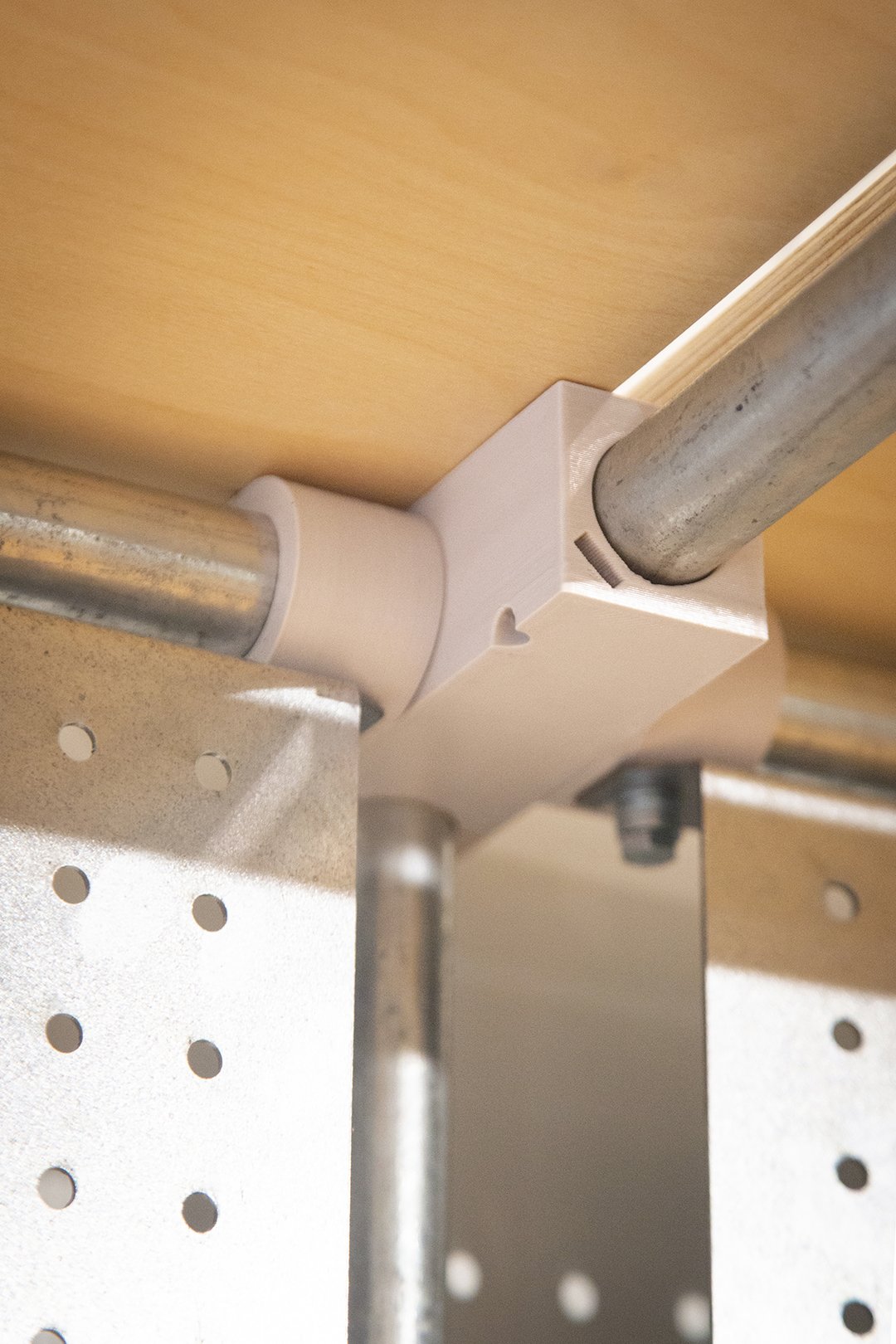
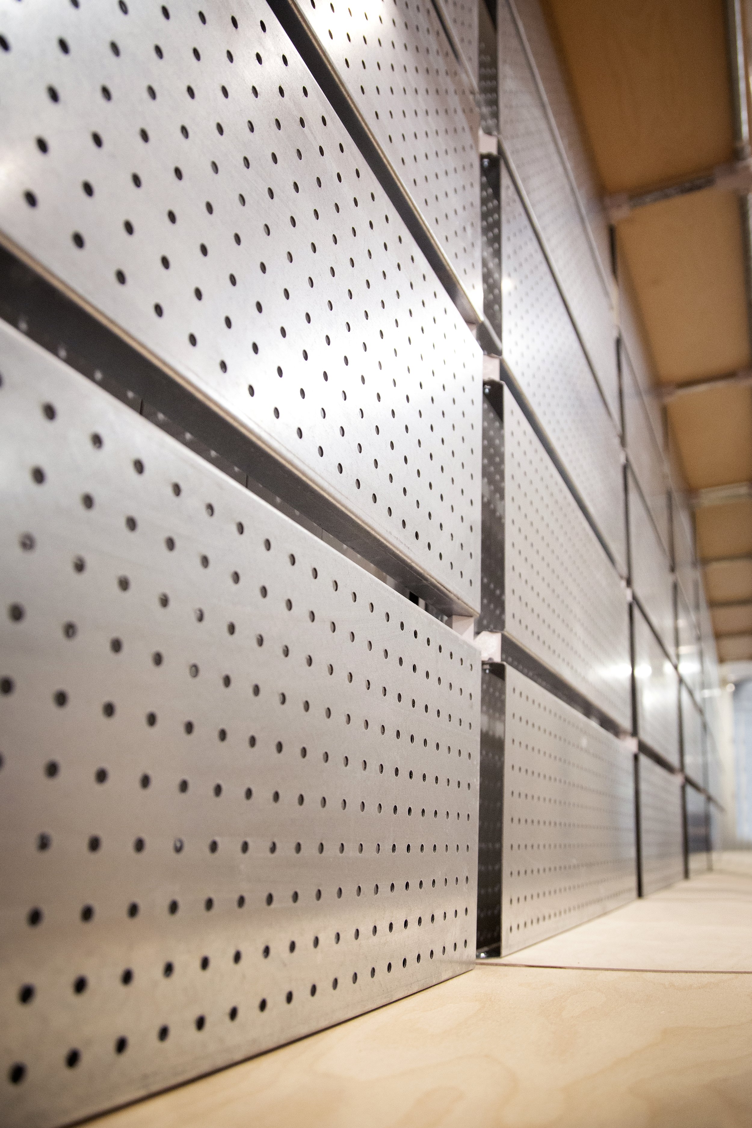
For the structure of the frame, we chose galvanised steel as it ages well, circular tubes for they could be easily assembled with ready-made connectors, reducing production operations.This system allows for reuse and flexibility for other events to come.

Inside Stories is a system
To the frame plug in the different tools of transcription. A camera capturing stills and top view moves, transmitting them on a screen. A tool that transcribes sound into words. A scanner that captures a digital imprint of a print. The content: Sound. Image. And text. All telling, the inside stories behind that window.
These different elements are fixed to the frame via home grown connectors that we customised and 3D printed with PLA, recyclable plastic.
All surfaces of the frame are cut out of material made from heat pressed residues of beer production.
The spatial configuration is defined by an annotated grid hand marked on the floor on which the furniture moves and adapts to the different types of events happening in the window space. The grid on the floor follows the grid of the frame structure.
#WIP
This same grid serves as a ruler for the wall, allocating spaces for the collaboration with Shayto Badjoko: 20 illustrations translating the theme of Inside Stories, winking at the different participants and the tools that they use.
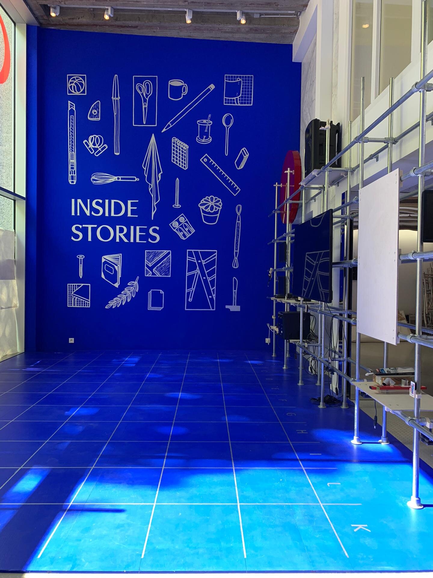
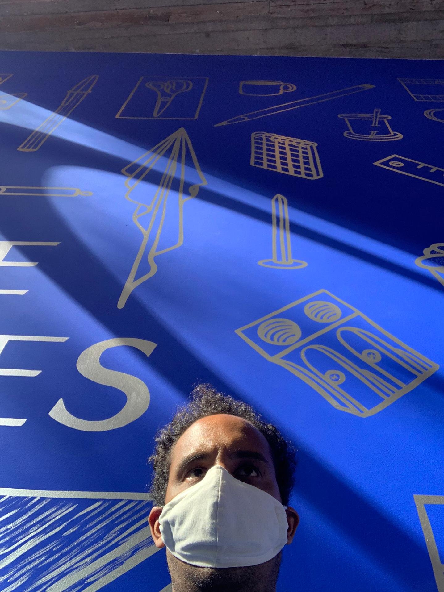
We kept the blue of Bureau Wolewinski from the previous MAD Window for it is a fantastic blue, and we would hate to waste a nicely painted wall. As for the furniture, we used those piling up in MAD’s storage, to put them at work, avoid waste and an extra layer on the storage pile, once the story of Inside Stories is dismantled.
Special thanks to our team. Special thanks to MAD’s team :)
You can replay all the lives, they are here.
Some pictures are from Eline Willaert

iMAL
In conversation with IMAL's Fablab team and the architect’s plans for the new space, we designed the furniture for Fablab present. All furniture is thought of within a system of pieces that are: easily assembled, thus dismantled and repairable, efficiently reproduced for possible future expansion, and as reusable as possible.
In conversation with IMAL's fablab team and the architect’s plans for the new space, we designed the furniture for fablab present. All furniture is thought of within a system of pieces that are: easily assembled, thus dismantled and repairable, efficiently reproduced for possible future expansion, and as reusable as possible.

What could be salvaged from past was salvaged: furniture from IMAL’s fablab and all wood surfaces from soon to be dead WTC. The structures are hand painted with a hammered finish. The blue boxes are borrowed from the Mabru Morning Market in Brussels in exchange for a deposit. They might never return there.


Our ingredients:
120m of 40x20x2mm steel rectangular tube.
312m of 60x30x2mm steel rectangular tube.
102m of 20x20x3mm steel corner.
24m of flat 60x5mm steel flat bar. Cut. Pierce. Paint. Add rivets. Assemble.
150sqm of agglomerated reused wood from WTC soon to be dead building. Cut. Structured. Placed.
208 blue plastic crates from the Mabru Morning Market. Paid for caution. Free renewal: Filled with materials and tools. Stored in furniture and on shelves.
97 eurostandard grey plastic crates. Recyclable. Filled with material and tools. Stored in furniture.


To their dishes:
3 counter stations: kitchen area, electronic area, chemistry area, caressing the windows
2 3D work station
1 2D work station
4 mobile working surfaces
1 triple shelving unit
4 double shelving units
High and low shelves with storing plastic crates, blue for the high, grey for the low. The shelves are off-cuts from the work surfaces
Off-cut boxes on wheels made with off-cuts of the wood used for the surfaced


Nice and clean pictures by Eline Willaert
Special thanks to iMal team for the co-construction.
Gregory, Guillaume, Stefan, Xavier, we love you <3


Dear WTC, goodbye and thank you :)


100th Territory
This place is your place. A hundred times.
It is redefined. Limited by walls, and edges.
Dispossessed.
Some even call it a non-territory of the multidisciplinary.

This place is your place. A hundred times.
It is redefined. Limited by walls, and edges. Dispossessed. Some even call it a non-territory of the multidisciplinary.
It is not ours. It is your place.
It used to be Belgium.
Now it travels.
It pops up in Maasmechelen Village. It is powered by MAD.
Pictures and video: © Maasmechelen Village 2019 09/19
Special thanks to L’Ouvroir for the support.


Bar Rodin + Duvel
On the first day there was Duvel. A gift to Bar Rodin they wanted to make.
When HIER began to design the benches and the bars— the courtyard was without straight floor, and it was dark over the night— HIER said: Let there be also light.


On the first day there was Duvel. A gift to Bar Rodin they wanted to make.
When HIER began to design the benches and the bars— the courtyard was without straight floor, and it was dark over the night— HIER said: Let there be also light.
Let there be an aisle of benches leading to the two symmetrical bars on the two sides of the entrance hall.
Let the benches be made out of lines, forcing the perspective into the Holy middle. And let those lines rest on stone. Or concrete.
Let the D’s of DUVEL be symmetrical too. With one mirroring the other.
Let them be embossed in the concrete.
Let the concrete be flexible, be smart, and adapt to the levelled floor.
And on the last day, there came people. They celebrated. And stained.
A mark of use.
Some pictures are from Eline Willaert


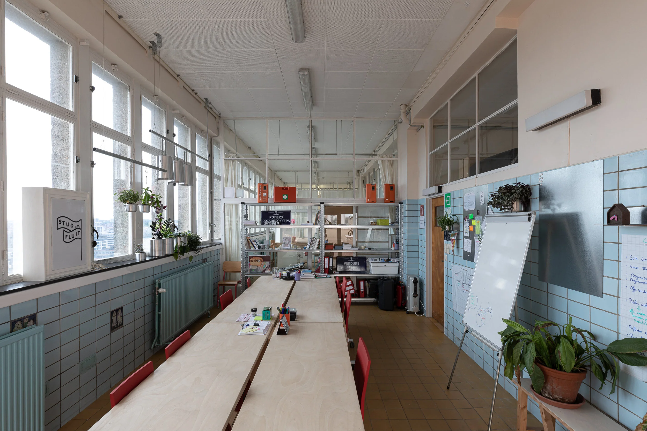
The galvanised era - MAD LAB
MAD LAB, funded by the public sector, is an incubator for young designers in Brussels.
Now, MAD LAB and its residents occupy the 13th and last floor of the highest social housing tower in Rue Haute, Brussels, Belgium, Europe, Earth.

And MAD LAB said: 'Let there be galvanised!'
MAD LAB, funded by the public sector, is an incubator for young designers in Brussels.
Now, MAD LAB and its residents occupy the 13th and last floor of the highest social housing tower in Rue Haute, Brussels, Belgium, Europe, Earth.

Formerly a daycare for the building, the space is a succession of pool blue tiled studios, separated by glass walls, with windows surrounding from all sides, looking at Brussels.
This floor needed deep cleaning, the holes patching, the studios privacy, and the whole, a touch of non clinical lighting and a spread of green.
MAD LAB had to stamp its presence there. Refurbish while occupying. This new era, marked by the metallic, is referred to as the galvanised era.
Pictures by Eline Willaert


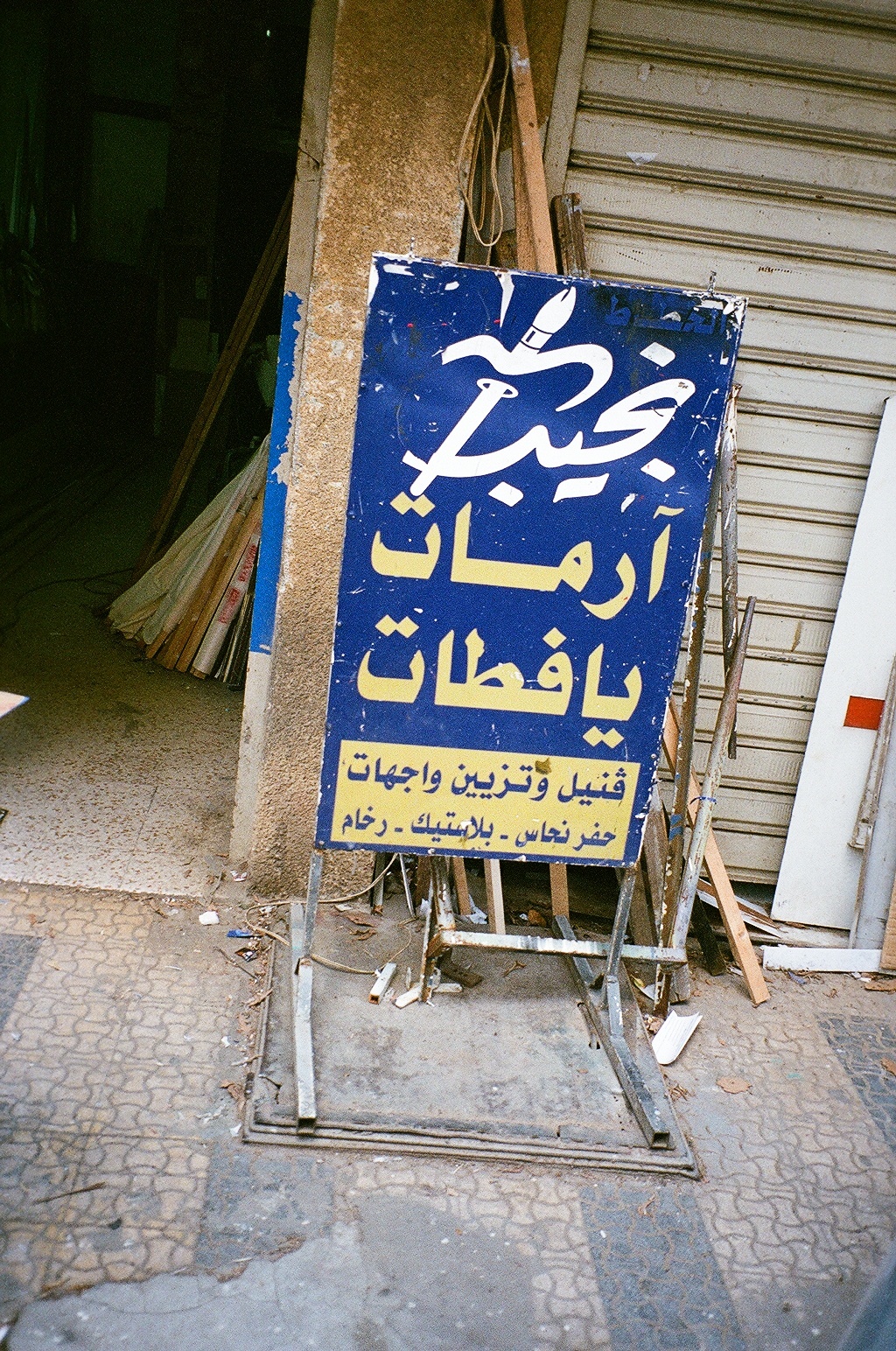
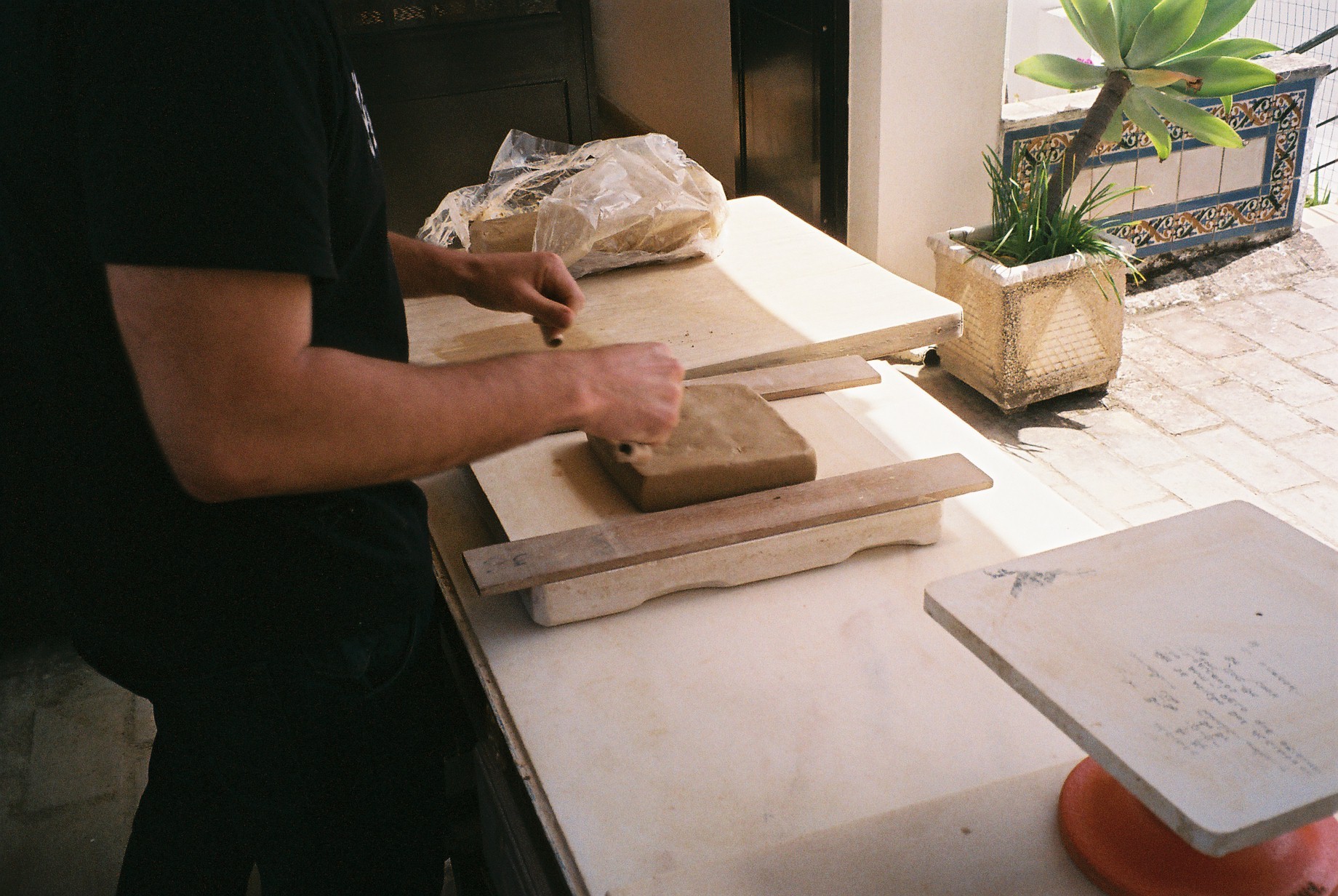
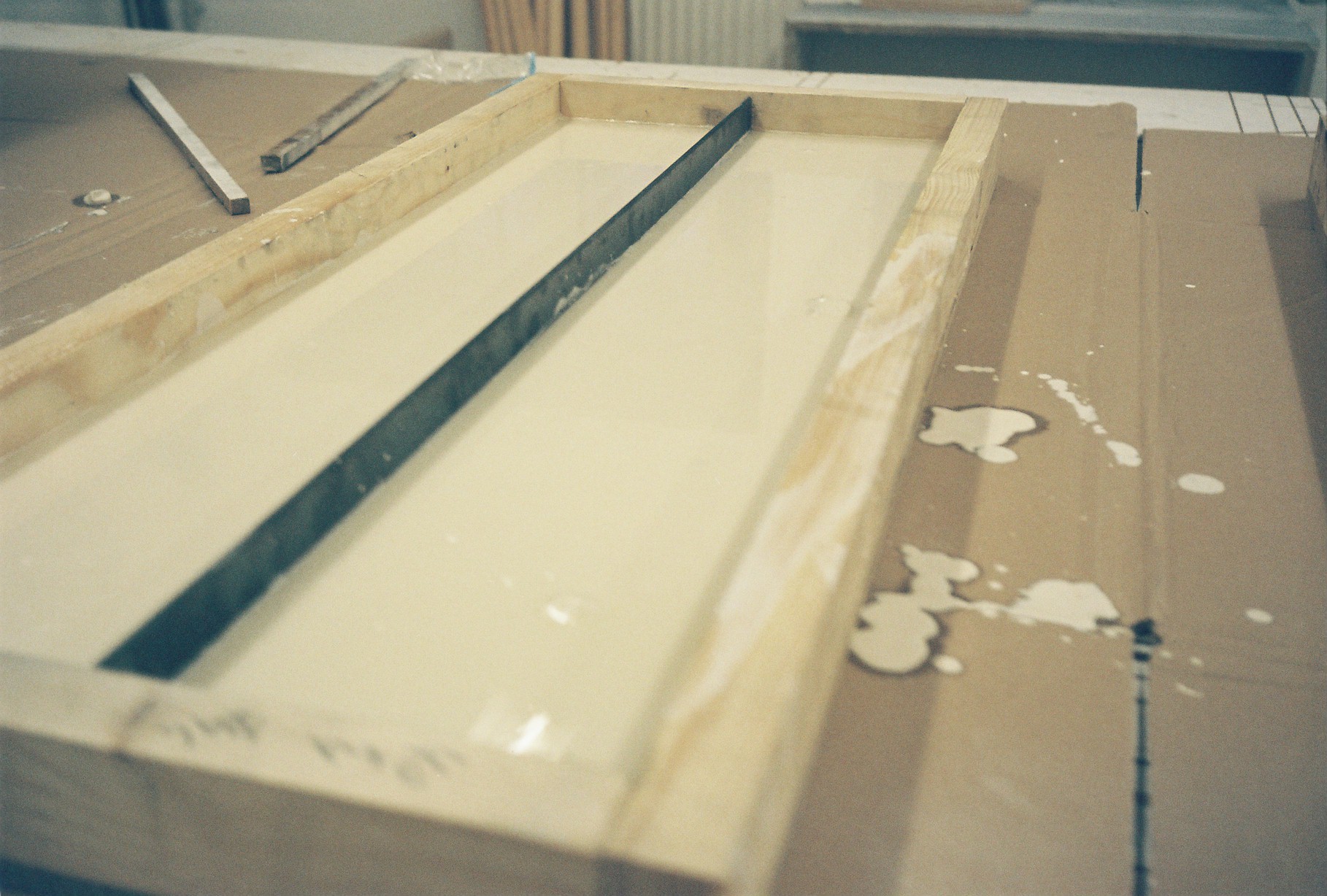
1000 Lira w Lira
1000 Lira w Lira we revisited the “1 Dollar Shop” concept and adapted it to the Lebanese Lira, an inflated currency that looses its value as we go, for value is a controversial topic.

In this project, 1000 Lira w Lira we revisited the “1 Dollar Shop” concept and adapted it to the Lebanese Lira, an inflated currency that looses its value as we go, for value is a controversial topic.
1 Dollar Shops, Pound shops, are shops where you find many materials.
1 Dollar Shops, Pound shops, all share 1 rule: no matter how big or small the product, or what it is made of, it is sold at the same unit price, 1, (here, 1000).
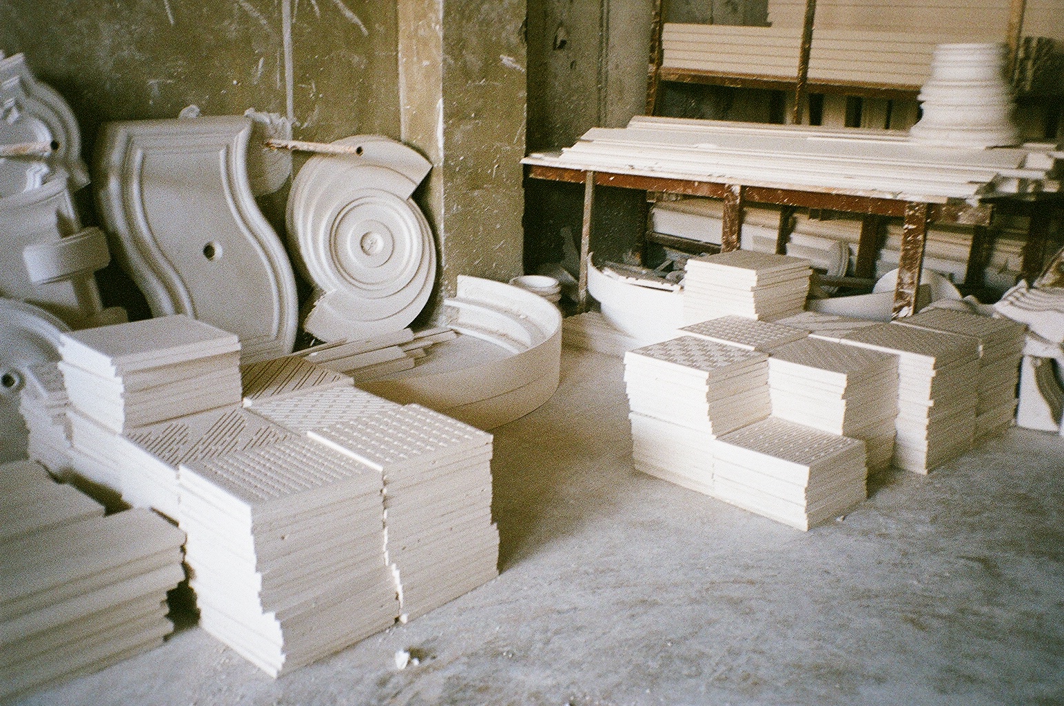
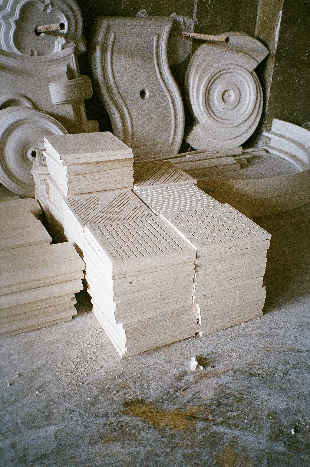
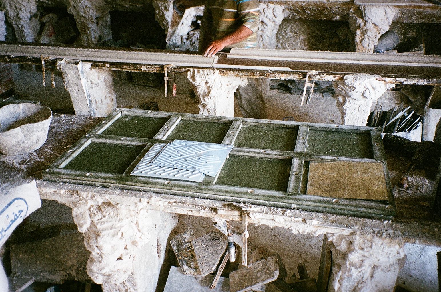
1000 Lira w Lira shop is a shop of a “1000“ materials all represented in “1”:
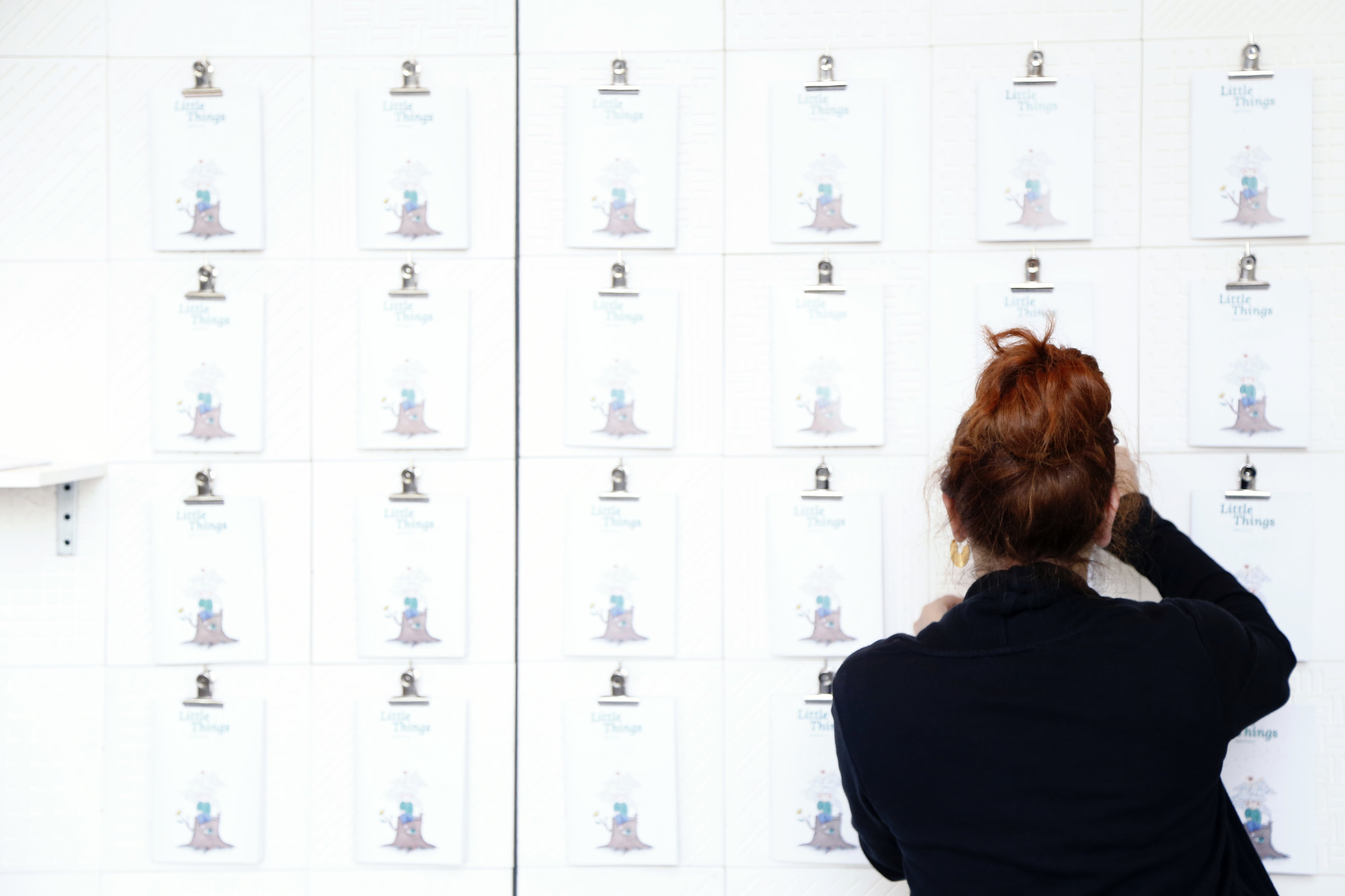
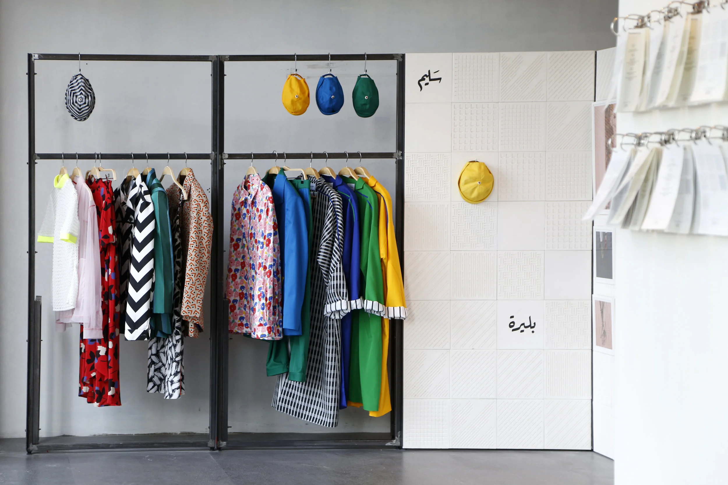
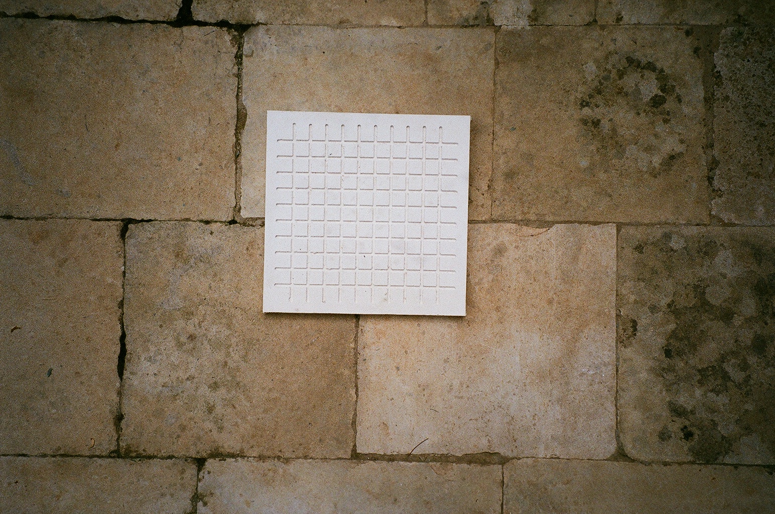
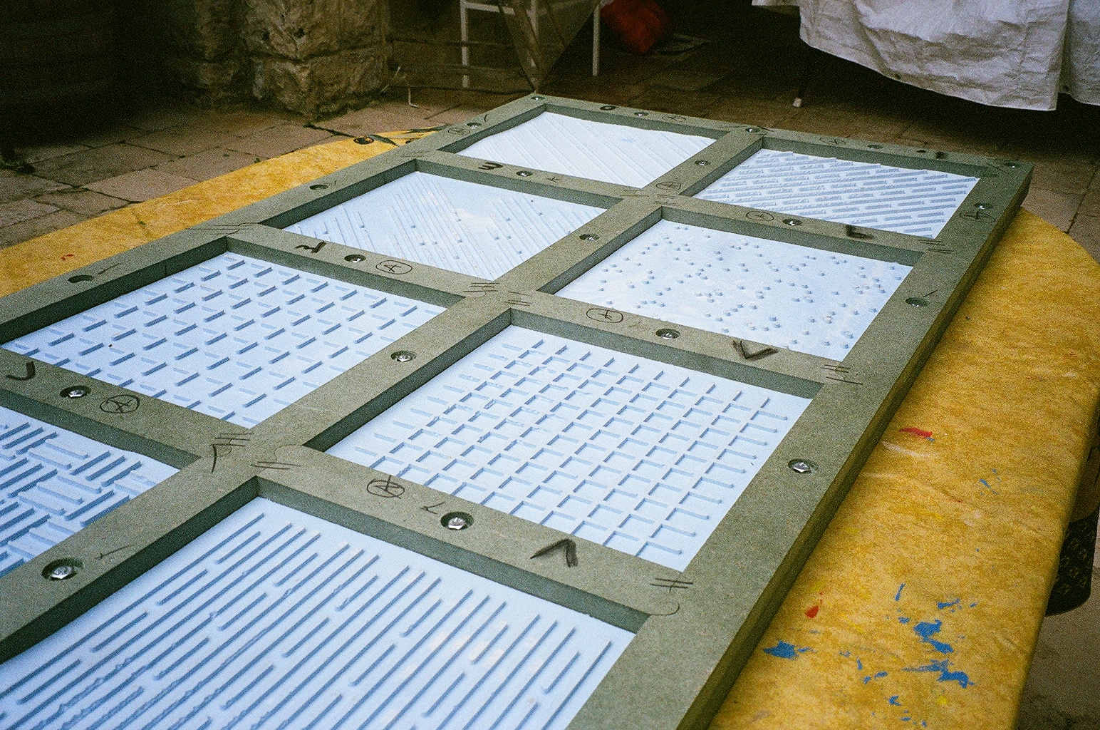
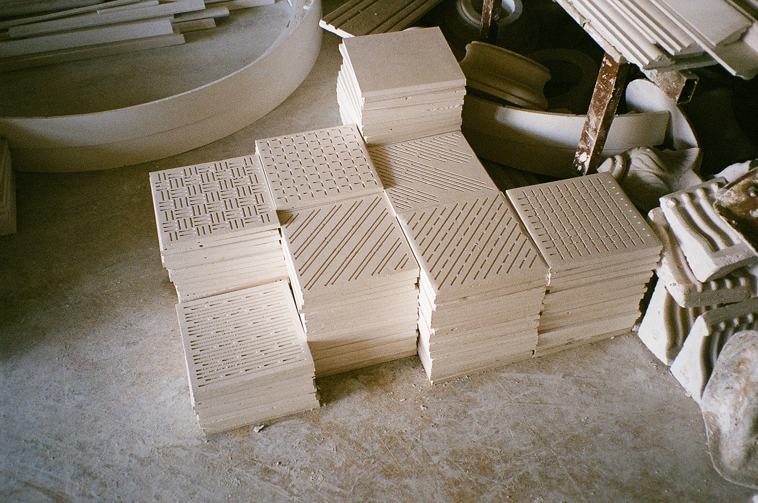
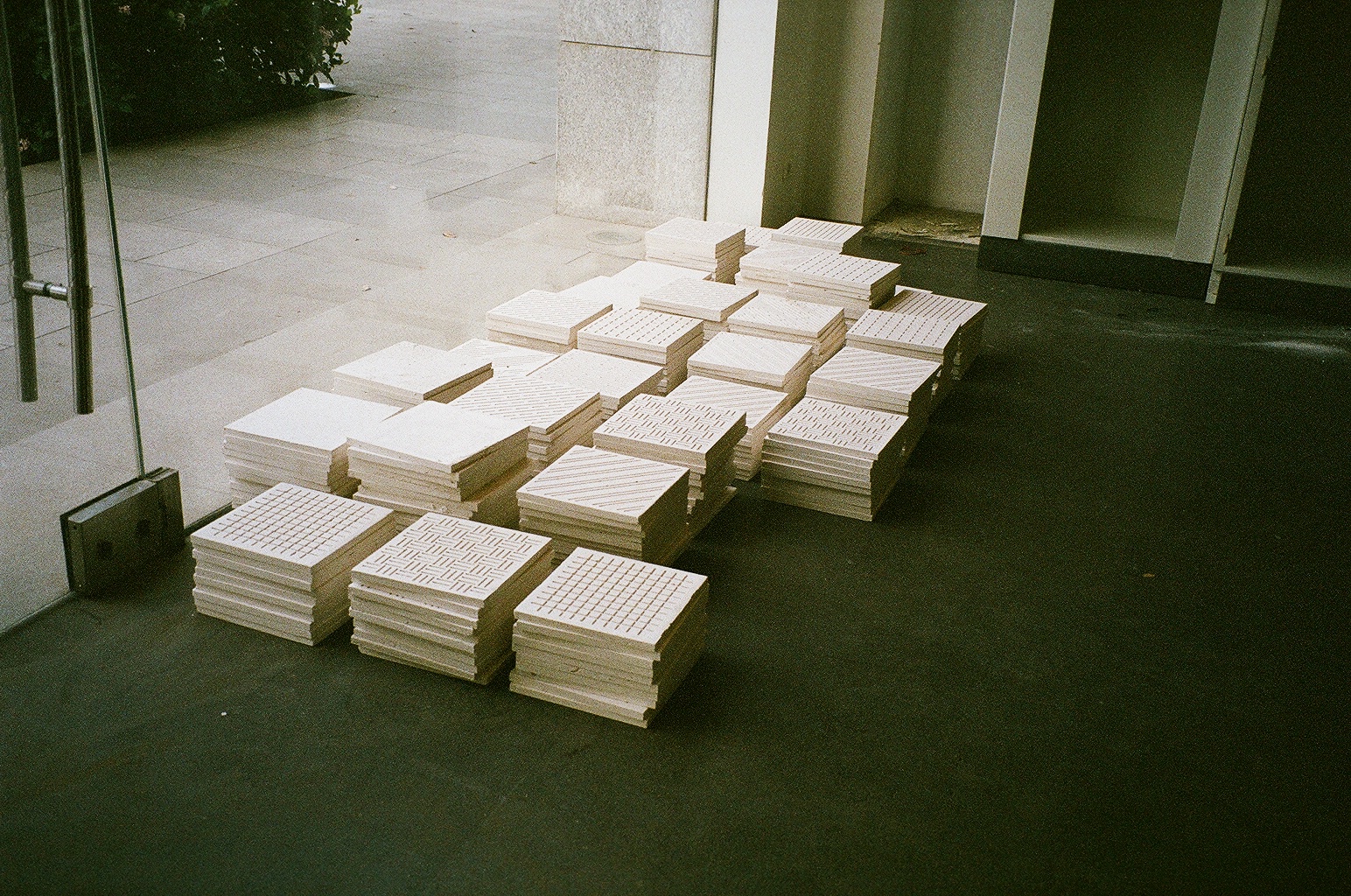
A plaster tile of 250*250*15 mm with 1 variable engraved hatch that symbolizes the different materials: steel, glass, brass, etc.
However in this shop, tiles are sold according to the material they are referring to. And therefore, a brass/plaster tile is more expensive than a steel/plaster tile, of course.
In this shop you can find a “1000” different products from designer clothes to photographs to illustrations, all sold at a “1000”. Well, the currency varies with each product and 1000 as a number is big or small depending to what it is referring to. So you will find cheap or expensive, but those are relative terms.
A “1 Dollar shop” is usually a saving store for the mass.
Geographically, this Lira w Lira shop is located in Beirut Central District, one of the most expensive and “luxurious” location in town: A location where saving stores were gentrified. This project aims to both honour and re-invite the middle mass, the “1000” to join the privileged “1” in a small shop of 30sqm with 1 big changing room of 55sqm, where the budget is somewhere in between. Big or small we mean.
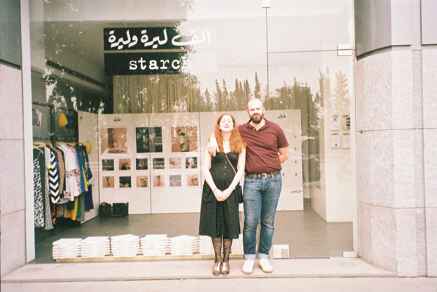
Photos by: Joe Khoury
1000 Lira w Lira
is a shop of
1000 materials all represented in
1 and its 1000 architectural, symbolic hatches.
1000 Lira w Lira
is a shop where
1000 ideas are collaged in 1.
1000 looks are unified.
1 memory is divided, multiplied, and scattered to the mile.
1 idea is documented in 1000 steps.
Or even sold, 1000 times.
1000 Lira w Lira
is the shop of
1000 designers. More like 7, where 2 make 1.
But the rest is yet to come.
1000 Lira w Lira is the hyperbolic/understated story of 1000/Lira and everything around those 2.