Signs of LooOve
Since 2017, we love them, we make them.
You might not know it, but you need it


Since 2017


We love signs


We make signs


CHEERS


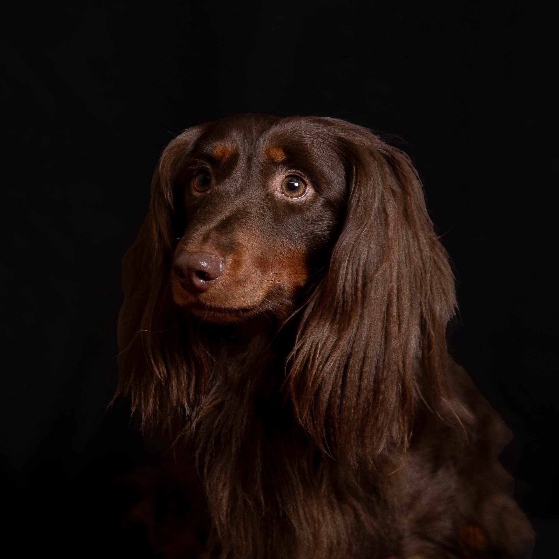
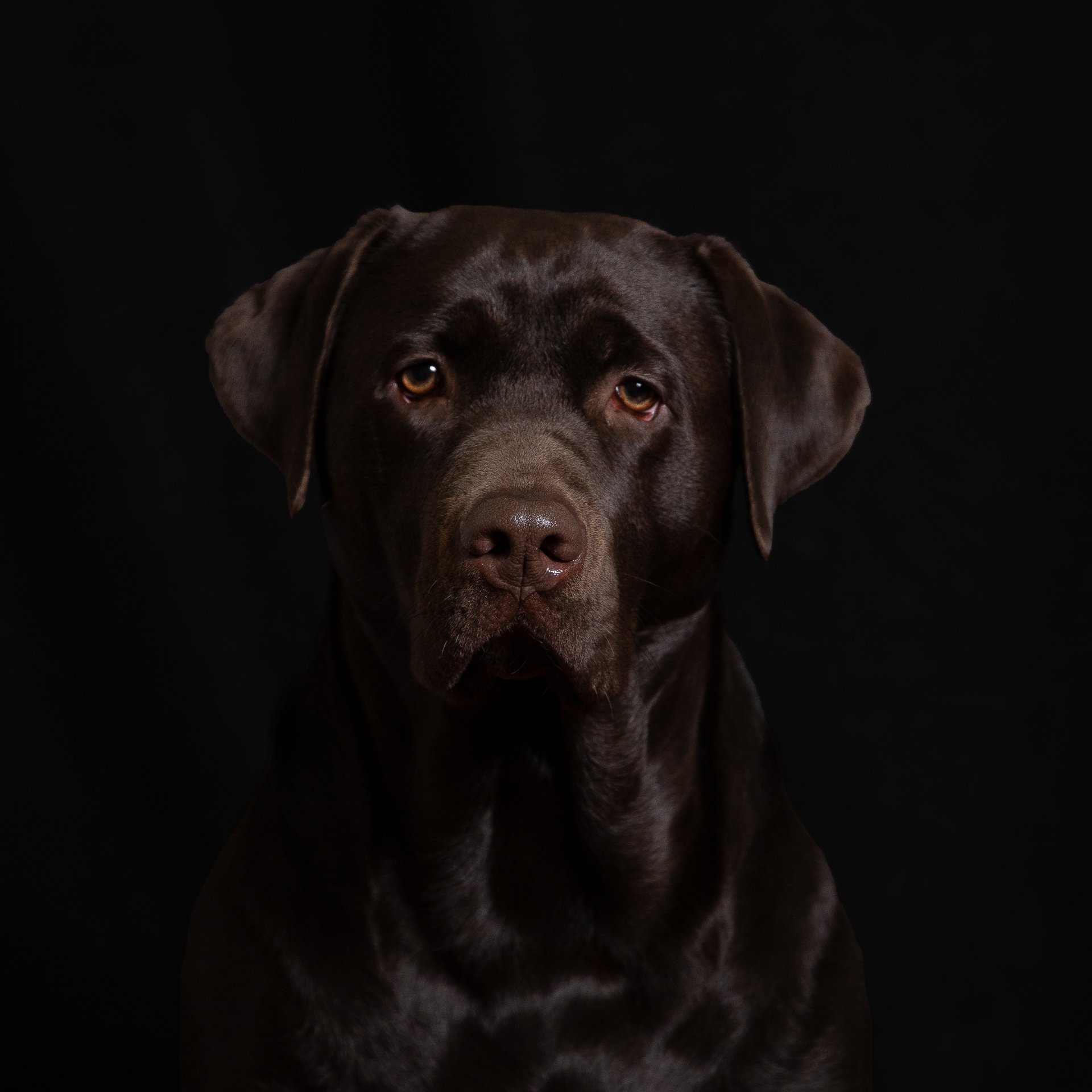
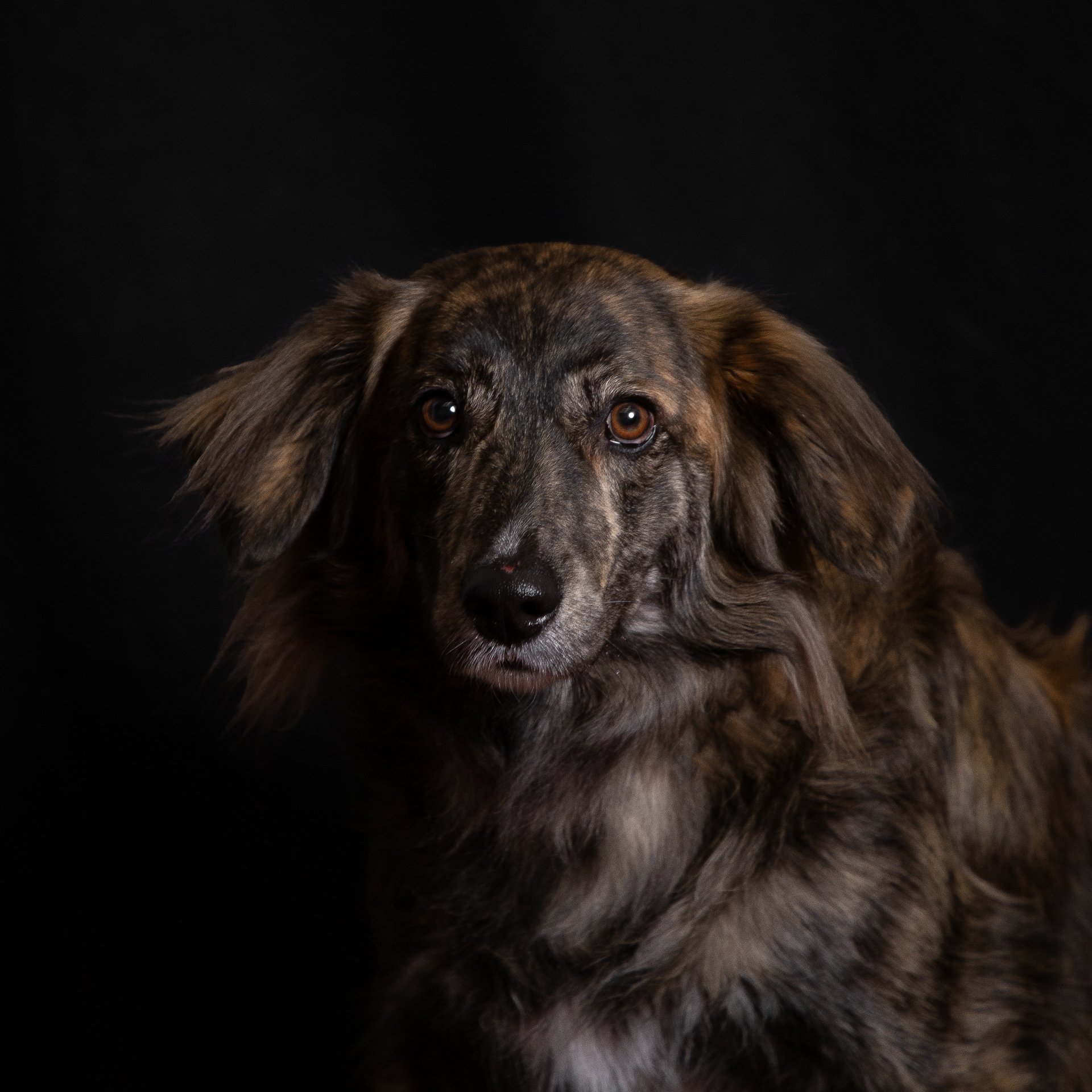
DOGUERIE – Canine XL
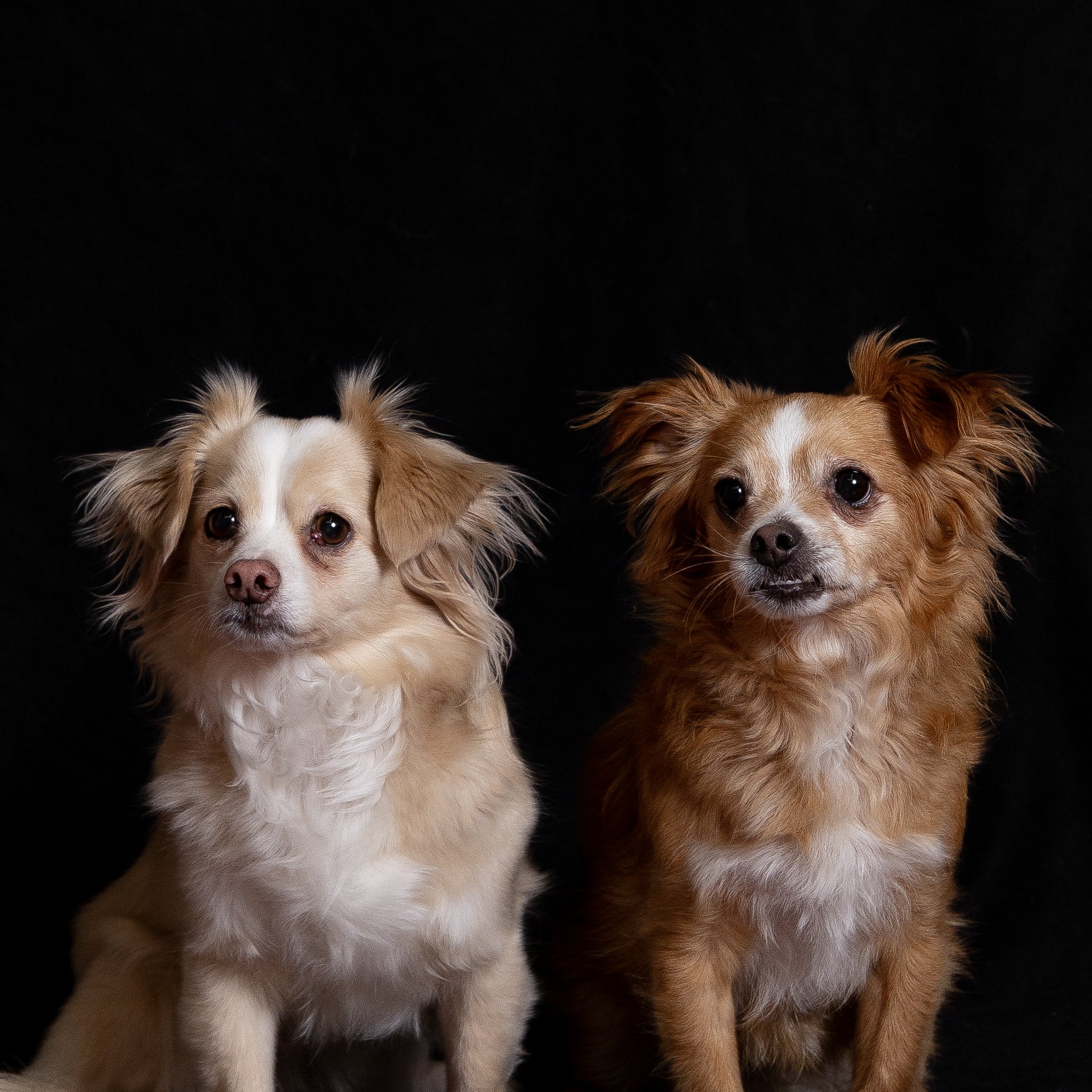
Where dogs and cats feel home. Our story with Canine started with a Bone, then another Bone facing it, to sign their cool presence in Saint-Gilles. The collaboration then expanded to cover the design of their new second store in Flagey.
Where dogs and cats feel home
Our story with Canine started with a Bone, then another Bone facing it, to sign their cool presence in Saint-Gilles.
The collaboration then expanded to cover the design of their new second store in Flagey.
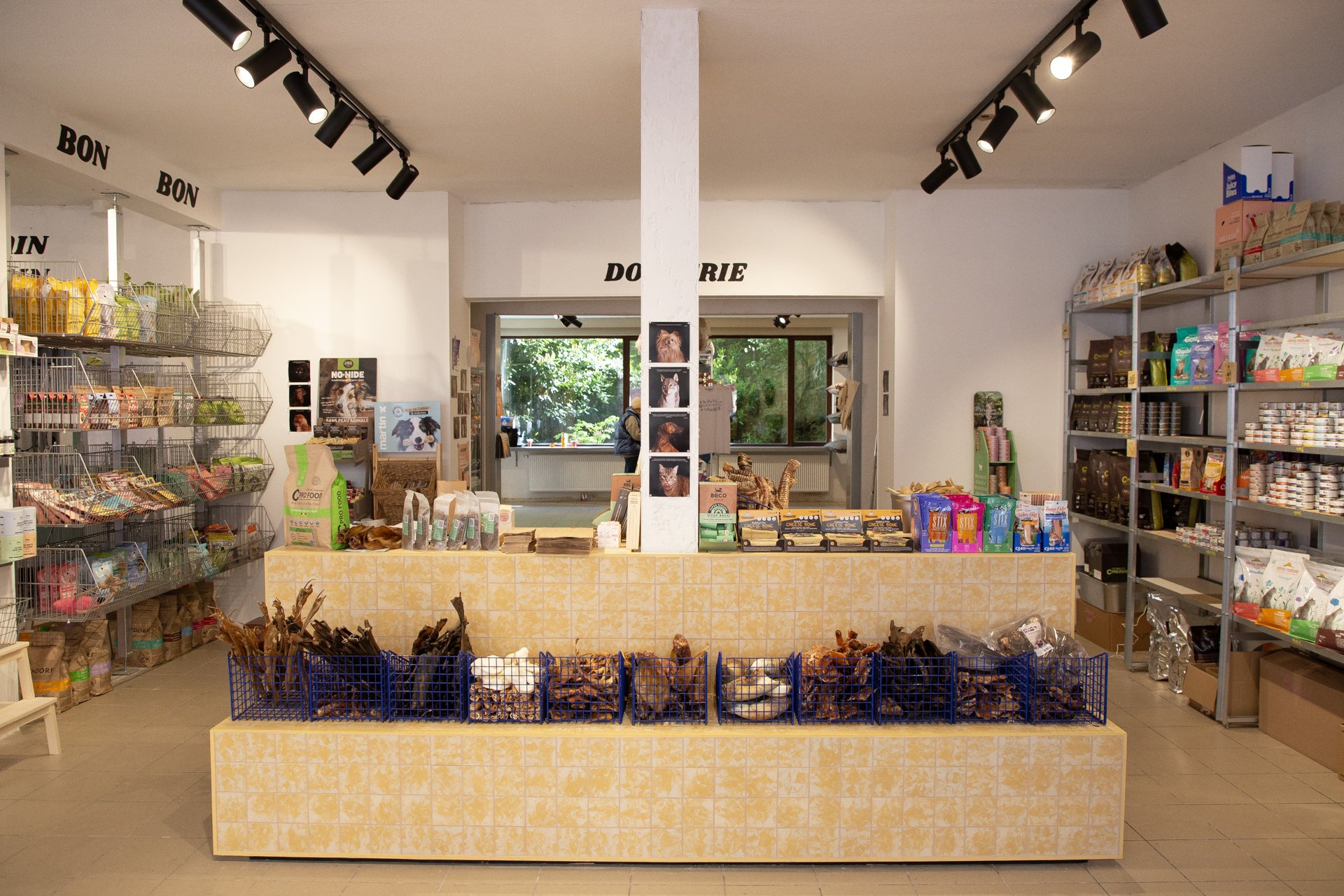
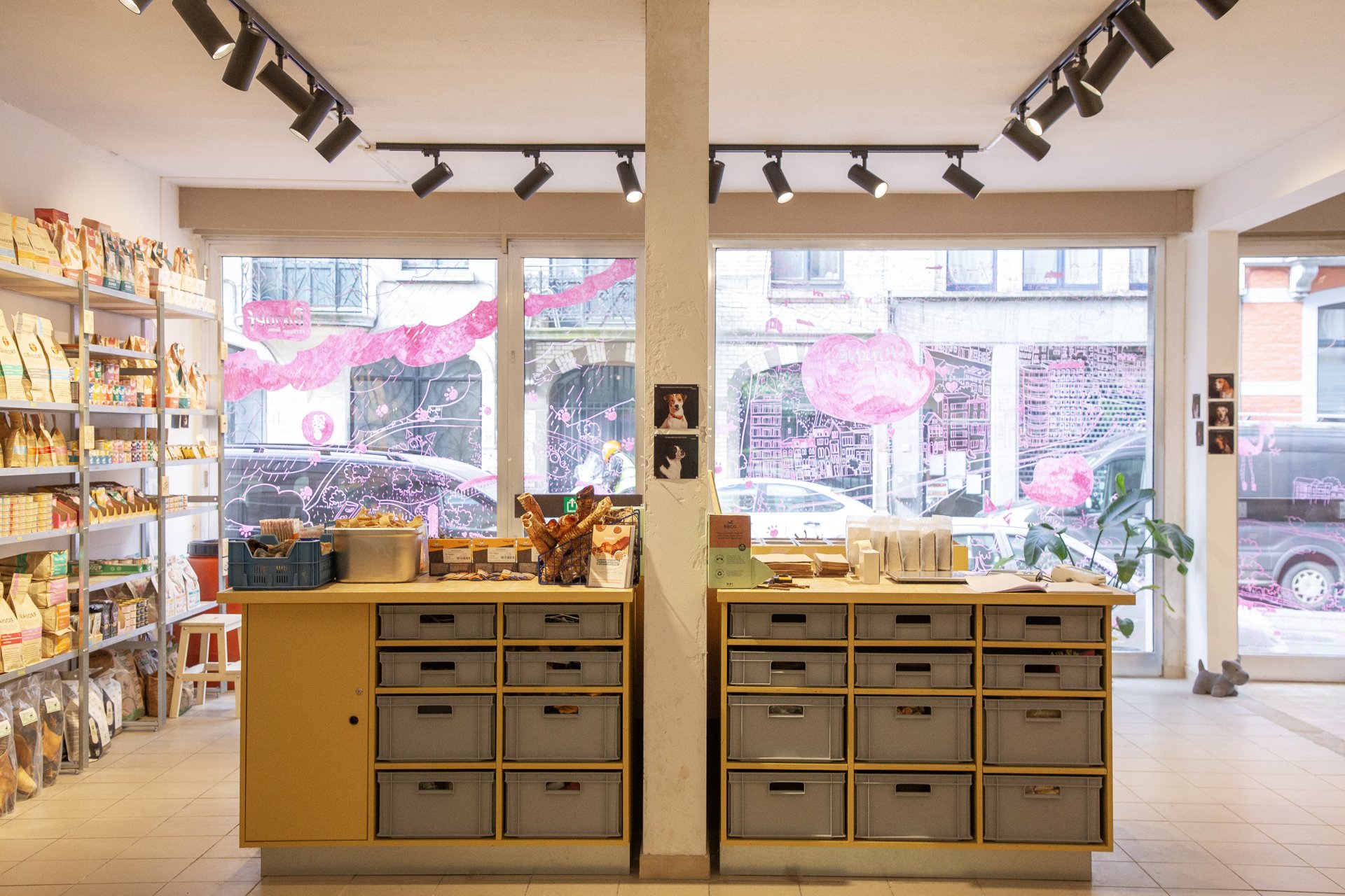
From identity to furniture to signage. And we had joy and we had fun, and with the yellow color we hoped to get the sun, to dog/cat paradise.
As for the shelving systems we placed, one system, s.alu, is rented from Rayon Belge for the back store. As for the shelves in the front, they are made from steel and reused scraps of wood.
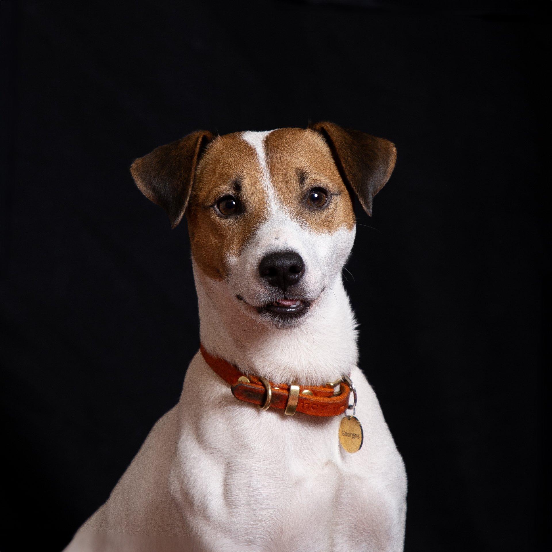
And to pimp the store even more, decoratively speaking, and to add a touch of personal/animal to it, we went building customer loyalty approach. For that, a photoshoot of the clients was organized, their feedback on Canine was noted, and the result is proudly exhibited in the different corners of the Canine No.02 store in Flagey.


Photos & Video by Luciana L. Schütz AKA Lulu.

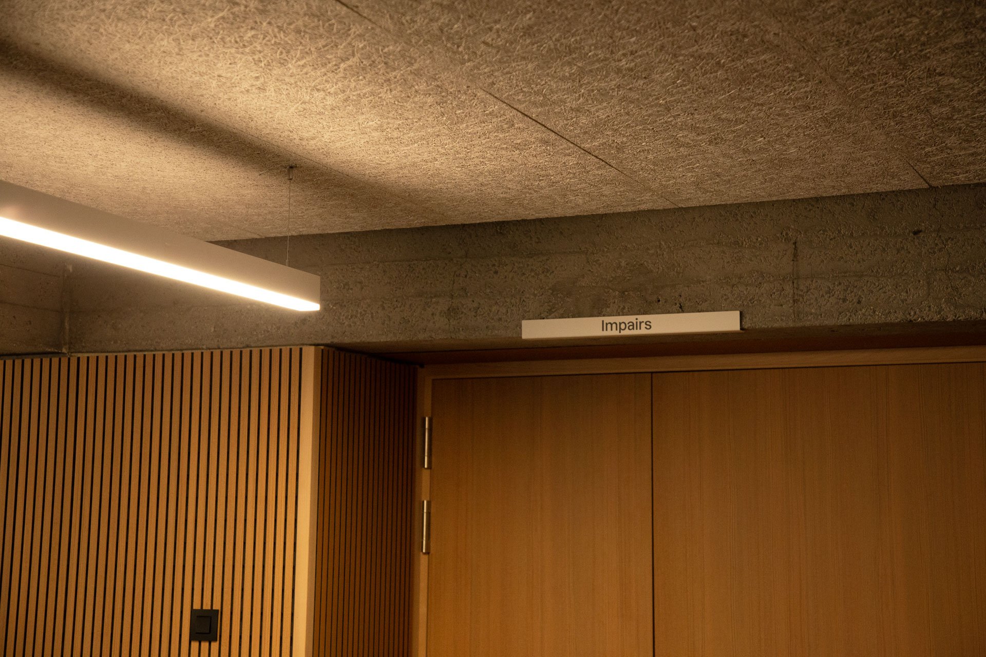
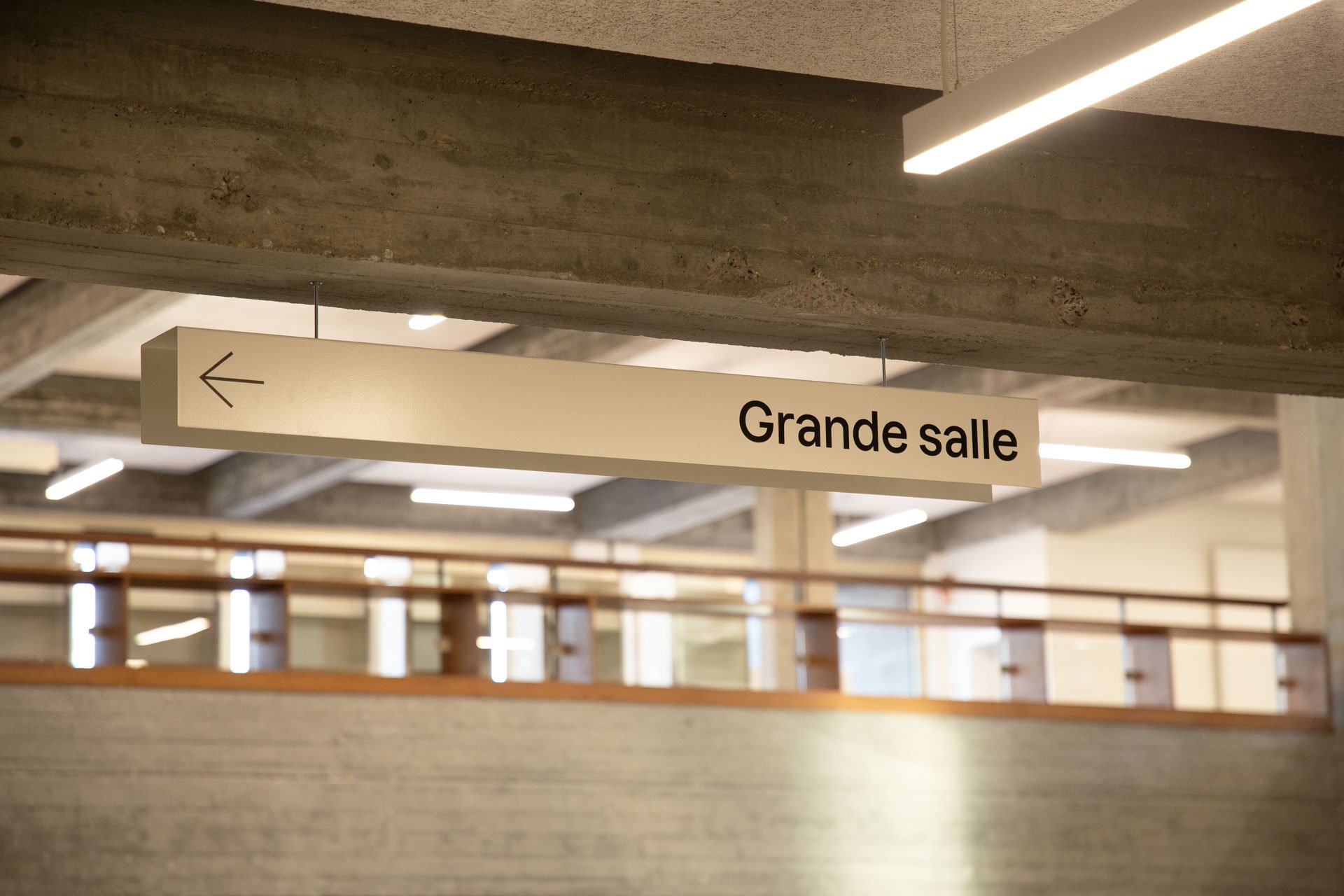
Find your way - Maison de la Culture de Tournai
For Maison de la Culture in Tournai we have collaborated, with Atelier Blink ( for we cherish collaborations).
They have designed, and we have developed, produced, and installed, signage.
For Maison de la Culture de Tournai we have collaborated, with Atelier Blink (we cherish collaborations). They have designed, and we have developed, produced, and installed, signage.


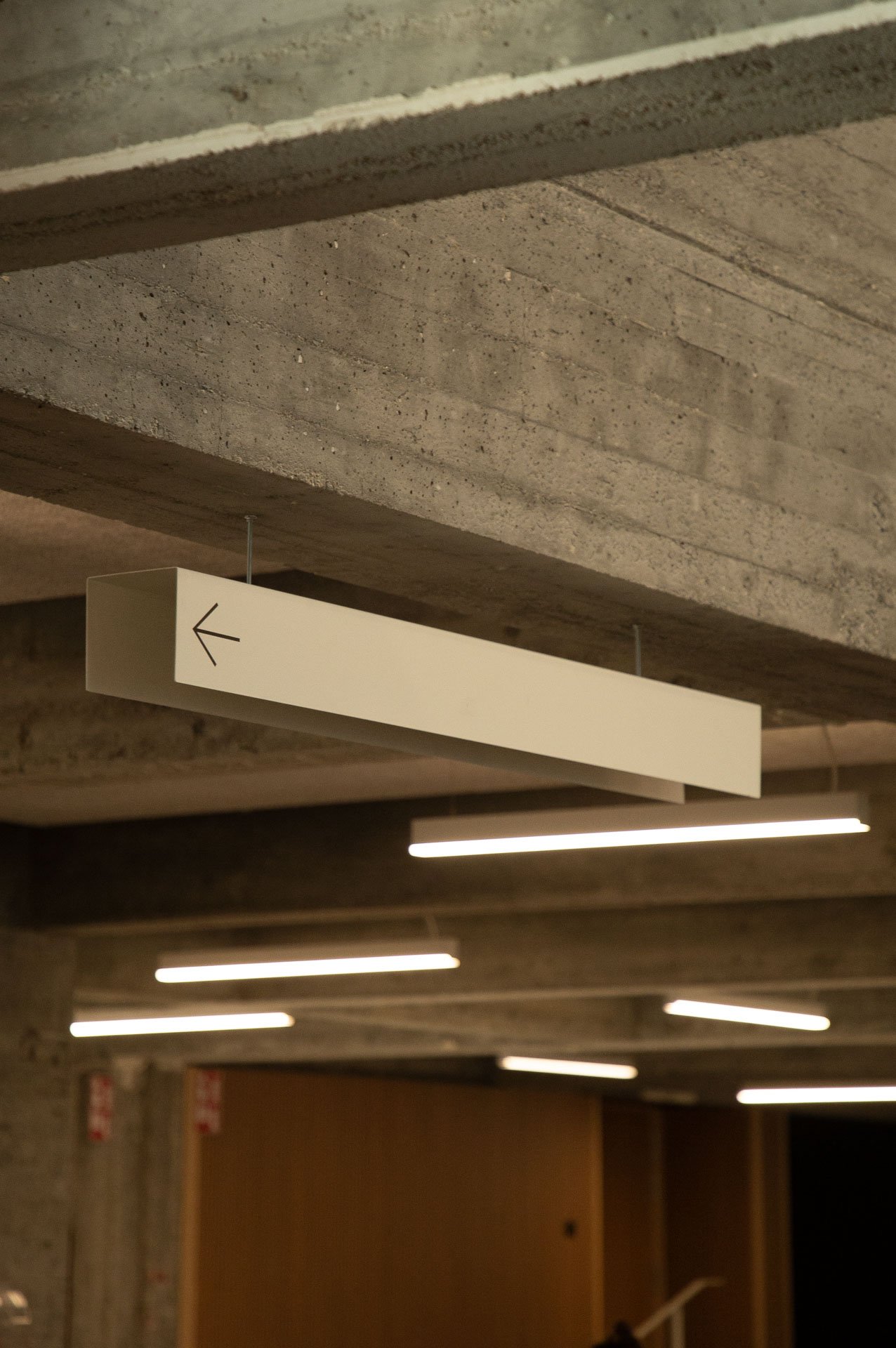


Signage as a mean to guide, to inform, and to improve, the experience of the visitor, by giving clear signs, and directions, pointing at the different areas and programs within the center.
That’s what we do.


Photos & Video by Luciana L. Schütz AKA Lulu.

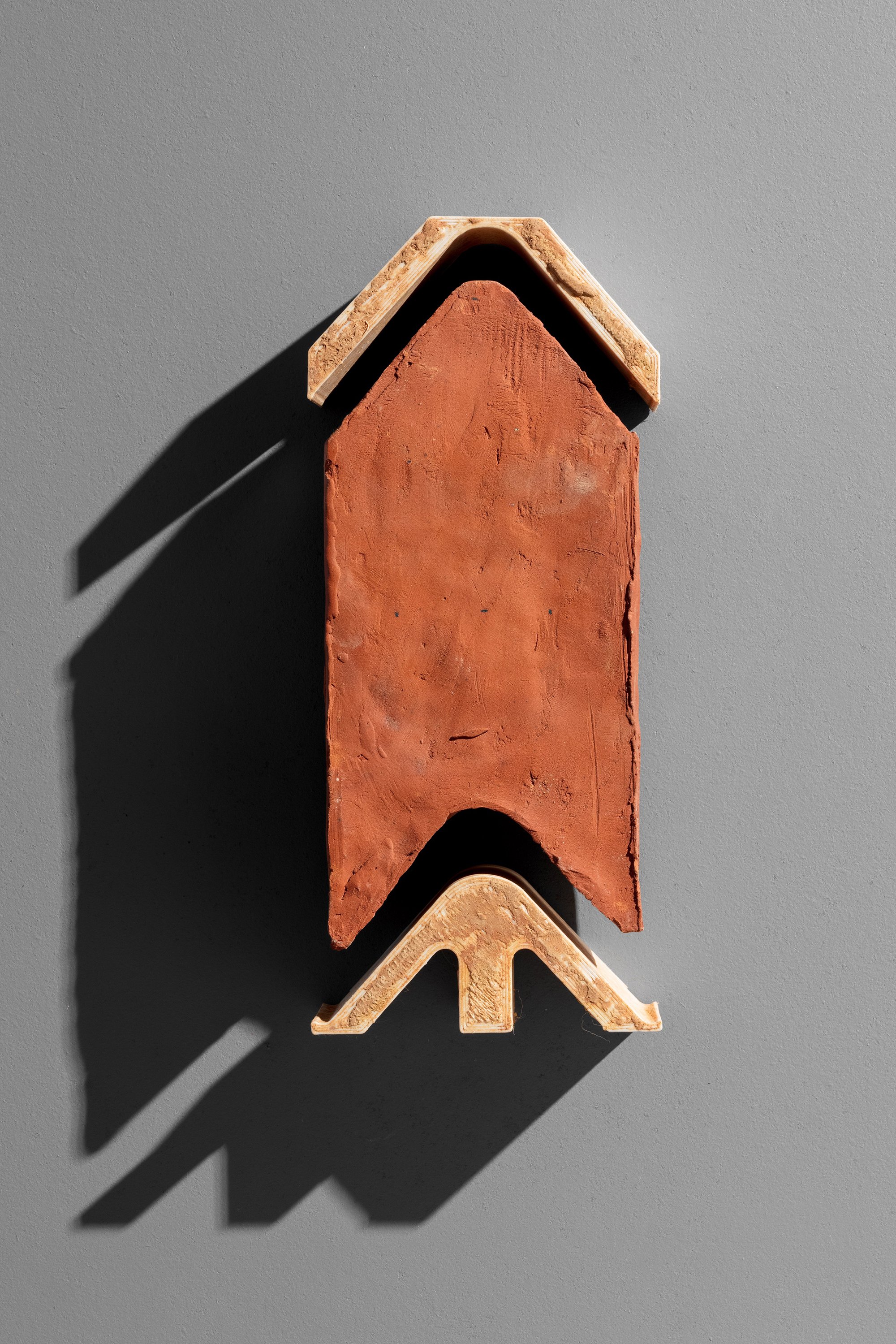
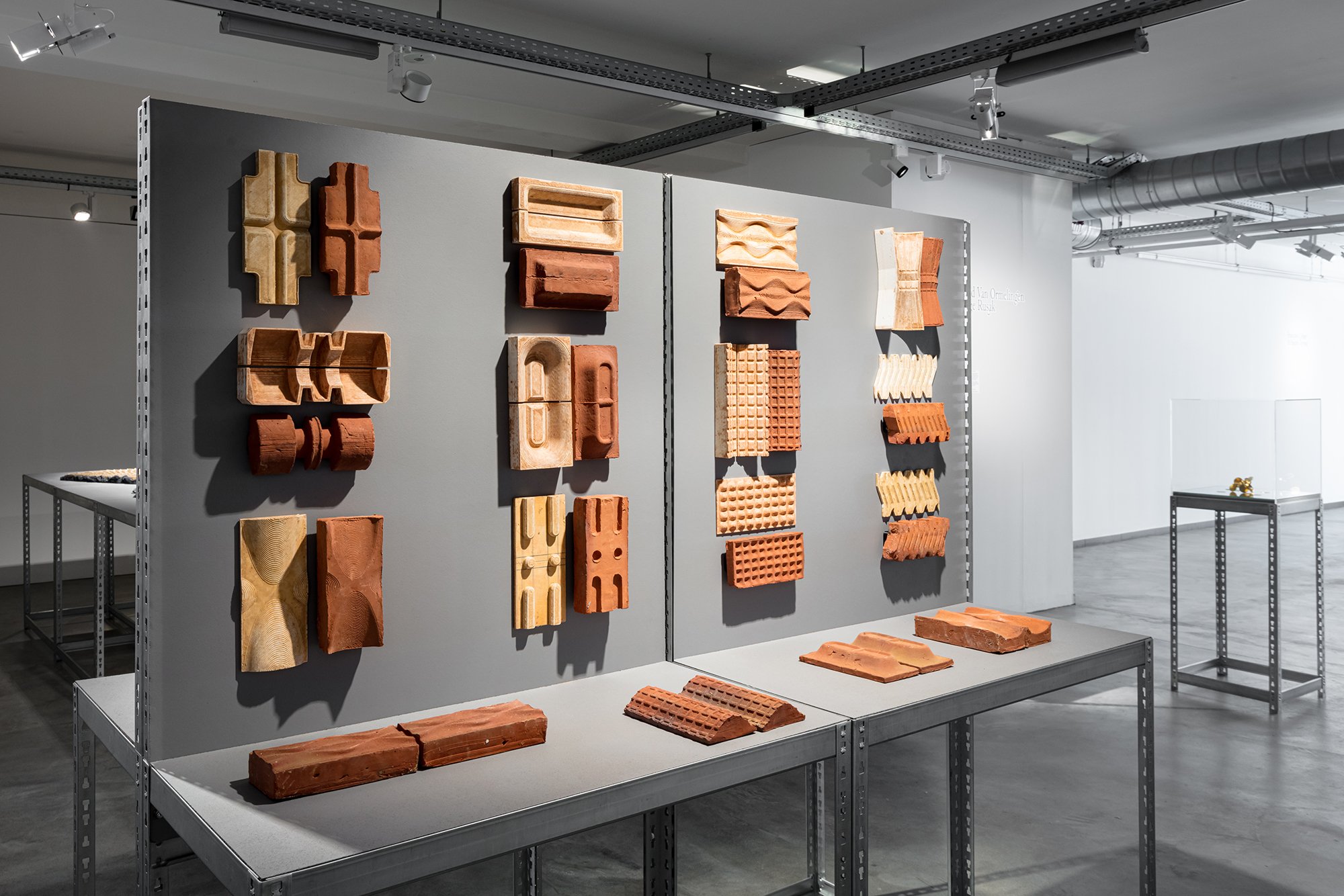
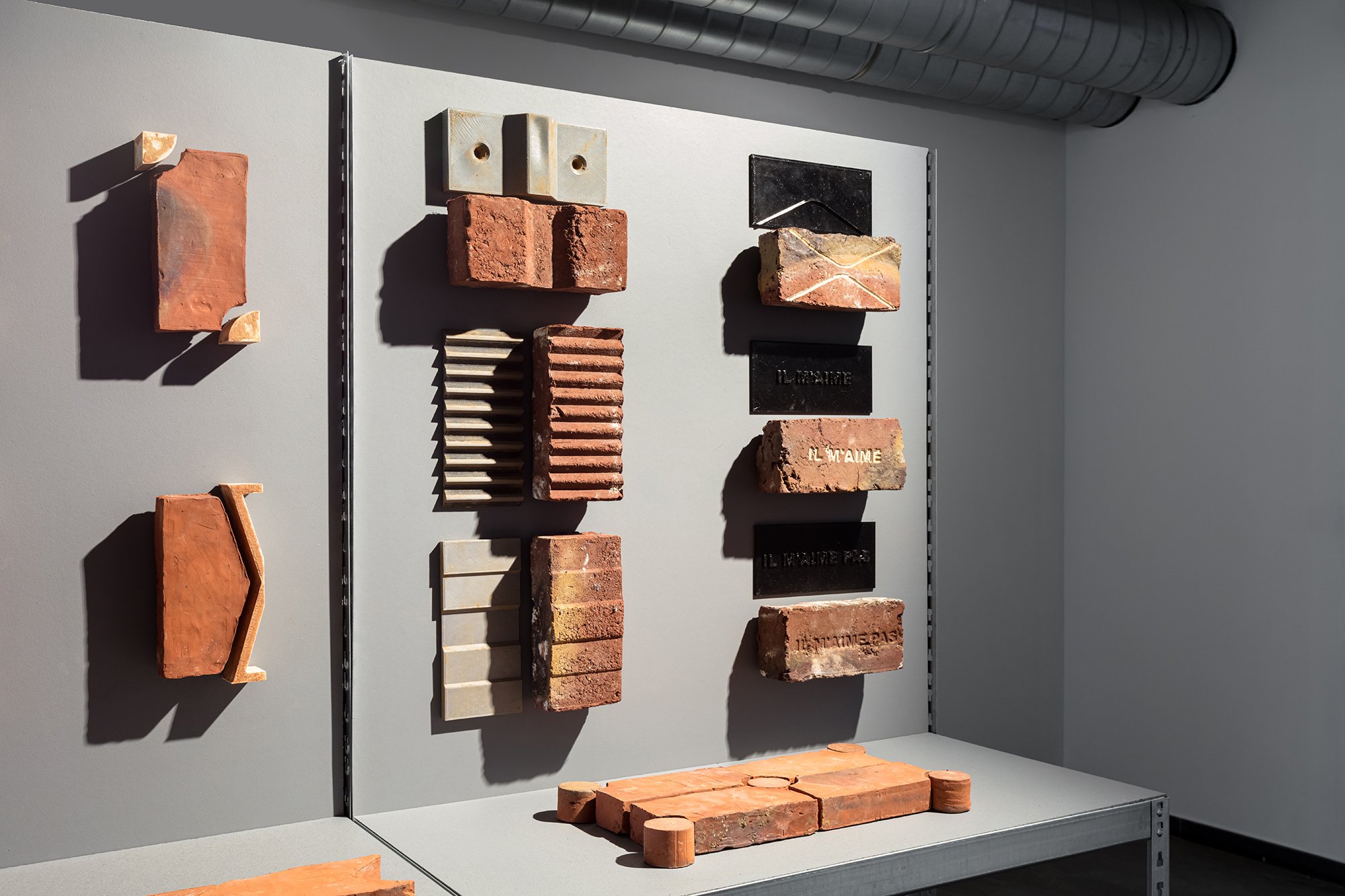
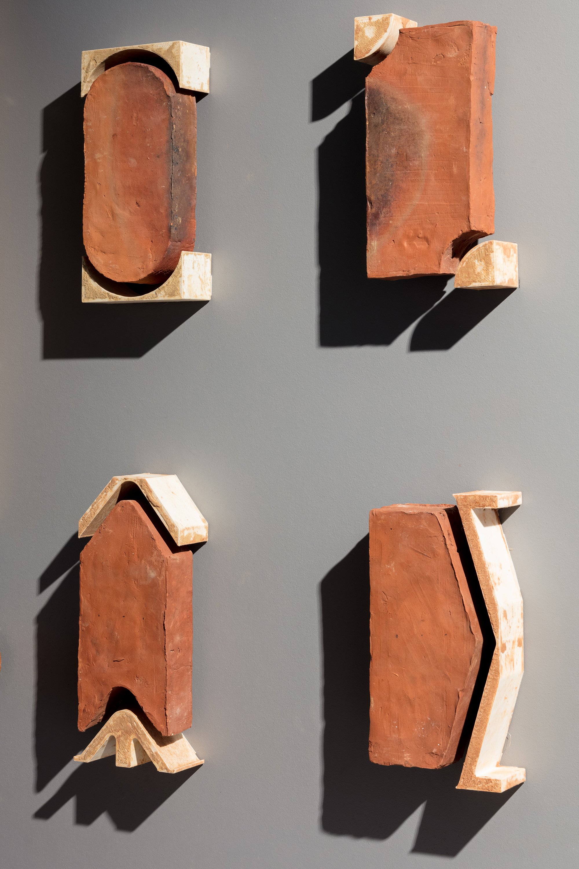
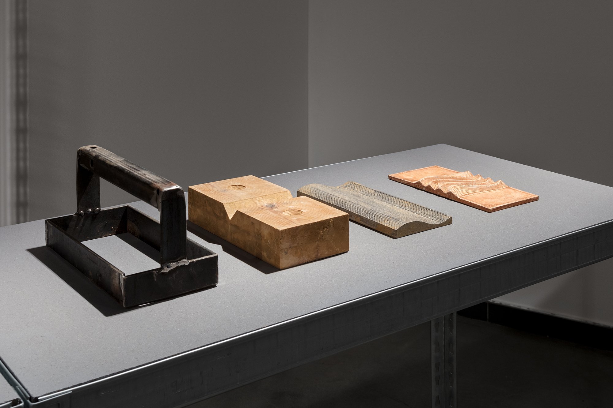
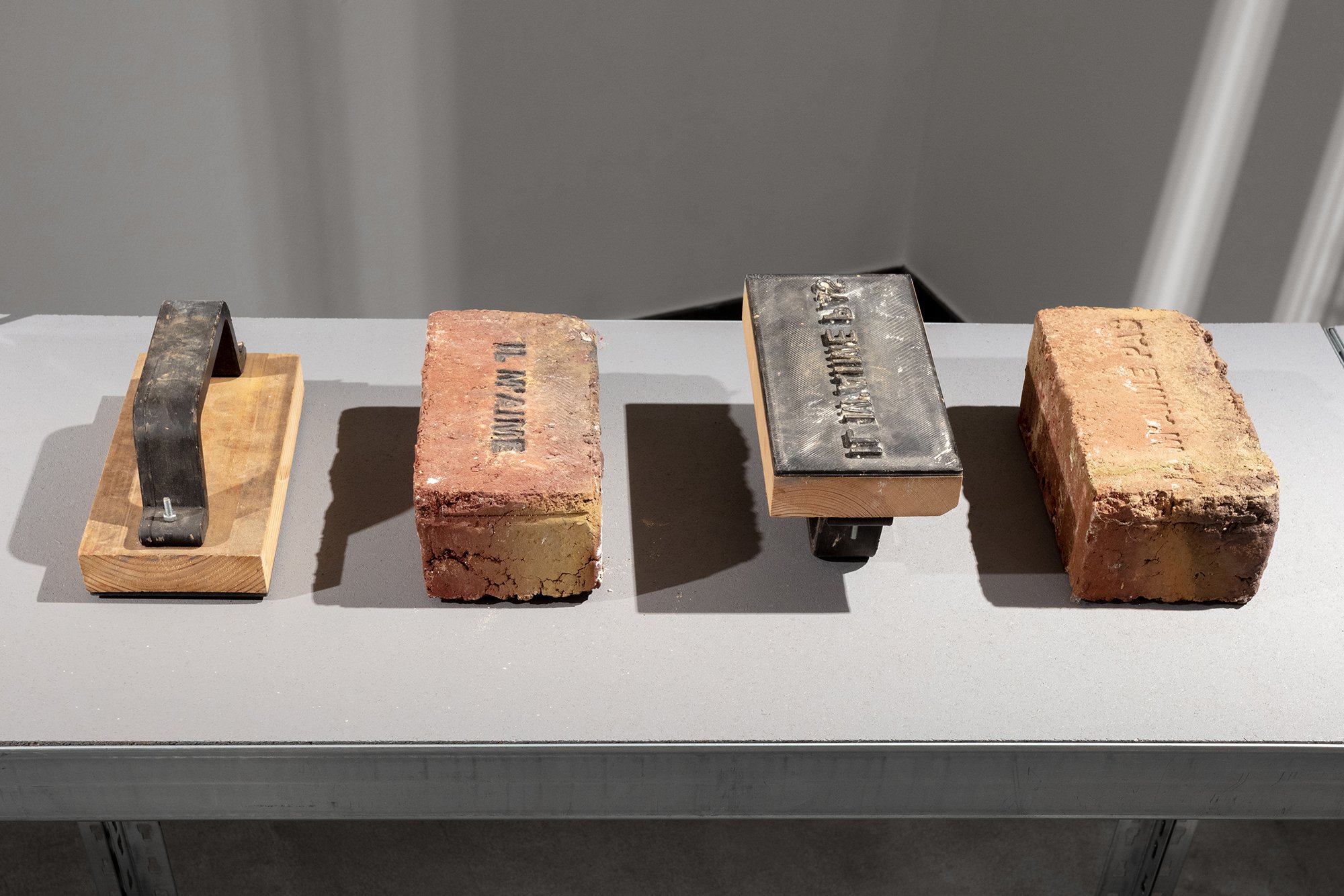
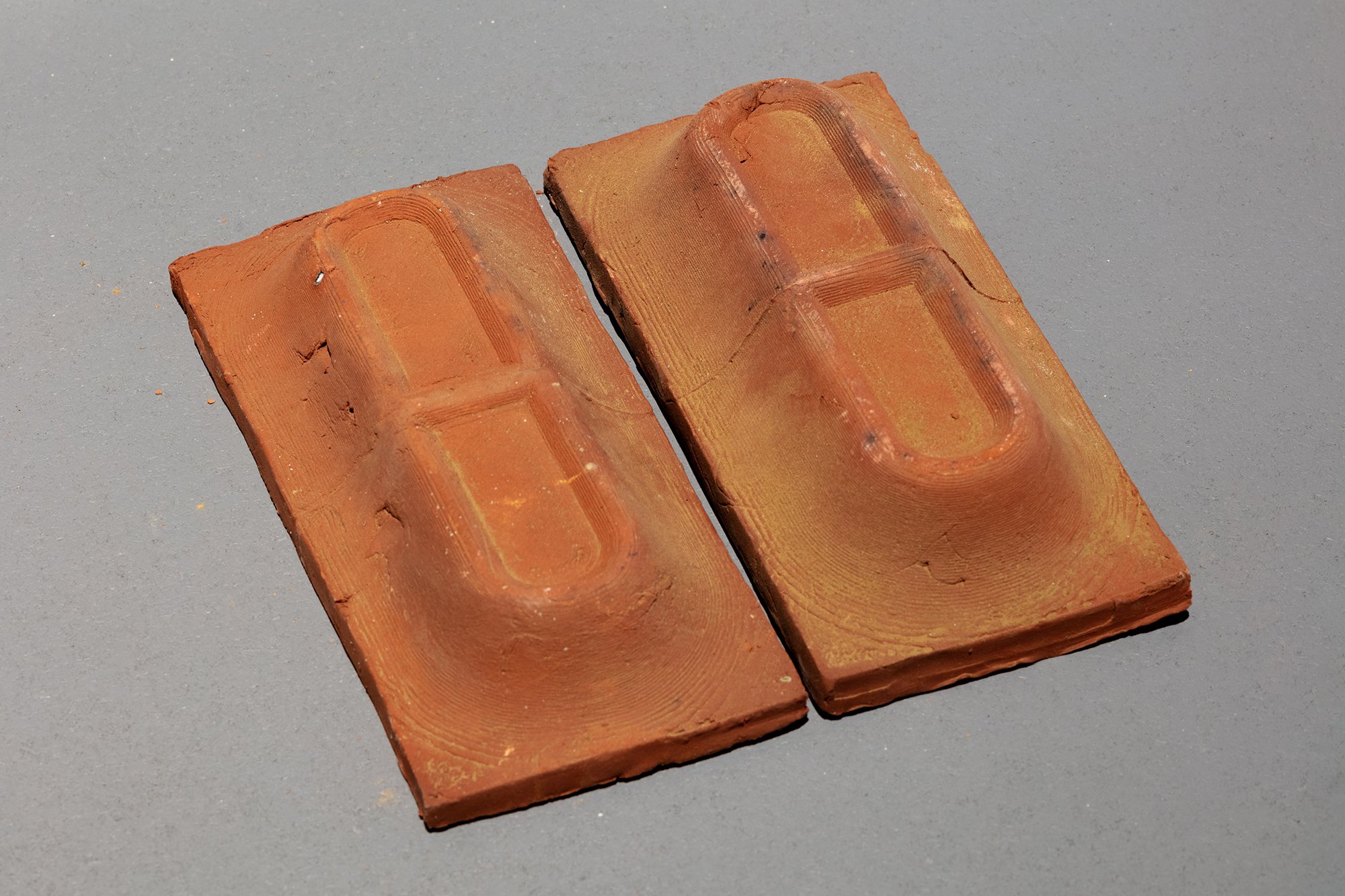
BRICKS
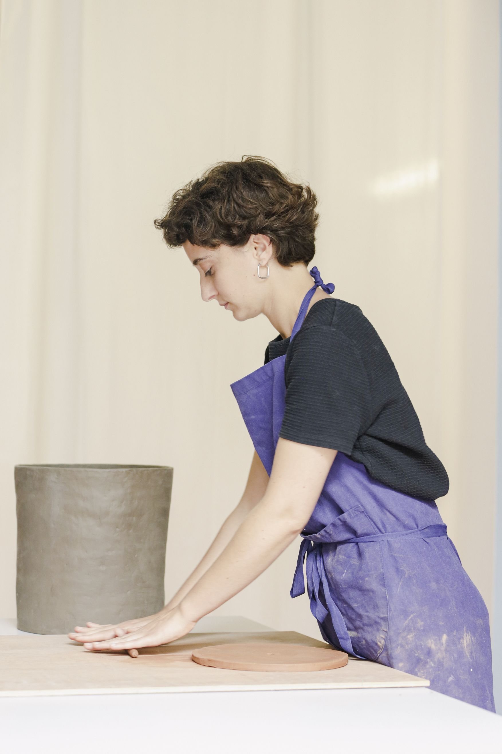
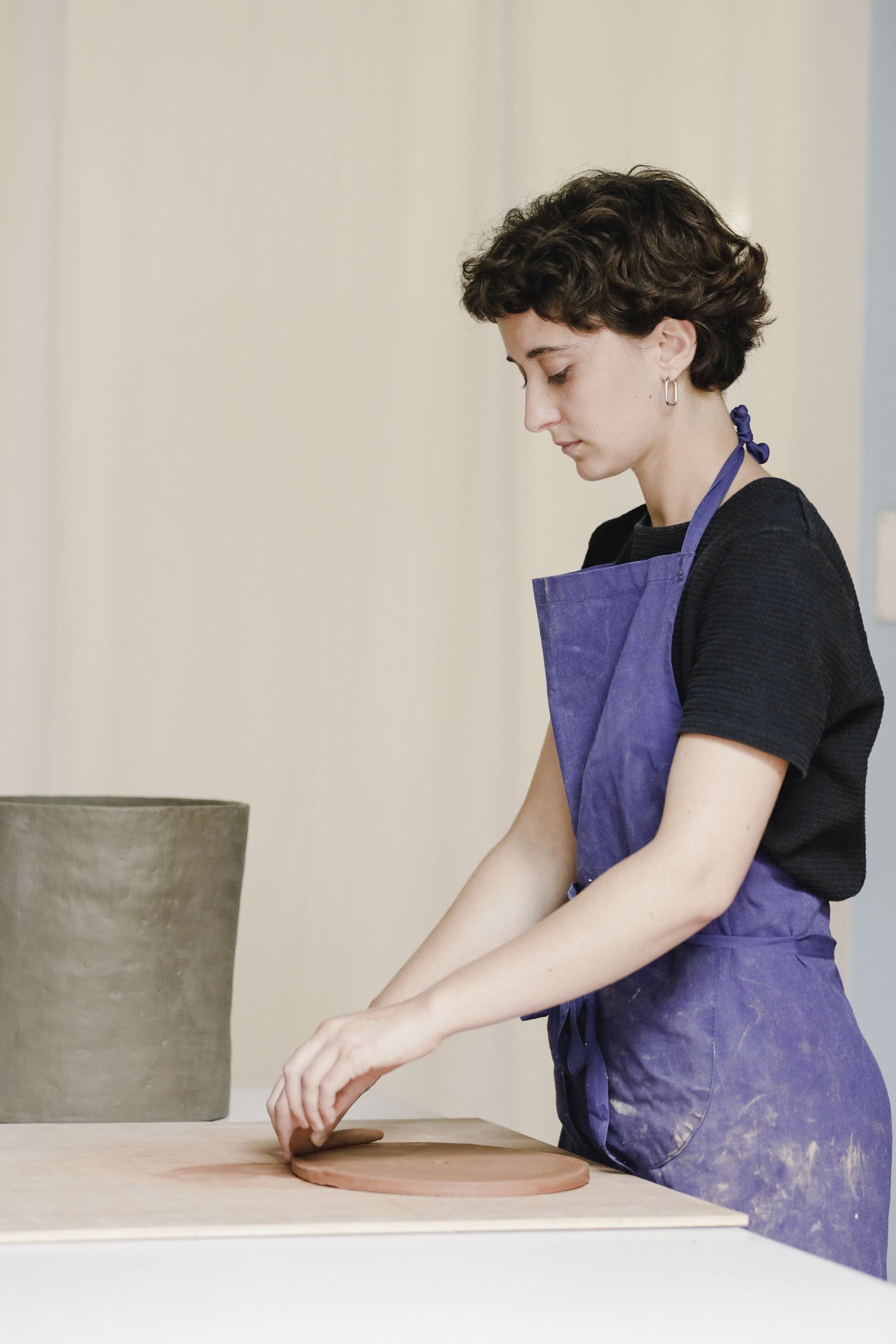
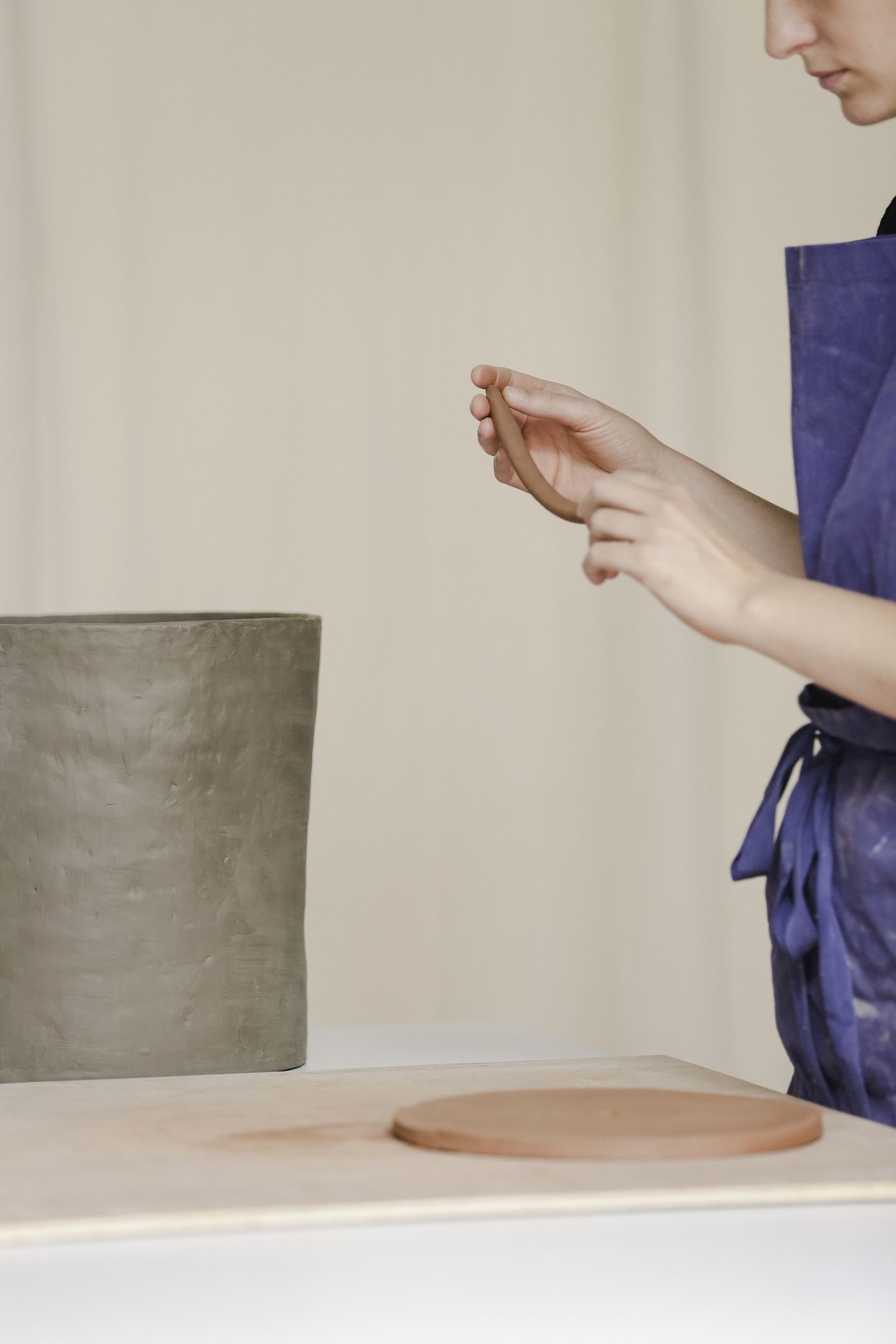
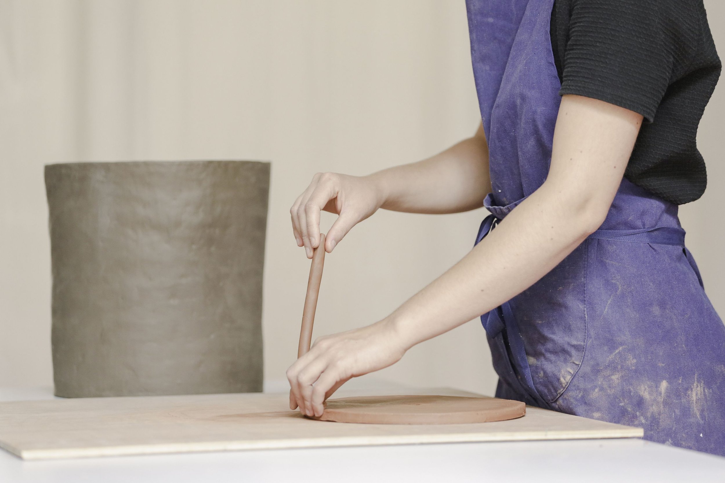
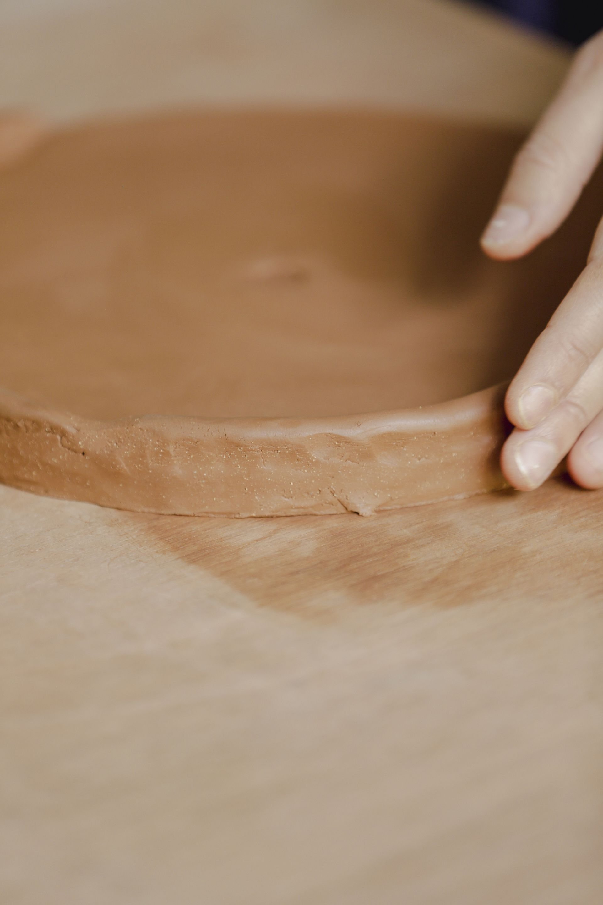
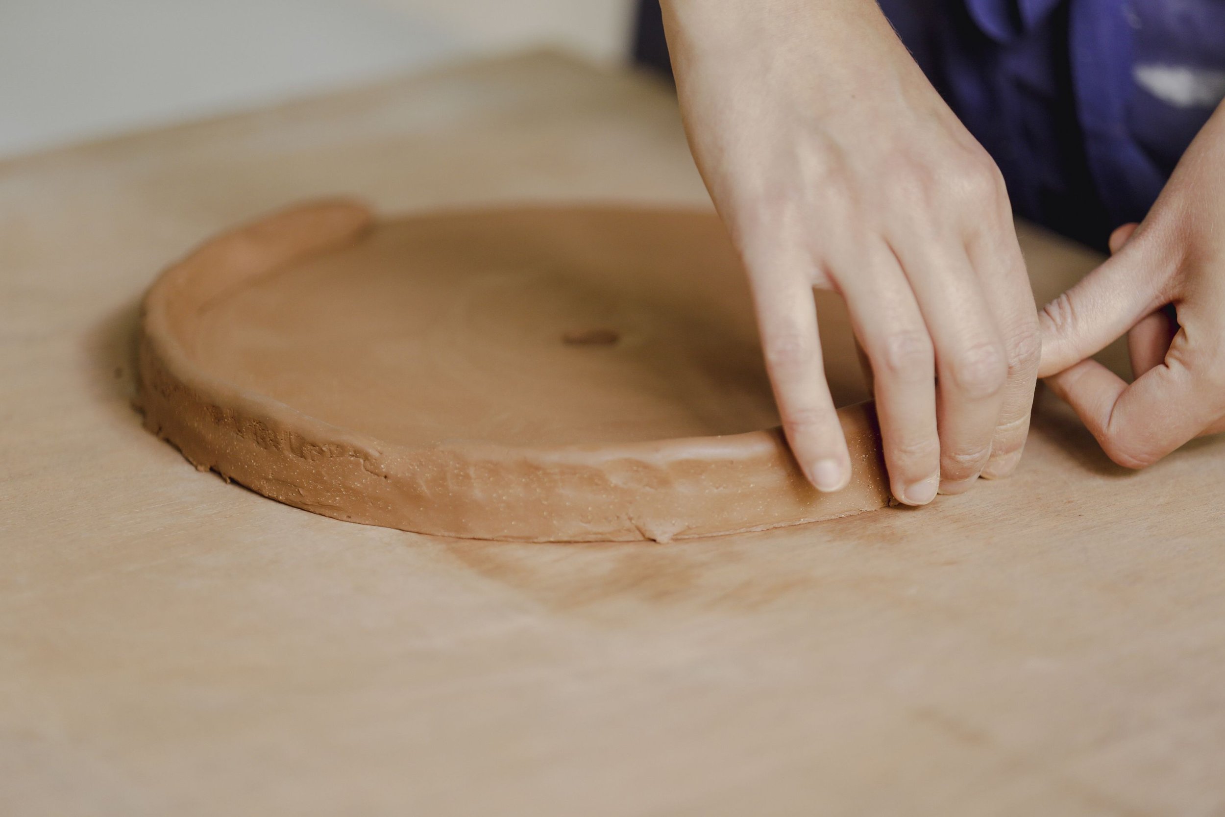
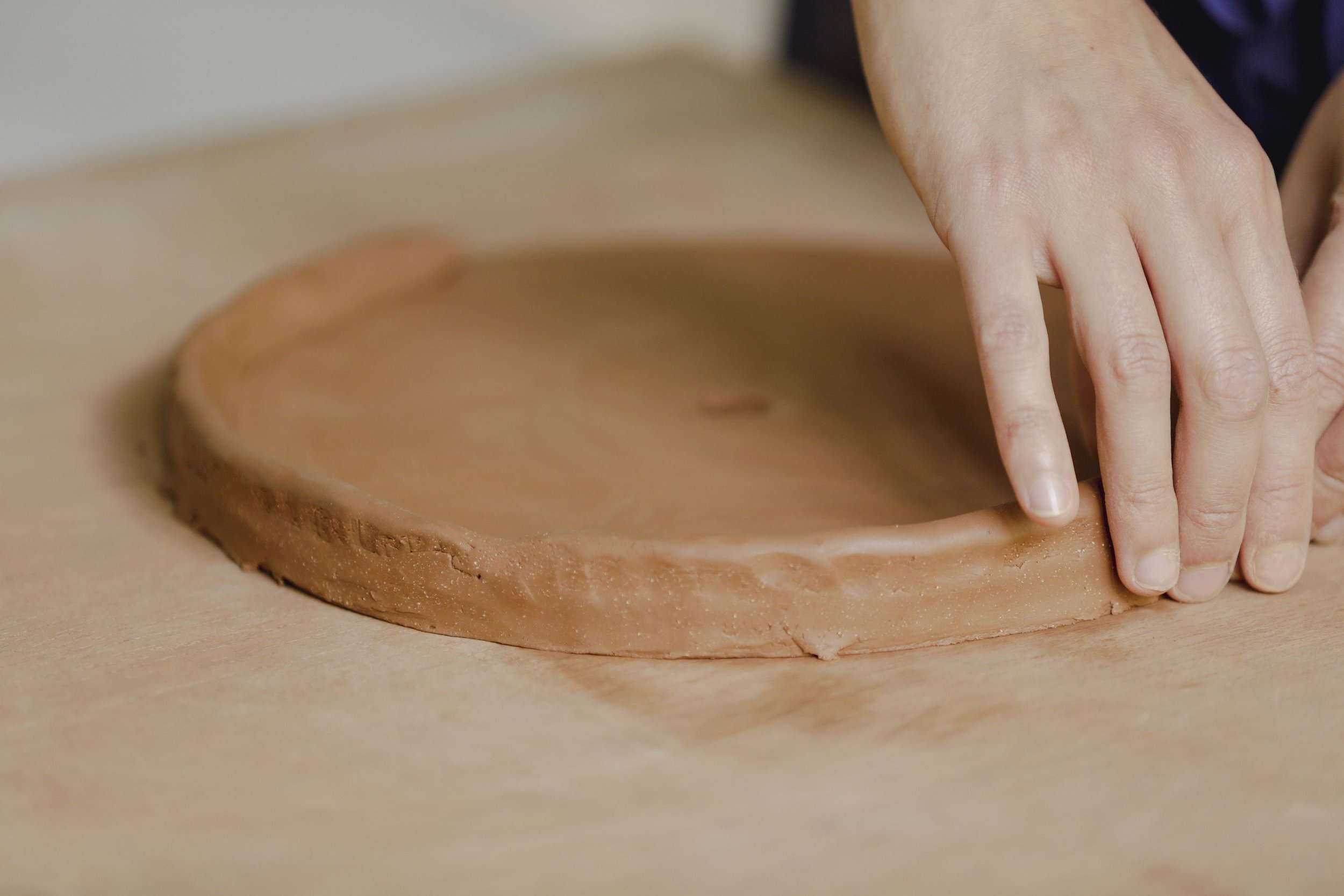
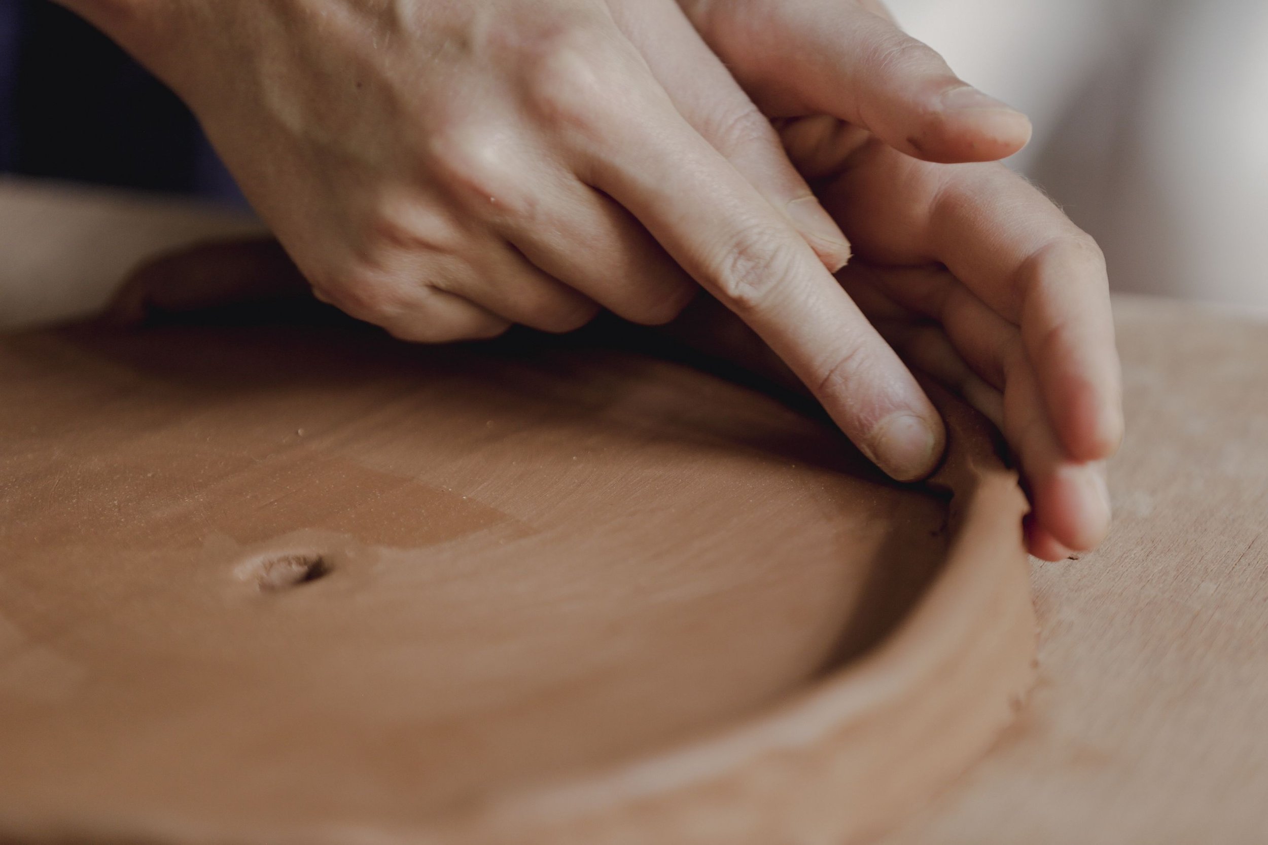
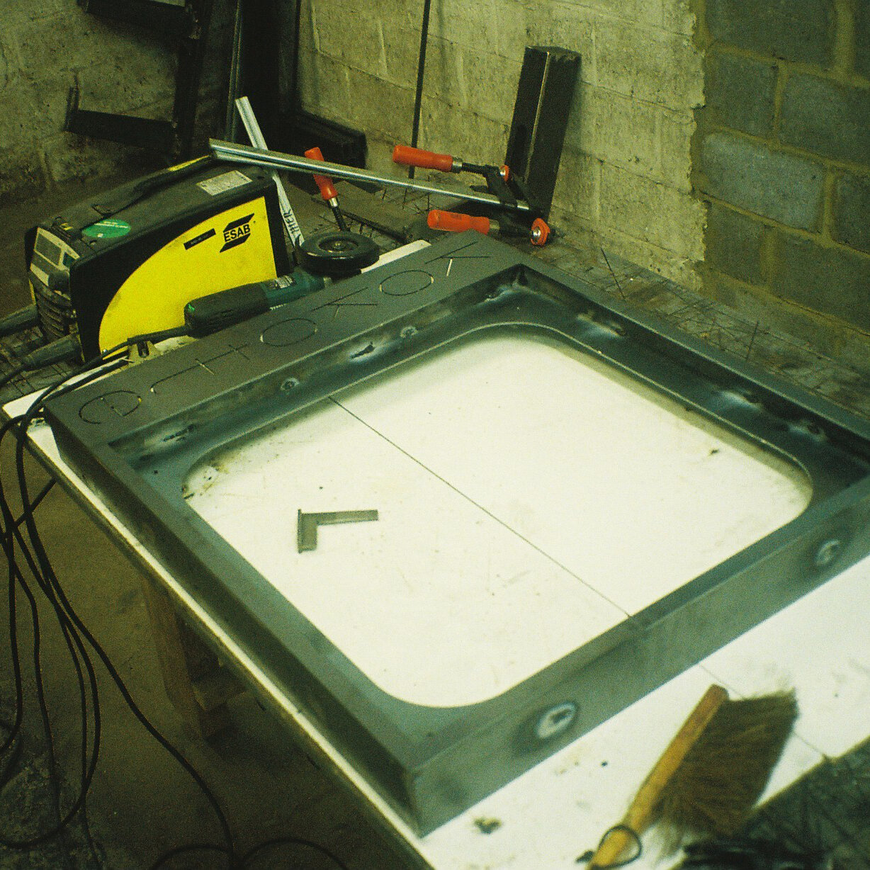
The collaboration HOULÉ x HIER is a research project, a work in progress and a story of process, of exchange, of adding and subtracting. A journey of words, drawings, textures, and samples.
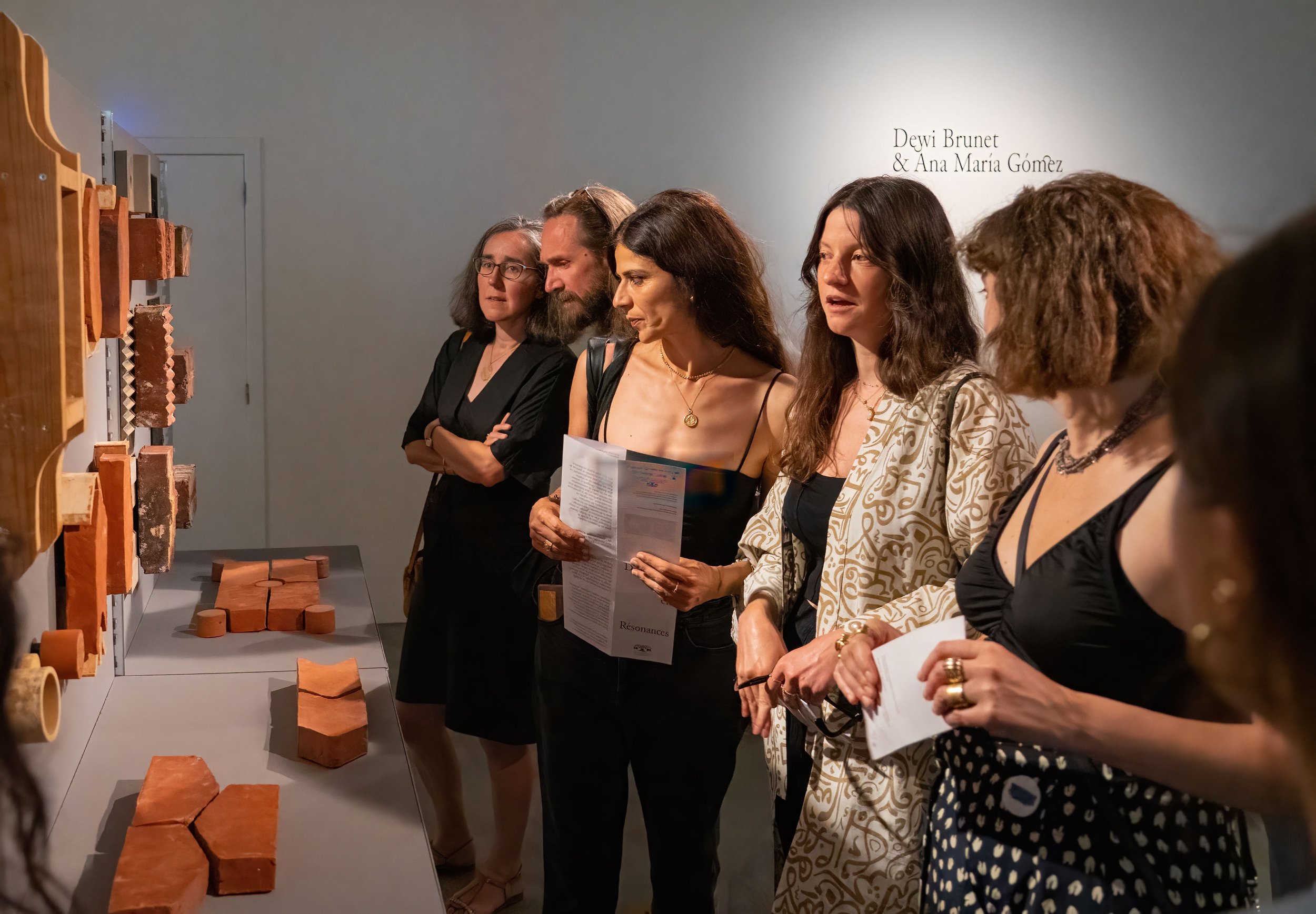
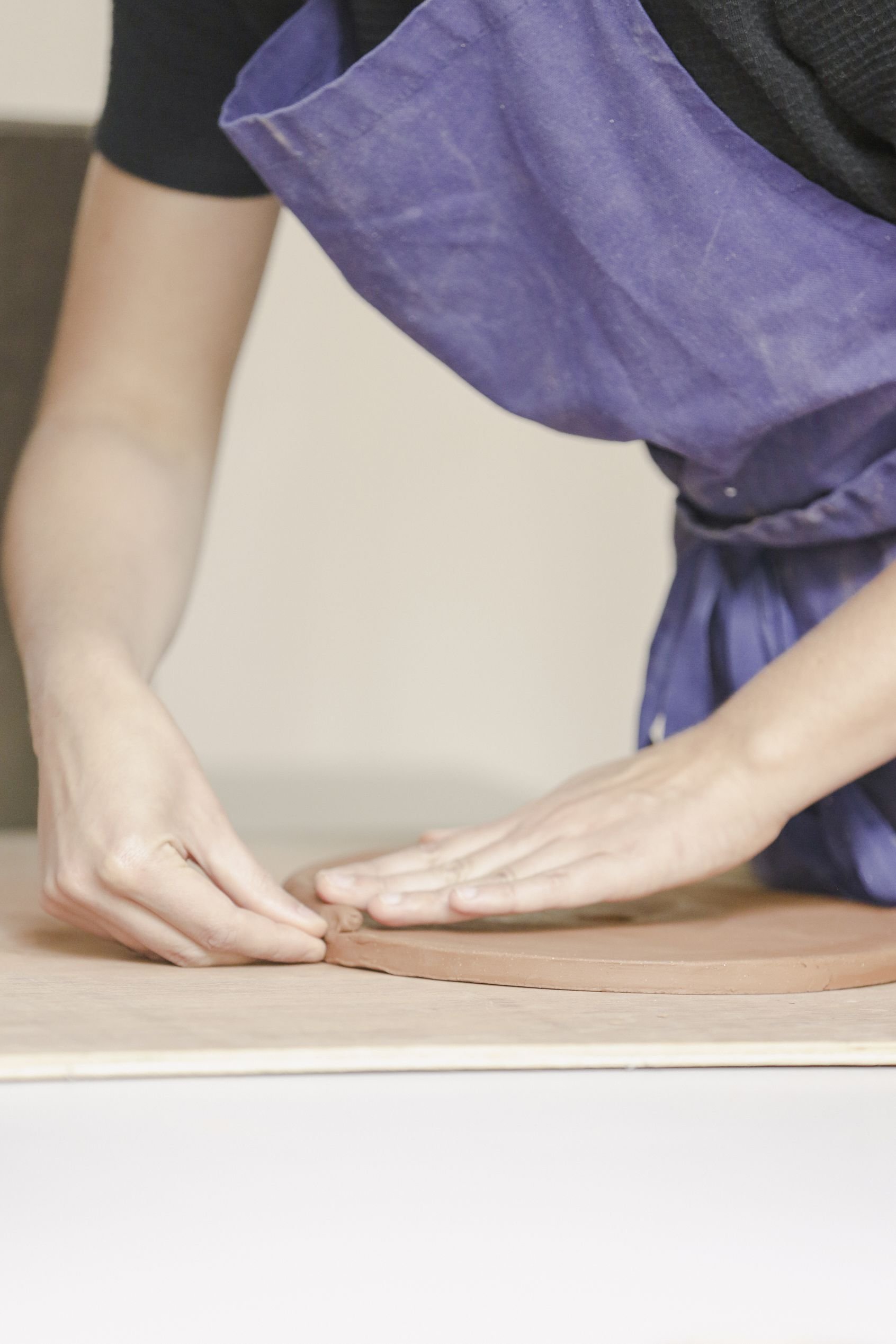
Here, the results of a one year collaboration, between HIER and briqueterie HOULÉ.
You can check out the feel of each brick made @fondationboghossian in the exhibition Duos in Resonance up to the 20th of august 2023.

The collaboration HOULÉ x HIER is a research project, a work in progress and a story of process, of exchange, of adding and subtracting. A journey of words, drawings, textures, and samples. A process generating multiples possibilities, some explored, and others yet to be explored. A process where mold and brick form a duo, and are a result of a duo.
in PROCESS we trust
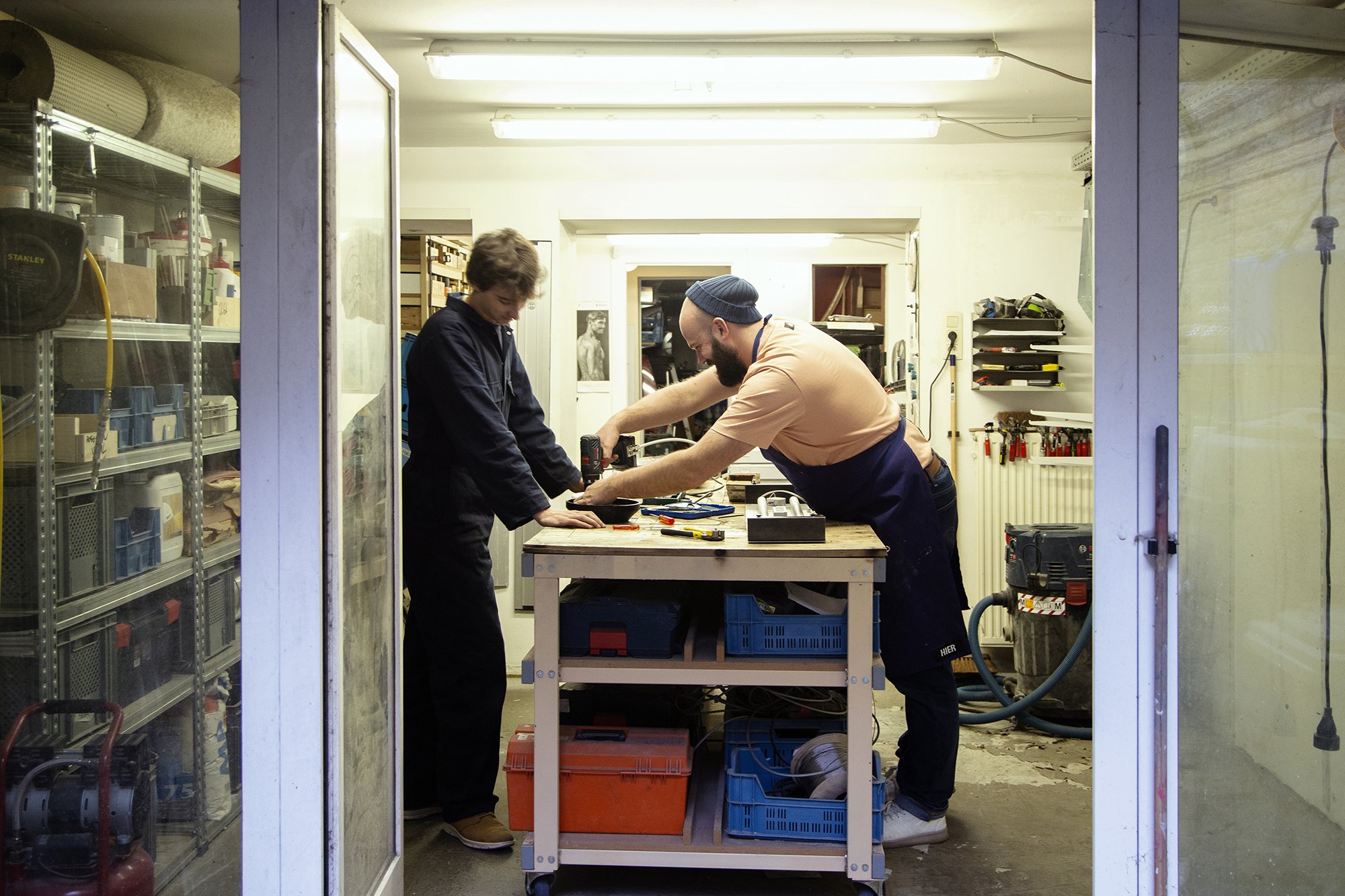
We have met. We have talked. We have listened.
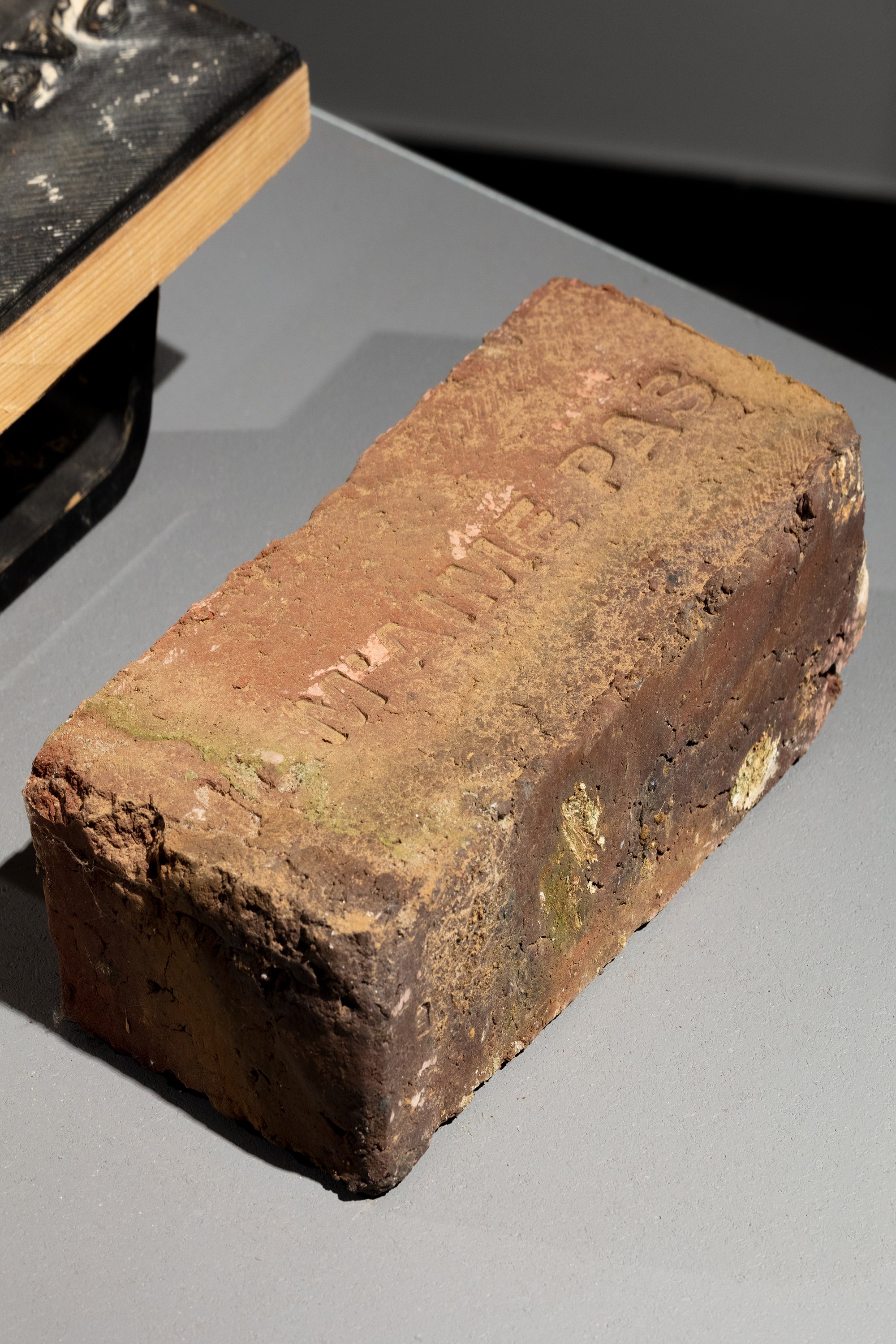
On one side, there is the artisan, Mathieu, and his machine, semi manual semi automated .
On the other side there is the design party, HIER.
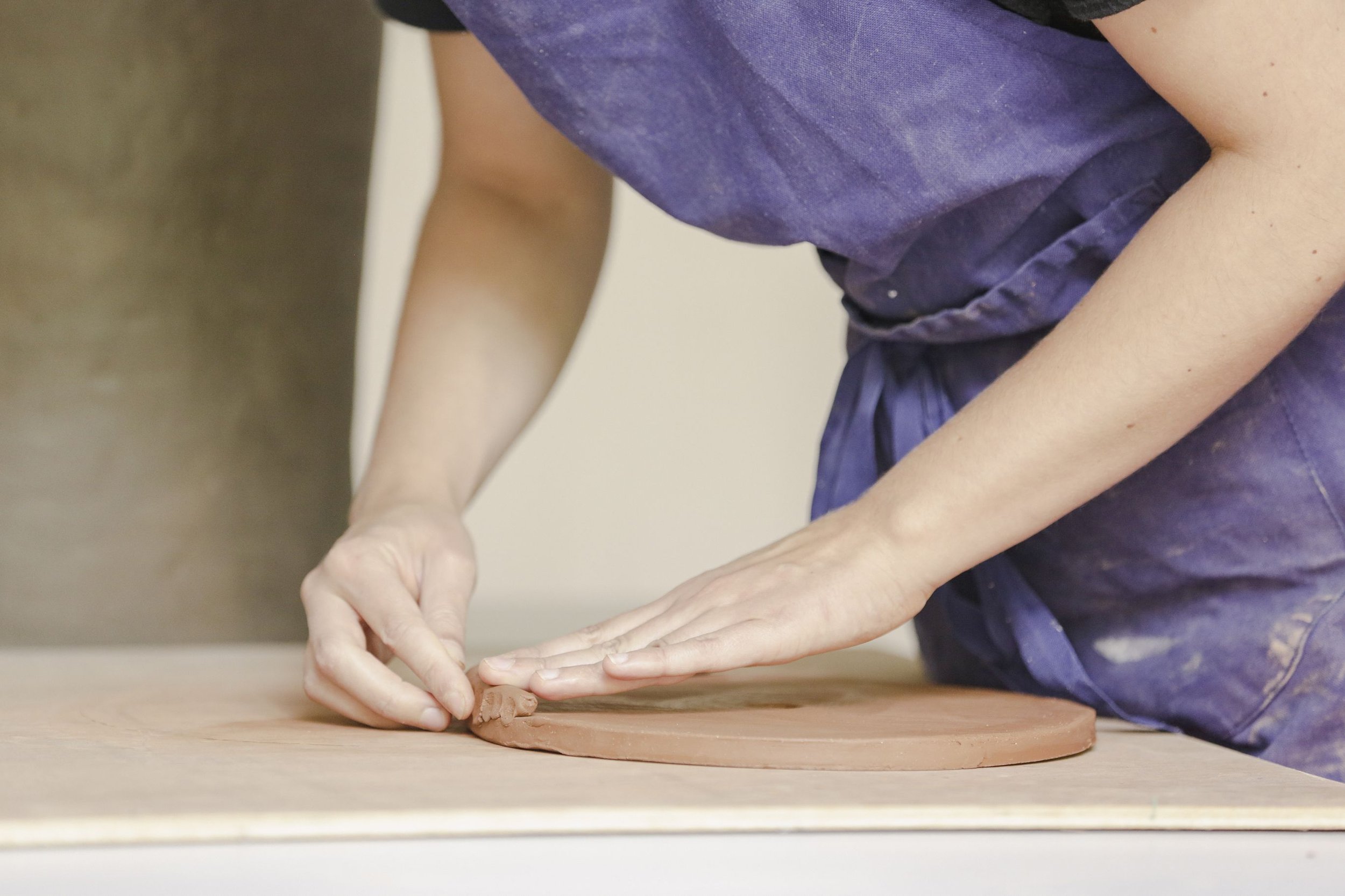
Mathieu Guitoun, a brick maker/artisan, produces bricks using the same techniques, machines & process as the old brick factories from 19th - 20th century.
That philosophy and respect for tradition offers an authentic look but also a quality that you no longer find with the industrial bricks. The same could be said about the colours: they are not to compare with those of the industrial brick.


Concept and approach
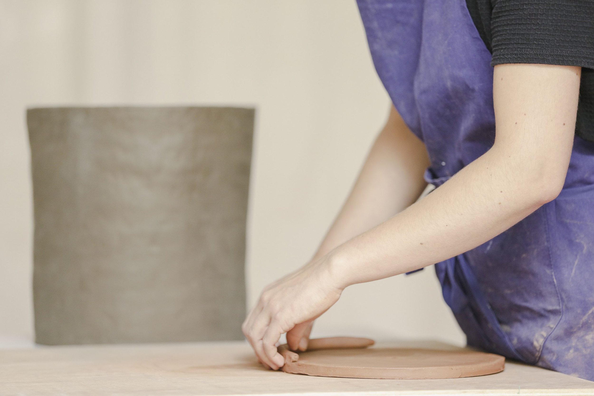
From the different approaches we could have chosen for this project, the duo decided to use Mathieu’s machine to produce more of his product, the ornamental brick. But more textured, deformed, or stamped.
Our approach is to use the same machine, make use of the freshness and malleability of the product before its drying and then cooking, and find low-budget solutions such as additions to the existing mold or stamps.
End game
to develop something that could be added to his catalogue of products.
develop something smart and efficient that tweaks the standard brick, adds variety to the collection.
Game plan
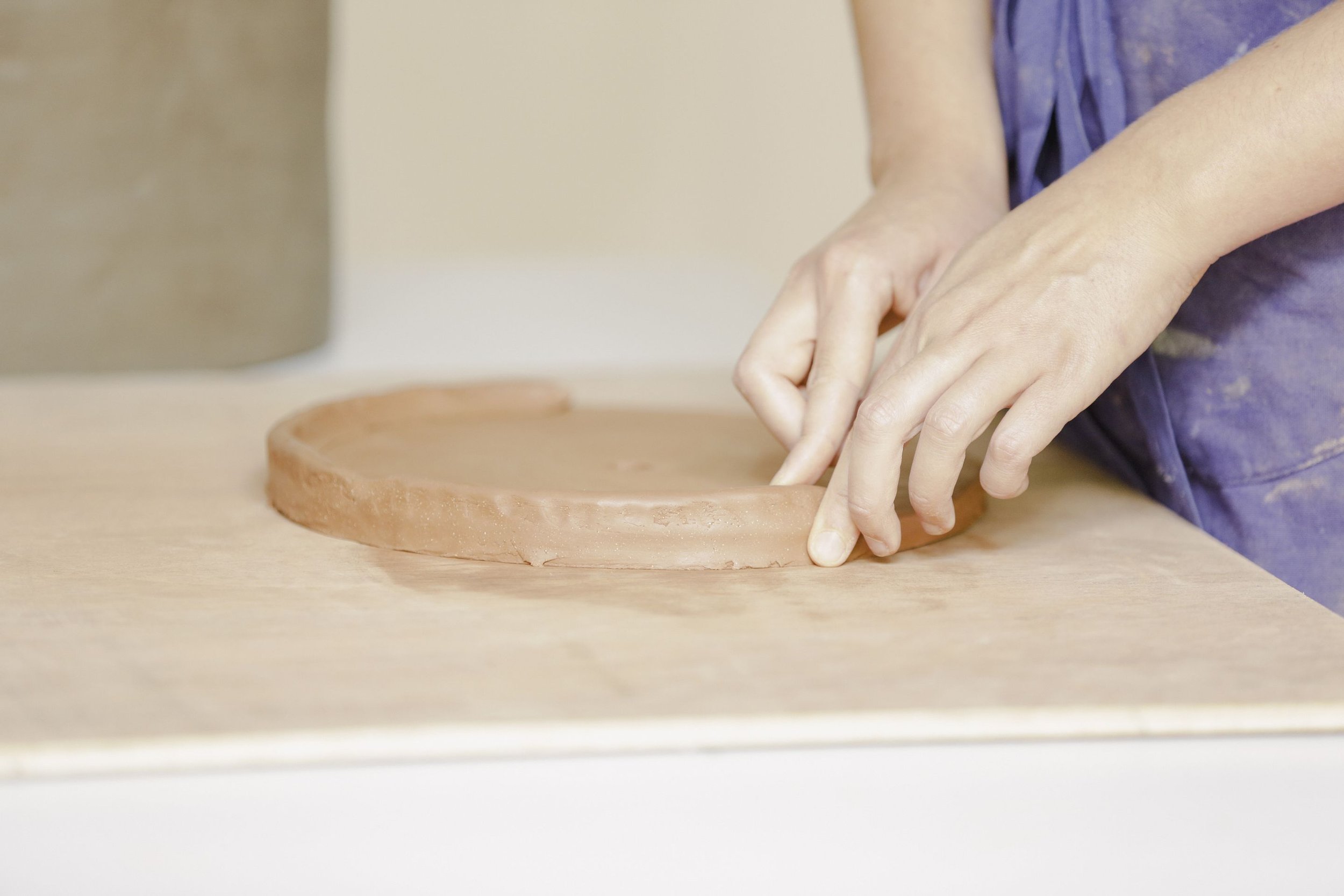
Modifying the pressing mould: add pieces, corners, or layers of textures
Manipulating after pressing: explore different stamps and enamelling techniques


Cheers to Wallonie Design. And thank you for this great opportunity and for pairing us together :)
Process photos by @heloiserouard & us. Photos of the exhibition by @silviacappellari and Maxime Legrand - Fondation Boghossian – Villa Empain, exposition Duos in Resonance, Brussels, 2023

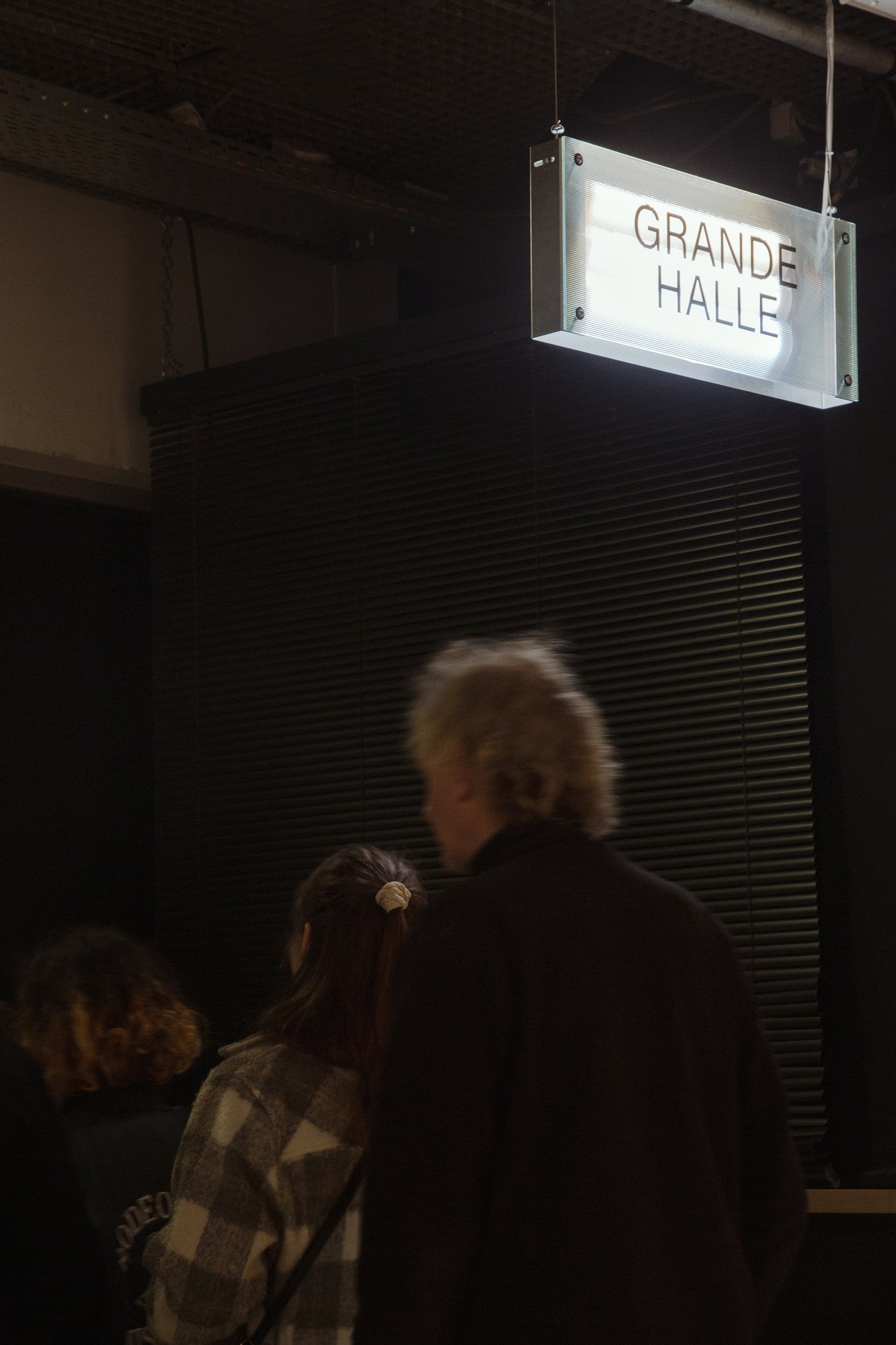
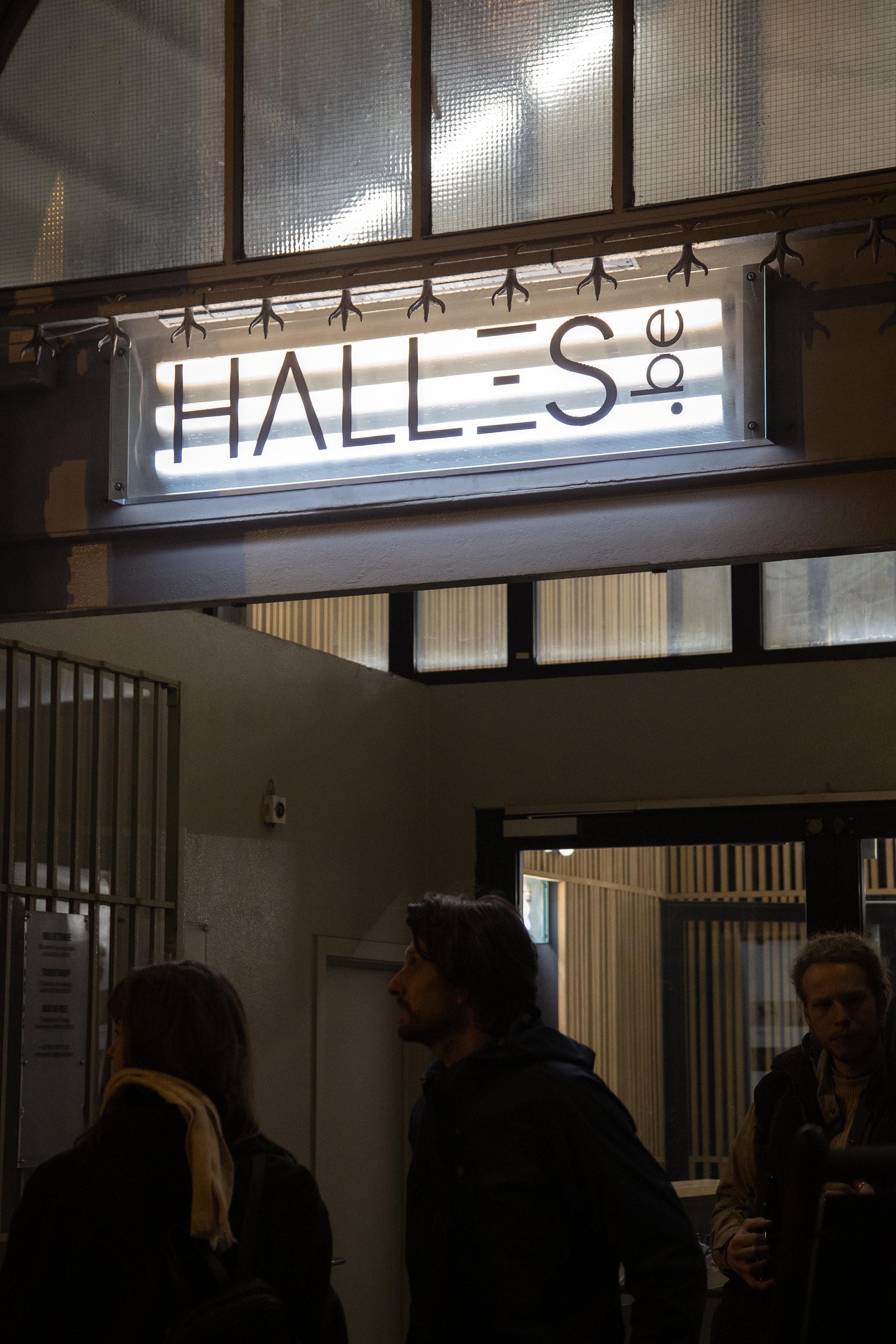
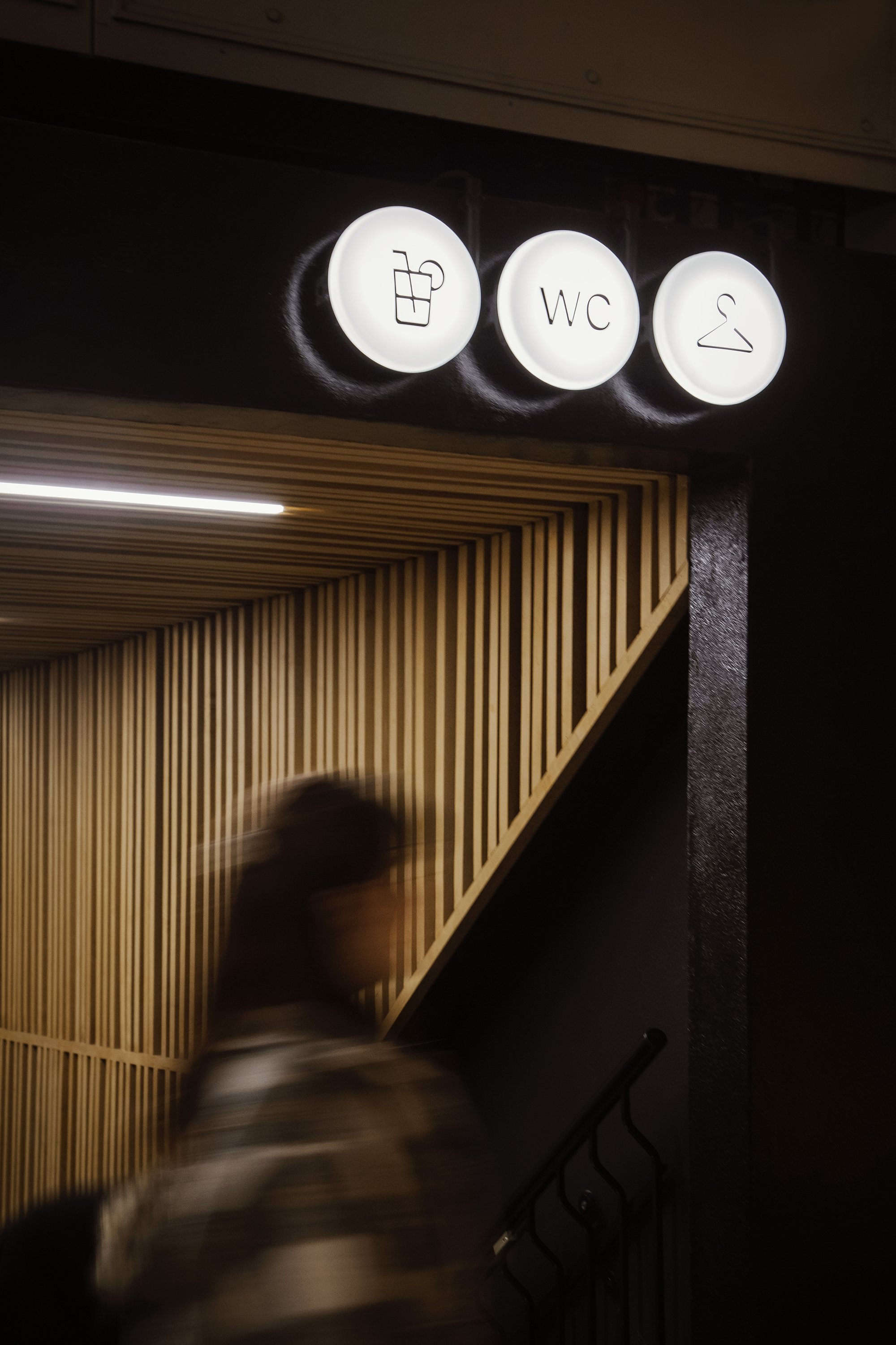
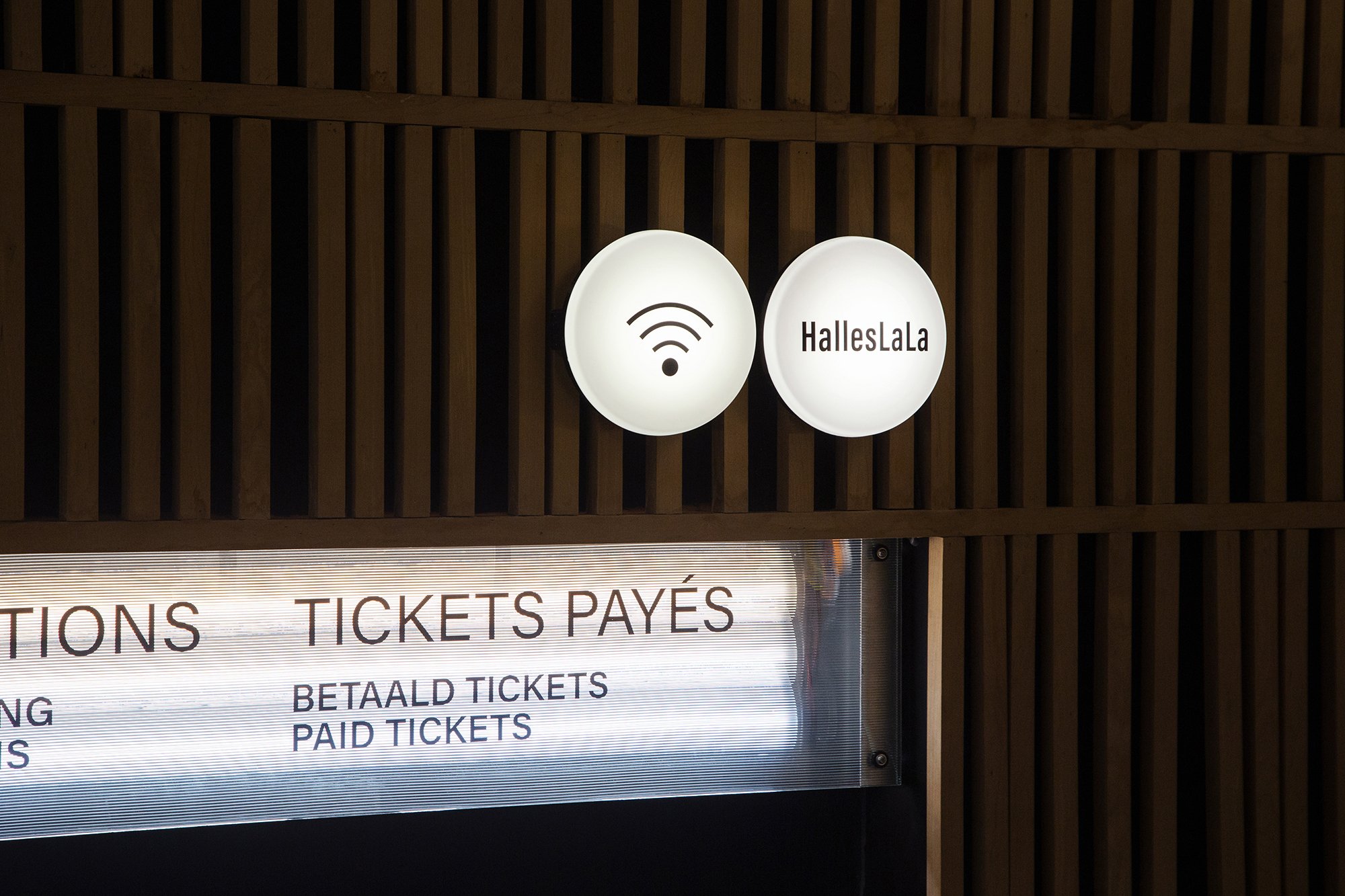
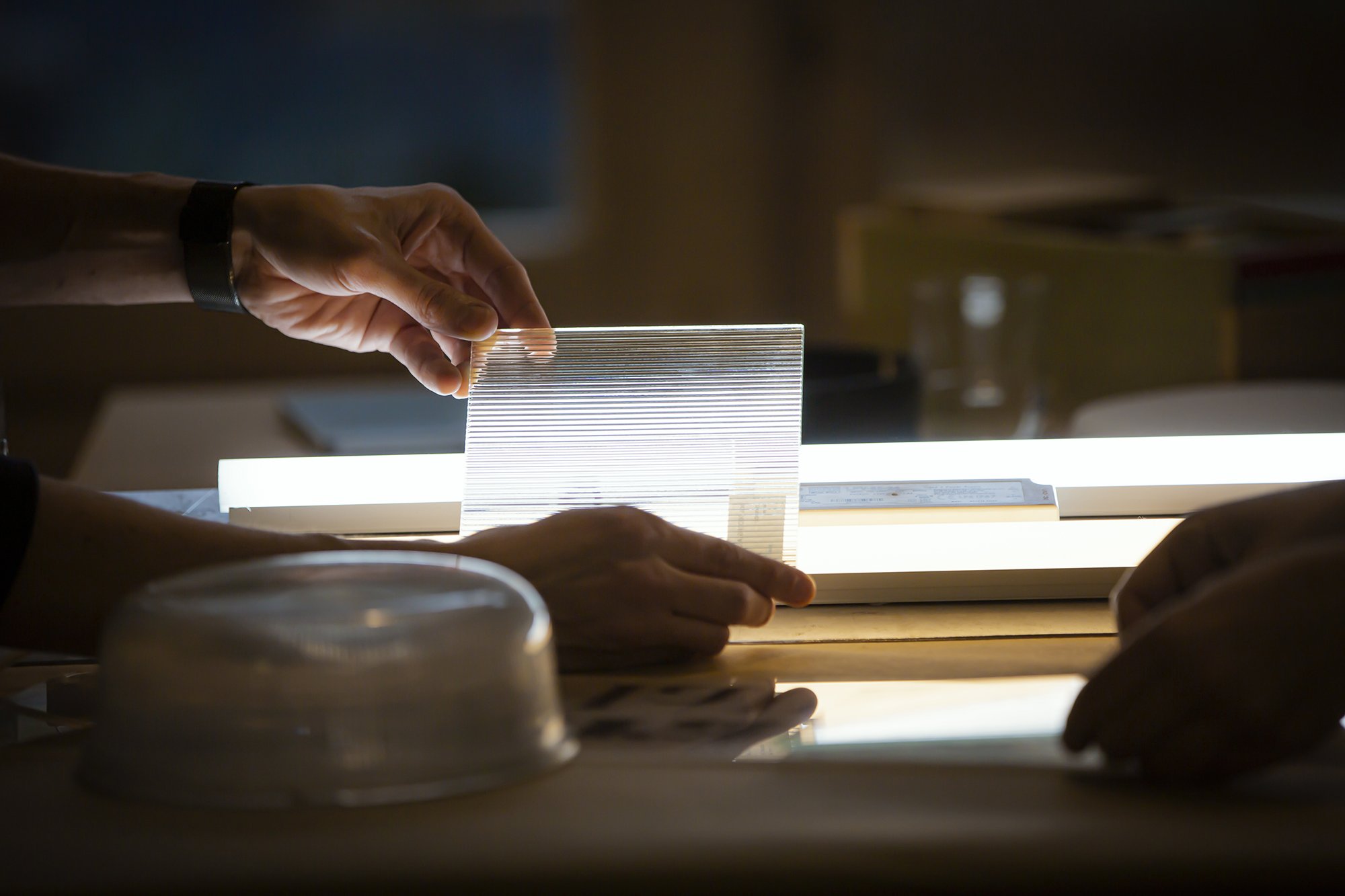
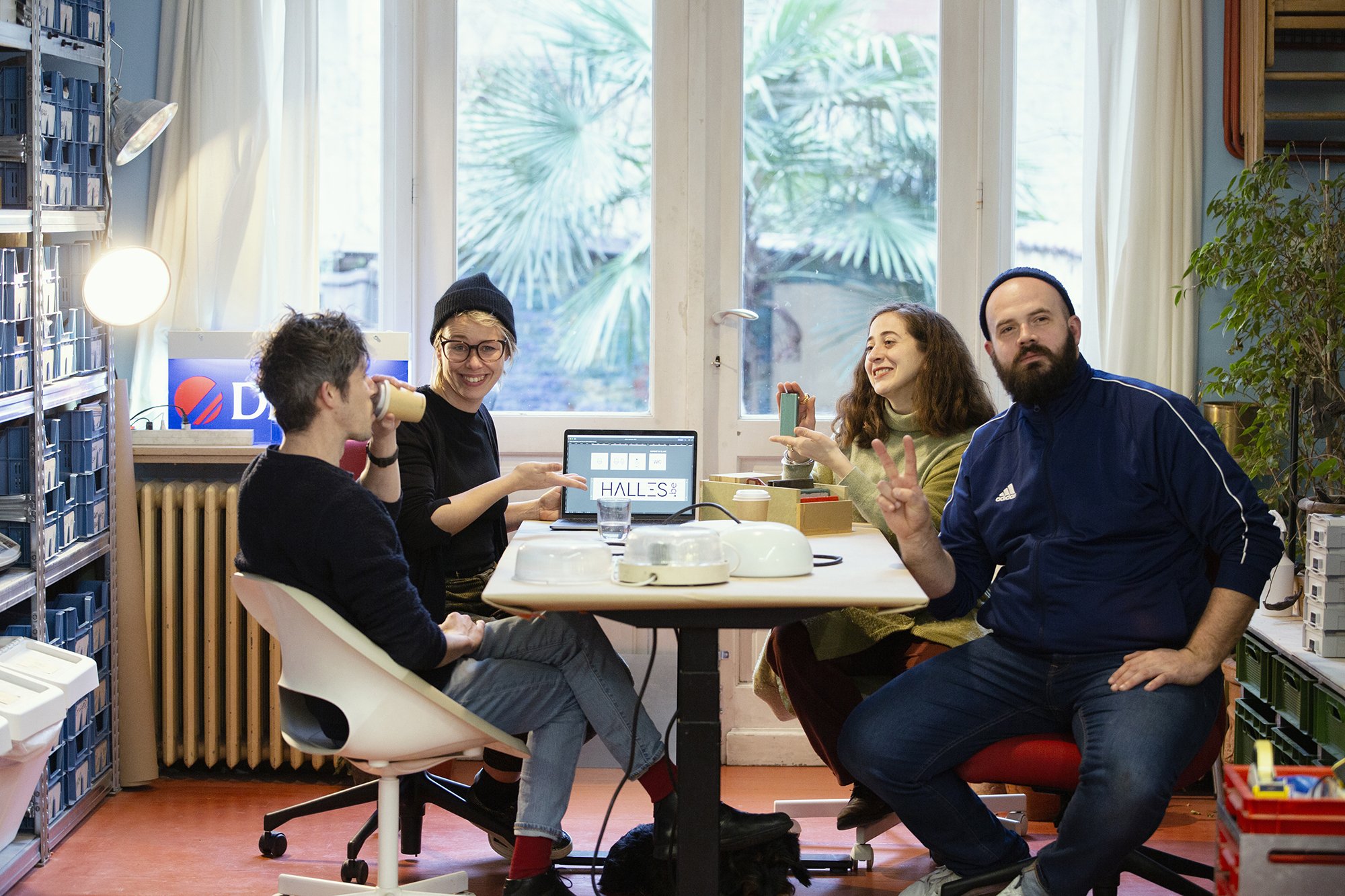
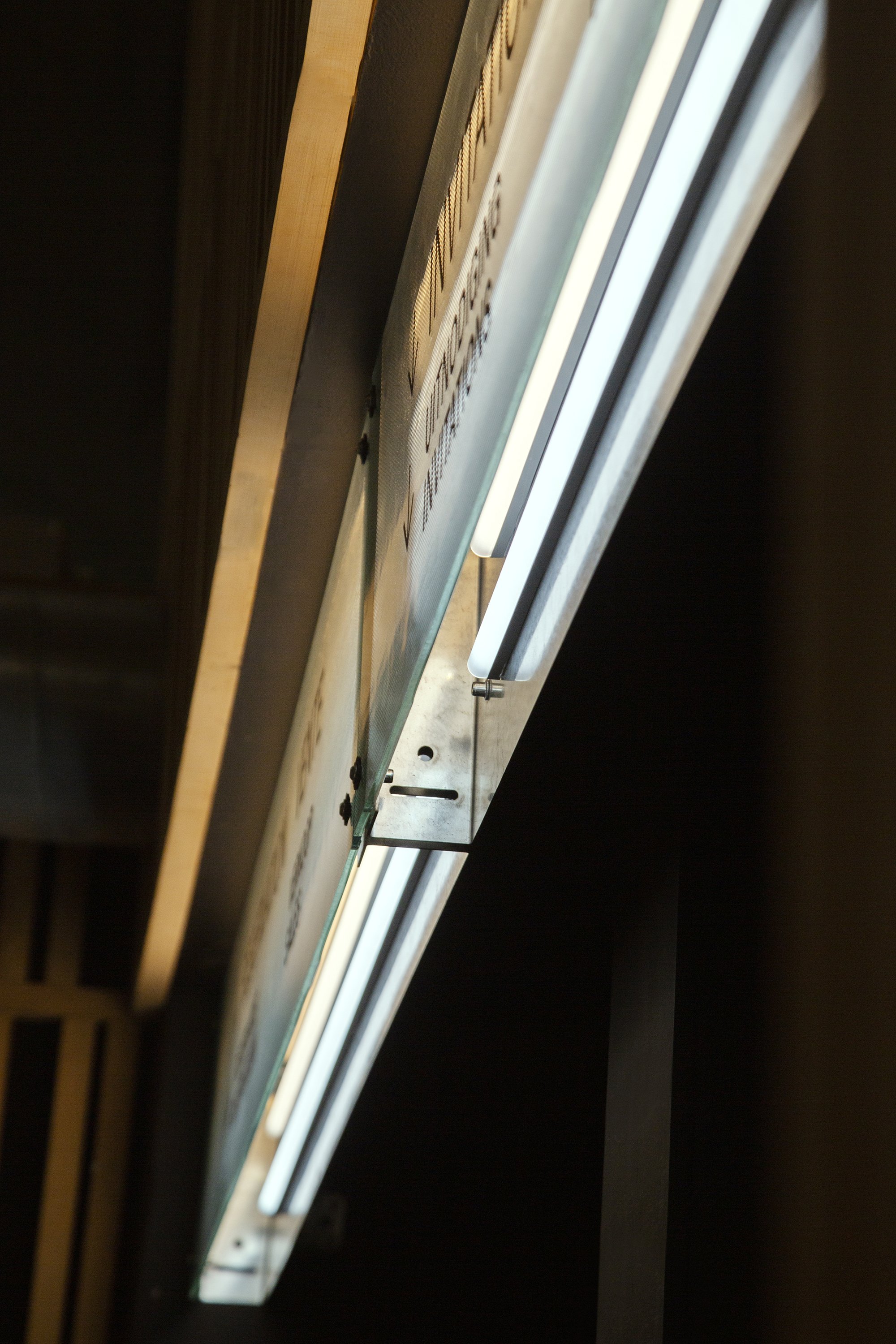
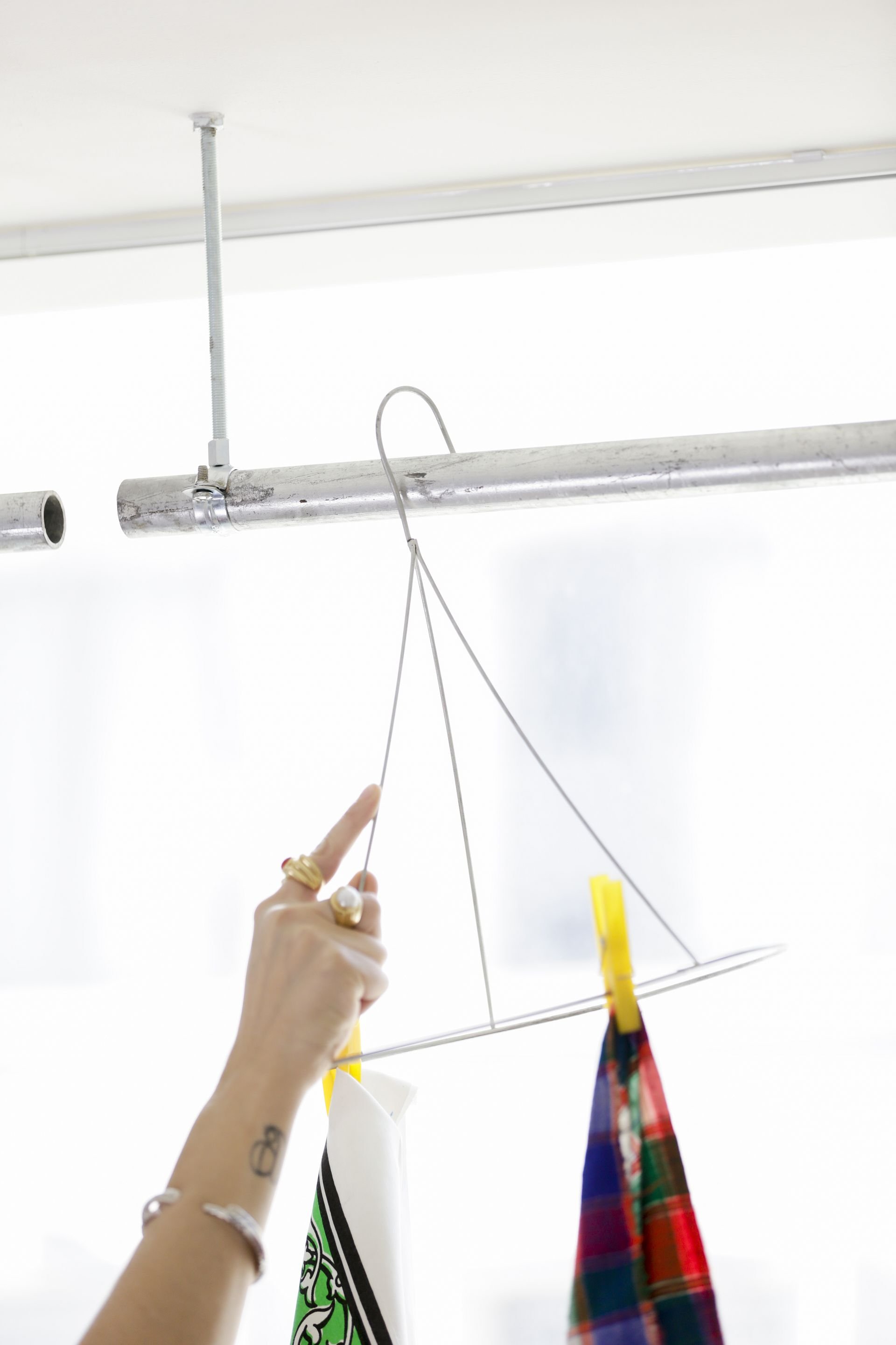
La Grande Halle
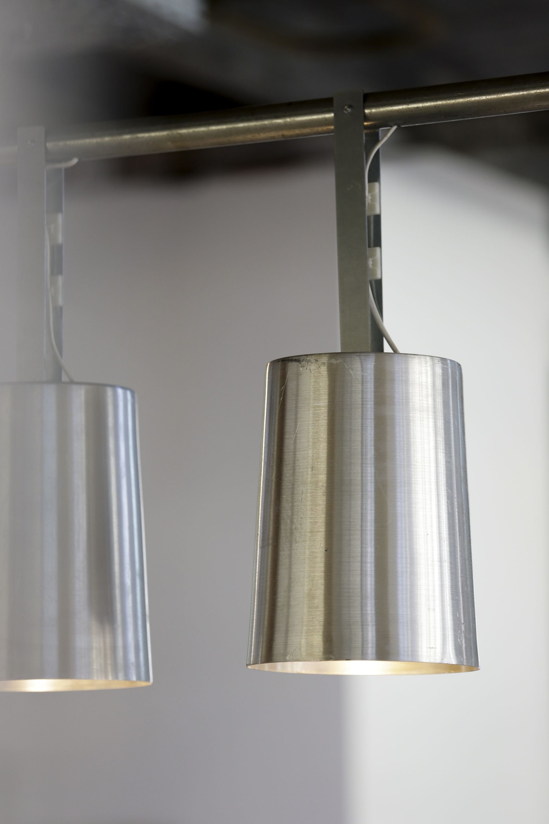
From light to language to signage, we used boxes of light to indicate the way and the services throughout the halls of the Halles de Schaerbeek.
This project commemorates a first collaboration with Studio Alvin. One amongst many hopefully. As we were delighted, to work with them.
Alvin are the masters of the graphics for this project, and we were commissioned the signage system for the Halles. For that, a word popped: light.
Light. Well. It lights.
It sets an ambiance, or emphasizes, elements over others.
Light. Well.
It glows and it shows.

It tells. the start, the end, of a show. It transitions, also.
There is a moment where it dims to black to then light specifically, something intended to be seen, leaving the audience in the dark. Literally.
Light is a language communicating queues. Indicating, time, and things.
It is a sign.
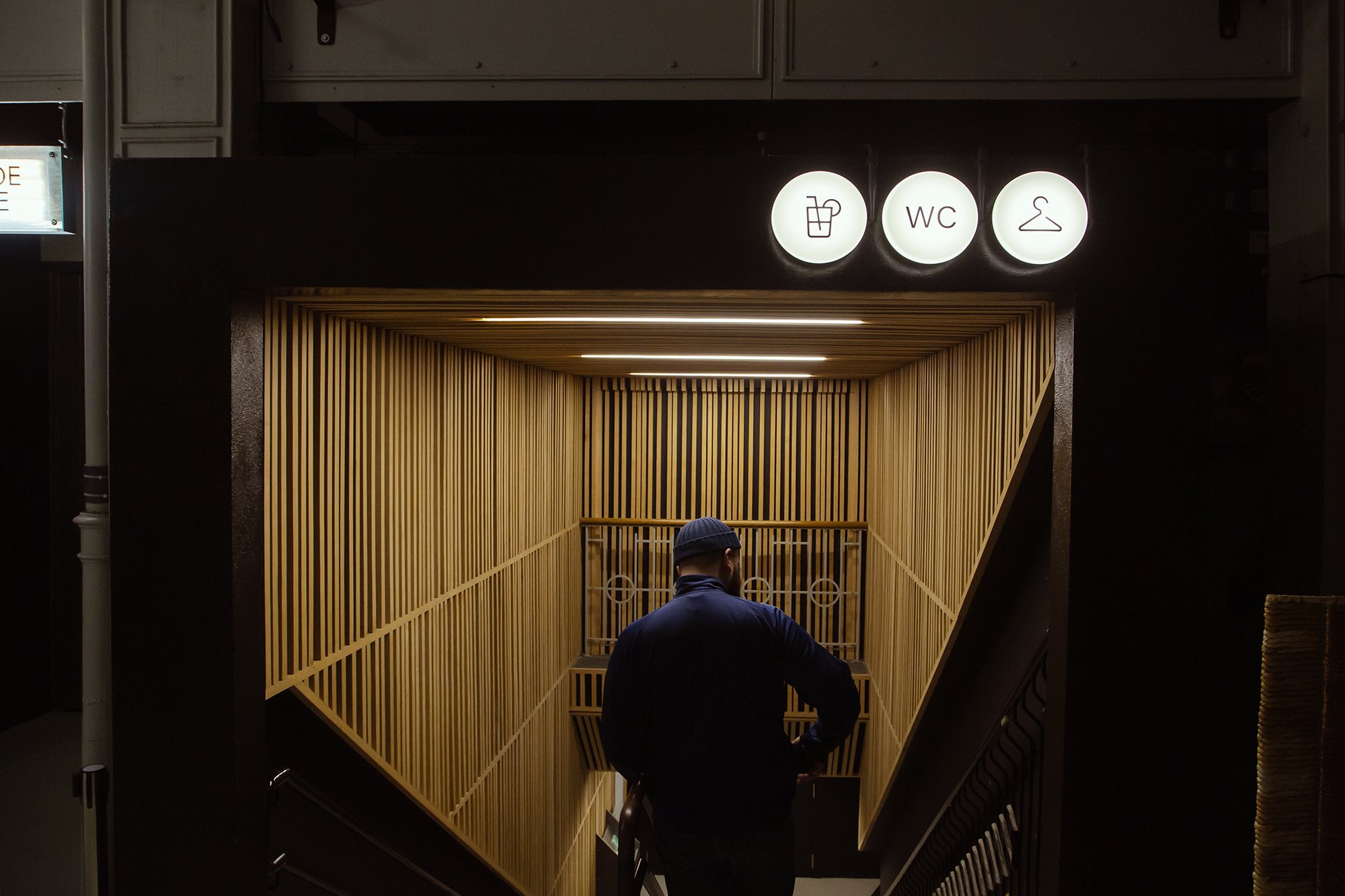
From light to language to signage, we used boxes of light to indicate the way and the services throughout the halls of the Halles de Schaerbeek.
The boxes are open, revealing what is happening in the backstage of the signage. Other signs are indicated on reused light globes, with a customized support, that brings back their purpose. To diffuse light.

Pictures and video by Joe Khoury Studio
Big up to Justine and Antoine ;)

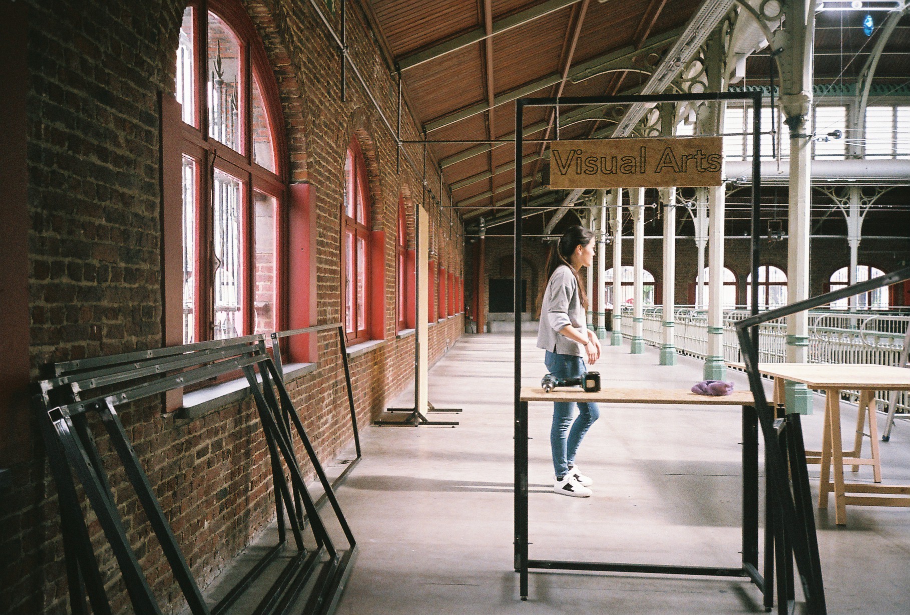
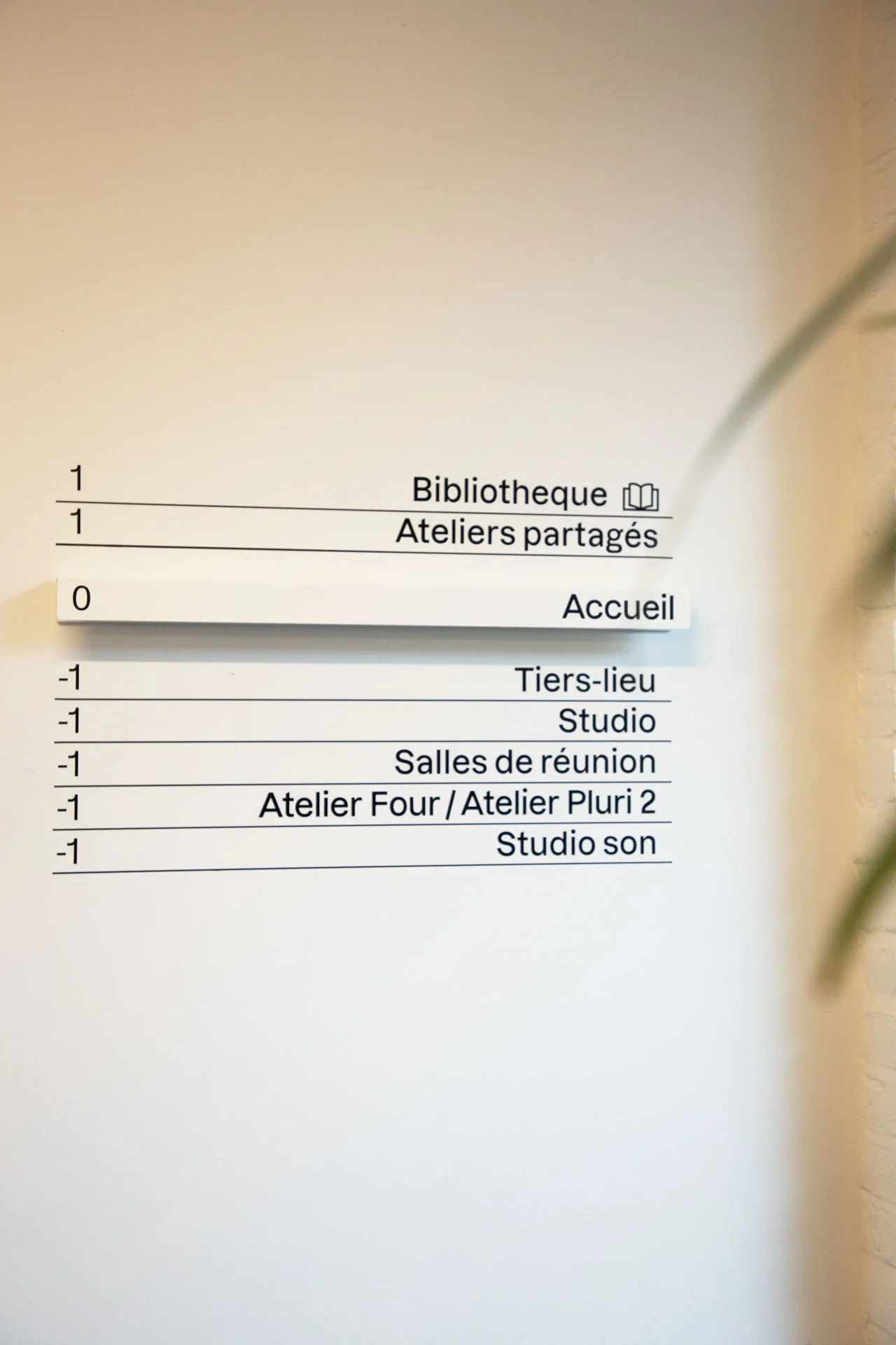
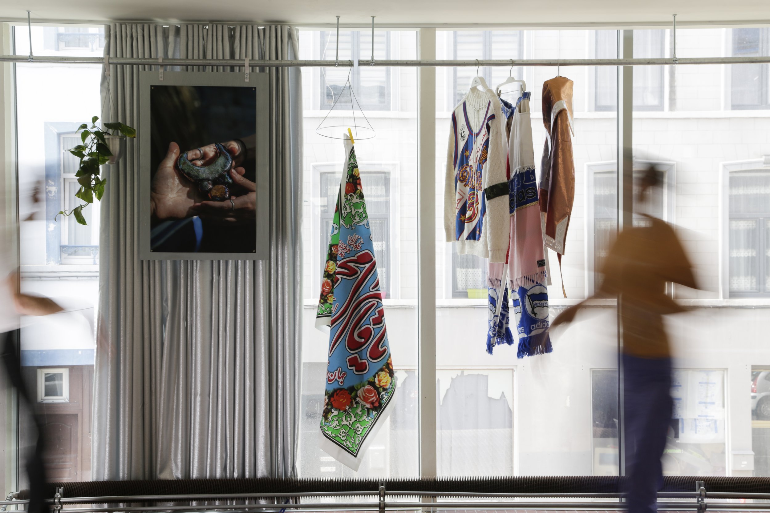
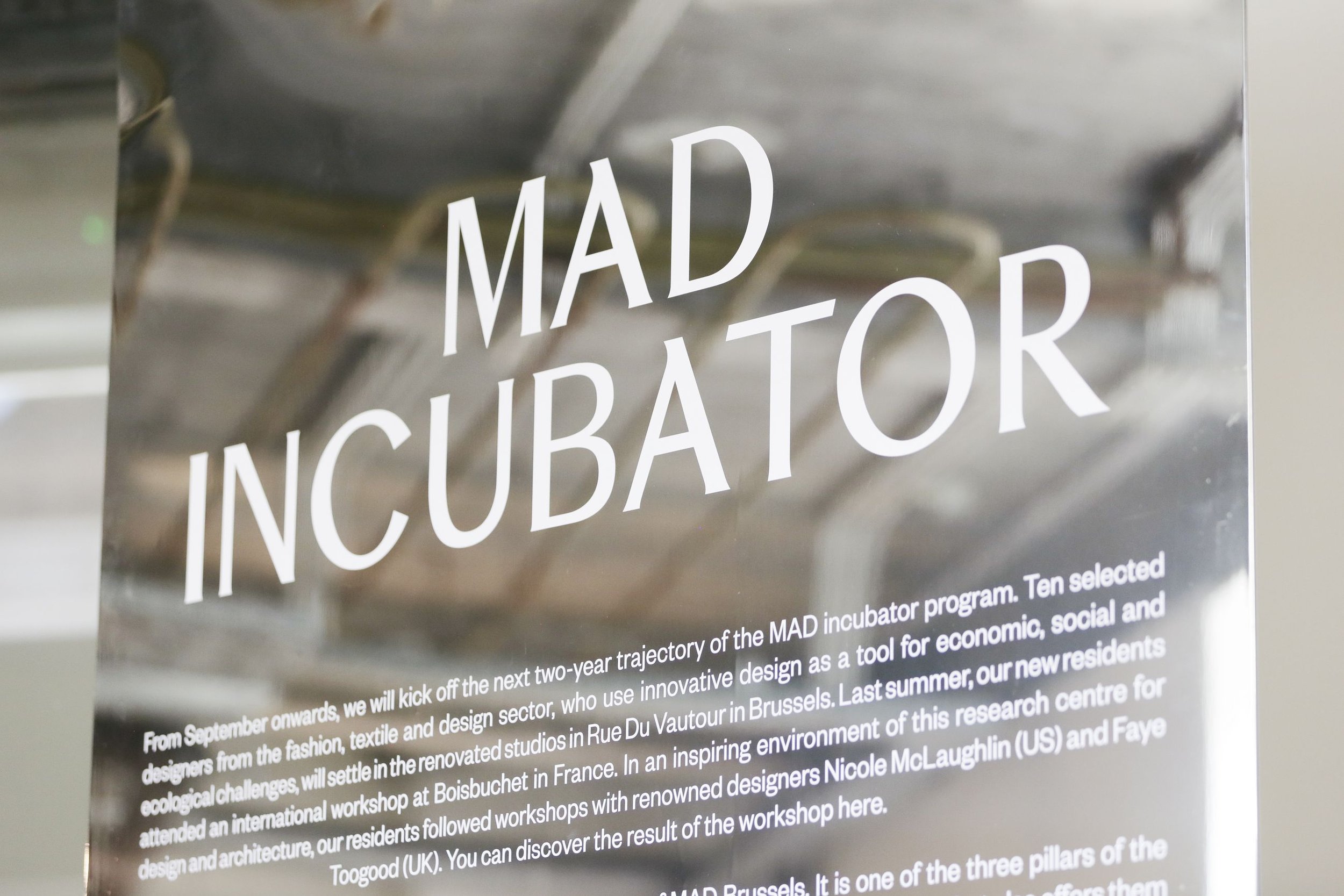
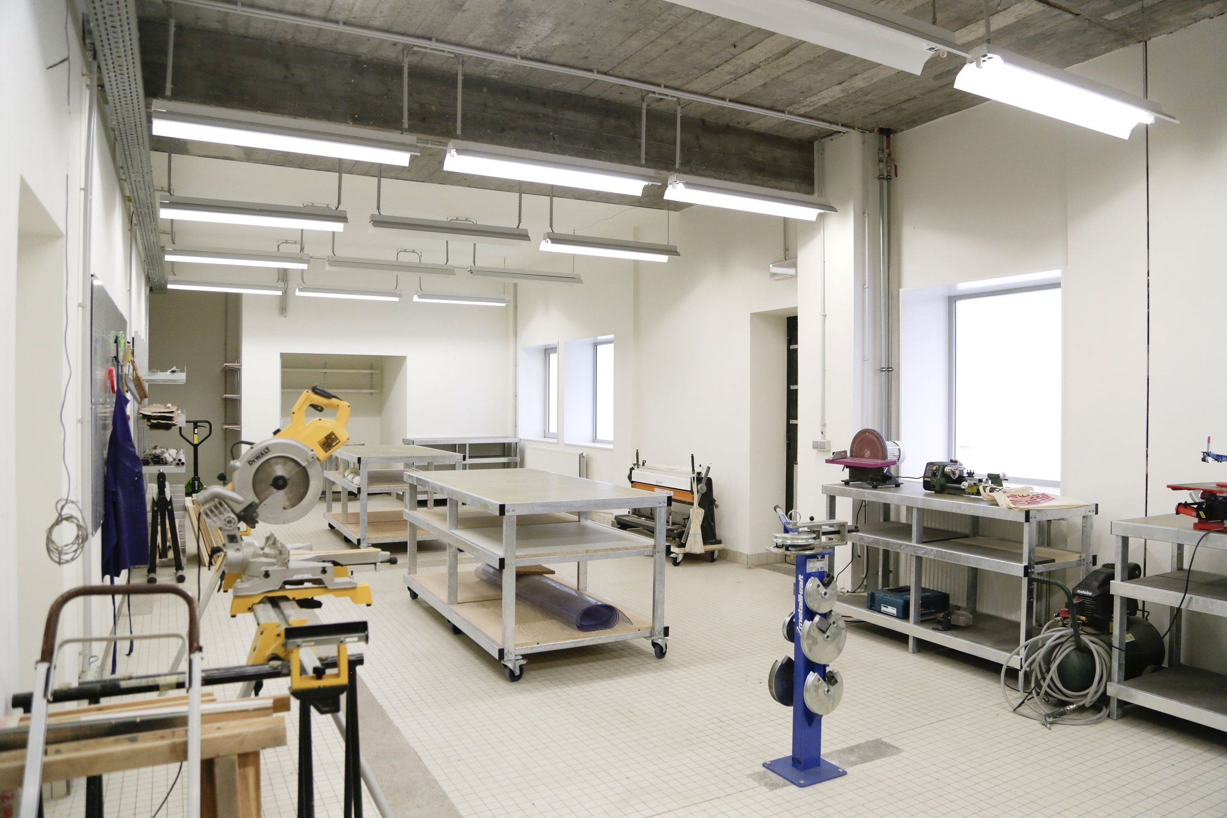
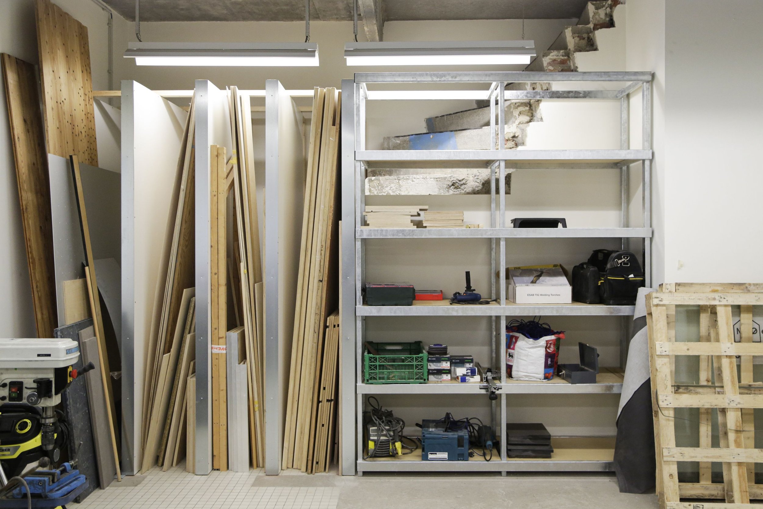
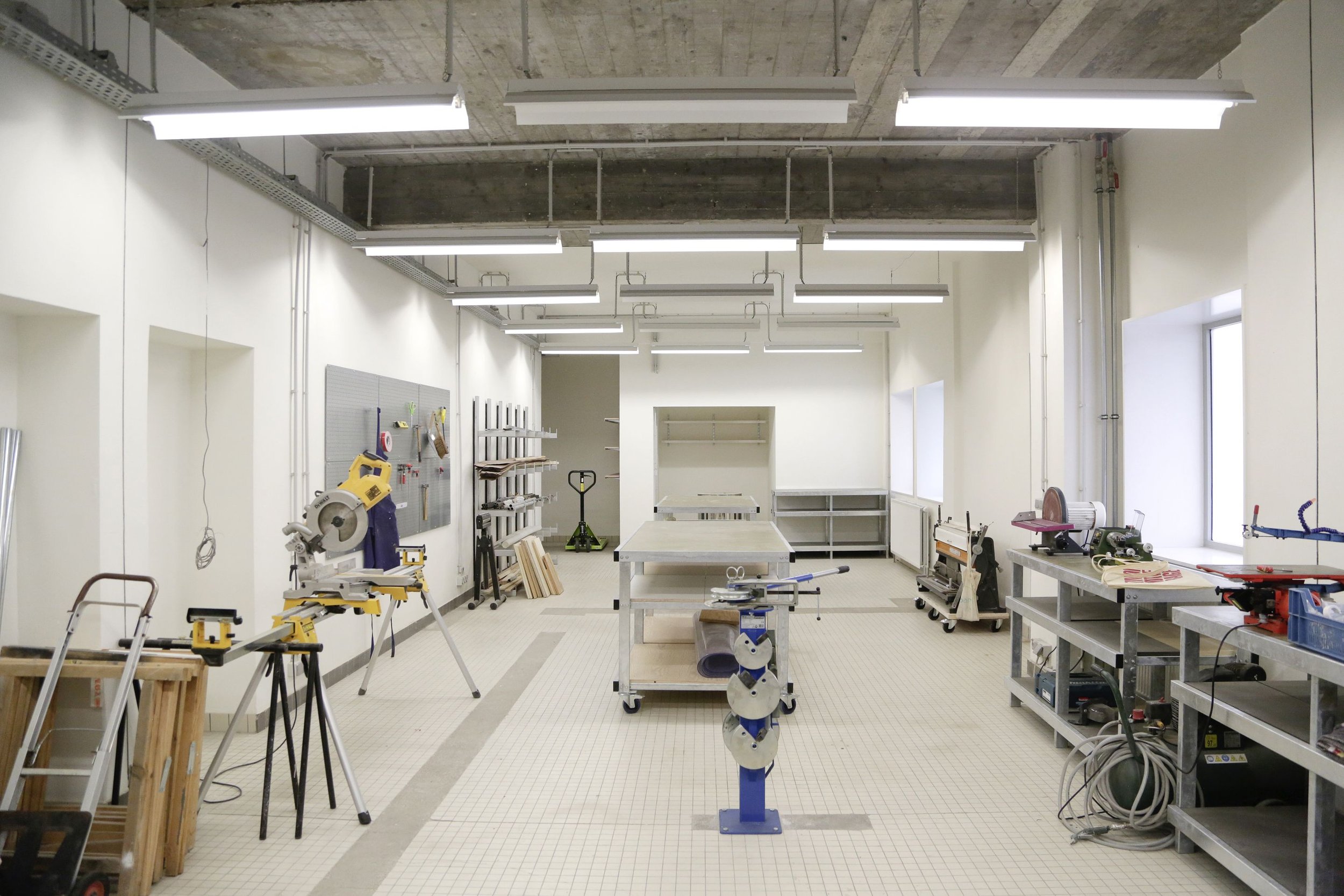
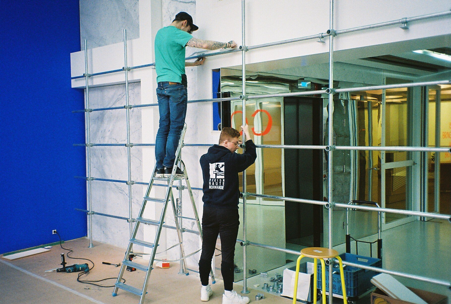
A galvanized Era, chapter 2 - MAD LAB
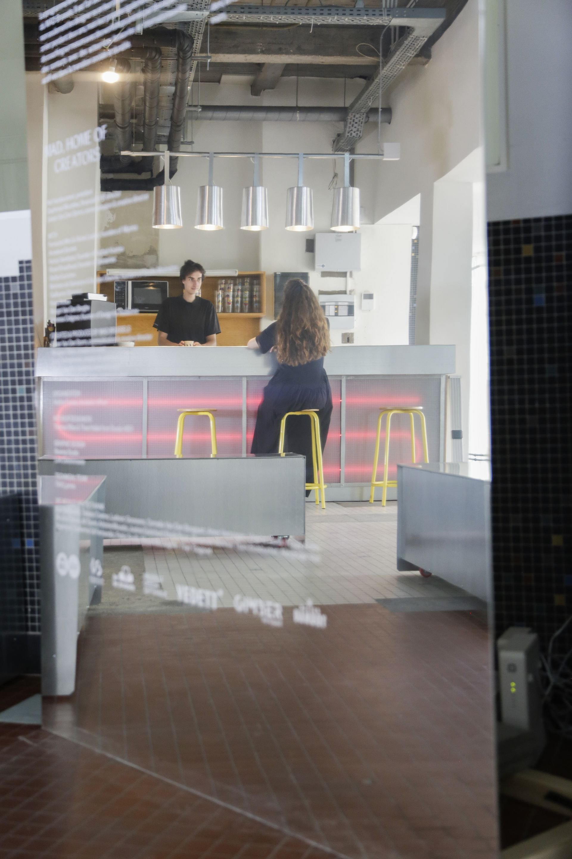
HIER was asked by MAD Brussels to design the common and public spaces of the new residents’ ateliers in Rue du Vautour, a space dear to HIER’ heart, as it was founded in that very space, in 2017, when we, Thea and Thomas were residents at MAD.
HIER was asked by MAD Brussels to design the common and public spaces of the new residents’ ateliers in Rue du Vautour, a space dear to HIER’ heart, as it was founded in that very space, in 2017, when we, Thea and Thomas were residents at MAD.
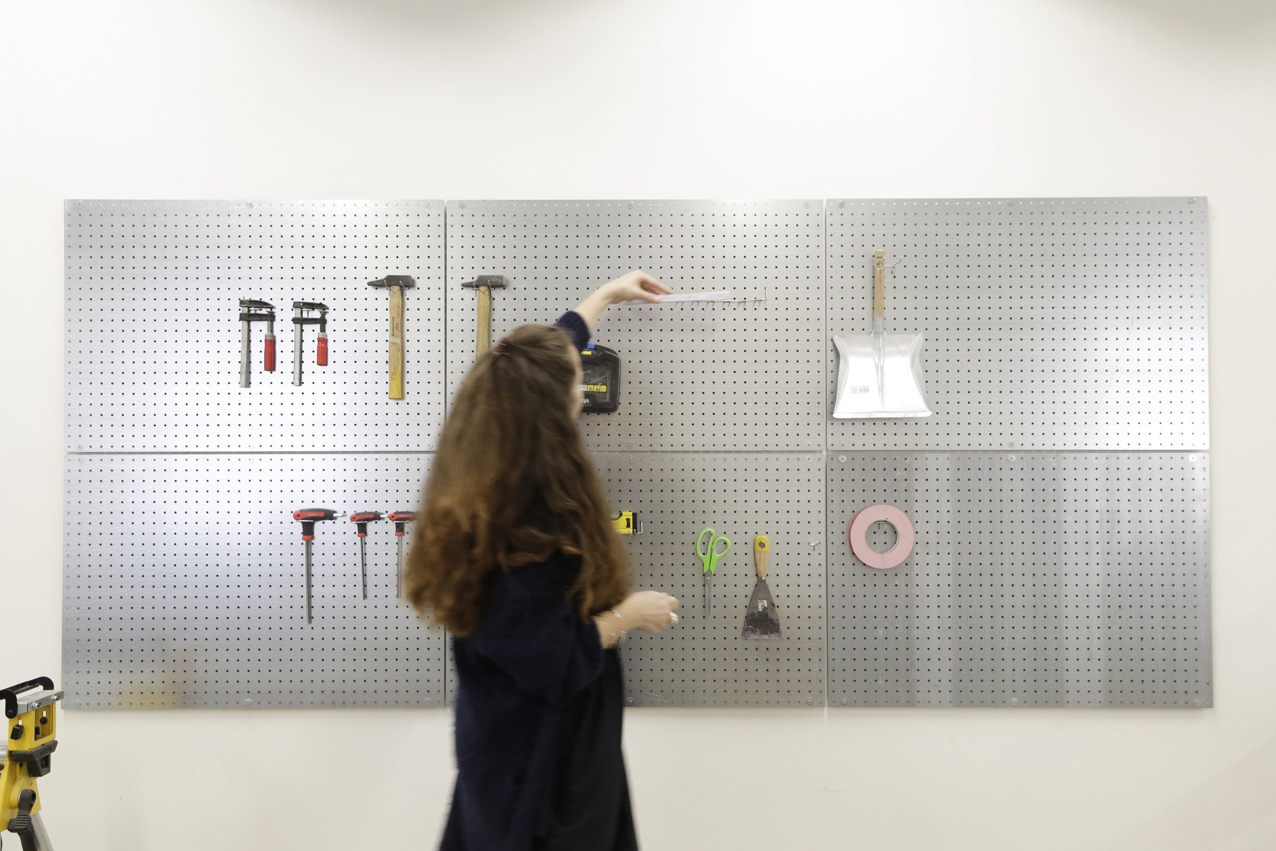
A space reminiscing in traces, layers of time, renovations, additions, subtractions, now all merged, in one space, visible through a shift in tiles. A collage of moments in time reflected through a difference in language and materiality. An era of tiling of many sizes and colours, one of subtraction of walls and patching with concrete, one of additions of steel and glass separators. HIER wanted MAD too, to leave a trace in the space. To mark their presence with a galvanised language. As the space is made of a patch work of materials and colours itself, we wanted the additions to be monochromatic. A silver metallic look, that homogenises, modernises, lightens the space, and comes in many different specifications.
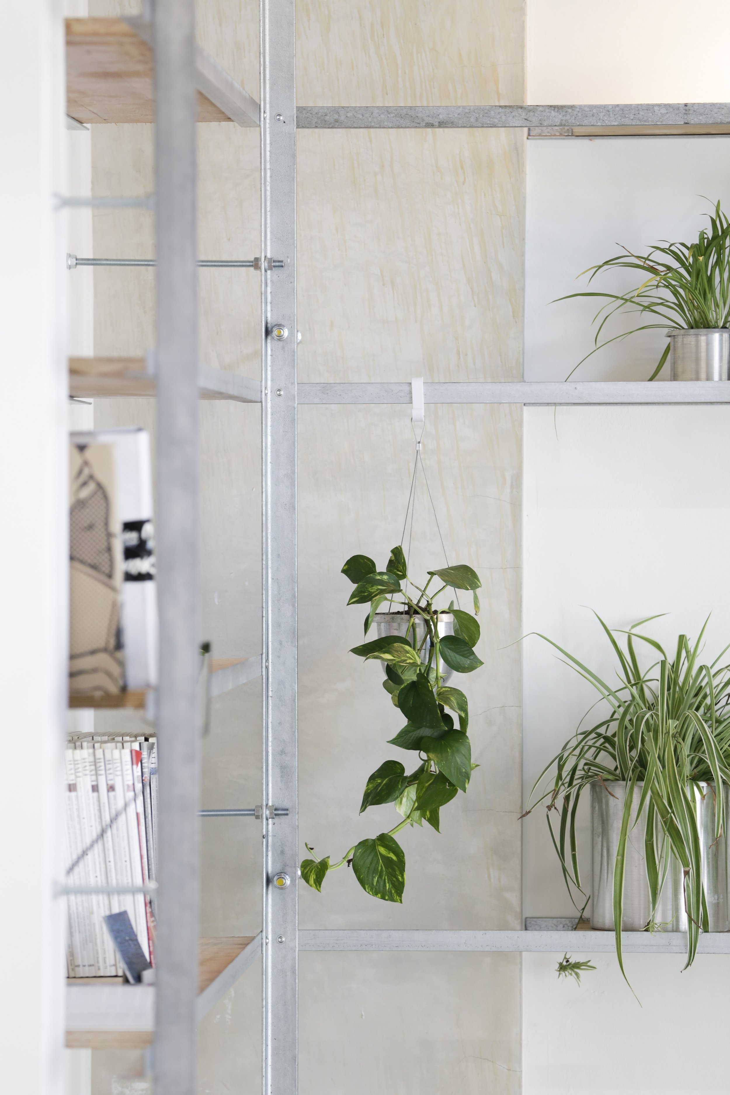
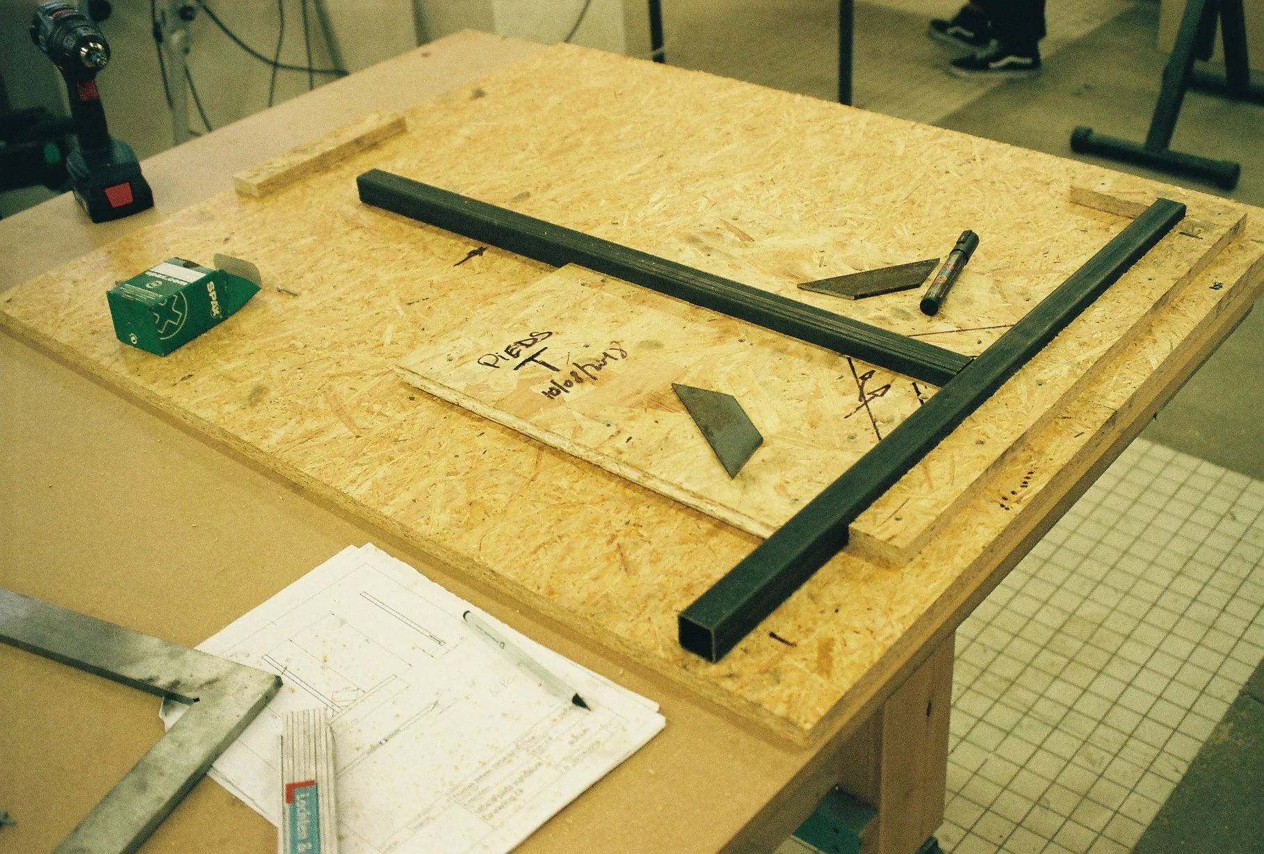
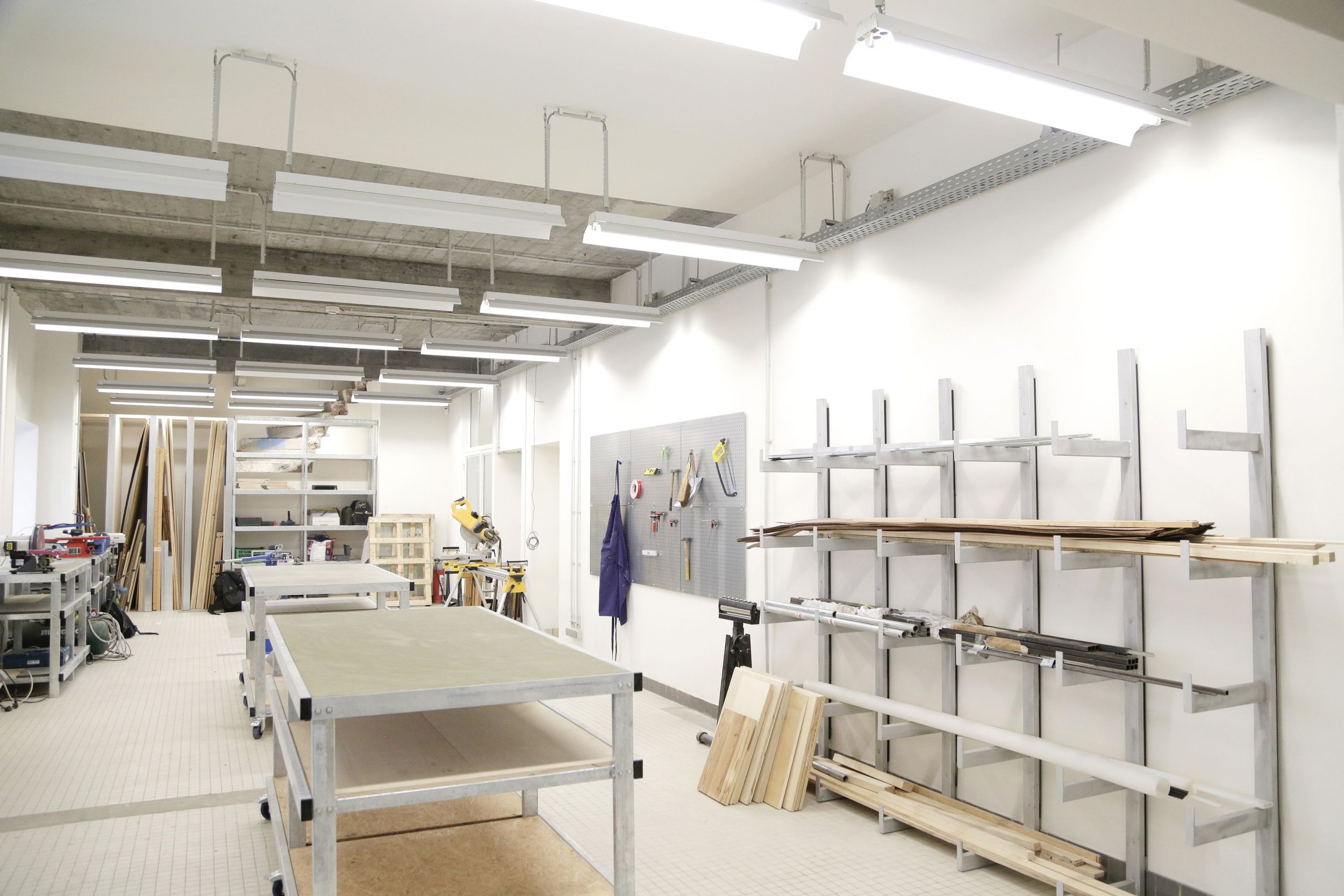
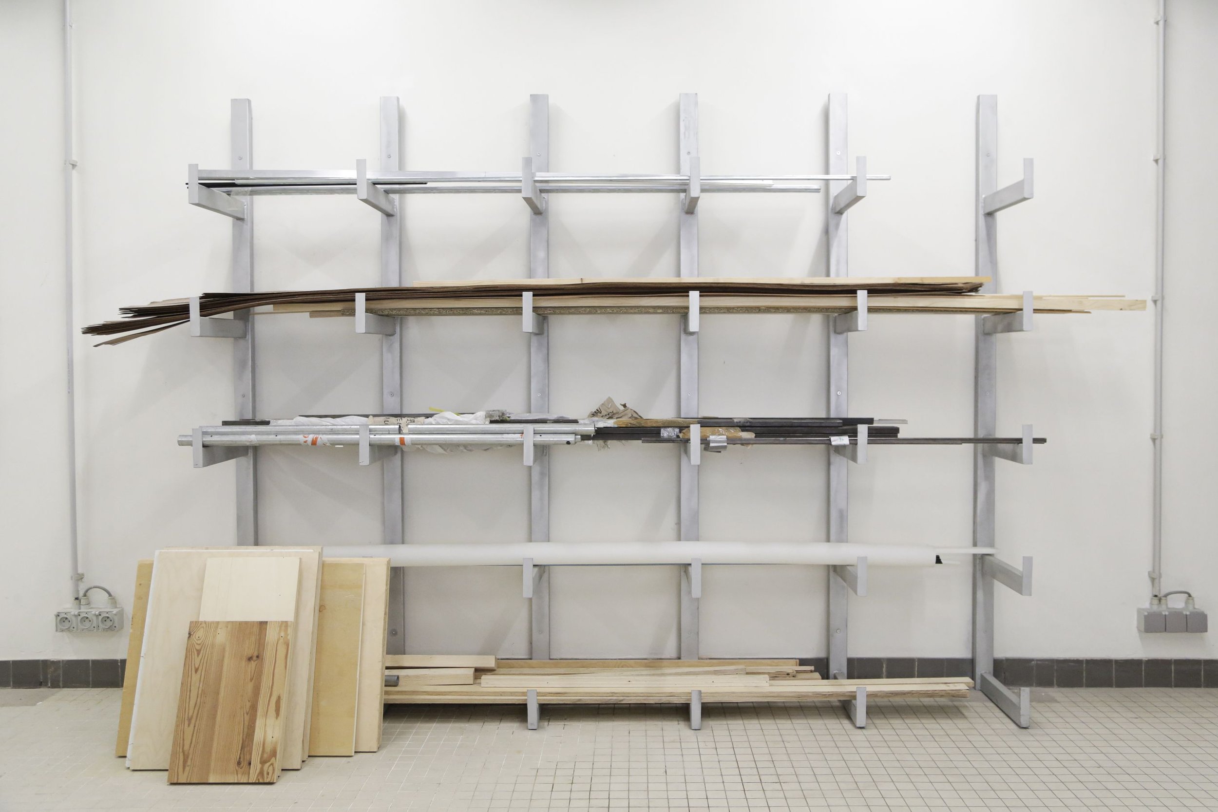
To source ourselves with materials, we dove into MAD Dansaert’s basement, full of relics, of projects past. We reclaimed all the wood we could and need, galvanised metal tubes from INSIDE STORIES, a past vitrine project HIER did for MAD, and other left-over galvanised metal sheets. All were part of a context once, that is lost, and now lie as orphans in the basement, ready to be found, in a new context. This idea of basement shopping was an obvious one, to avoid waste, to bring back elements from previous installations into the design loop, as a responsible choice, and because it allows us to actually build everything needed for the space even within the relatively small budget.
Formerly a day-care for the building, the space caters now for or a small entrance, and a design workspace at the ground floor, a fashion workshop, studios for the residents and a big common space on the first floor. The big common space has an open kitchen with a bar and is meant to have a double programme: a cantina on most days, and an exhibition on occasions. With an open programme comes the need for flexibility and various possibilities.
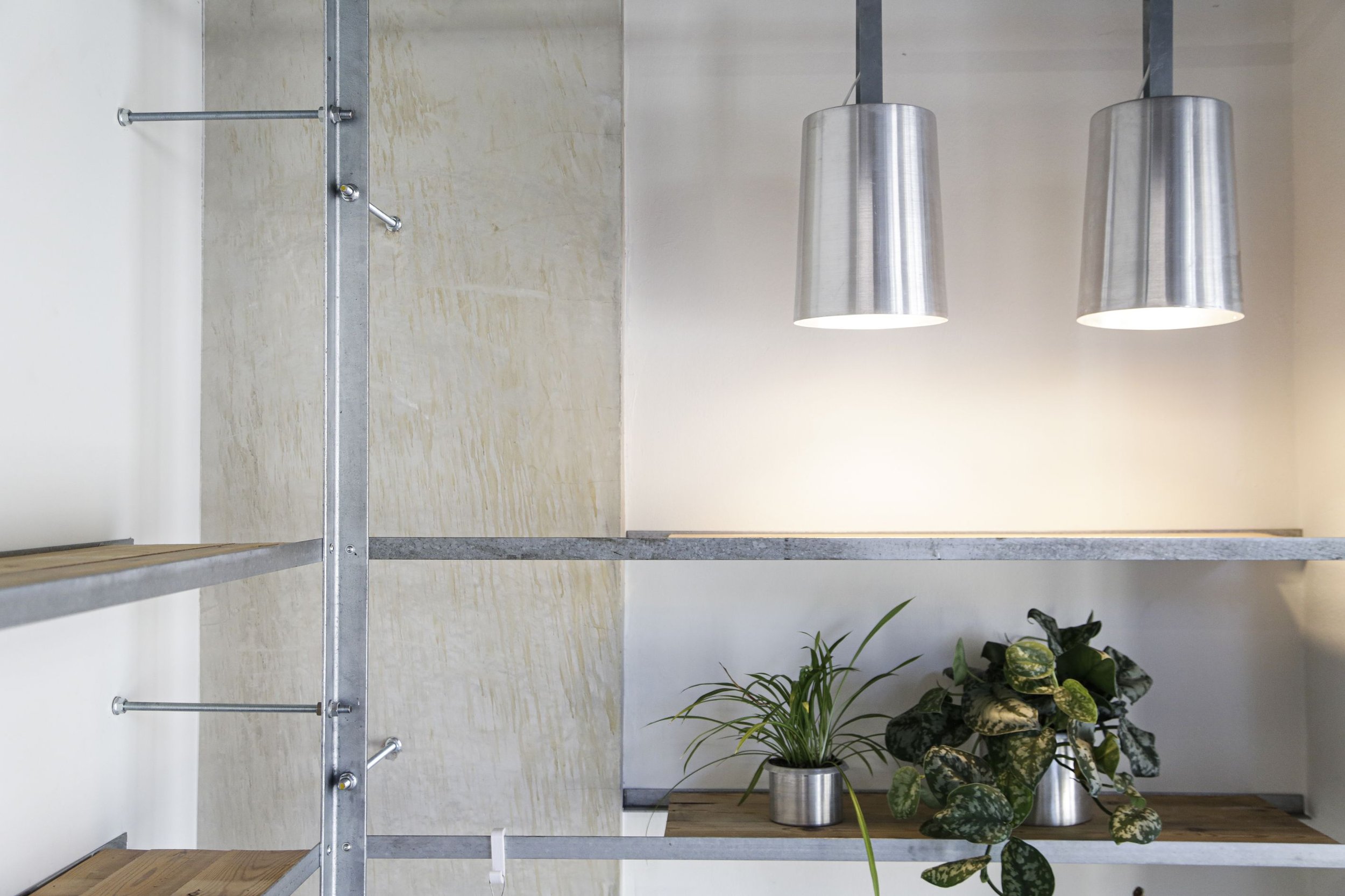
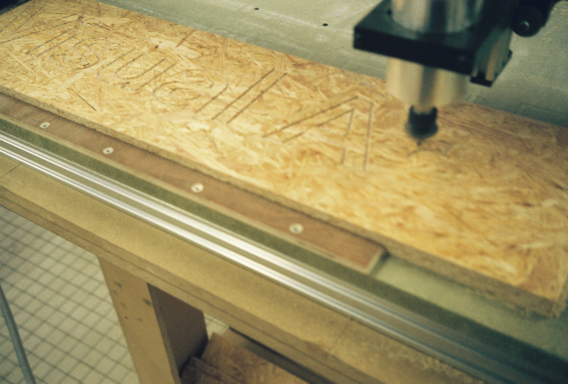
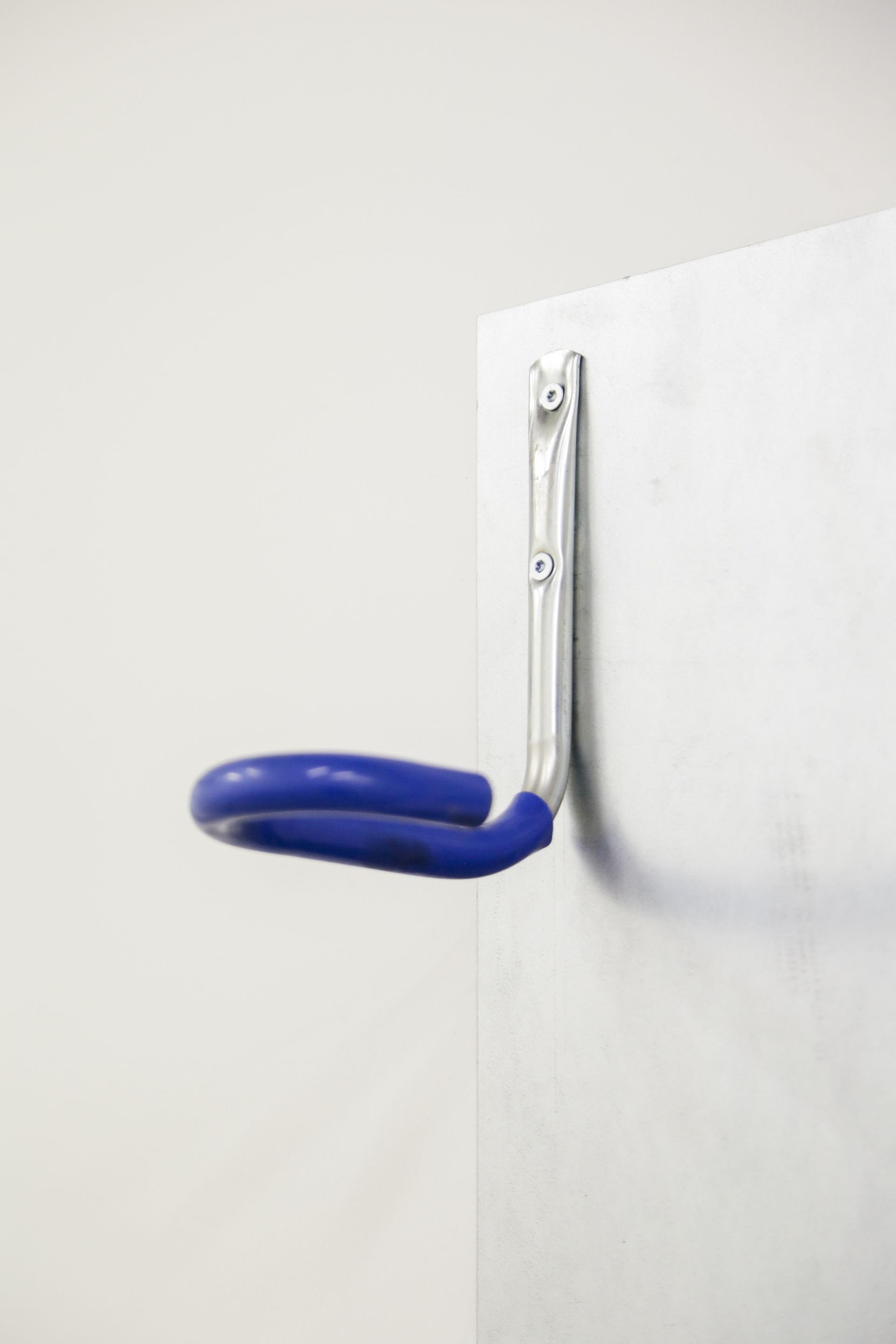
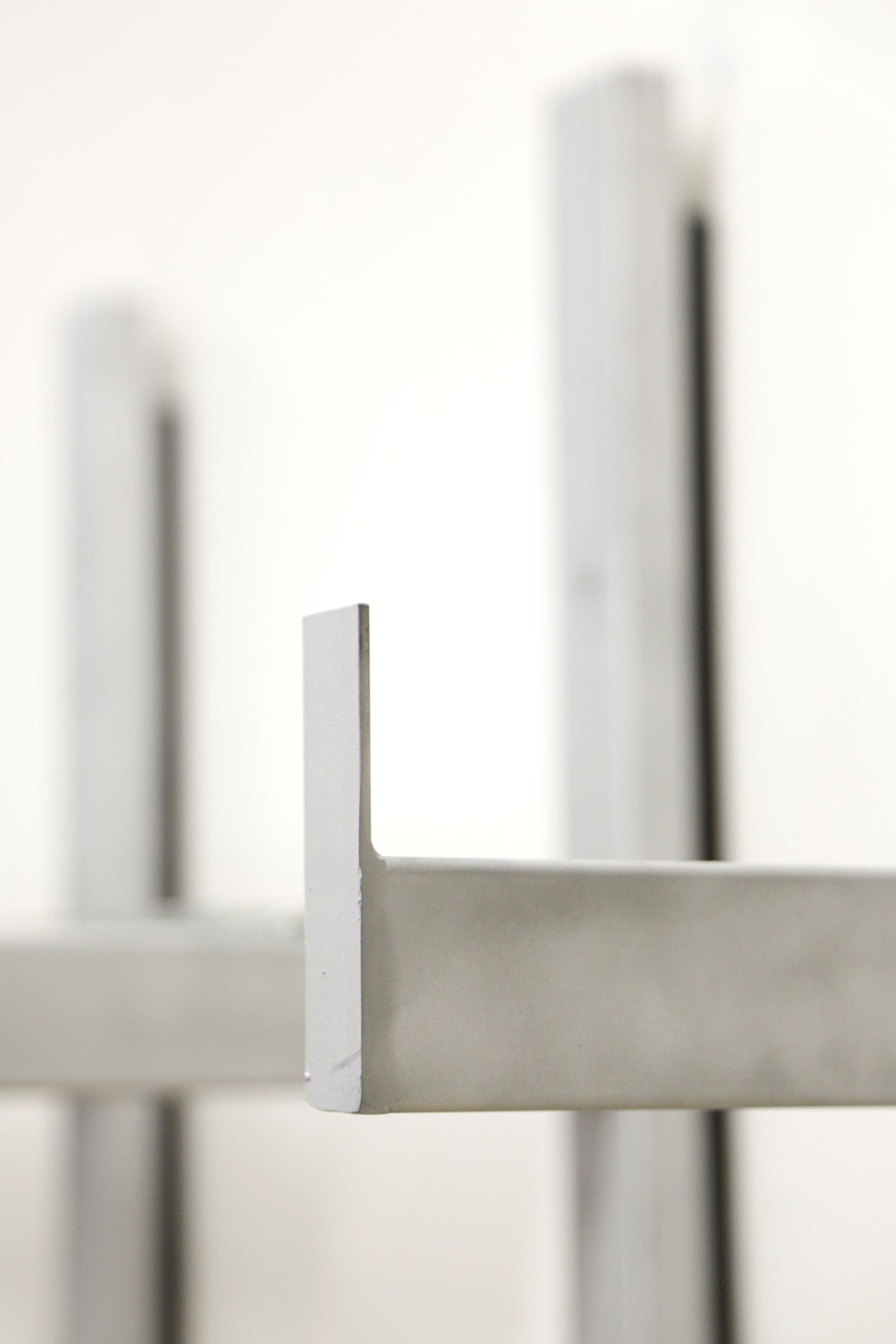
For the design workspace, we designed, produced, and installed a system of furniture, with rectangular galvanised metal tubes, some on wheels and some fixed. The surfaces were ones of reclaimed wood.
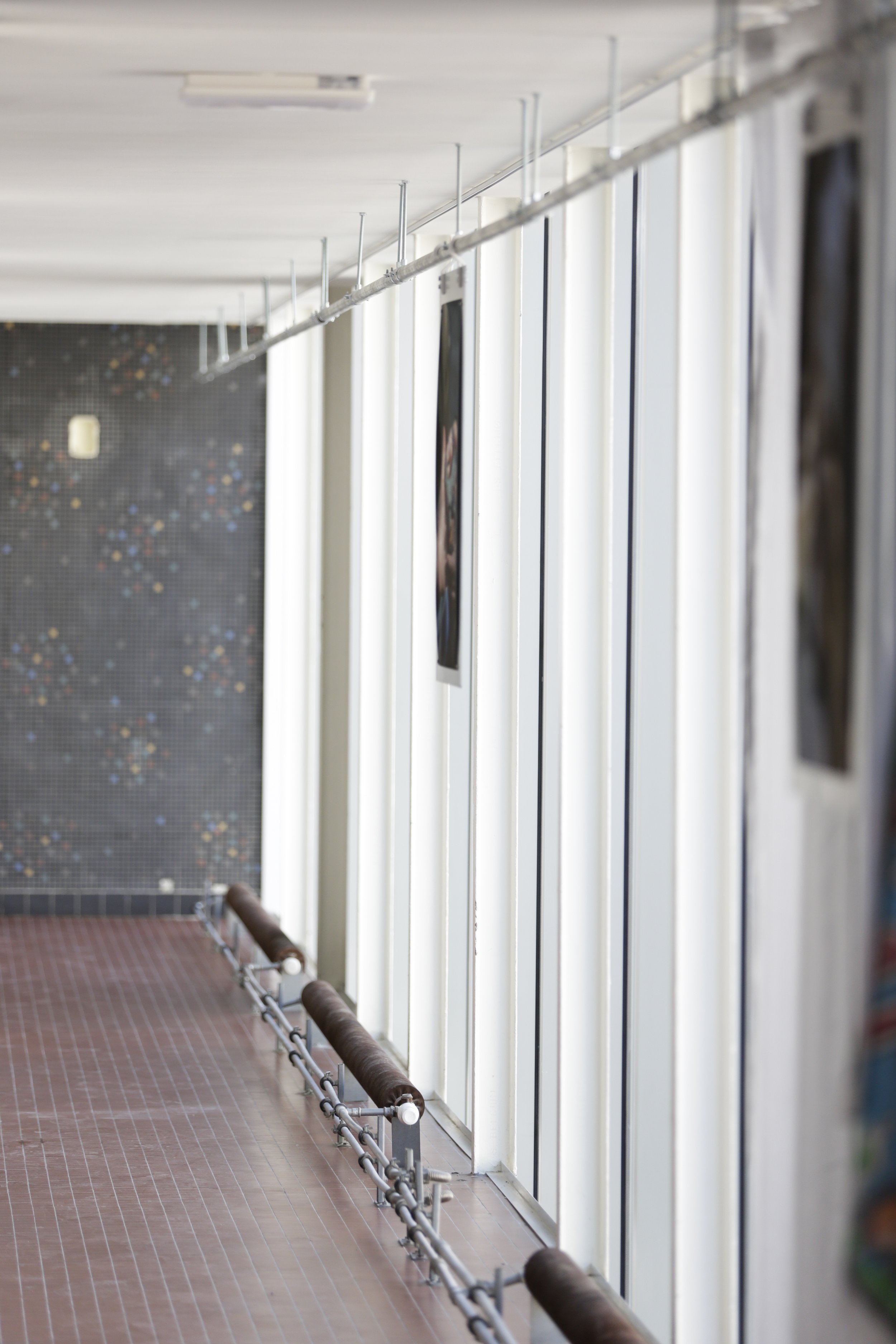
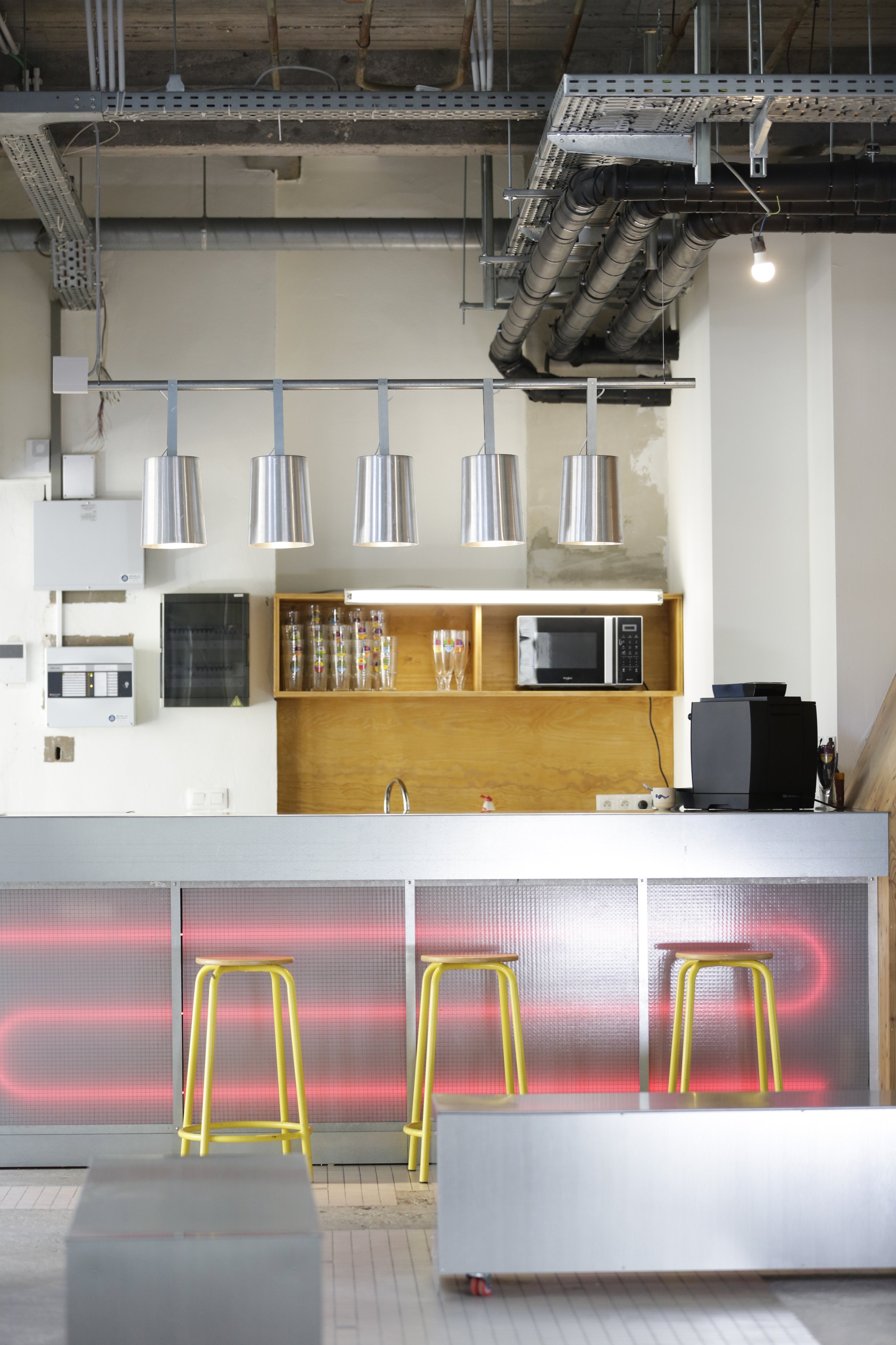
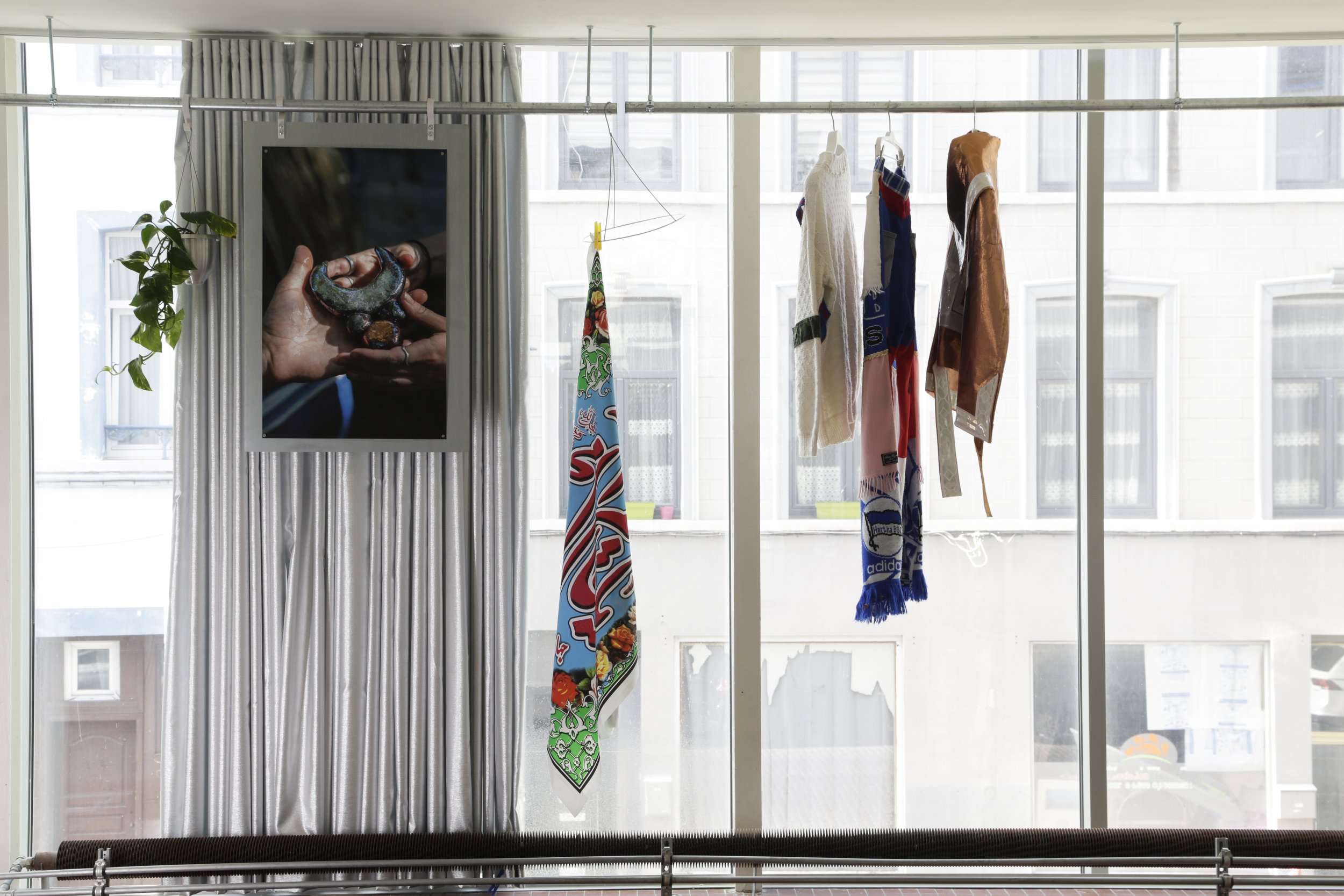
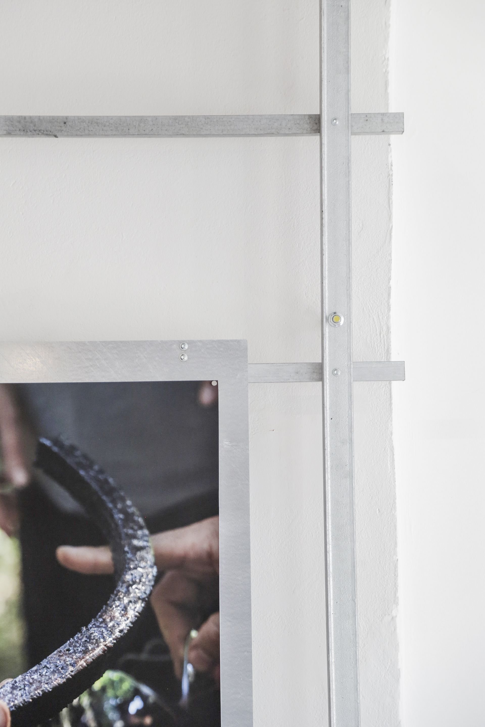
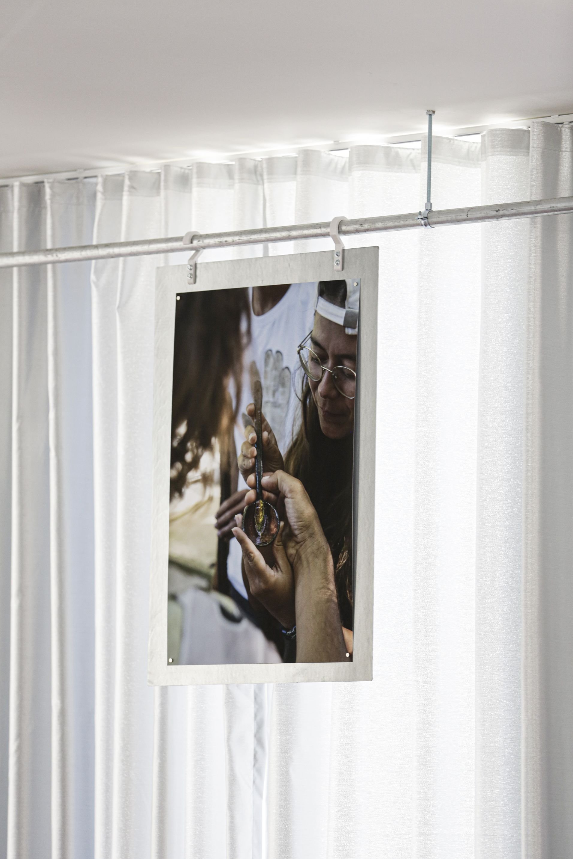
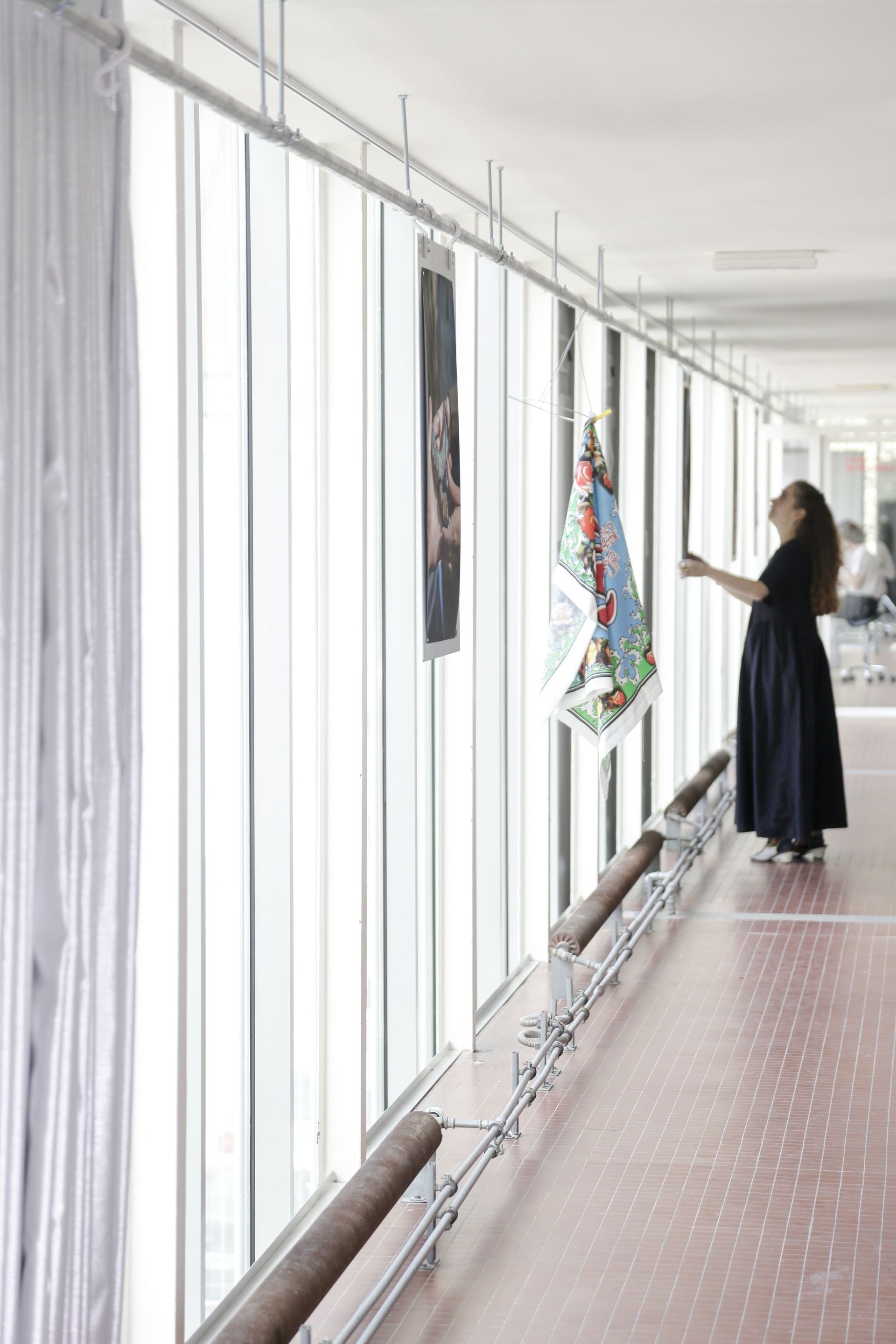
In the big common space, as a display/exhibition support, we installed a 50-meter-long rail running through the red- tiled circulation path, with curtains, hooks, and hanging metal sheets for display of mood boards or other prints. The rail came from the reclaimed basement steel.
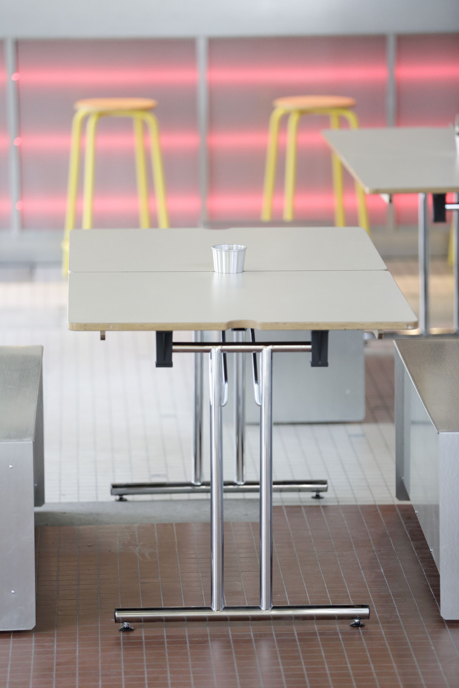
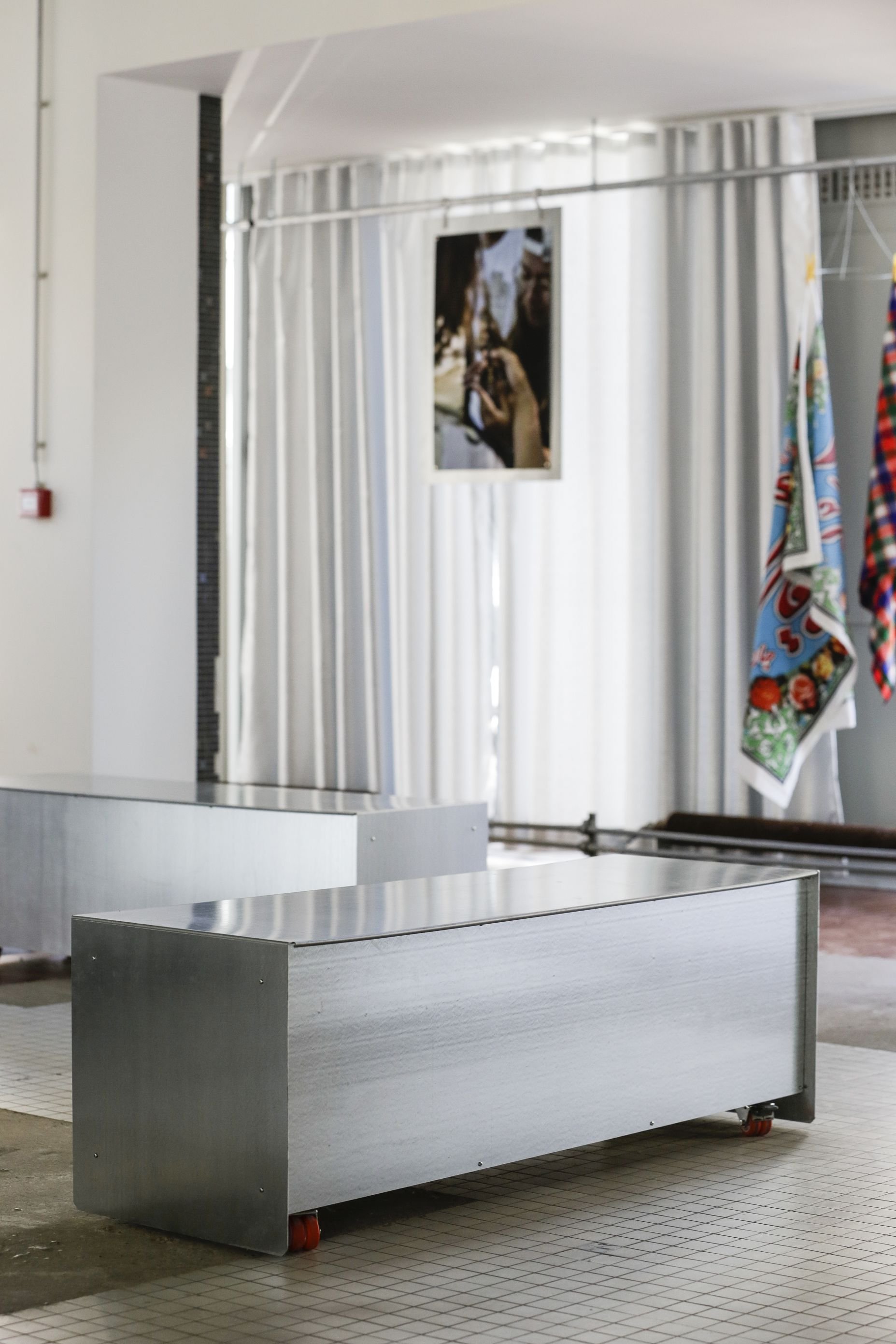
The library was built with a different profile of the same material of finish: it is an assembly of two sizes of L-profiles juxtaposing and reclaimed wood for the surfaces, with lighting and pots designed by us but made in Beirut, by Coco El-Ballis, an artisan in metal turning. Tables for the cantina have foldable legs for flexibility and reclaimed laminated wood found at Rotor for the surfaces. We designed and produced benches on wheels from folded galvanised metal sheets, to serve both as seating for the canting or moving pedestals for exhibitions.
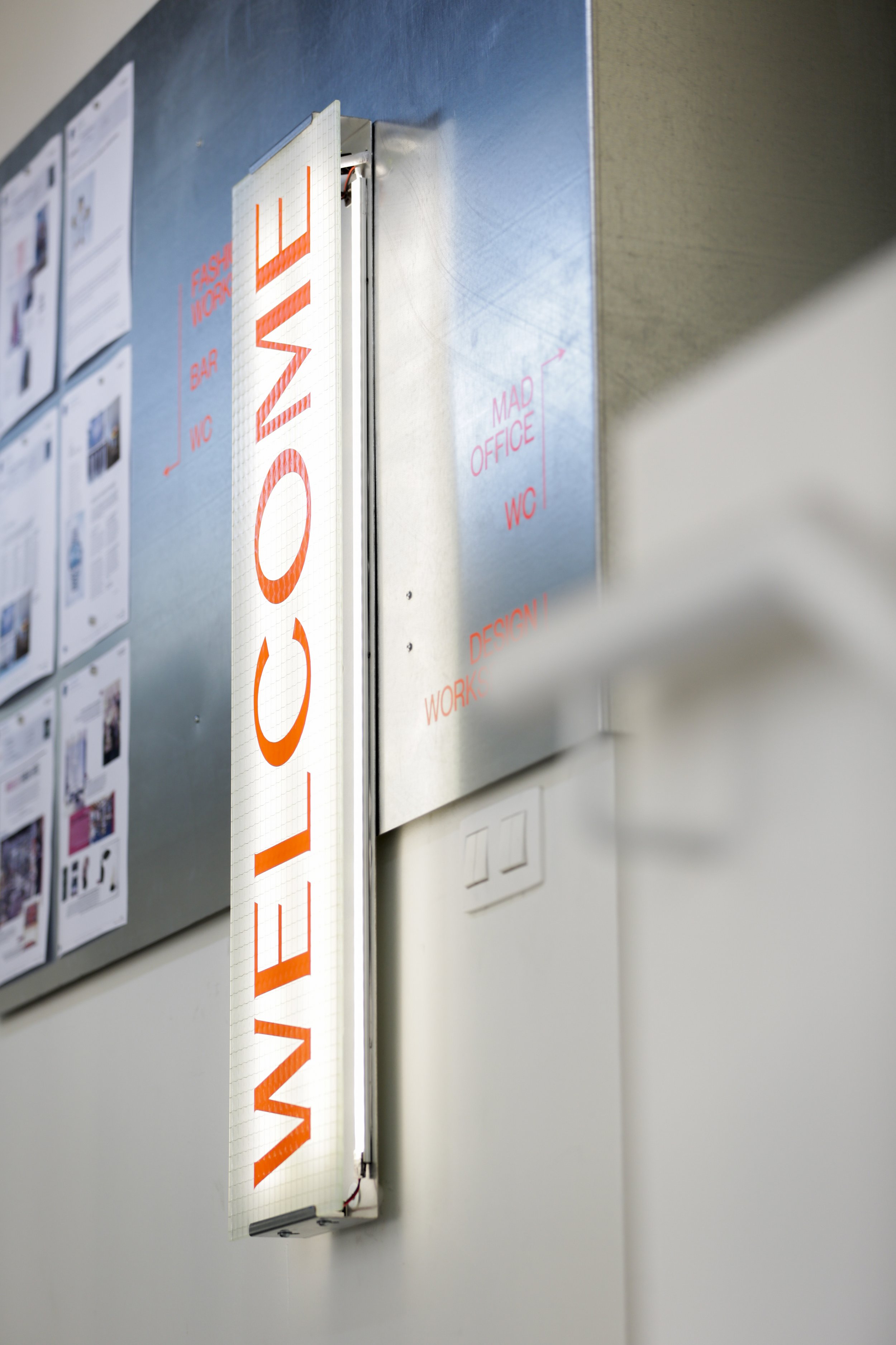
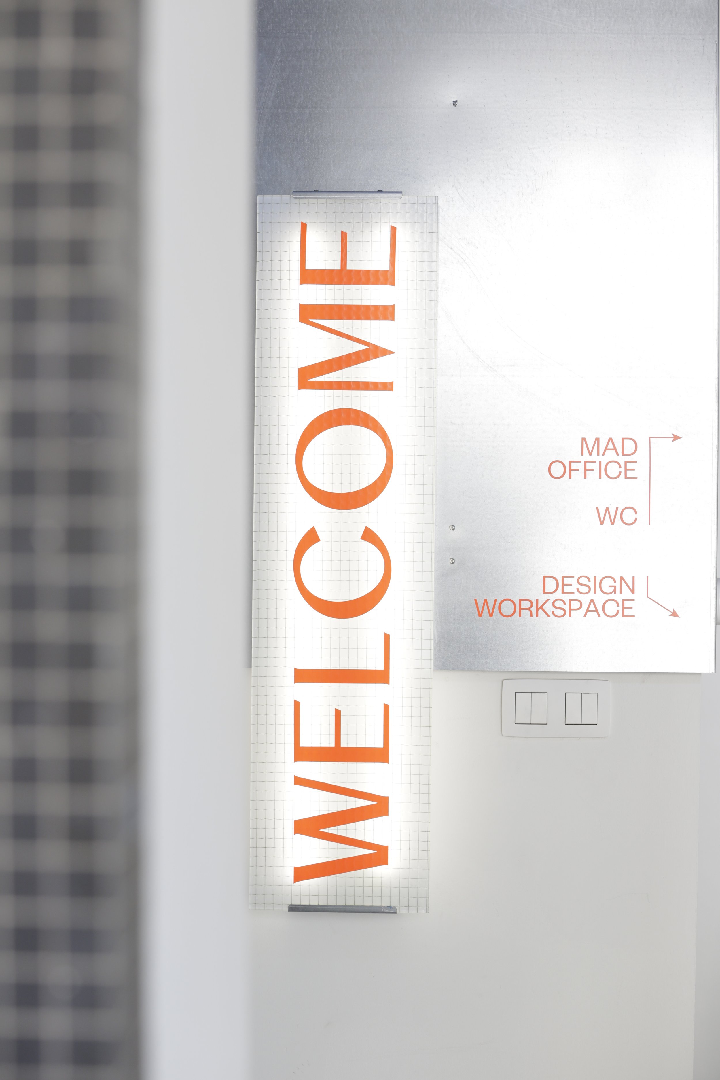
We freshend up the kitchen bar with a coat of galvanised sheets and wired glass. The movement in the red lighting is a wink to the graphic ceiling, noticeable by its maze of heating tubes running through. That same folded metal and wired glass appear again on two other occasions, up and down, as welcome signage walls.

We design knowing that we ourselves are producing and installing. Every detail is crafted and refined, to tell the same story, and for a logical assembly. In this project we handled all phases from design to production to installation; there, a hand-to-hand approach.


Pictures done by the handsome Joe Khoury

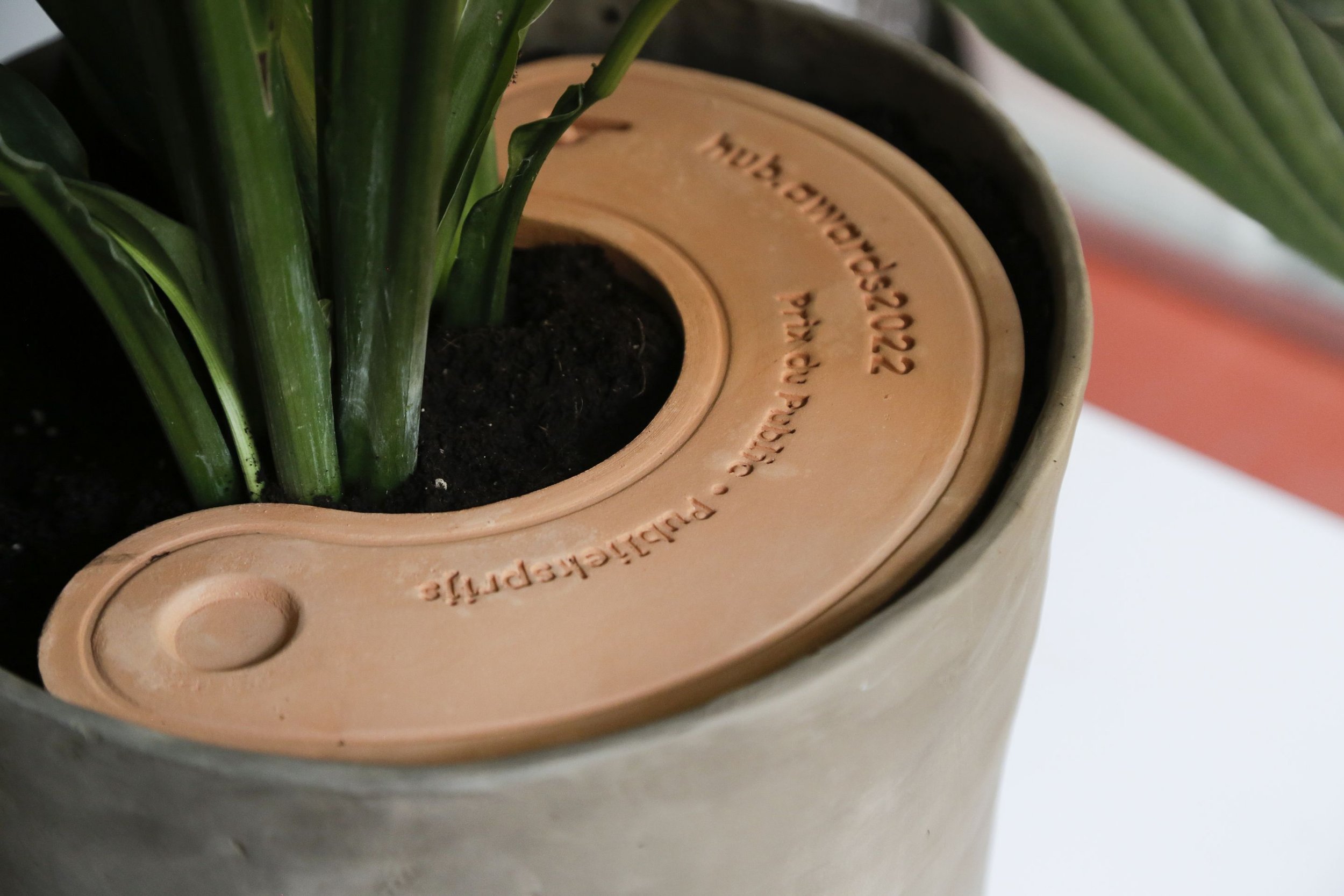
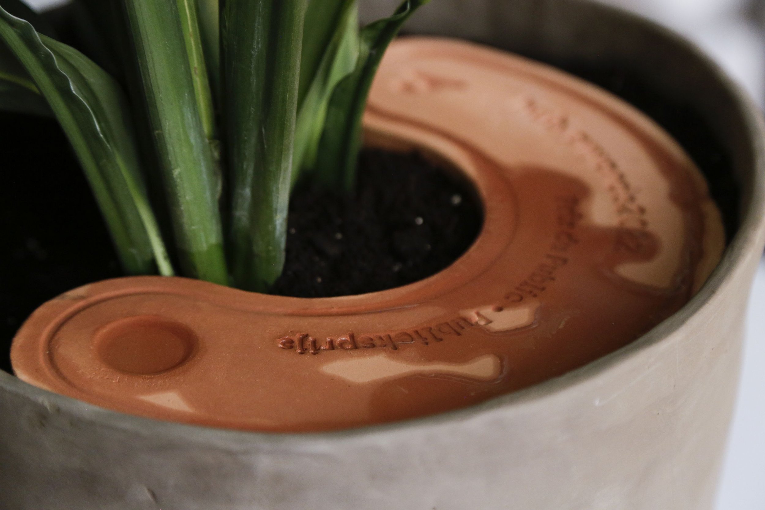
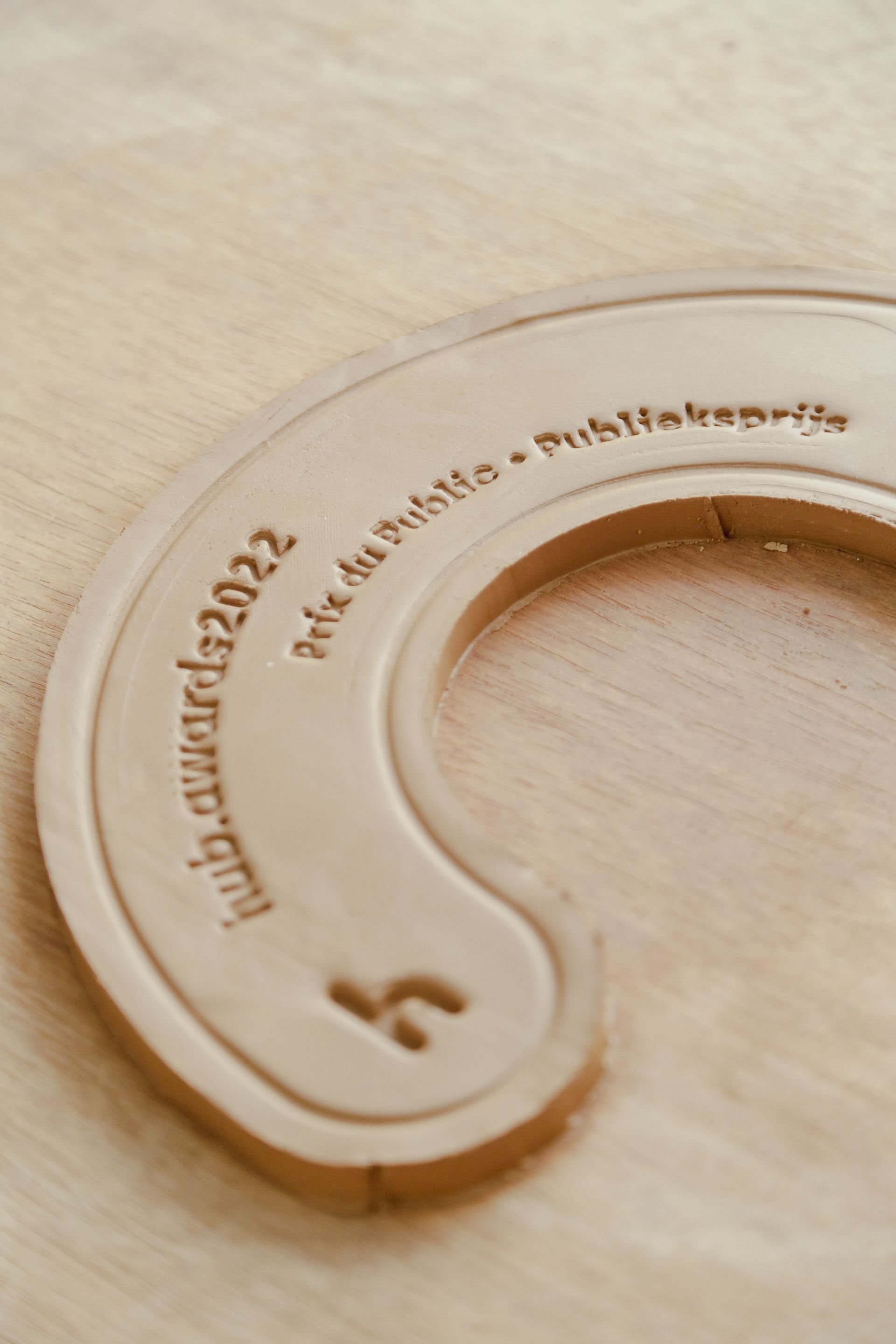
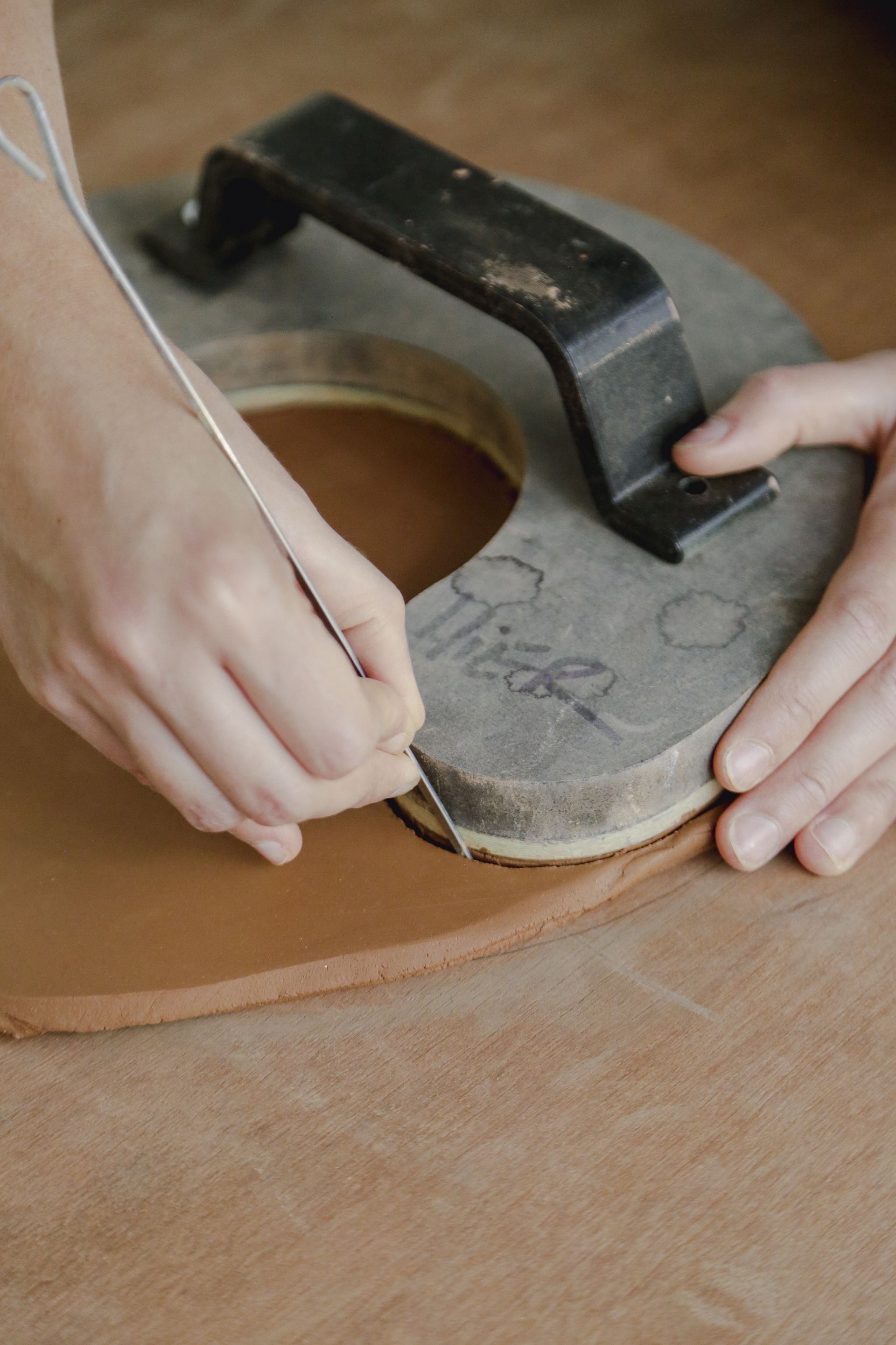
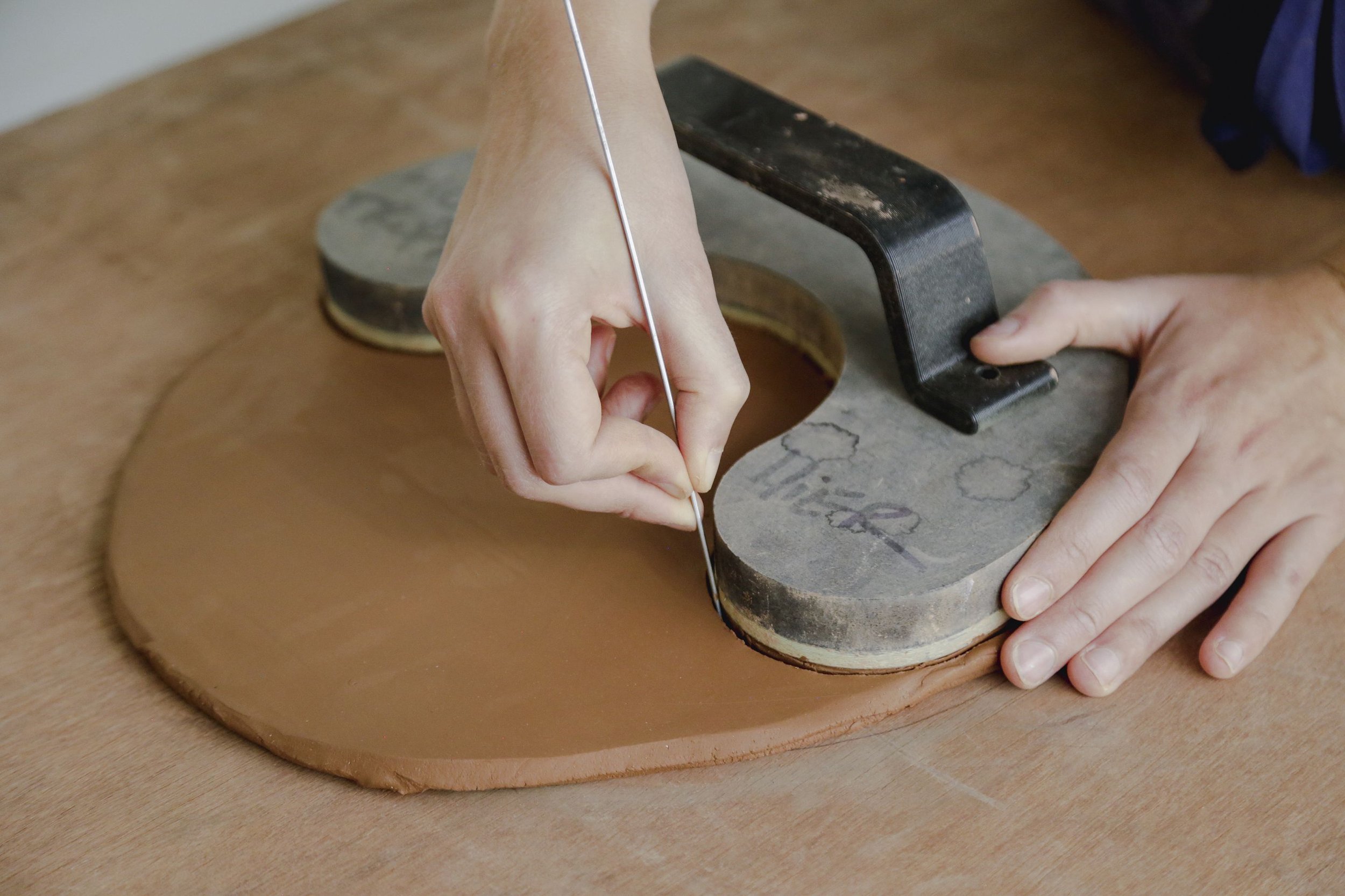
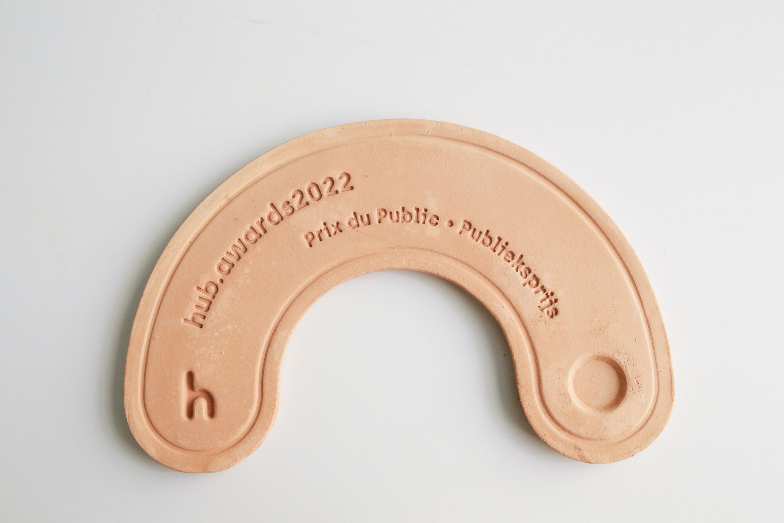
hub.awards2022
This is not a trophy. Not in a traditional sense anyway. It should not gather dust. It does not die on a shelve. It lives. It grows. It glows. Well no. It does not glow. But for sure evolves.
This is not a trophy. Not in a traditional sense anyway. It should not gather dust. It does not die on a shelve. It lives. It grows. It glows.
Well no. It does not glow. But for sure evolves.
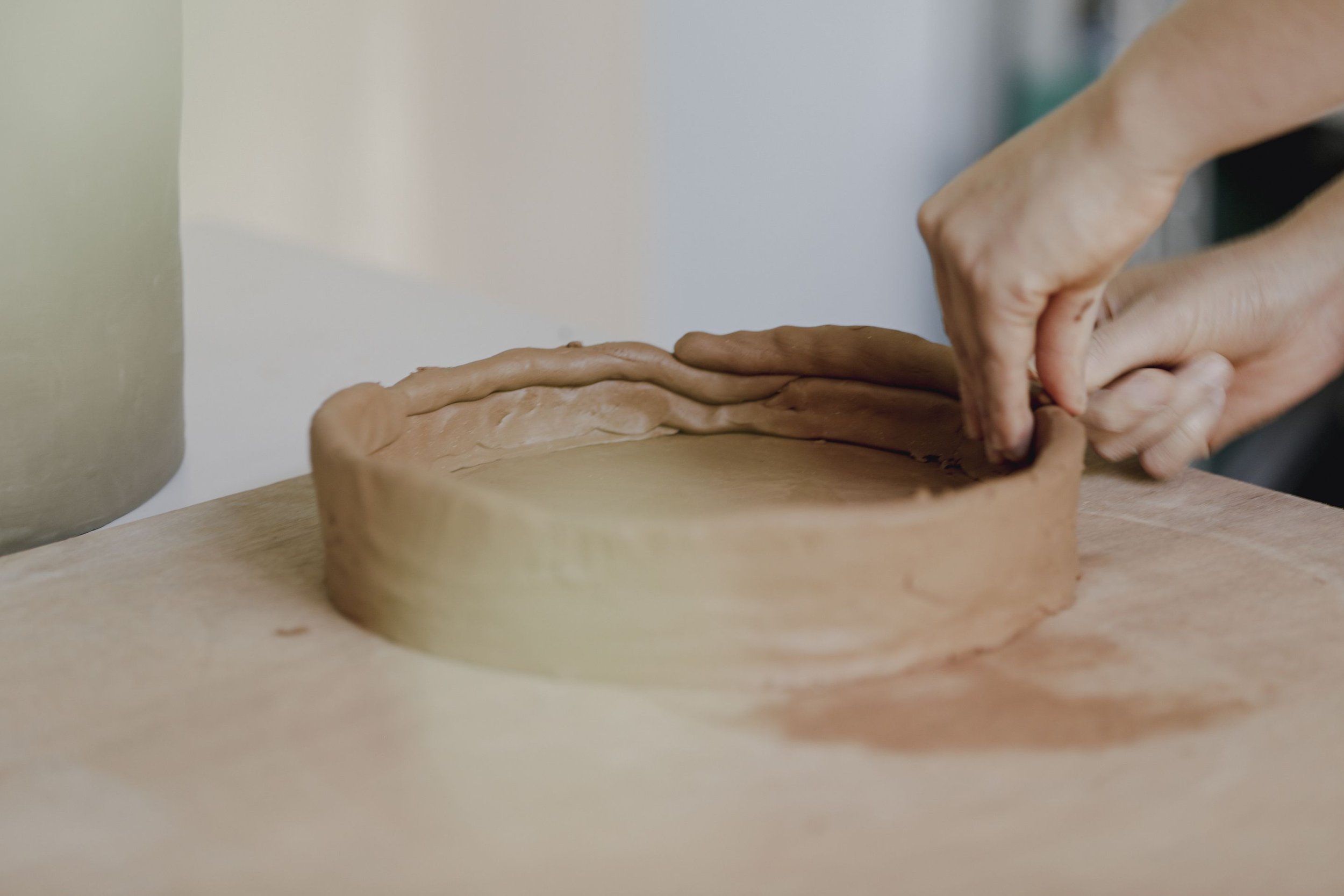
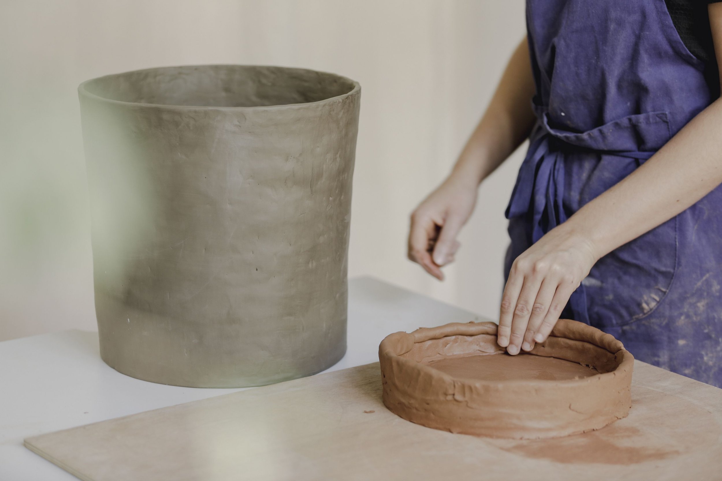
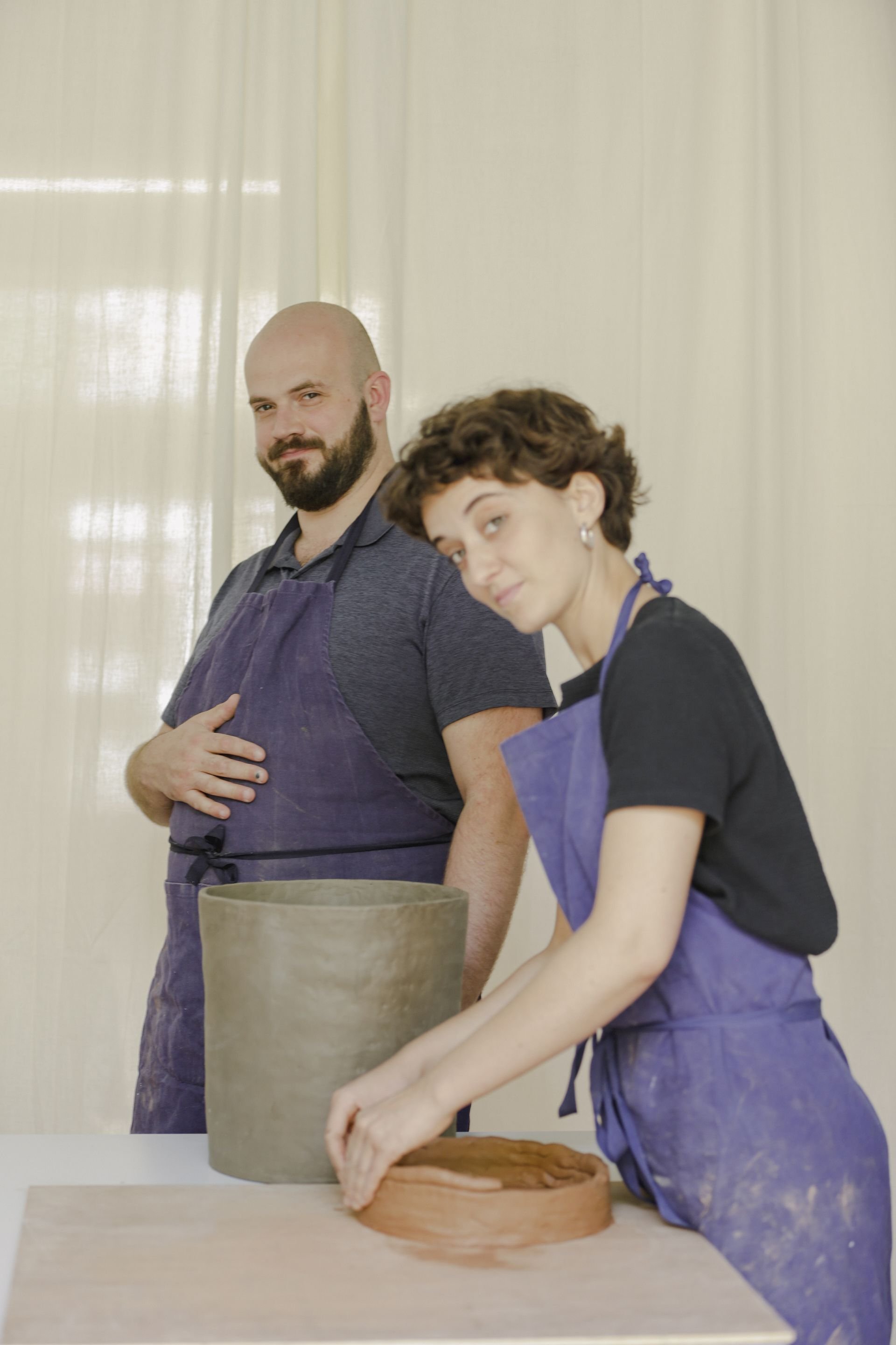
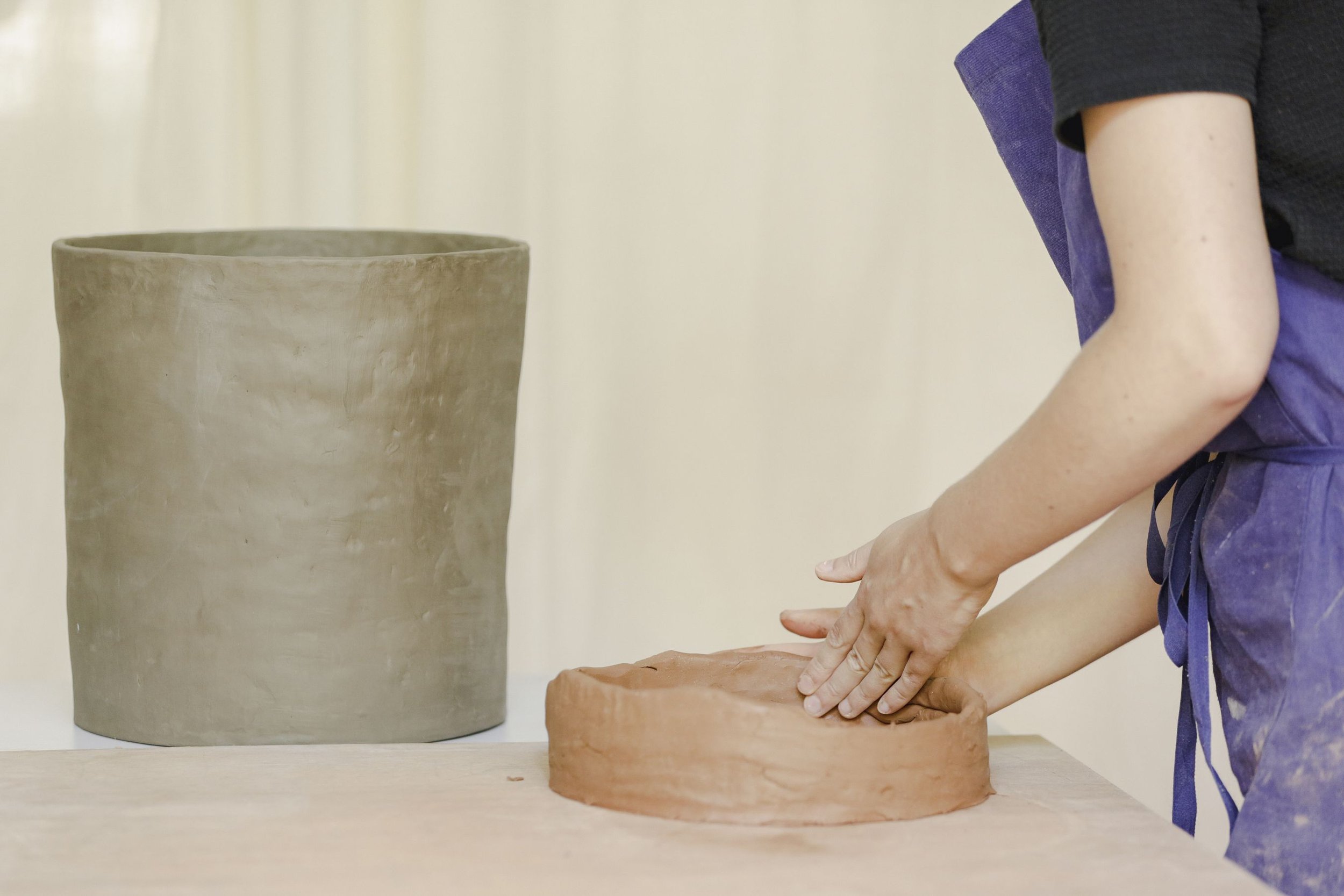
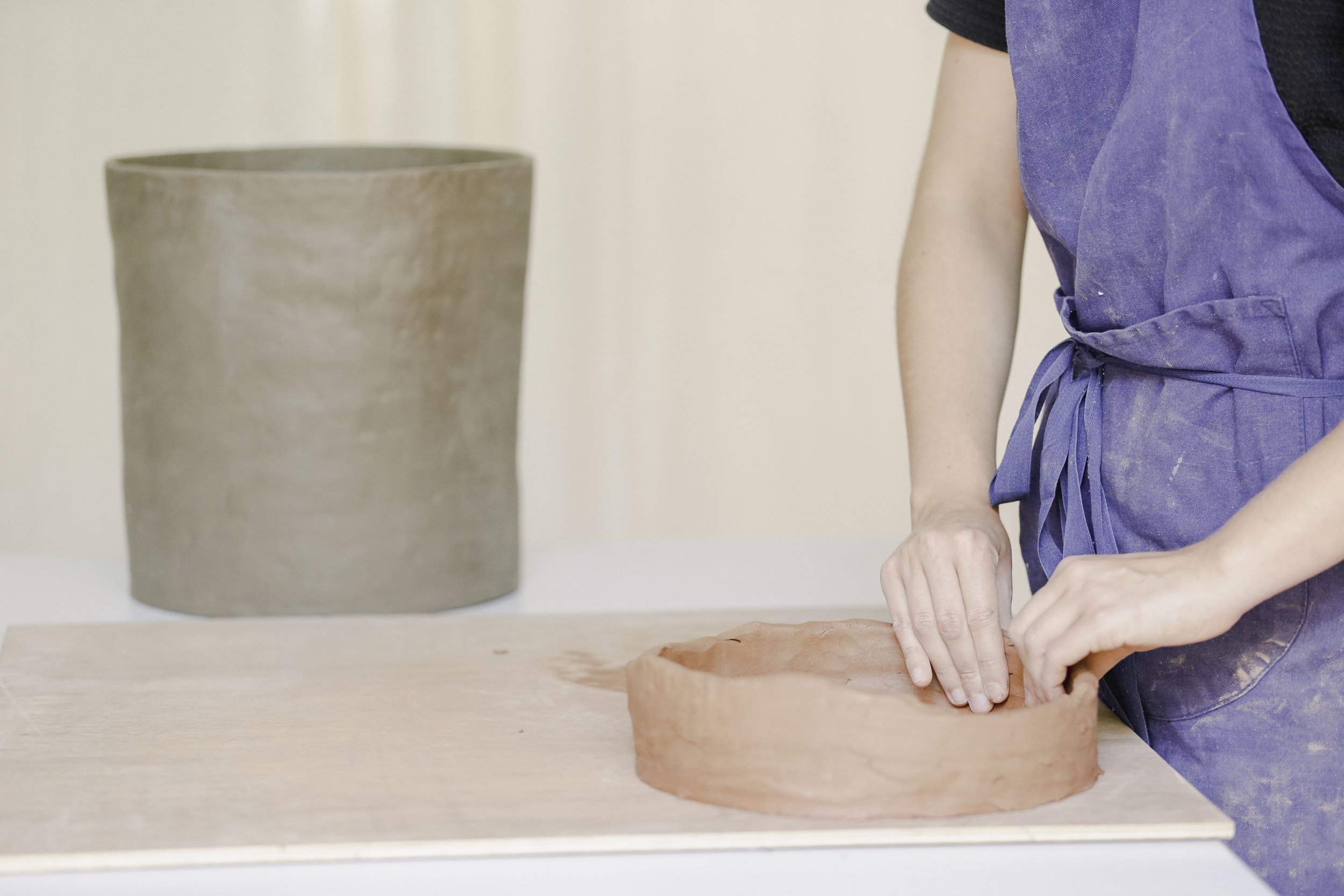
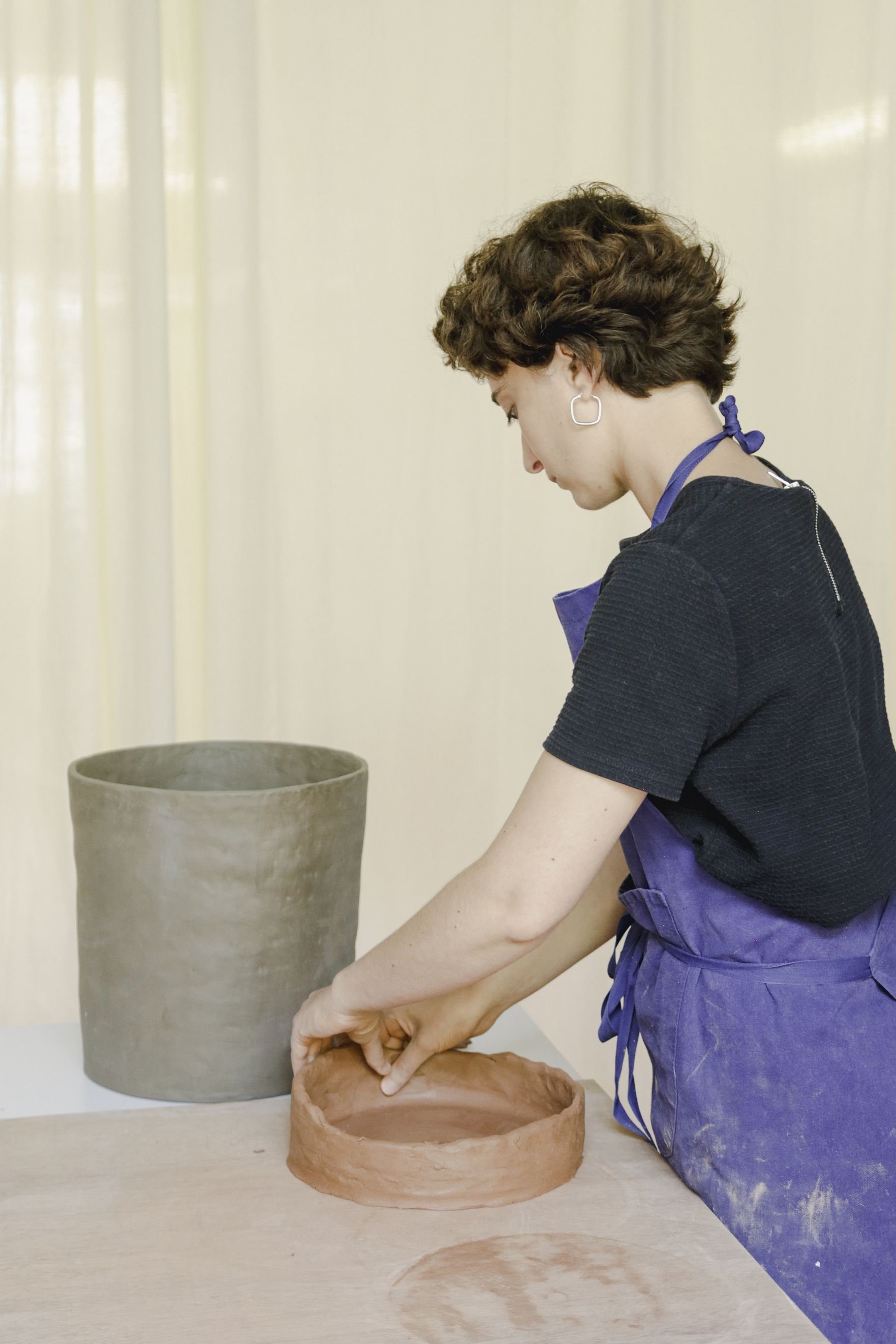
3 parts it gathers. The pot/container. The personalised mini trophy/retainer. And the plant/of life.
To each category a symbolic plant. Carefully chosen.
Each plant grows in hand made pot, made in Brussels, with Belgian earth.
Around each plant's neck sits a mini personalised trophy, that retains water and feeds the life. Made just like the pot. With Belgian earth.
A project for hub.brussels
Ceramics: Esther Bapsalle
Pics and video: Joe Khoury Studio
Special thanks: Justine Guichard

ACE
While the main sign is composed of floating letters slightly offset from the facade surface, the secondary signage uses the same material, brass, as a sheet, more like three of them spreading along the grid of the elevation, caressing the entrance of the school.

A prime new image for a cool secondary school: a new signage, for a new logo. This project is the fruit of a collaboration with Jihane Chartouni and Mohammad Hosso on graphic branding.
HIER designed, produced and installed, the physical manifestation of this new colourful logo: a brass signage, monochromatic, putting forward the geometry of the new logo, its elegance, and juxtaposing it with the sobriety of the architectural standing of the facade.


While the main sign is composed of floating letters slightly offset from the facade surface, the secondary signage uses the same material, brass, as a sheet, more like three of them spreading along the grid of the elevation, caressing the entrance of the school, and hand painted by our recurrent collaborator Maks Signs. Brass is a material that evolves with time, matures, grows a patina of time.


Send you children there >>> ACE


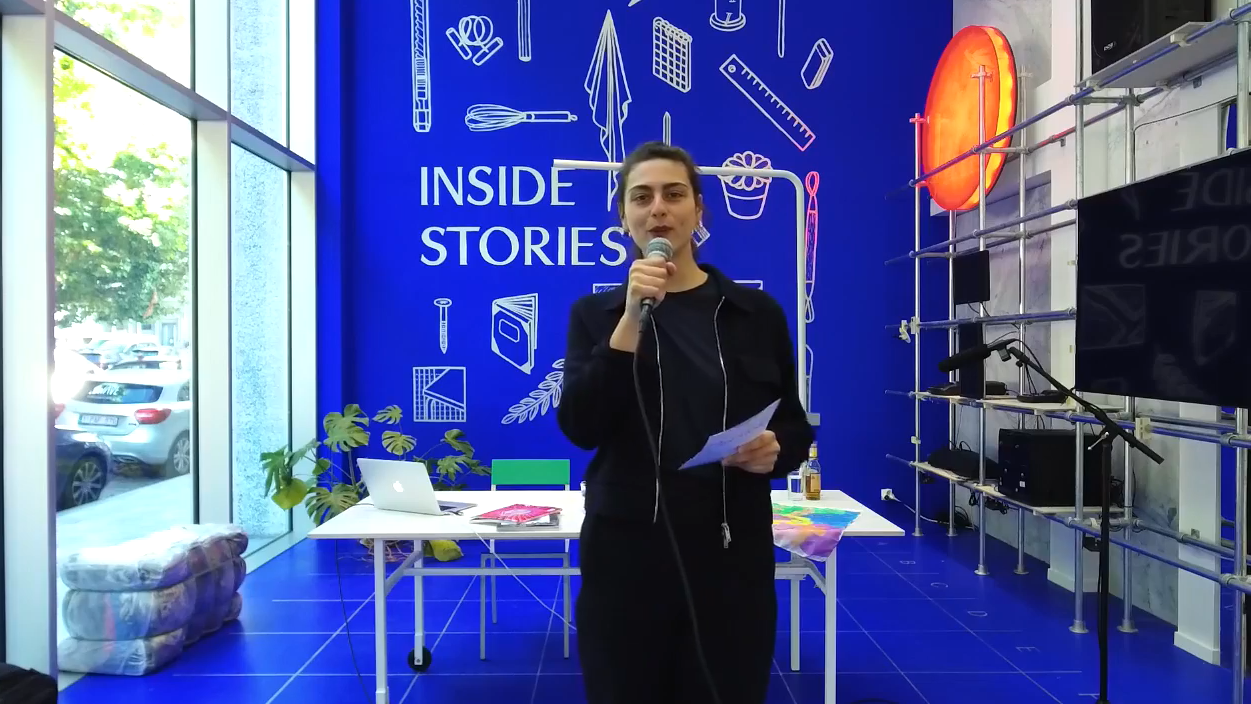
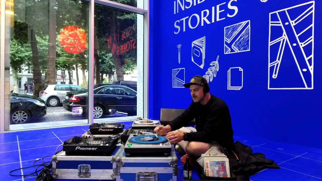
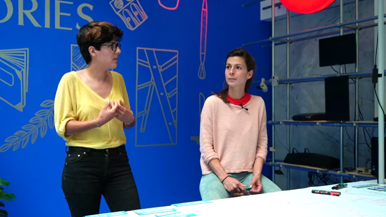
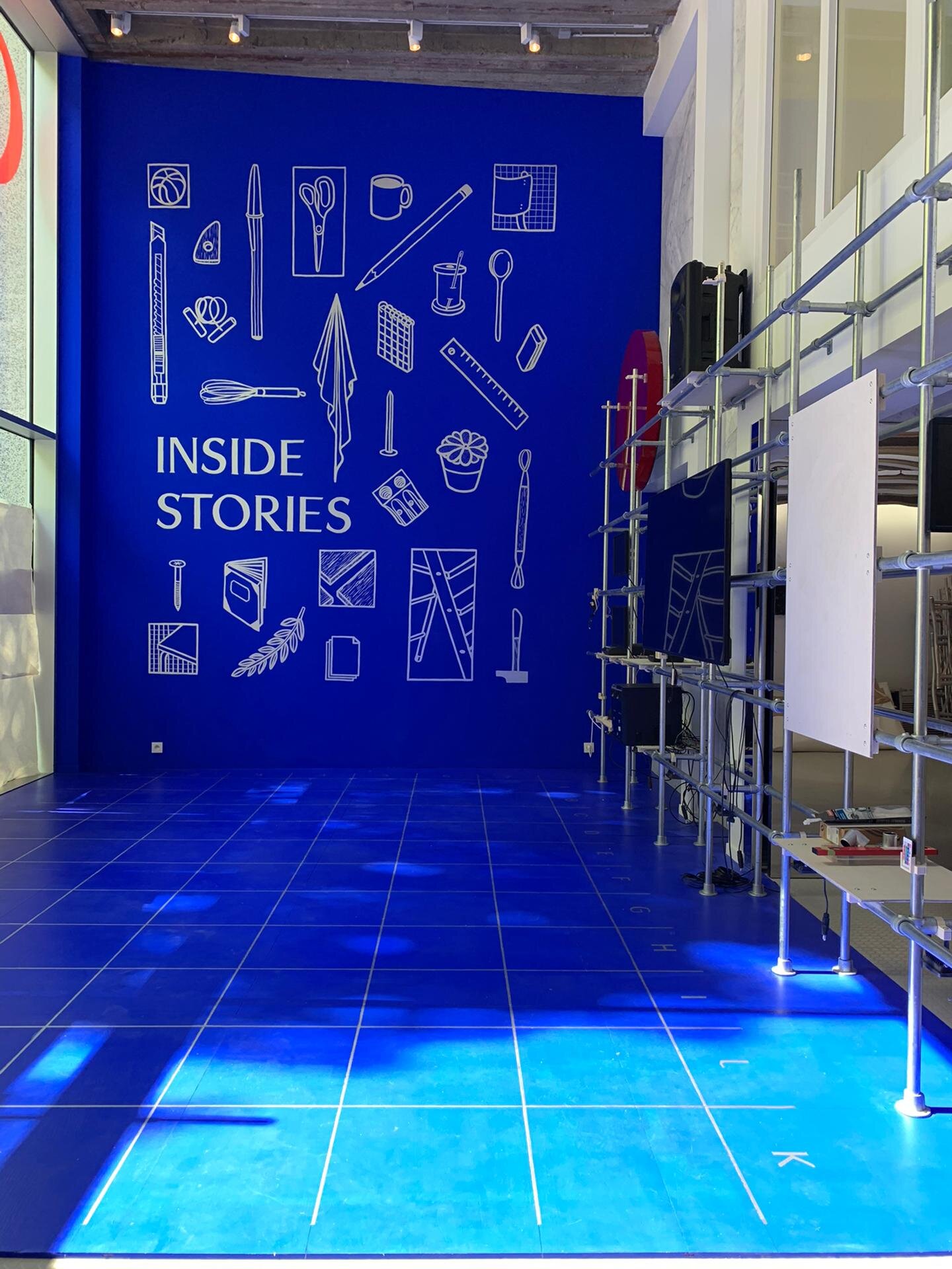
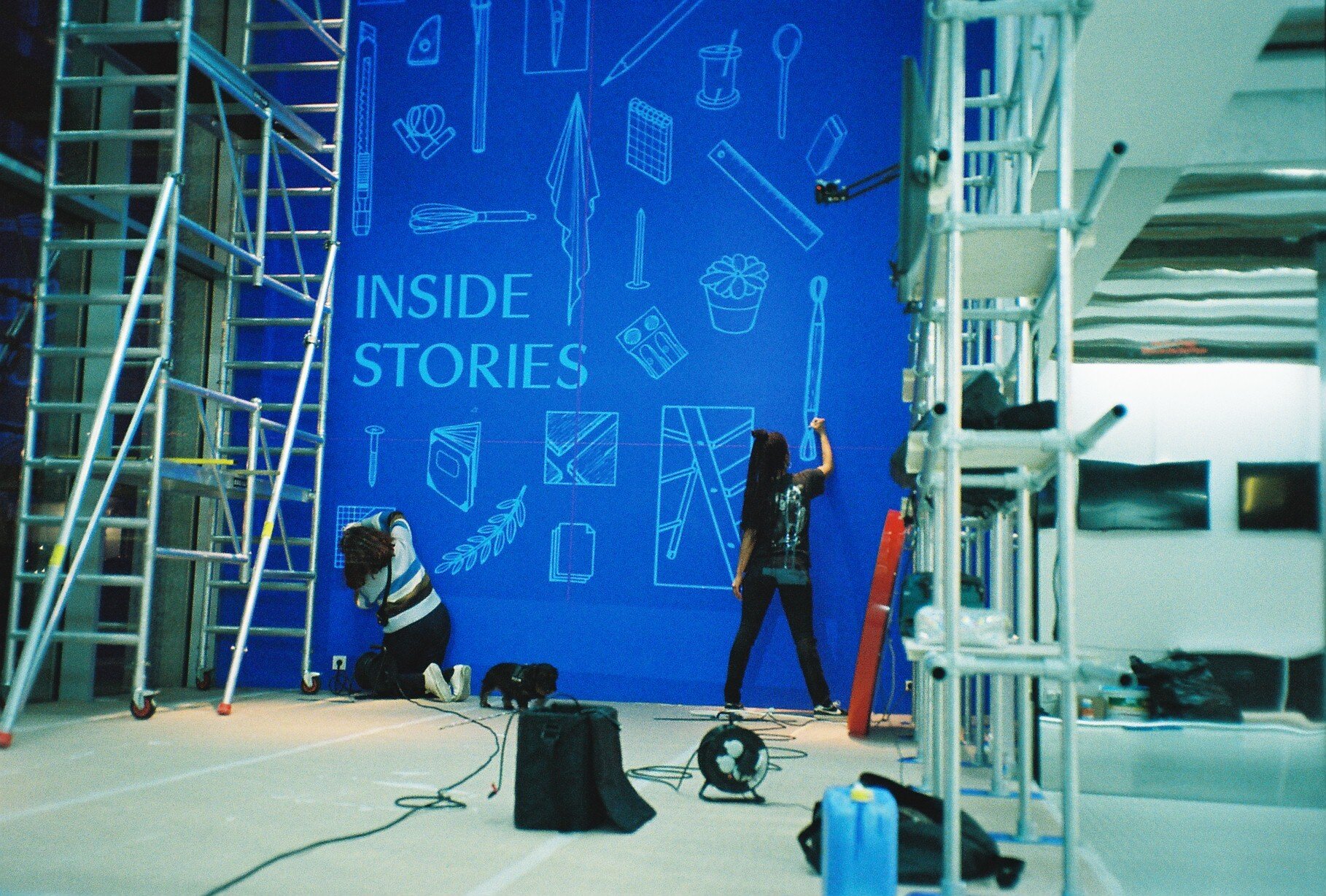
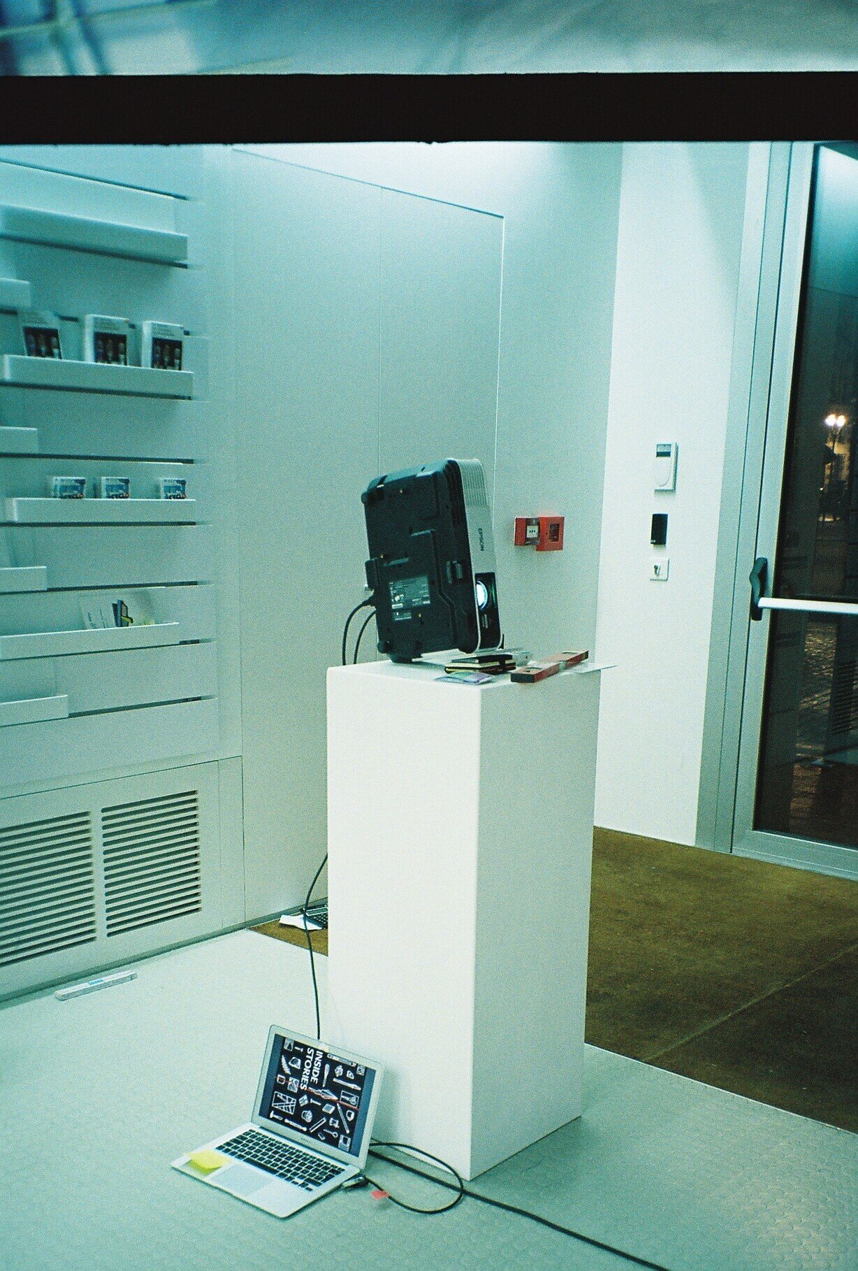
Inside Stories
A window of windows, of Inside Stories.
One of translation, transcription and essentially transmission.
This scenography, commissioned by MAD Home of Creators, is designed to host a series of fortunate events, from master classes to conferences and workshops.
A window of windows, of Inside Stories.
One of translation, transcription and essentially transmission.
This scenography, commissioned by MAD Home of Creators, is designed to host a series of fortunate events, from master classes to conferences and workshops.

We looked at the theatre as a space of transmission. From theatre to curtain. From a separating curtain to a technical curtain. A curtain of transmission. A frame of transmission. With one lighting element: the red mascot light that we previously conceived for MAD Home of Creators for the pop-up shop 100th Territory.
For the structure of the frame, we chose galvanised steel as it ages well, circular tubes for they could be easily assembled with ready-made connectors, reducing production operations.This system allows for reuse and flexibility for other events to come.

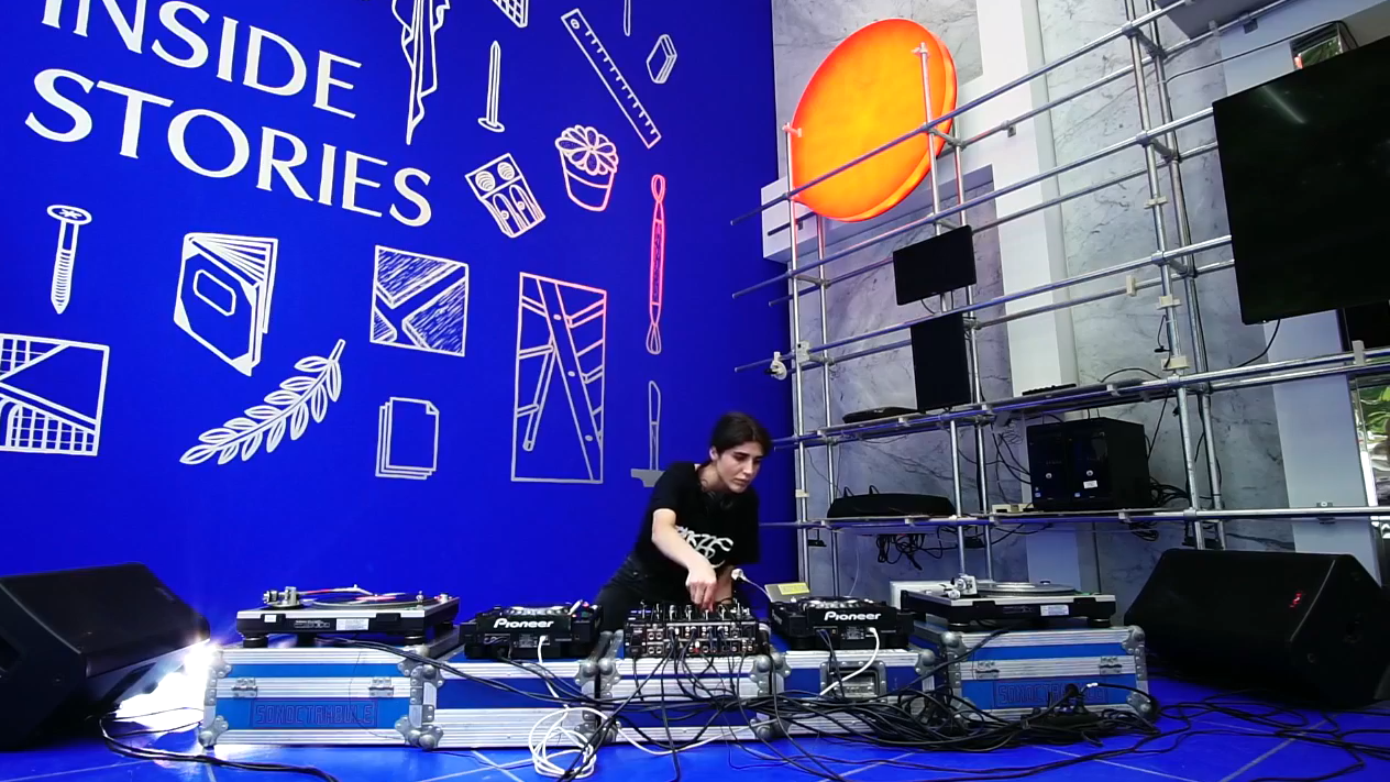
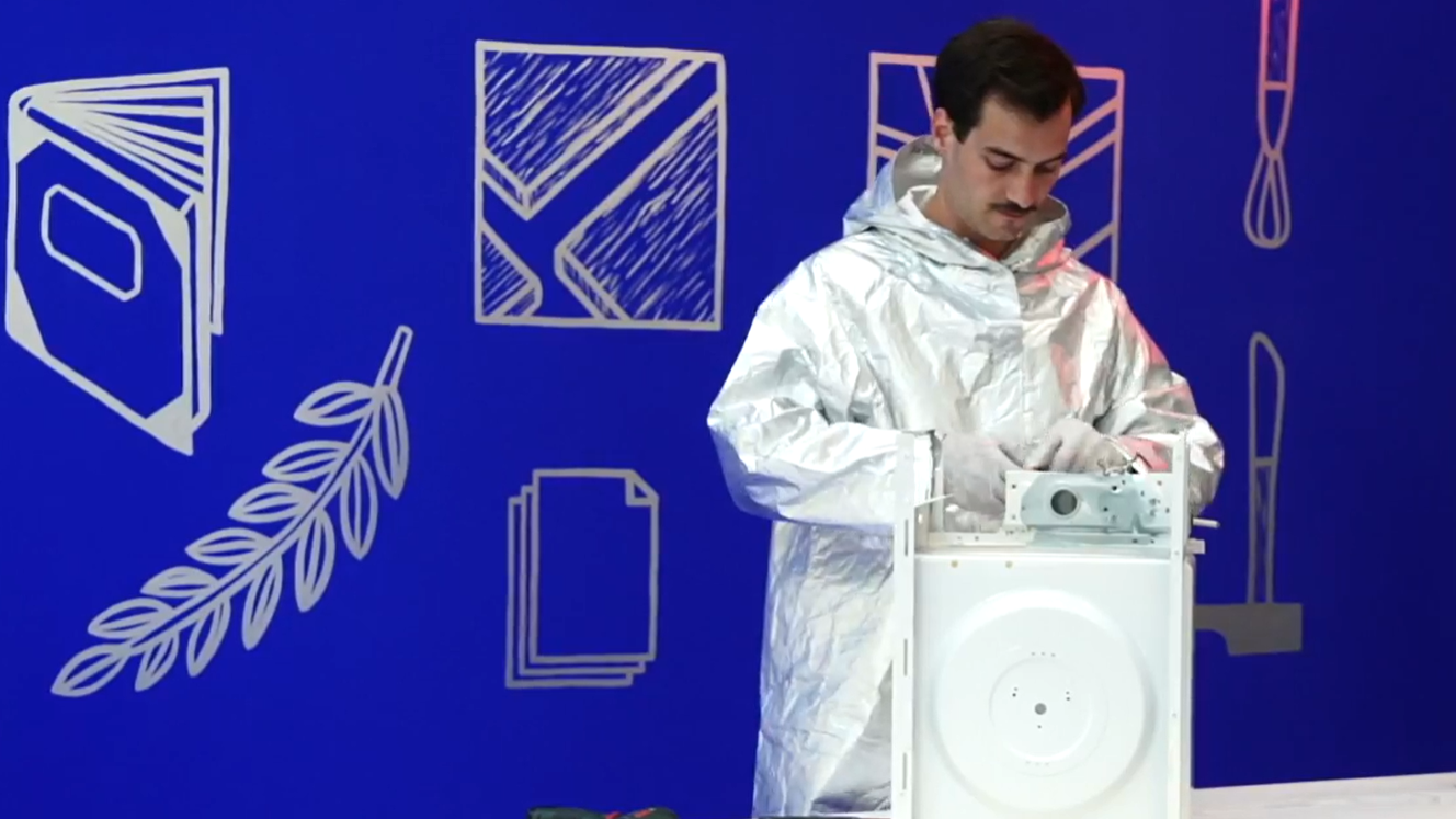
Inside Stories is a system
To the frame plug in the different tools of transcription. A camera capturing stills and top view moves, transmitting them on a screen. A tool that transcribes sound into words. A scanner that captures a digital imprint of a print. The content: Sound. Image. And text. All telling, the inside stories behind that window.
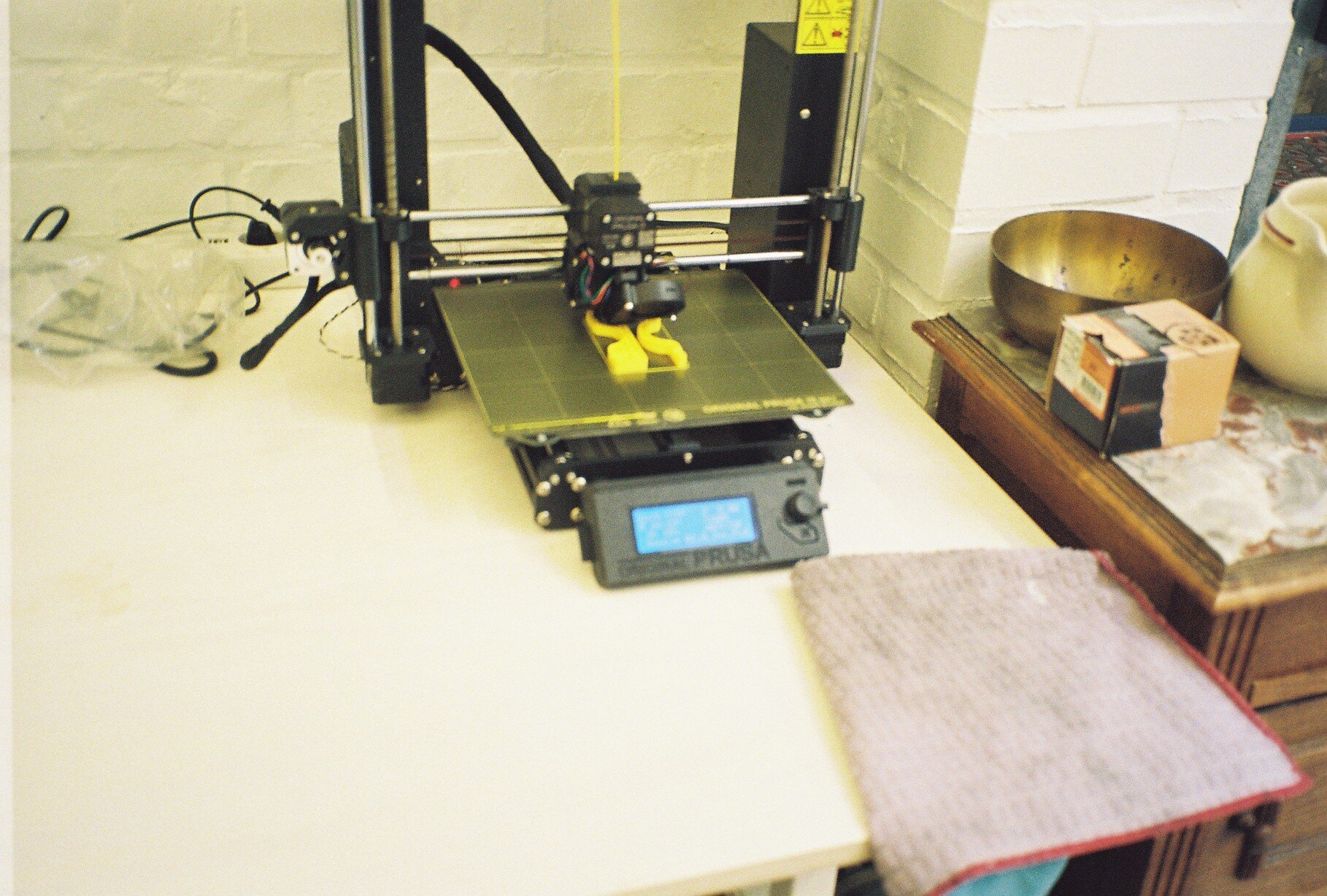
These different elements are fixed to the frame via home grown connectors that we customised and 3D printed with PLA, recyclable plastic.
All surfaces of the frame are cut out of material made from heat pressed residues of beer production.
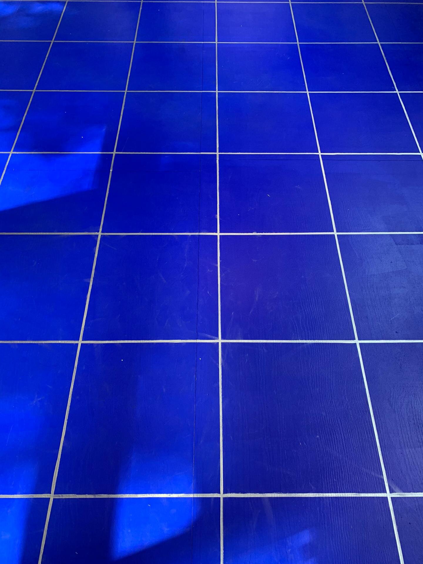
The spatial configuration is defined by an annotated grid hand marked on the floor on which the furniture moves and adapts to the different types of events happening in the window space. The grid on the floor follows the grid of the frame structure.
#WIP
This same grid serves as a ruler for the wall, allocating spaces for the collaboration with Shayto Badjoko: 20 illustrations translating the theme of Inside Stories, winking at the different participants and the tools that they use.
We kept the blue of Bureau Wolewinski from the previous MAD Window for it is a fantastic blue, and we would hate to waste a nicely painted wall. As for the furniture, we used those piling up in MAD’s storage, to put them at work, avoid waste and an extra layer on the storage pile, once the story of Inside Stories is dismantled.
Special thanks to our team. Special thanks to MAD’s team :)
You can replay all the lives, they are here.
Some pictures are from Eline Willaert

Signs 4 hub.brussels
While KOKOTTE is a food incubator, L’Auberge Espagnole is a retail incubator. Both are projects set by HUB Brussels to help businesses test their ideas before investing big. Both are constant spaces, with shops and restaurants varying throughout the year.

A signage for pop-up hosts.
While KOKOTTE is a food incubator, L’Auberge Espagnole is a retail incubator. Both are projects set by HUB Brussels to help businesses test their ideas before investing big. Both are constant spaces, with shops and restaurants varying throughout the year.
The brief was to design a signage that has integrated lighting and that allows for change, and adapt to every new business. The signage has both a constant part and a variable one. While the white structure always remains, the two surfaces attached to it ever change.

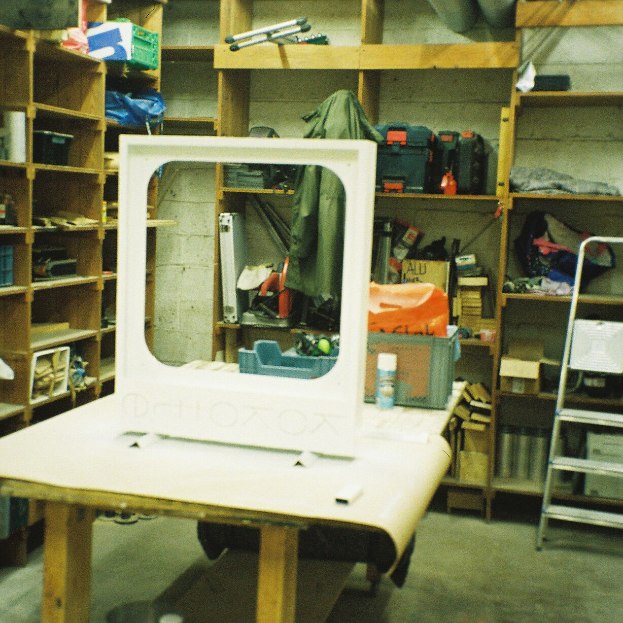
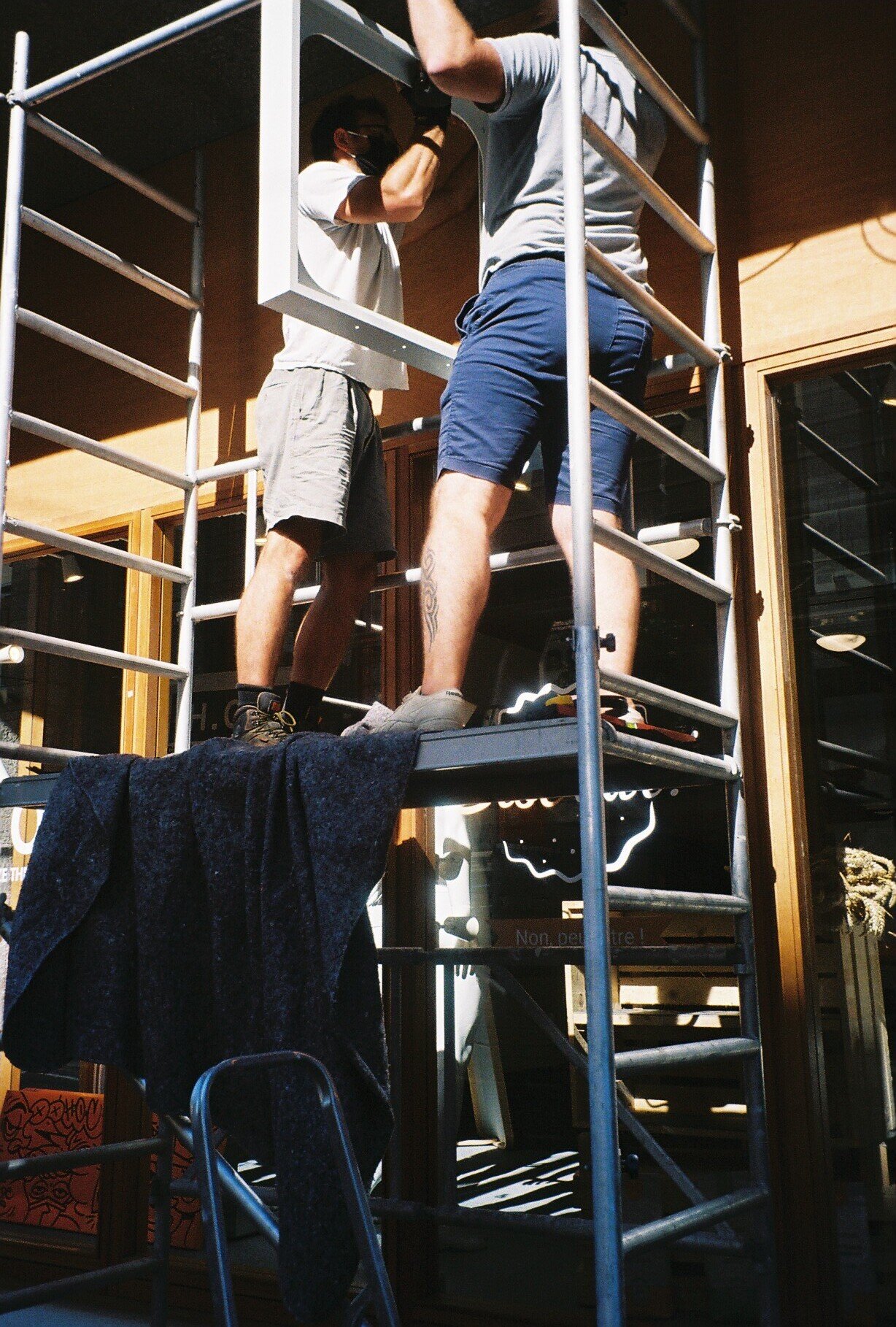
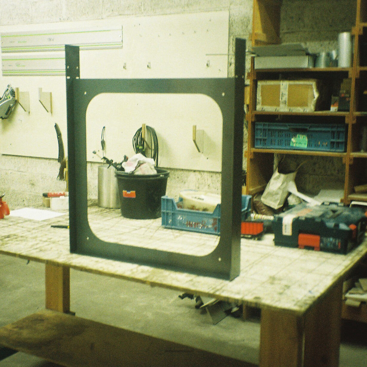
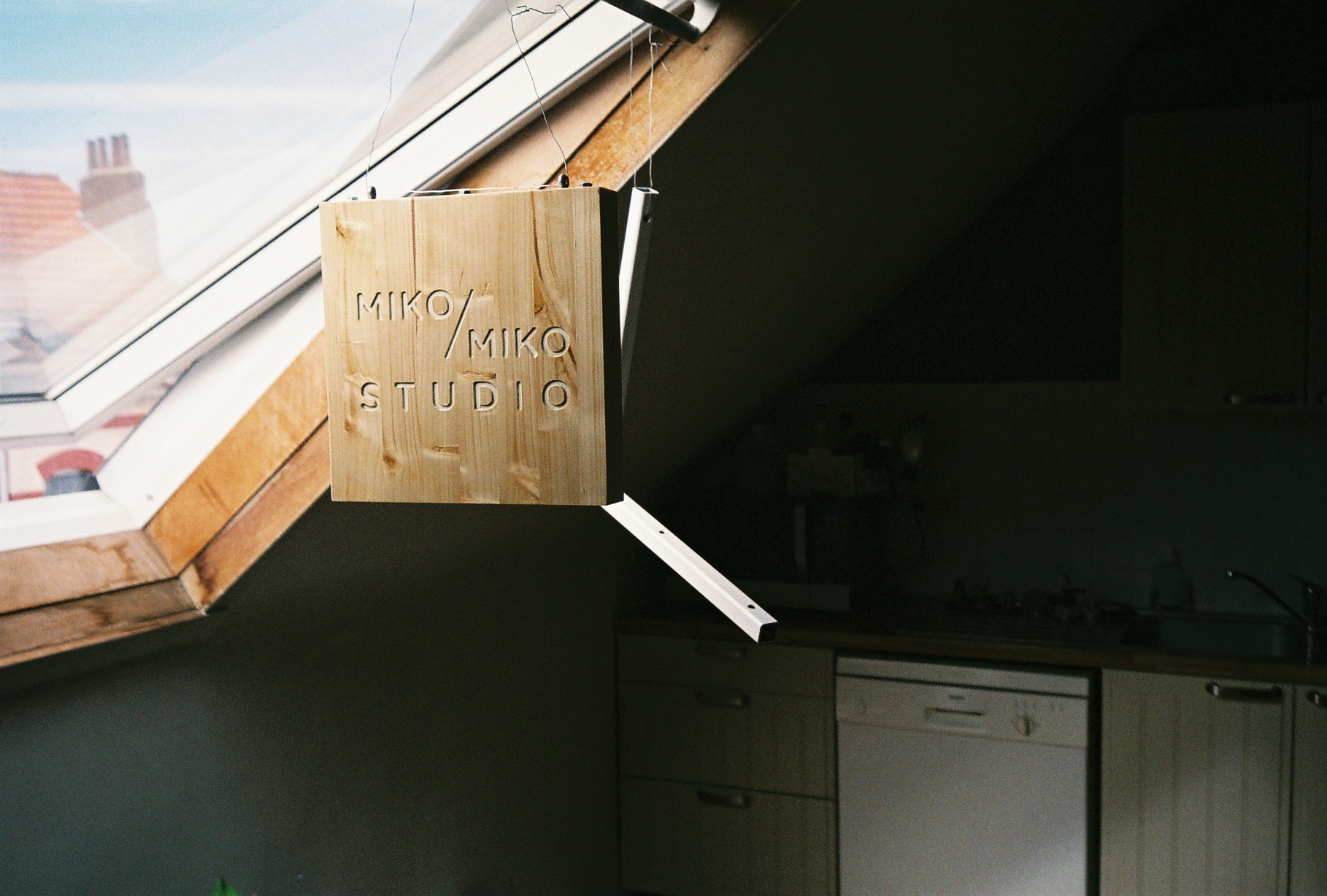
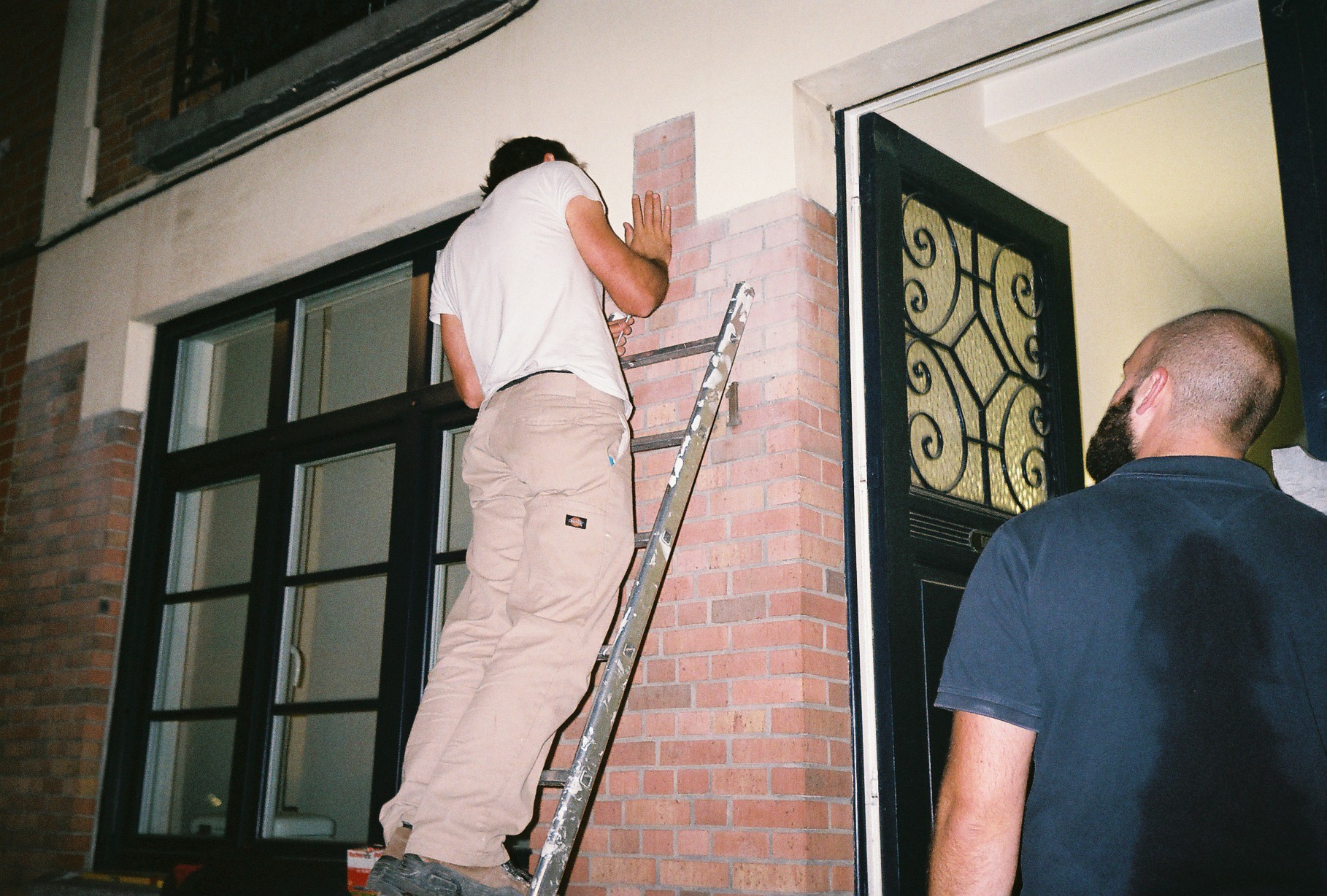
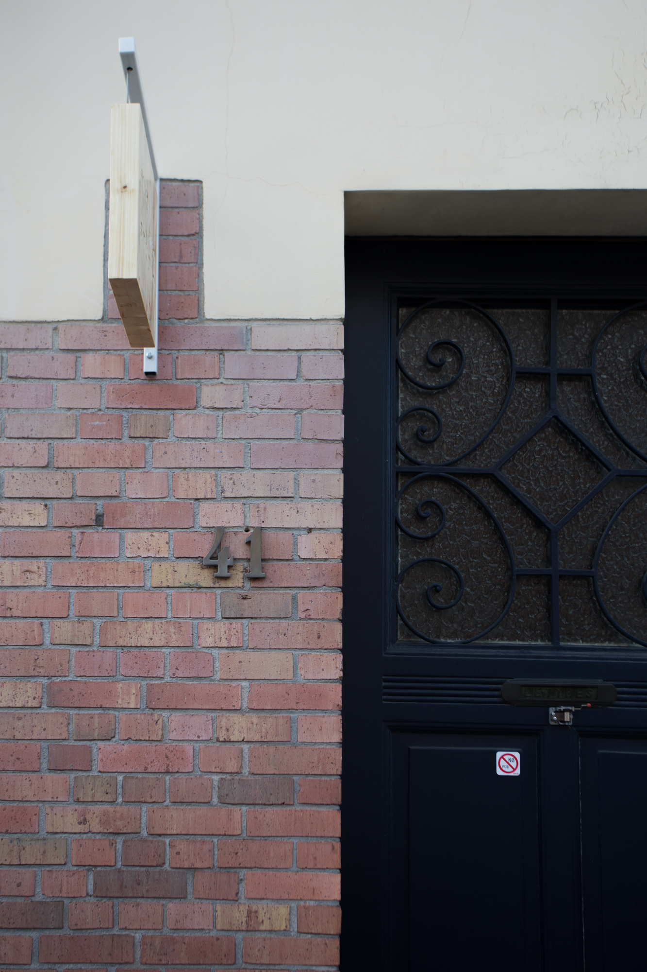
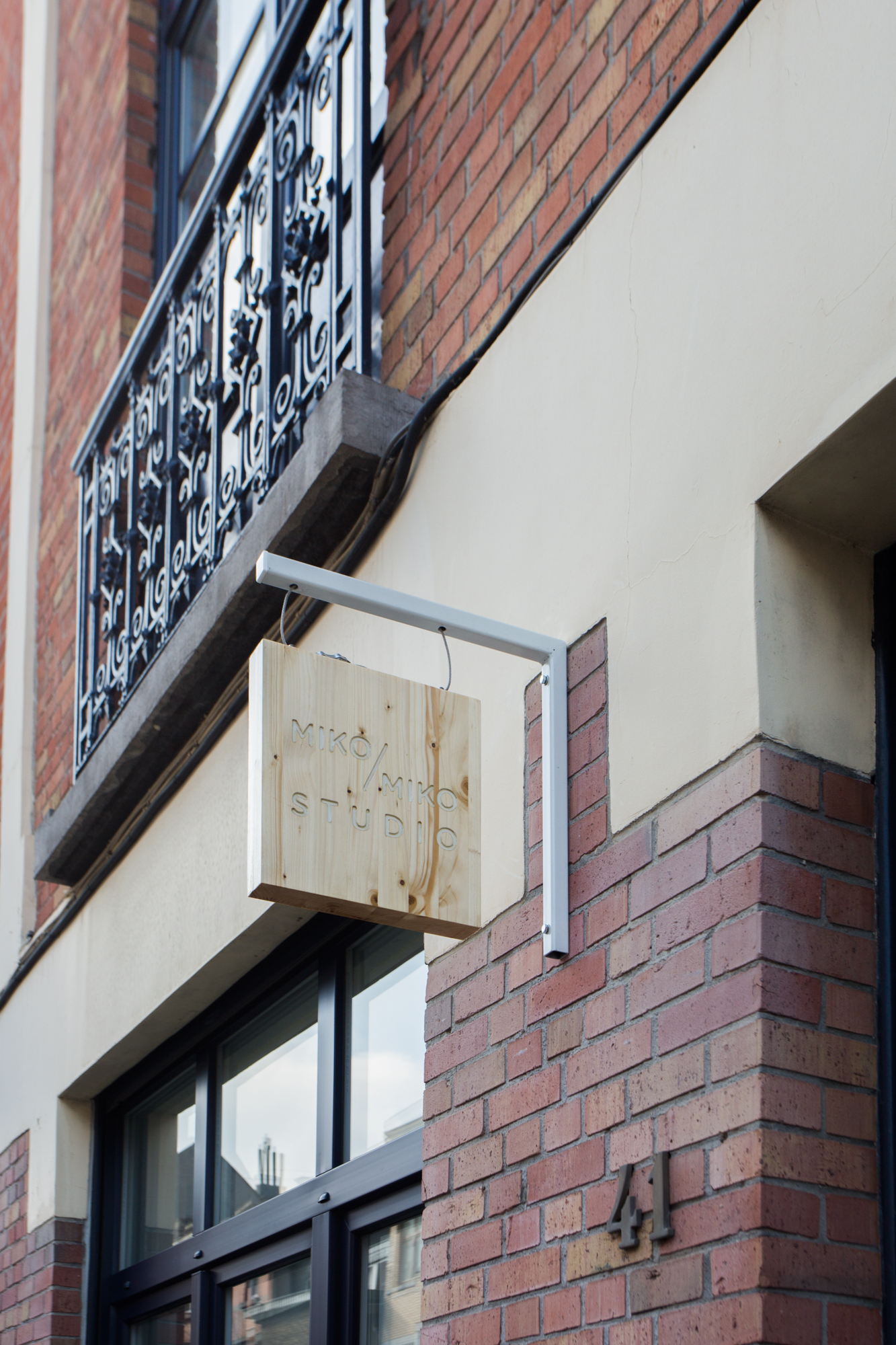
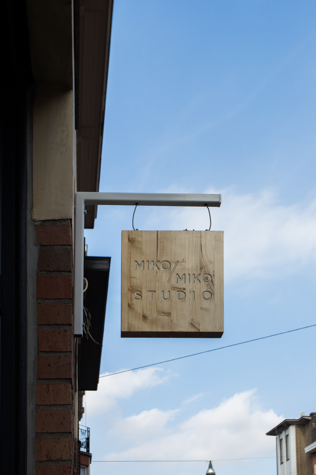
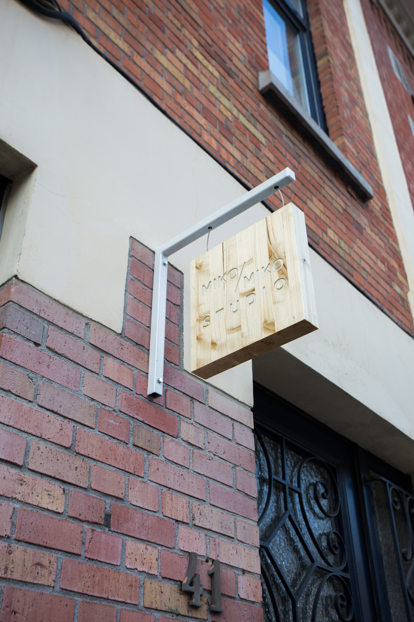
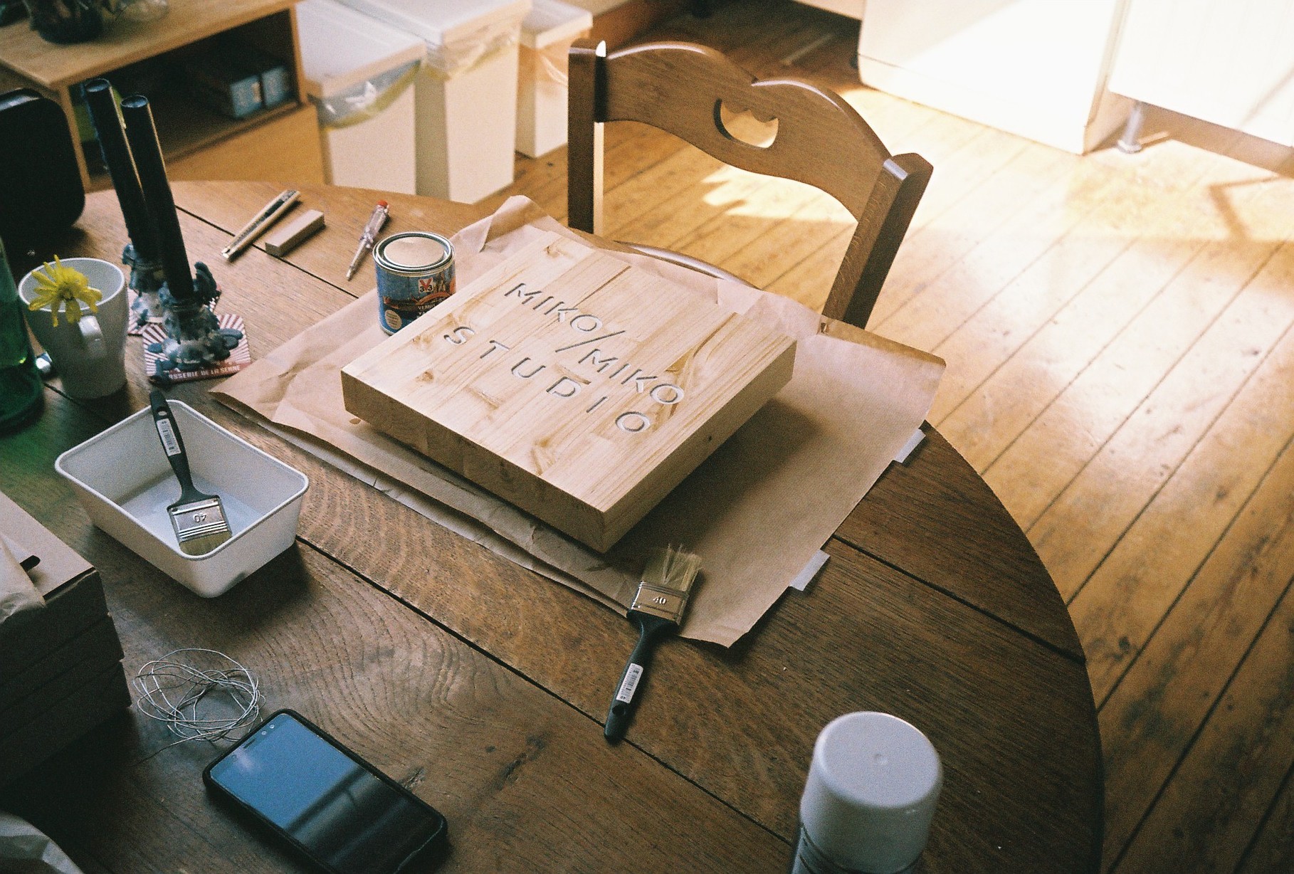
MIKO/MIKO Studio
A sign for MIKO/MIKO photography studio, inspired by Japanese Ramen restaurants


Culture Market
Culture market is an event that brings together art institutions from the Brussels region to meet and be able to present themselves to a wider public.

In times of need. In times of lack of time. We do reuse ideas from our library. If not “owned” or bespoke to another story. If it is justified.
Culture Market is an event that brings together art institutions from the Brussels region to meet and be able to present themselves to a wider public. Everything happened at the Halles Saint-Géry.
The event needed a display system that is eco-conscious, easily assembled, flexible, with a reasonable budget, and a fast production. On one hand a brand new design phase was going to affect the unchangeable deadline. On the other hand, the structural system we had developed for 1000 Lira w Lira was completely suitable for this project, so why redesign in this case?
We replicated the structure. Tweaked it. And assigned a new surface to it. With a material that fits better the colours of the story of this particular project.