ACE
A prime new image for a cool secondary school: a new signage, for a new logo. This project is the fruit of a collaboration with Jihane Chartouni and Mohammad Hosso on graphic branding.
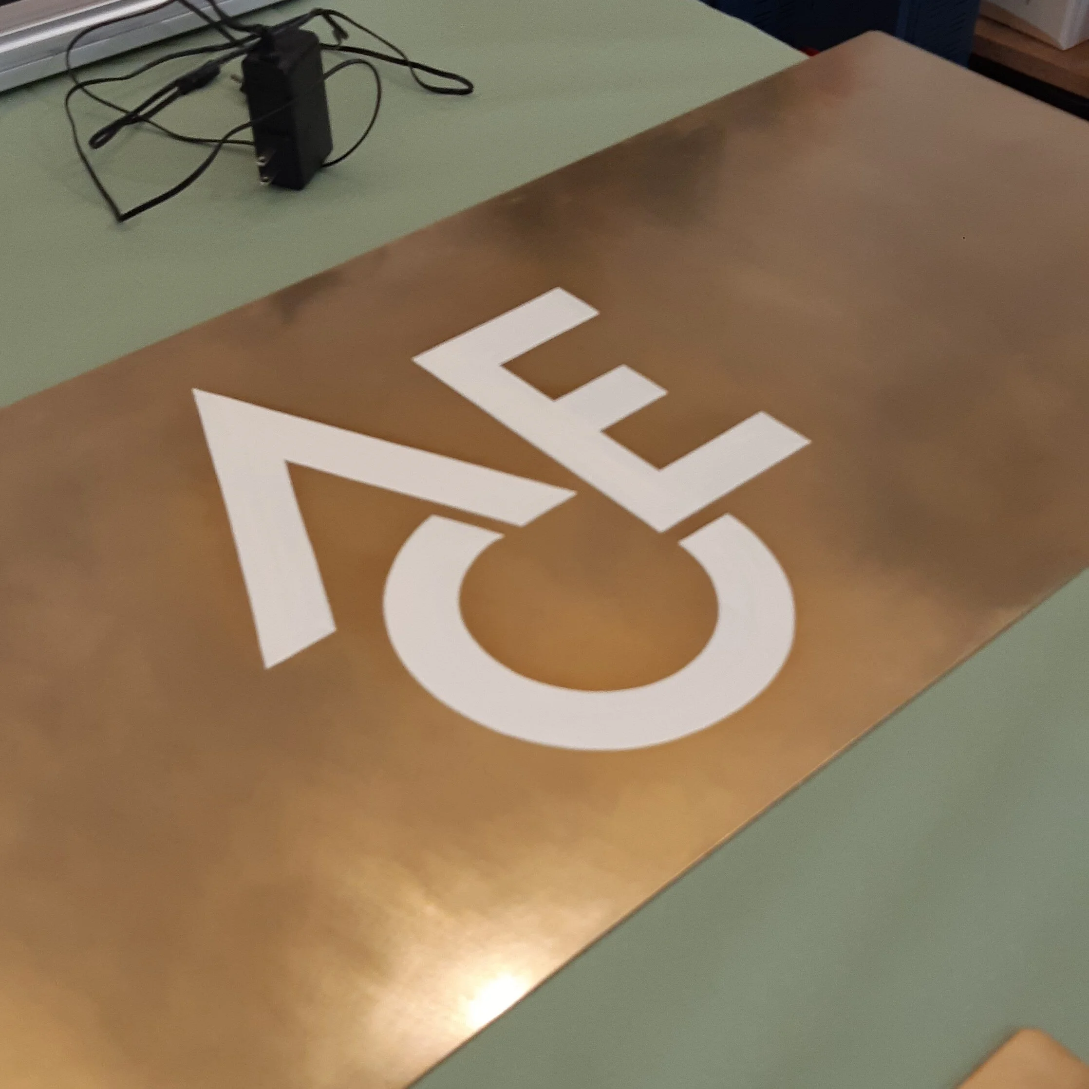
HIER designed, produced and installed, the physical manifestation of this new colourful logo: a brass signage, monochromatic, putting forward the geometry of the new logo, its elegance, and juxtaposing it with the sobriety of the architectural standing of the facade.
While the main sign is composed of floating letters slightly offset from the facade surface, the secondary signage uses the same material, brass, as a sheet, more like three of them spreading along the grid of the elevation, caressing the entrance of the school, and hand painted by our recurrent collaborator Maks Signs. Brass is a material that evolves with time, matures, grows a patina of time.
Send you children there >>> ACE


