Rayon belge
Rayon belge is a family business that specializes in providing smart / elegant display solutions for shops, homes, work and cultural spaces.
Rayon belge is a family business that specializes in providing smart / elegant display solutions for shops, homes, work and cultural spaces. Our focus is on combining functionality with aesthetics, offering high-quality shelving systems, to store, organise and display, enhancing the look and efficiency of all kind of spaces. Our journey began with a mission to design shelving systems that meet the specific needs of Belgian shop owners. We offer a comprehensive range of shelving systems that are of superior quality and designed to adapt to the evolving market needs. Innovation is at the core of our approach, allowing us to propose futuristic solutions that address the ever-changing demands of the industry. What sets rayon belge apart are two things. First, as a team of architects and designers, we offer more than just product. We bring scenography expertise and advice to the table, we install the products, and we take care of maintenance: a full set of services to make the list of worries of business owners shorter. Second is our innovative rental approach for our display systems. Recognising the dynamic nature of Belgian shop owners and their evolving challenges, we have chosen to offer renting as an option to buying the systems. This unique approach provides businesses with the opportunity to benefit from new display solutions without making a significant upfront investment. It offers flexibility and room for growth, which is particularly valuable for starting businesses that are still discovering their needs or those of their clients.


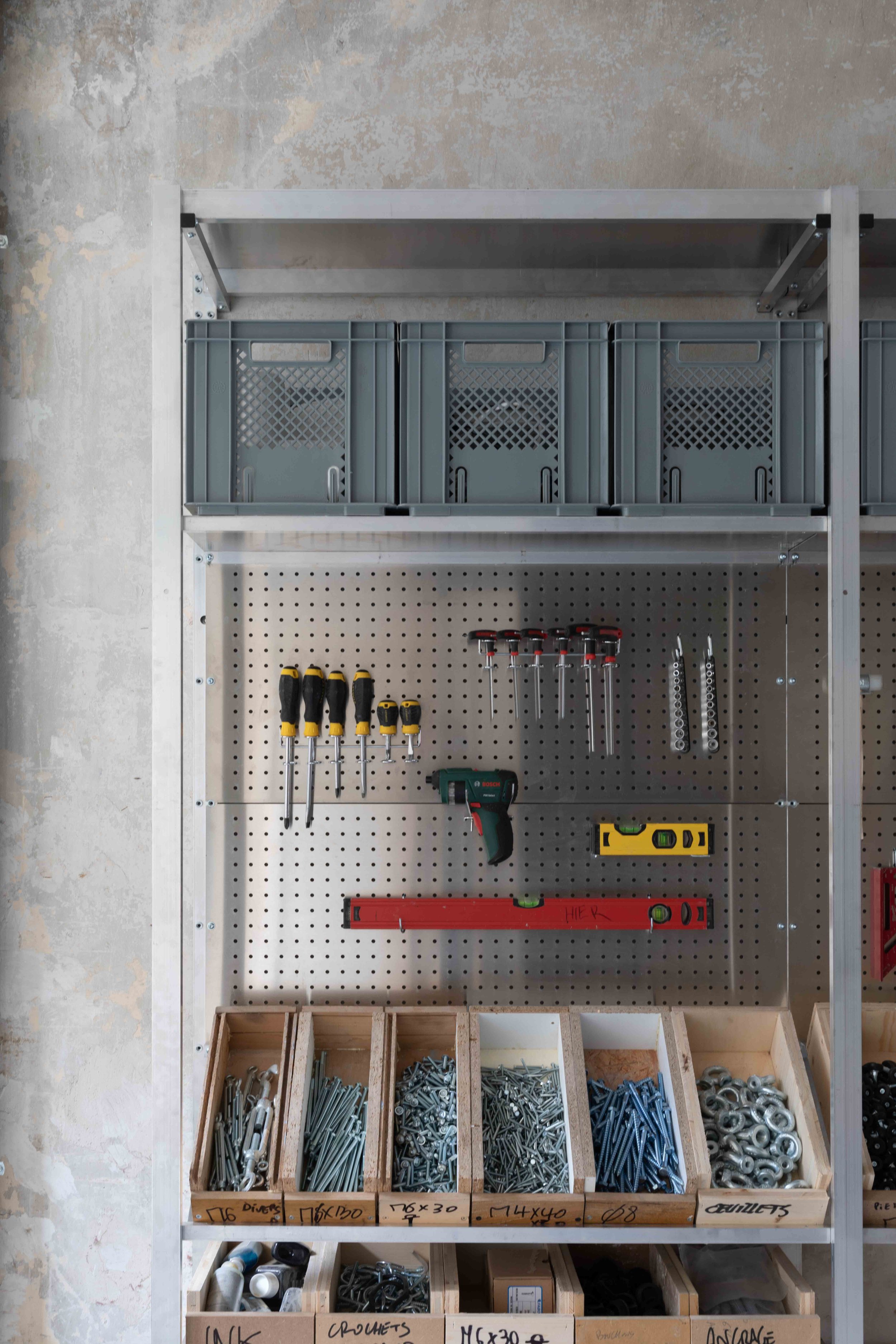


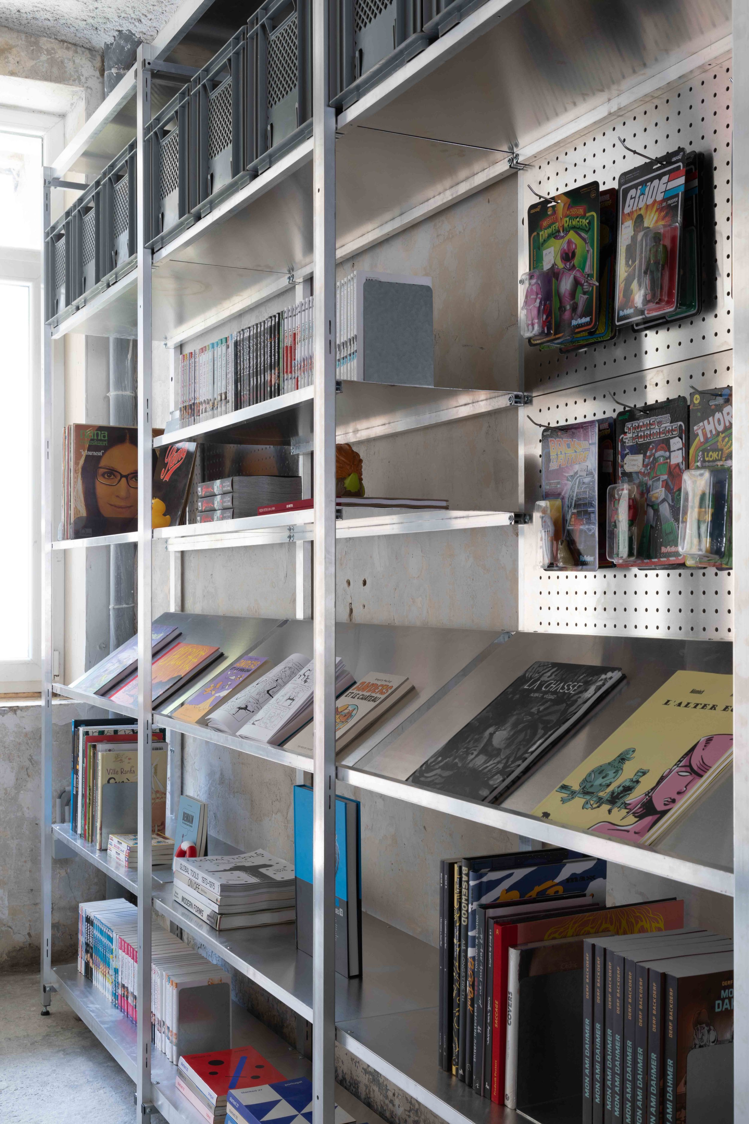

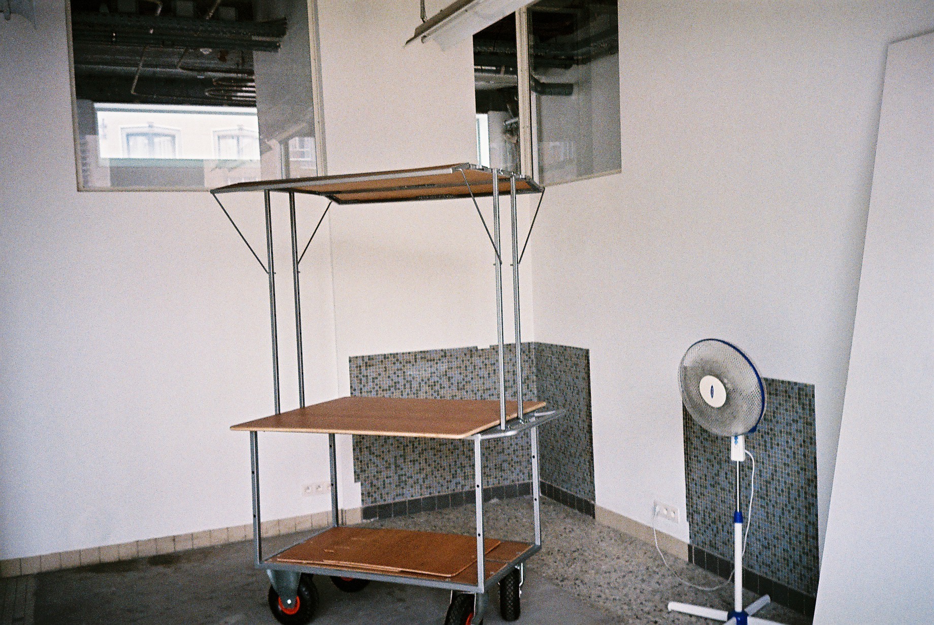
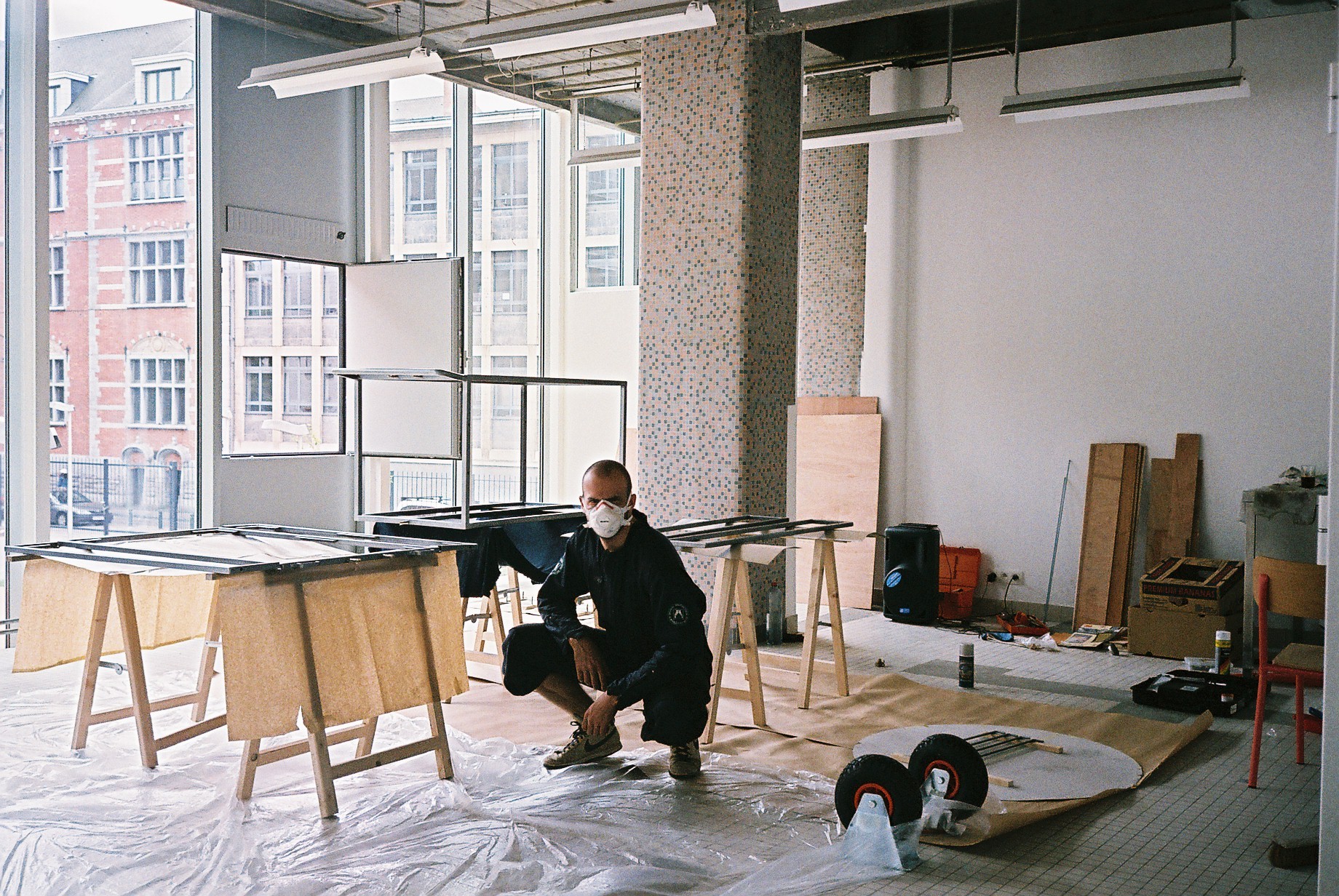
S.alu is our first shelving system, in raw aluminum, lightweight, completely recyclable and easily transportable on a trailer bike. It is designed to serve the needs of shops or cultural spaces, but could also be used for other kinds of spaces, such as a home or a workspace. S.alu is to be fixed on a wall or doubled, back-to-back, to free-stand. It comes in same depth and width but in four different heights, to best adapt to your space and user experience.
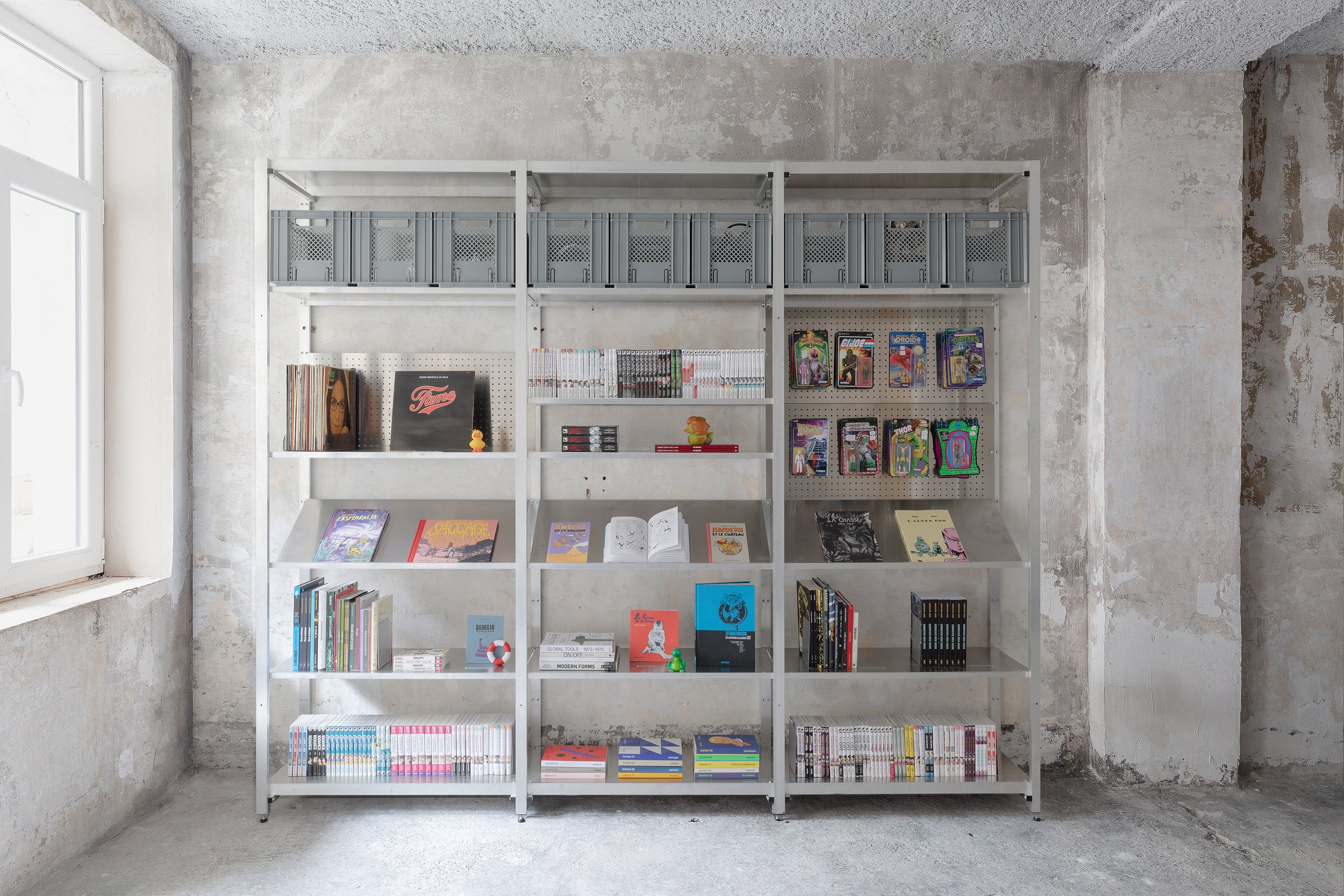
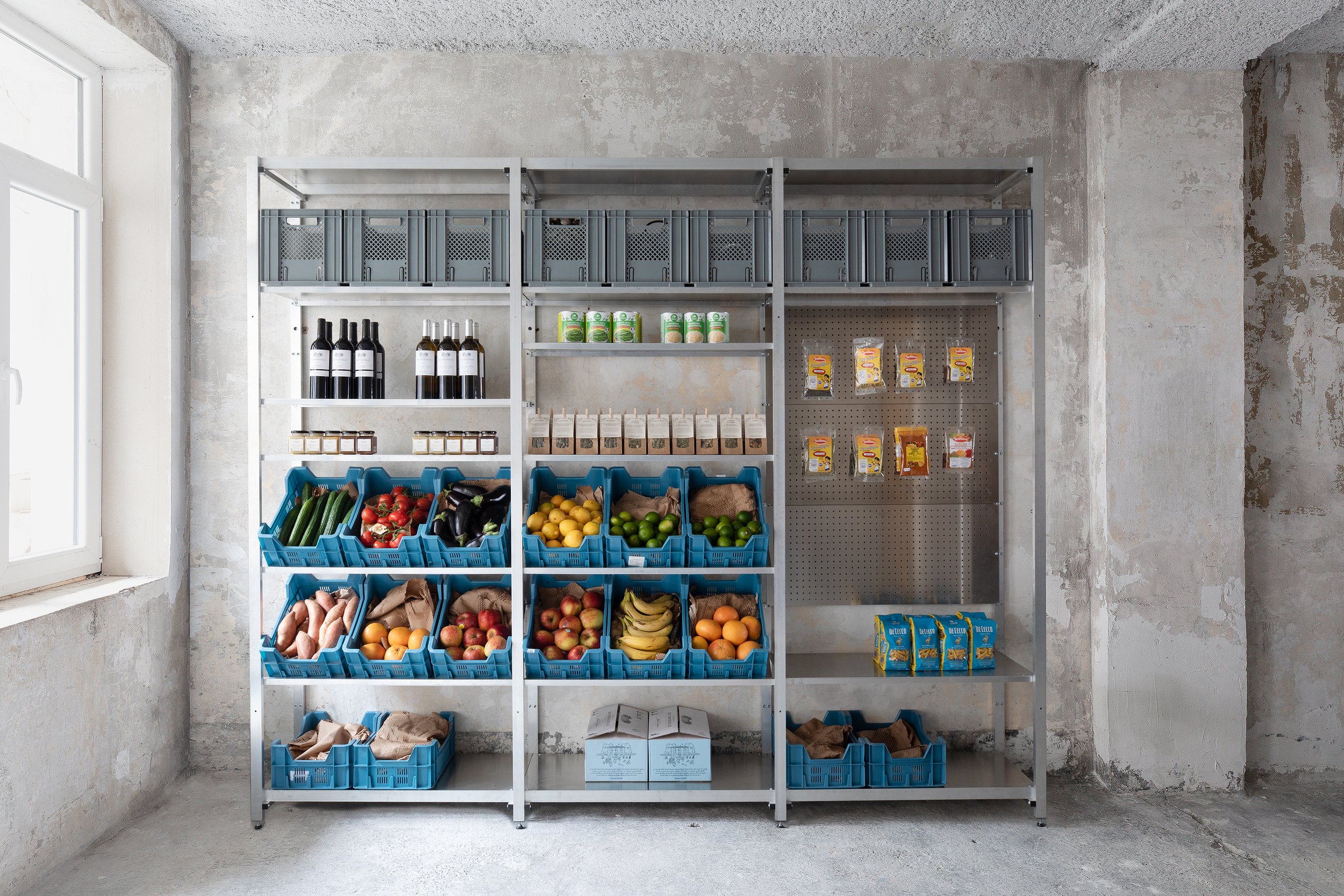
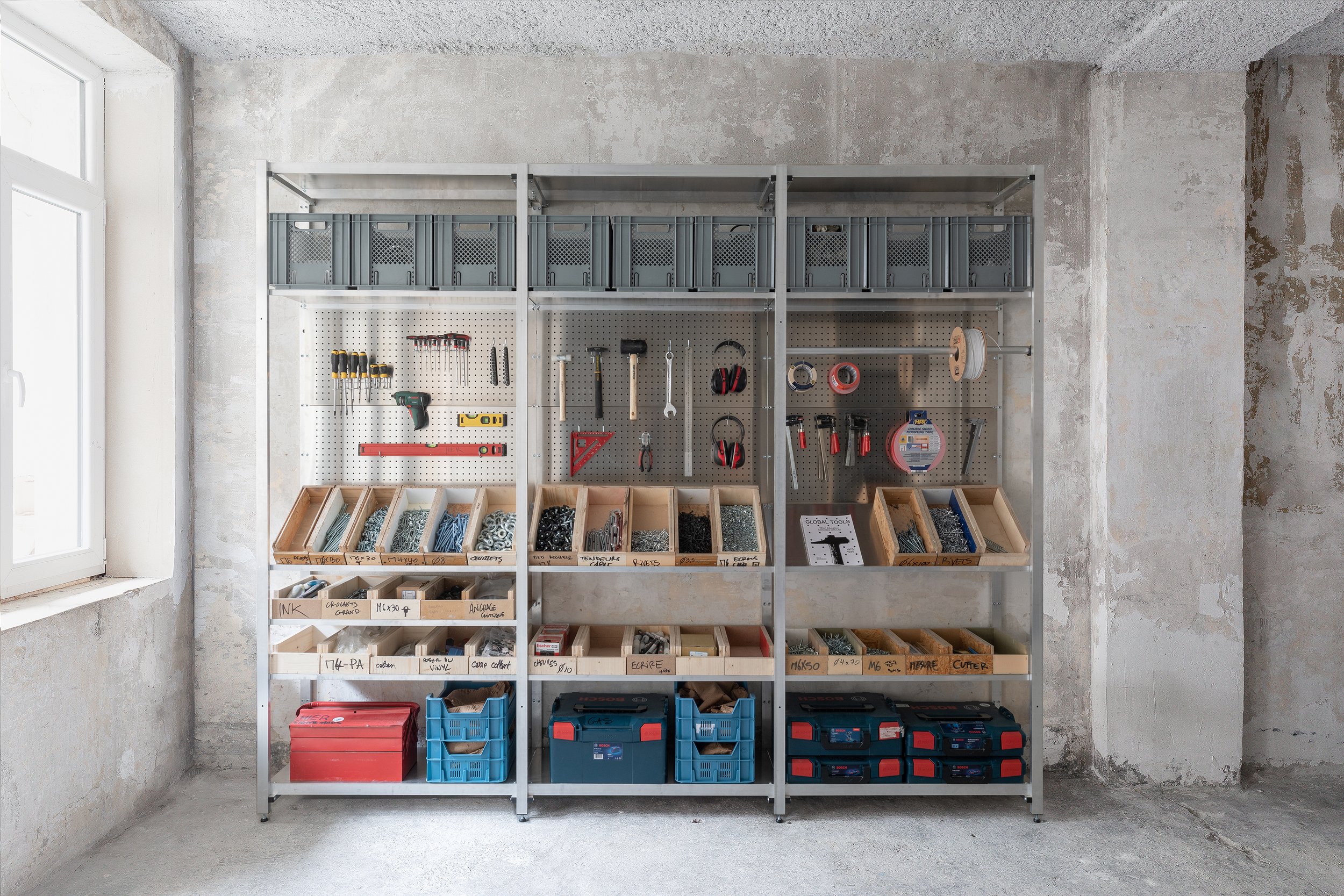
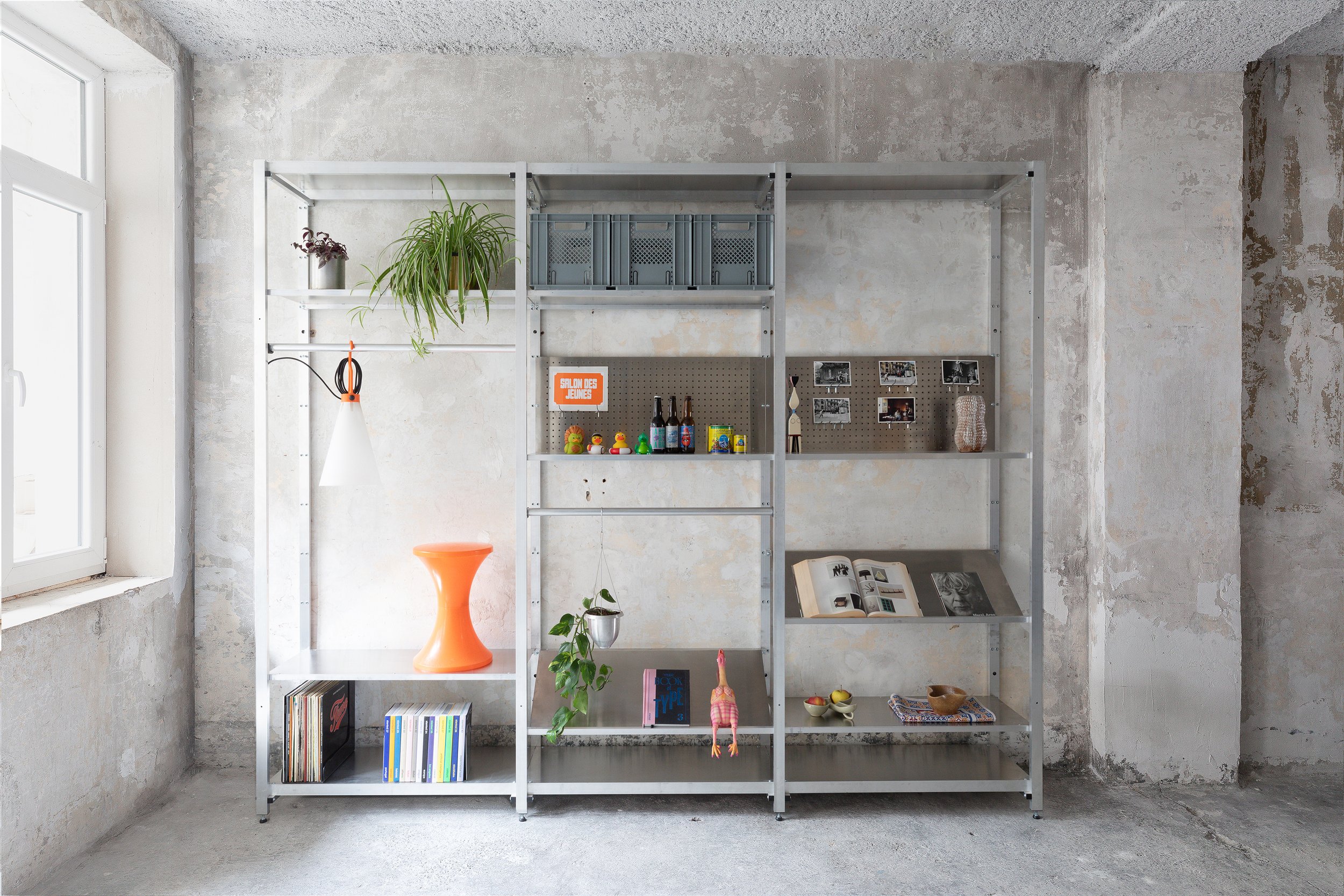
It is a modular and a flexible system, with a wide range of accessories that serve different and sometimes changing, display needs. As mentioned already, it is made in Belgium, available for sale and for rent.
When you buy, installation, display advice and maintenance are available, optional services.
When you rent, we come with our beautiful team of caring individuals, take care of the installation, maintenance, & display changes. And with every change of season, the team comes again, with a new set of accessories, for a new display, and goes with anything no longer needed, leaving you with no stock, no waste, and no stress.
Photography by Eline Willaert - Video by Joekhoury Studio.

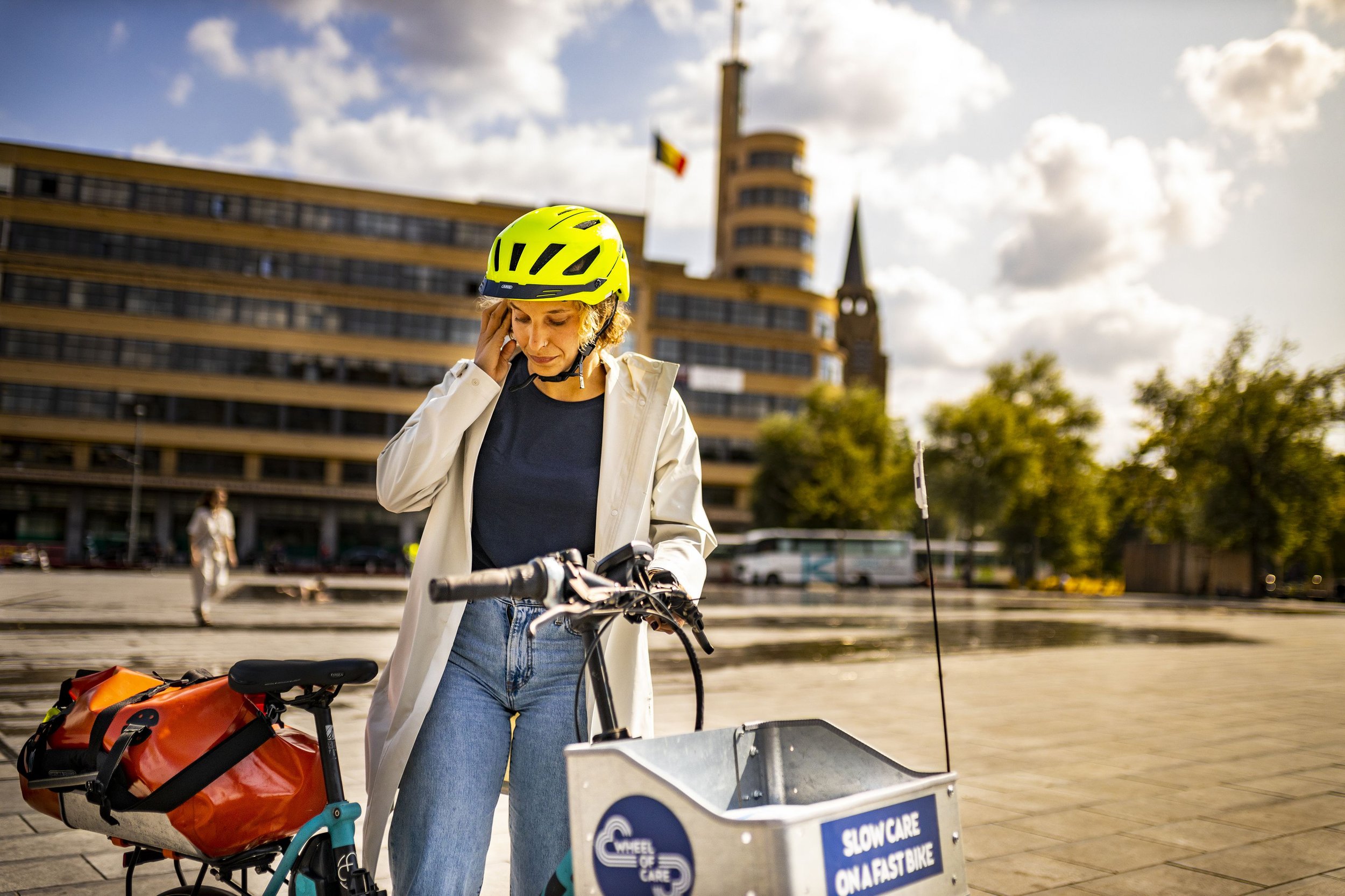
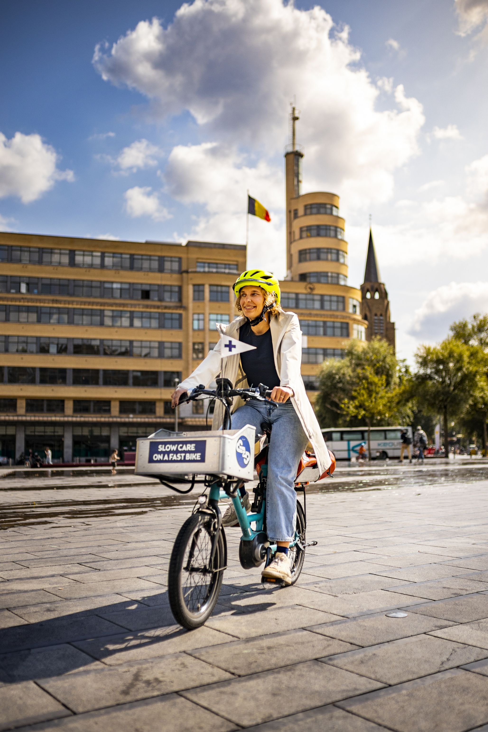
Loads of love - Wheel of Care
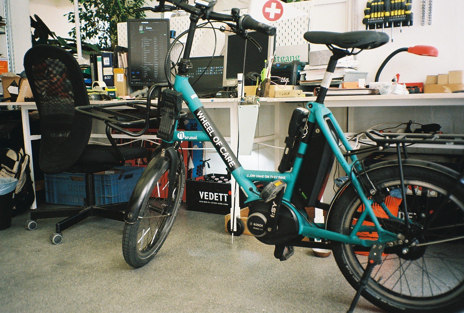
For WHEEL OF CARE we rethought the physical branding of this fast bike.

For WHEEL OF CARE we carefully rethought the physical branding of this fast bike.
We designed the frontal box and its accessories and the back tray that holds a rack bag that we carefully selected in shape and colour to give the best reference to paramedic tools.
The flag on the front accompanies, and tells, the story of ambulant care travelling through the city.
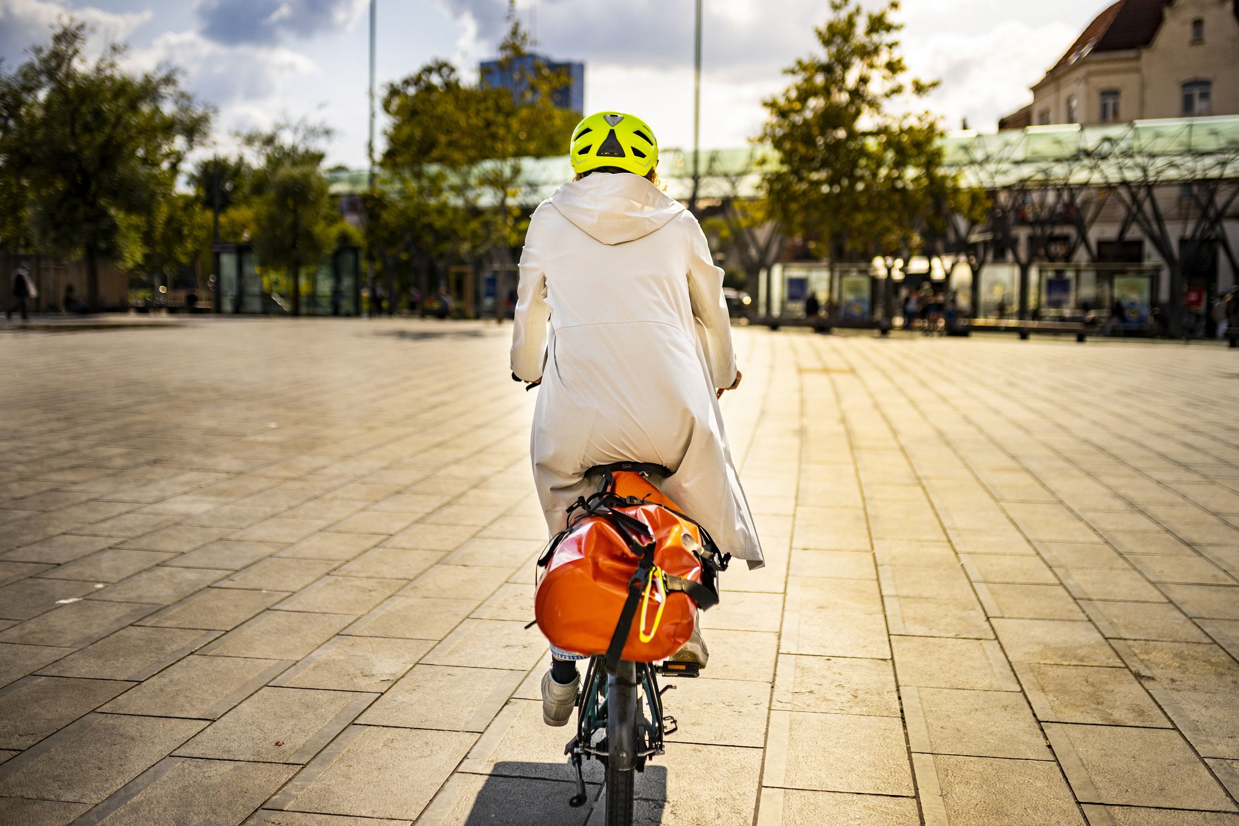
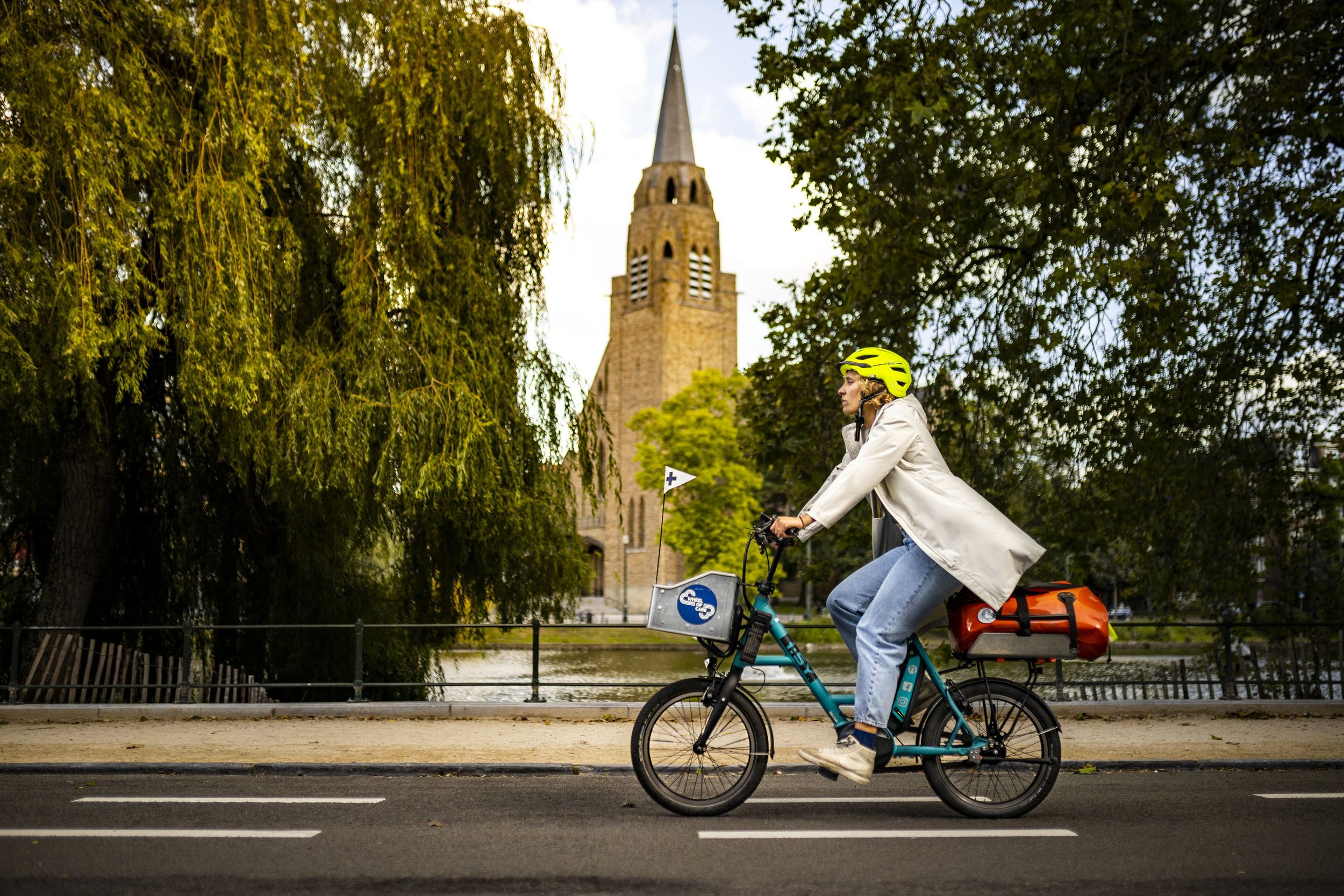
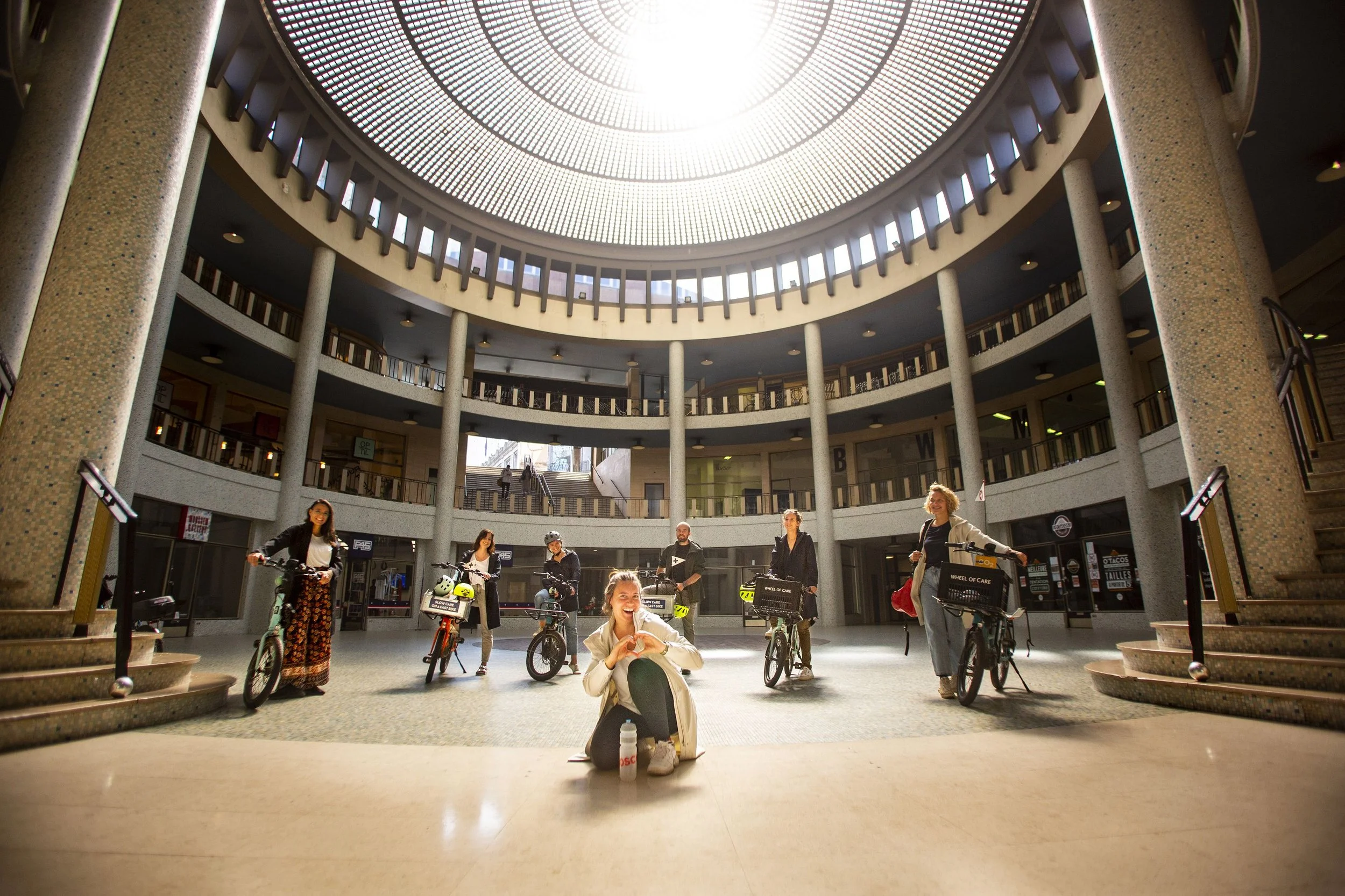
Professional pictures are from Bill Caron
Special thanks to Flora <3


Bruxelles Environnement
We have put together a product in progress that is manufactured in Brussels.
Context
Belexpo is an exhibition, by Bruxelles Environnement, about the environment, the city and the climate. It is mainly addressed to children from 10 to 14 years old.
This exhibition is highly interactive, very successful, and thus challenged and worn by its many mini-visitors.
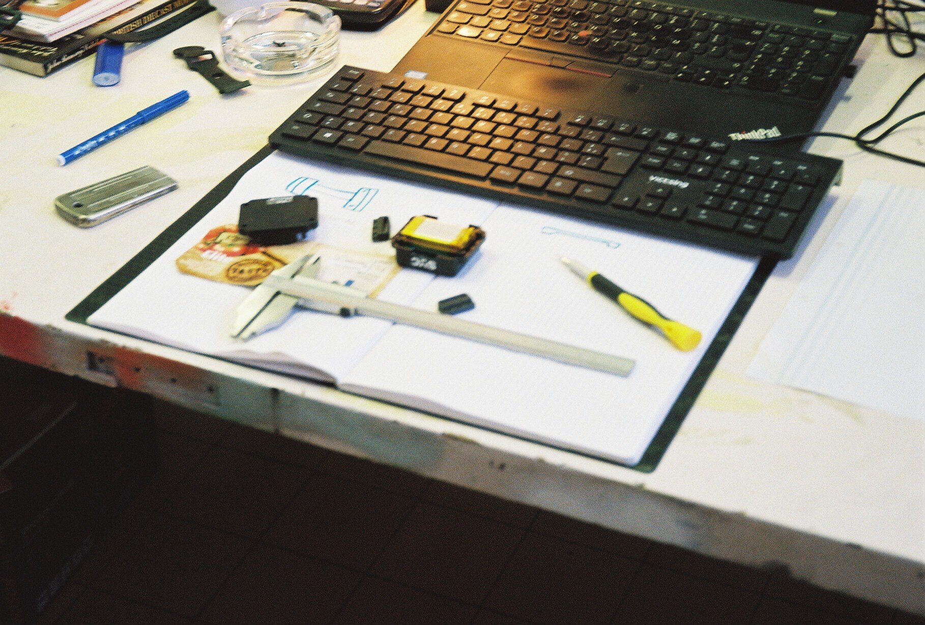
For an ultimate experience of the exhibition, the visitors are given a watch to go over their wrists and that activates the many challenges of the exhibition. The watch allows the interaction between the visitors and the elements of the exhibition and is a crucial tool for Belexpo.
Bruxelles Environnement has witnessed a rapid degeneration of the bracelets holding the watches and could not access space parts to replace them with. Not that the replacement would have been smooth anyway. We have been asked to look into this problem, analyse it, and research to find a solution that listens to the needs of both the user and the staff handling the product everyday. The brief is to develop new bracelets for the watches of Belexpo

Product specifications
Adjustable
Easily fixed around the wrist
Respects hygiene conditions/ easily cleanable
Sustainable, long lasting, and easily replaceable.
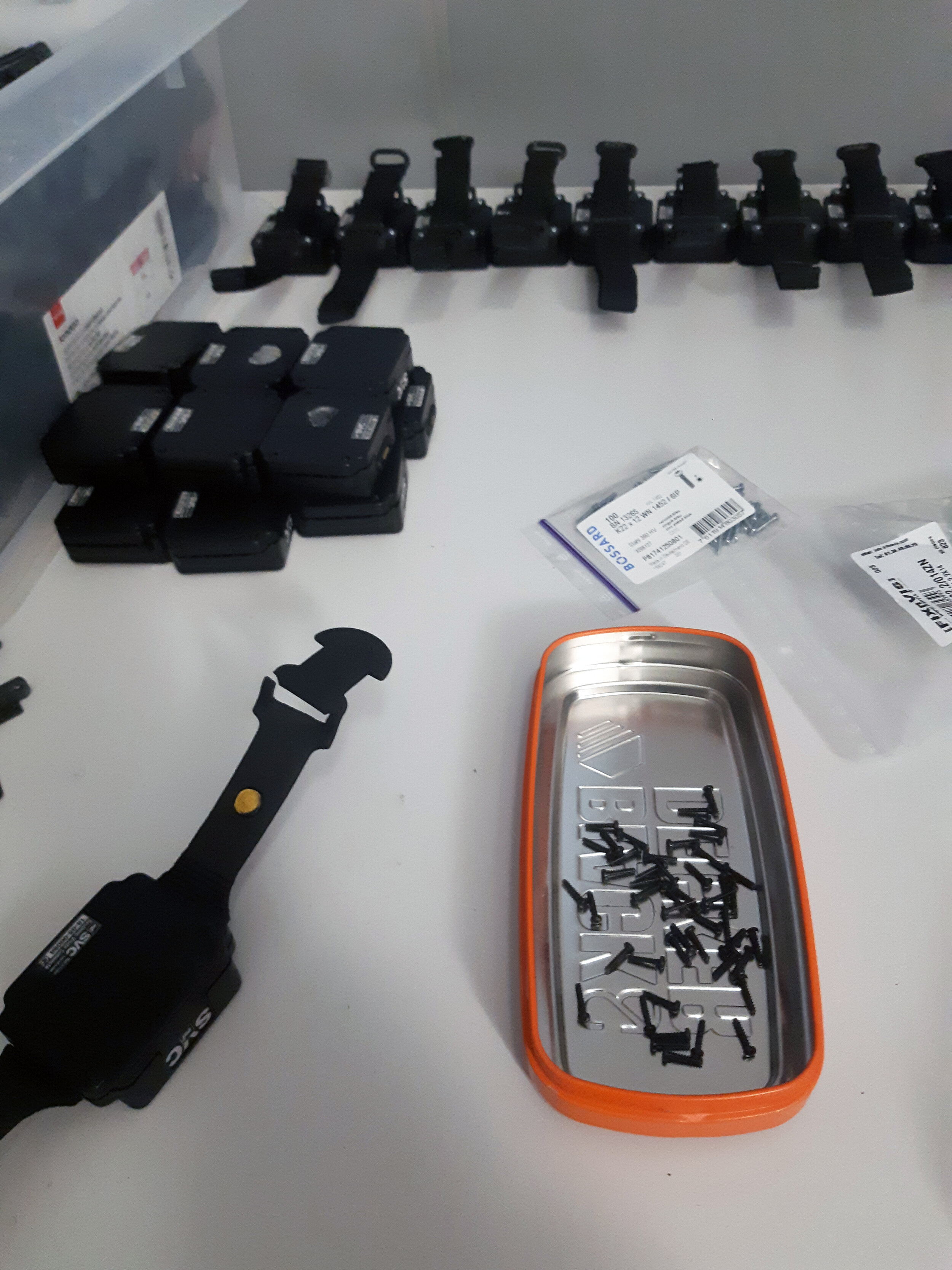
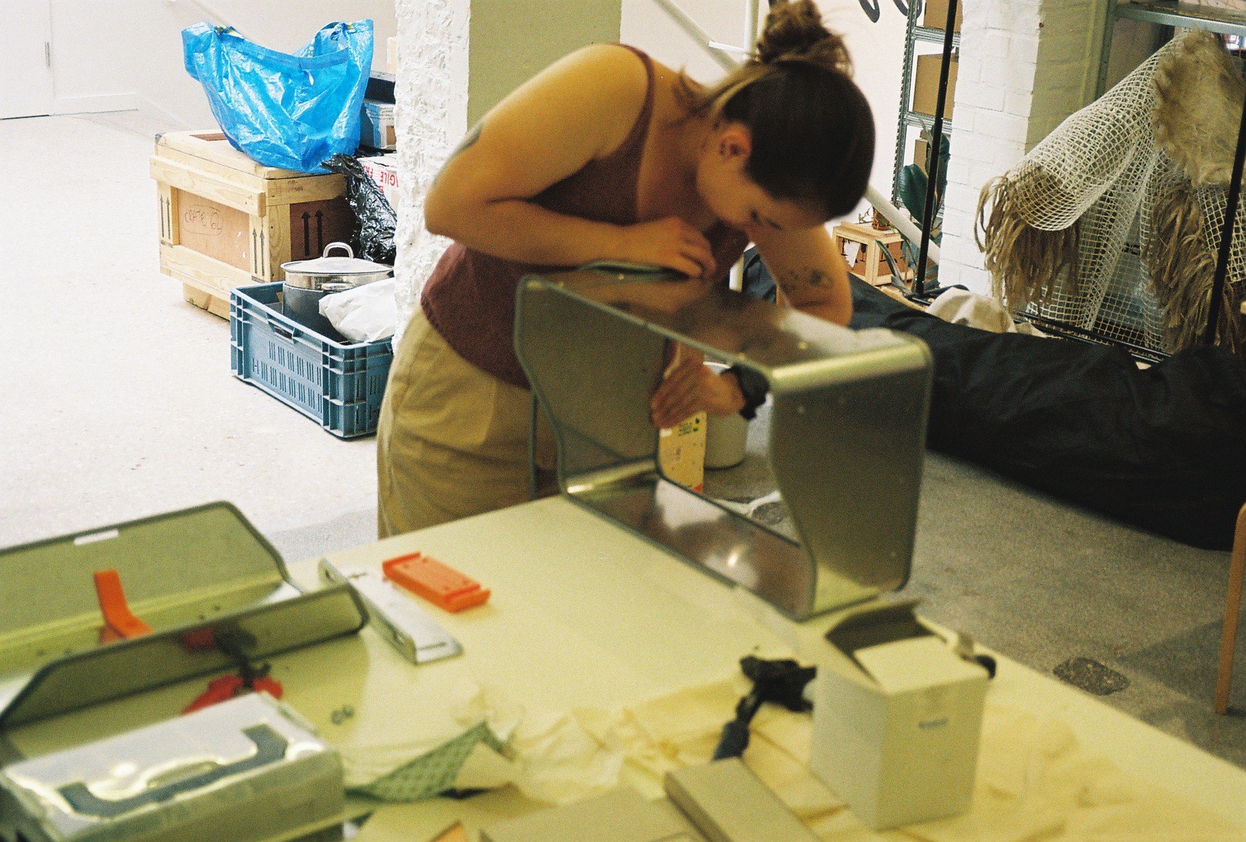
Work in Progress
We have put together a product in progress that is manufactured in Brussels, partially by us, HIER, and partially by our recurrent collaborator, L’Ouvroir.
L’Ouvroir is an association located in the heart of Brussels. It is an initiative carried by people with disabilities wanting to be engaged and participate in their society. Together, despite their disabilities, they built a workshop where they undertake varied manual/productive activities.
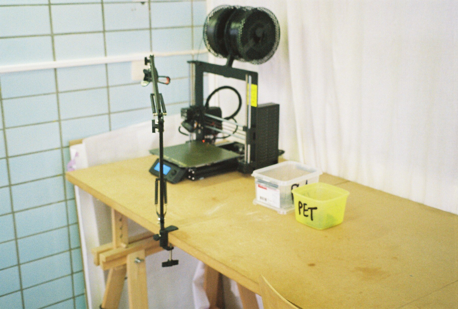
They are producing the fabric part of the bracelet while we are modelling and 3D printing the details adapting to the existing watch and holding together the fabric bracelet.
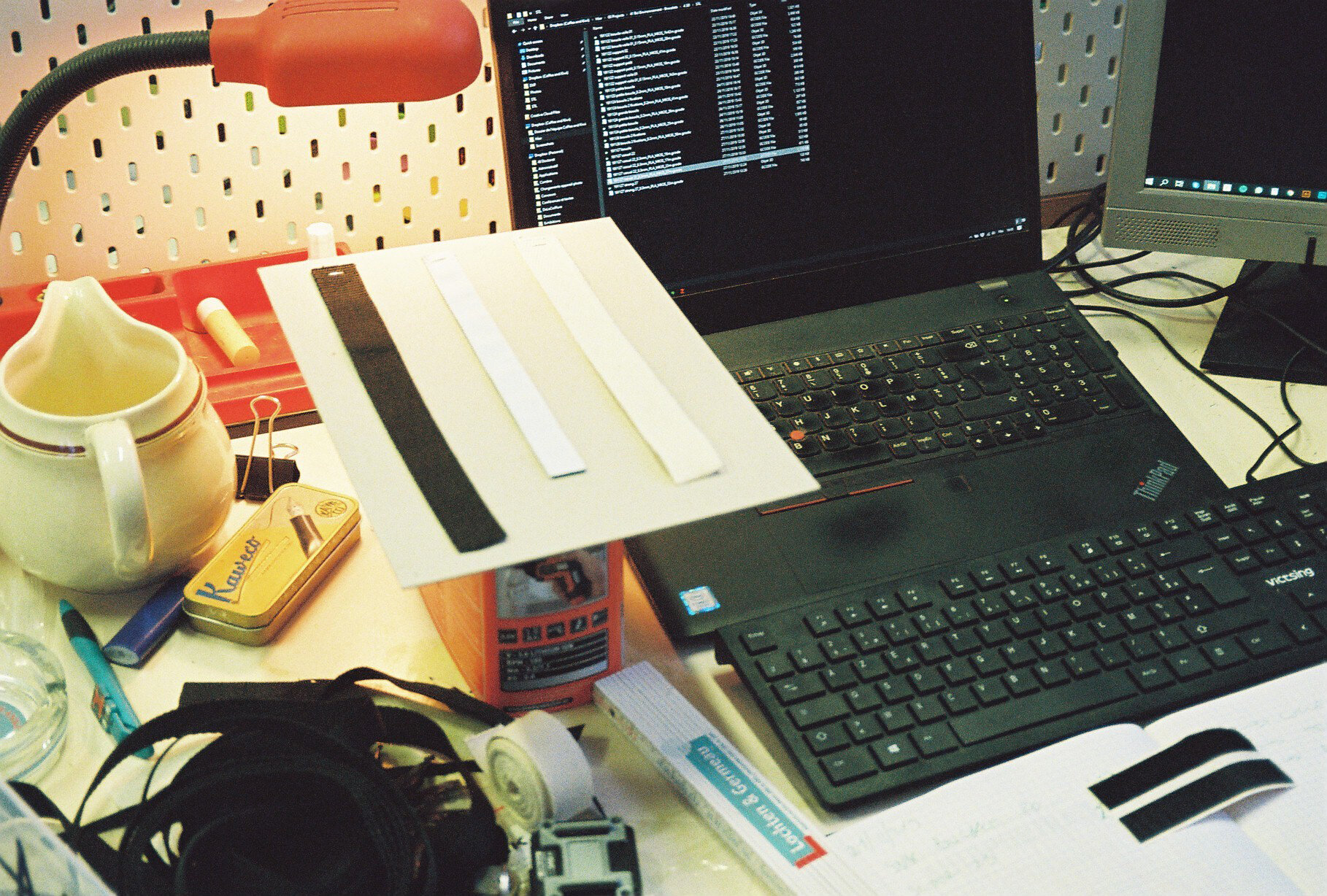
For the fabric part of the bracelet, we chose Nylon. A recyclable strong plastic, resistant, and cleanable by machine. We have designed the 3D printed details in a way that allows the team to easily remove the nylon bracelet and clean it in a washing machine. This nylon bracelet has a Velcro sewn on it by l’Ouvroir making the bracelet easily fixable around the wrist of both an adult and a child; the velcro making the whole adjustable.
For the 3D printed parts, we have chosen to work with PLA which later becomes an industrial compost, recyclable. We have printed these parts in 5 different colours to facilitate recognising the charged watches from others. Those 3D printed parts are easily mountable and replaceable, making their maintenance smooth.
The design is adaptable, adjustable, and efficient. We chose to concentrate the production in Brussels, to make sure that the products are easily reproduced or repaired without any need for costly maintenance equipment. We have listened to the needs of our client, Bxl. Env., worked on different options, together with them and l’Ouvroir, to come up with this version of the product in process; the fruit of our triangular collaboration.


More information about:
Belexpo or Bruxelles Environnement

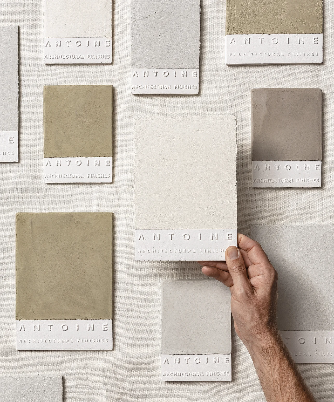
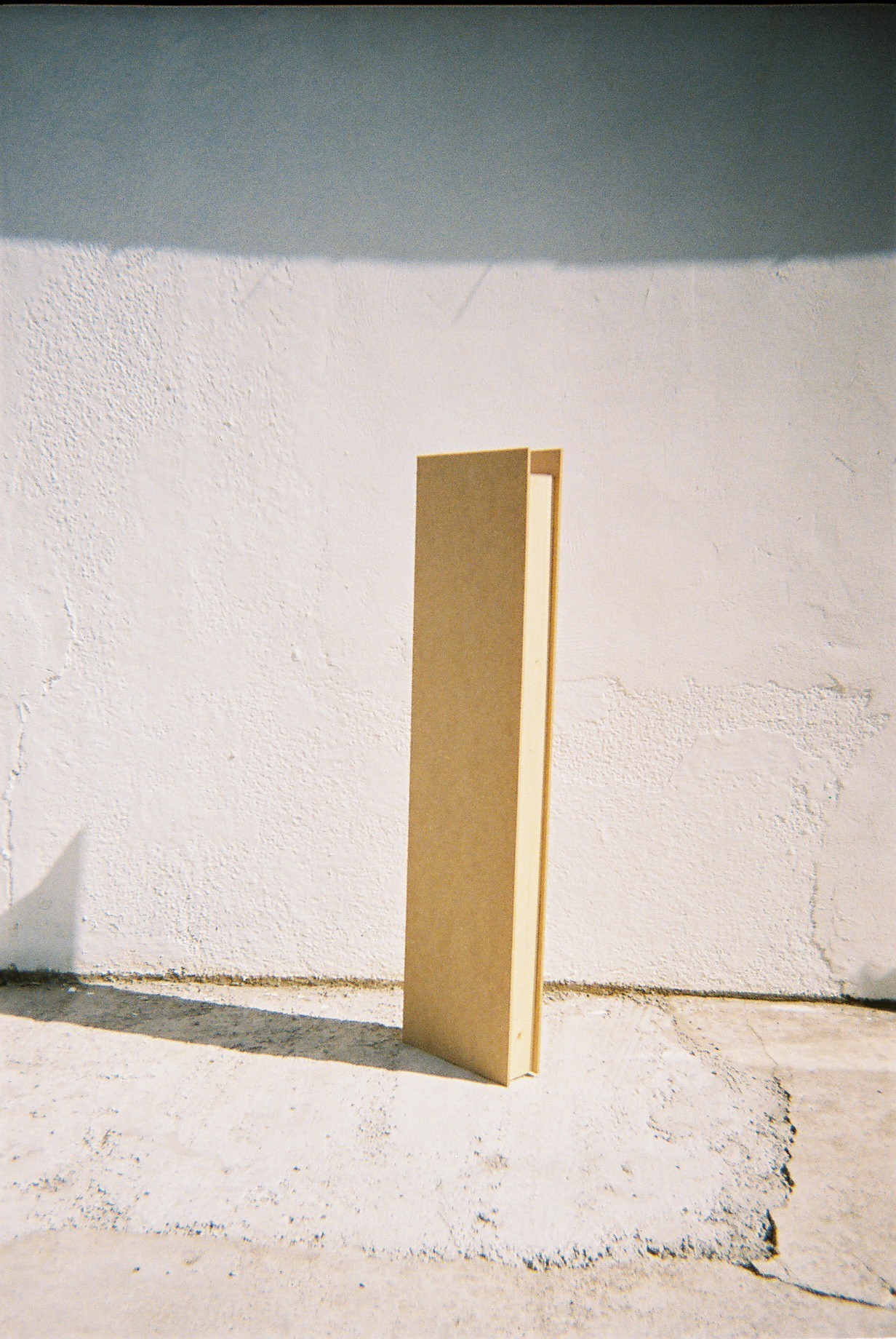
Antoine architectural finishes
A simple, sample story.
The story of a genuine sample meeting an architect, hoping to be caressed, kept, and then maybe chosen.

A simple, sample story.
The story of a genuine sample meeting an architect, hoping to be caressed, kept, and then maybe chosen.
We have spent sometime listening to the brand, to its lean towards the beautiful imperfections; to it’s raw/natural story, its textures, and wanted to reflect it in a simple sample that is different from others, and would attract and be kept by an architect who receives un-storable amounts of samples. A sample that is genuine, and therefore out of plaster, lightweight, imperfect, covered then with natural paint, Antoine's architectural finish. The sample has Antoine’s name embossed from its surface, waiting to be felt with the run of the fingers, poetic to the touch, just like Antoine's textures.
Collaboration with Joost Vanhecke
Photos by: Piet Goethals


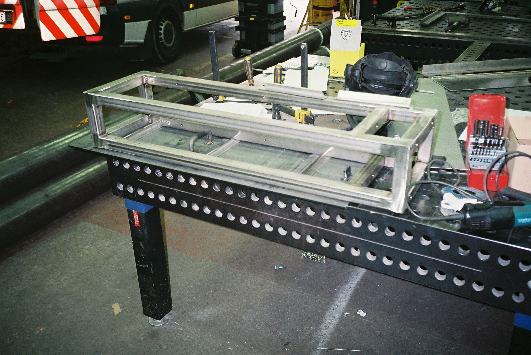
One line. Two lines. A horizon line.
A library for Antoine. A display of a sample story. For a line of architectural finishes. For Milan design week. In the heart of a collaboration with collective BRUT.
The materials of the library _from dark to light, from heavy to light_ are steel for the structure and plaster coated with an Antoine finish for the shelves, just like the simple samples, only bigger.
The structure, an assembly of two frames, one straight one tilted, allows the samples to be displayed in a vertically tilted position, standing on one shelve while resting on the other.
Photos by: Eline Willaert


Photo by: Alexander Popelier

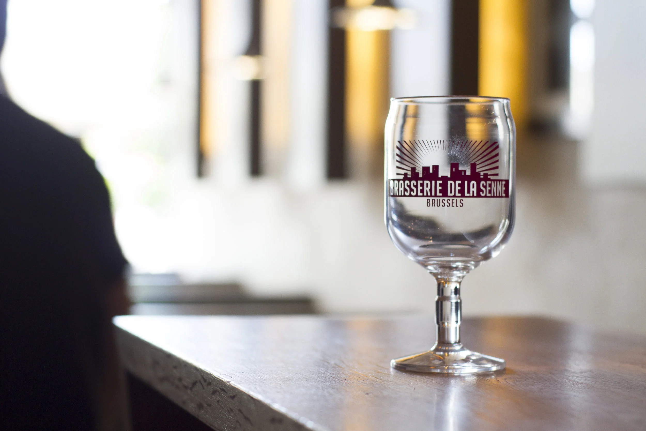
Brasserie de la Senne
Design a beer glass specifically for the brewery, one that is not picked from a catalogue
Design a beer glass specifically for the brewery, one that is not picked from a catalogue
A particular care should be given for the conservation of the foam
The straight sides of the glass (which is not common in beer glasses) is a “vitrine” for the beer
The converging neck tightens the aromas
The aim was to design a glass that is in between the calice of a special beer and the simple glass of the table beer, perfectly representing the philosophy of Brasserie de la senne, a beer for connoisseurs, without elitism.


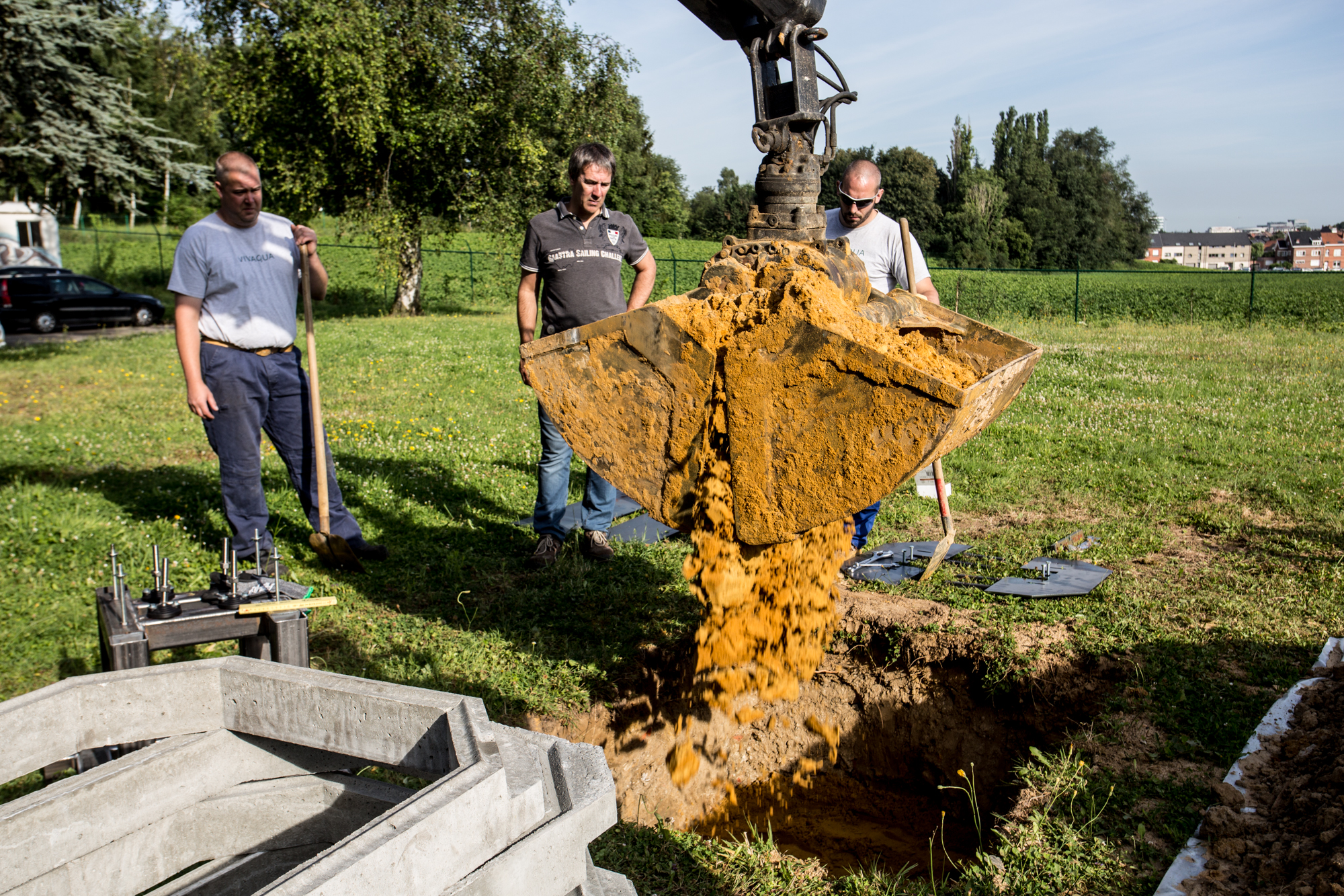
Water Bank
A permanent fountain for the city of Brussels. Designed to stay. To resist. To promote Vivaqua tap water. As a drinking water.

A permanent fountain for the city of Brussels. Designed to stay. To resist. To promote Vivaqua tap water. As a drinking water.
The fountain is completely produced by the maintenance workshops of Vivaqua.
The design takes into consideration the maintenance, and all the parts are easily accessible and replaceable.
Photos by: MIKO/MIKO Studio
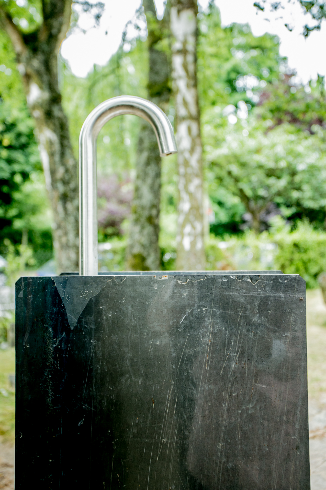
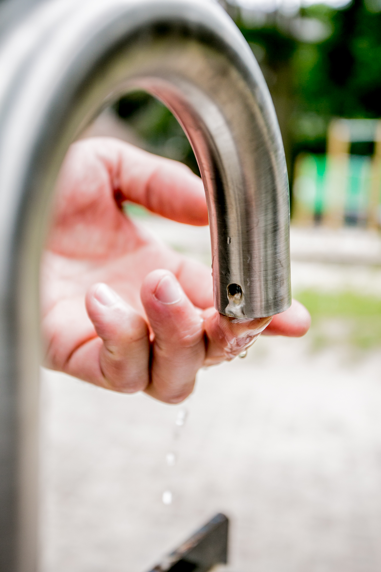
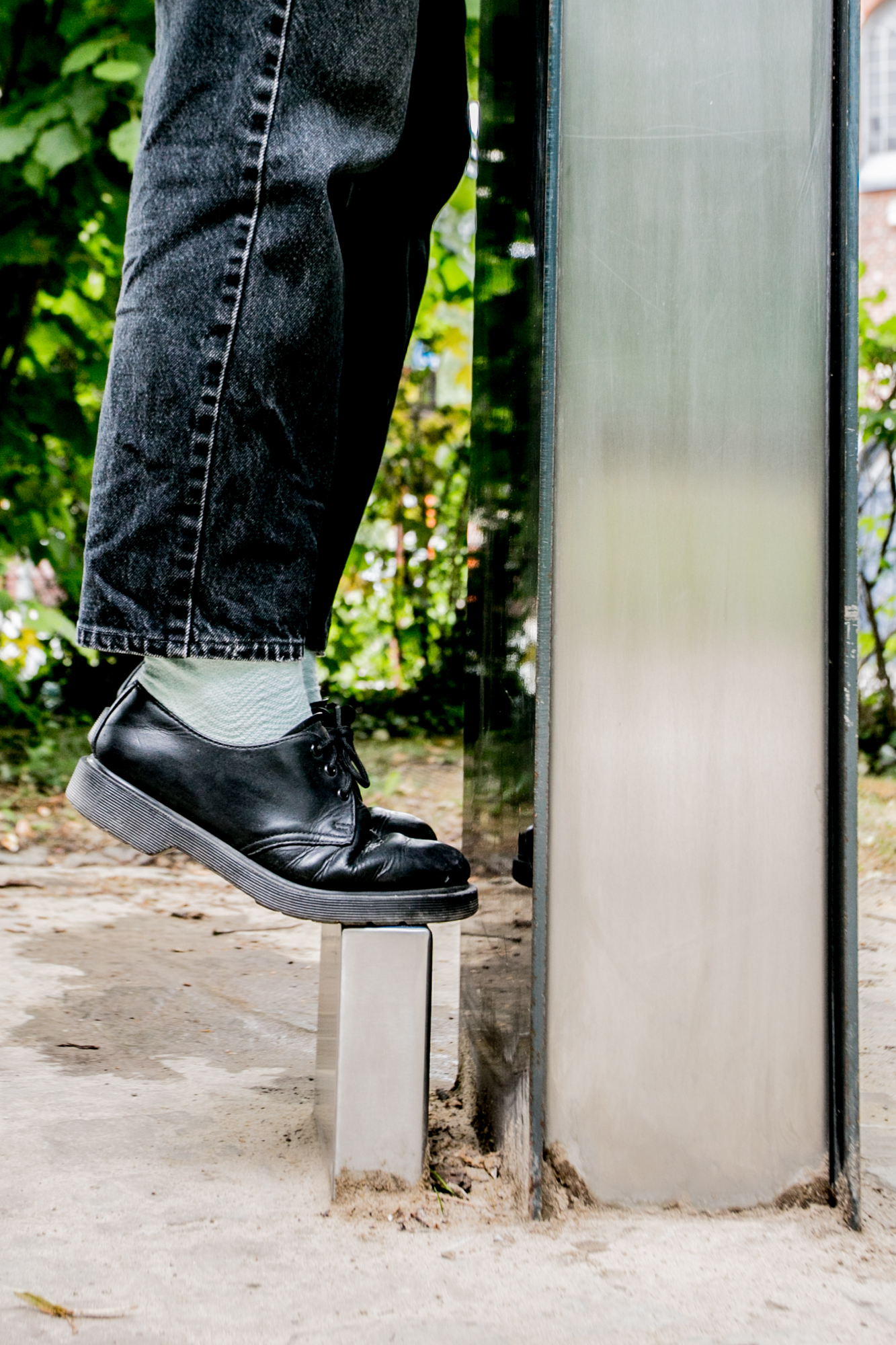
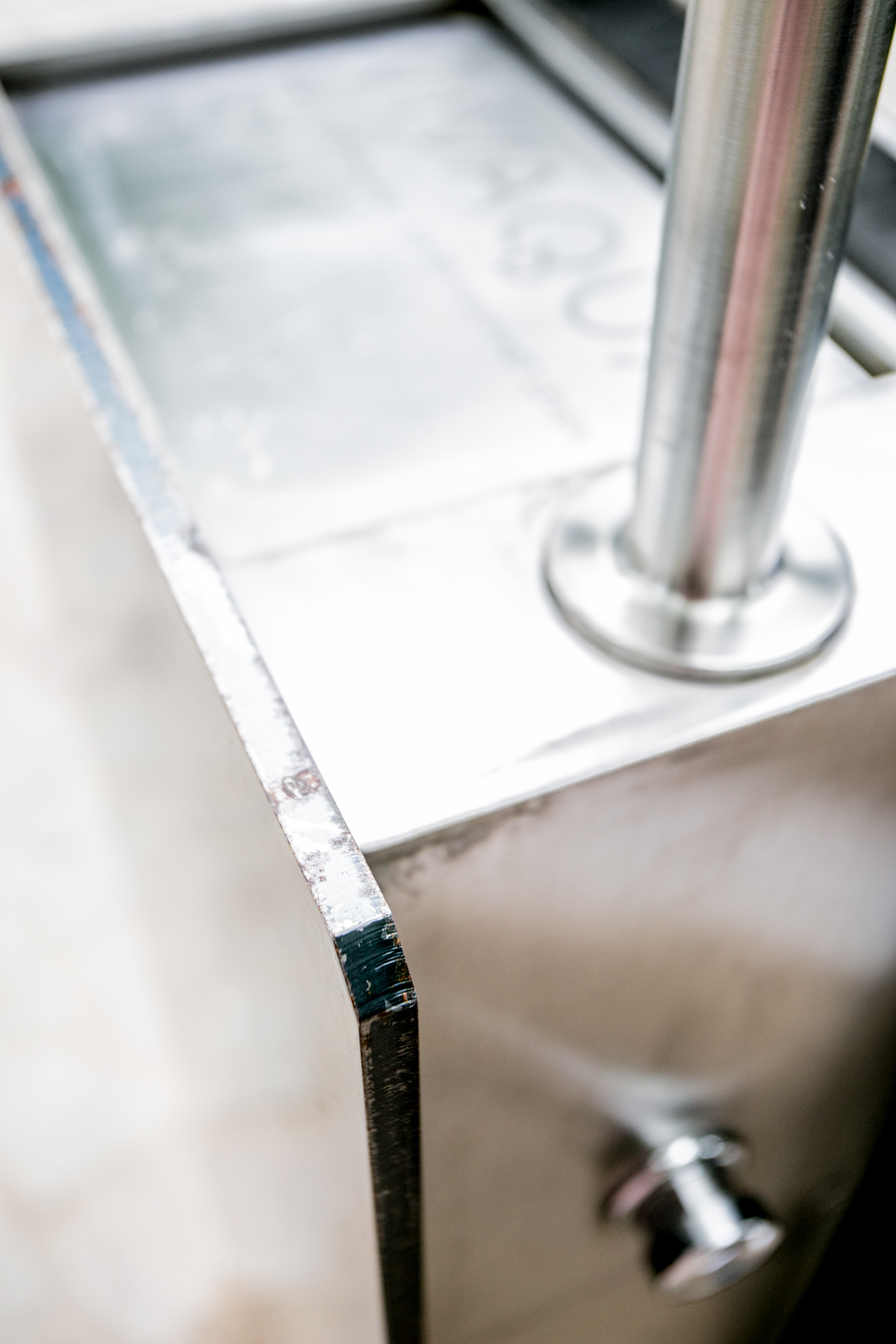
The water exit cannot be contaminated. The design provides surfaces for branding. And for tagging. And a step for children not be jumping.


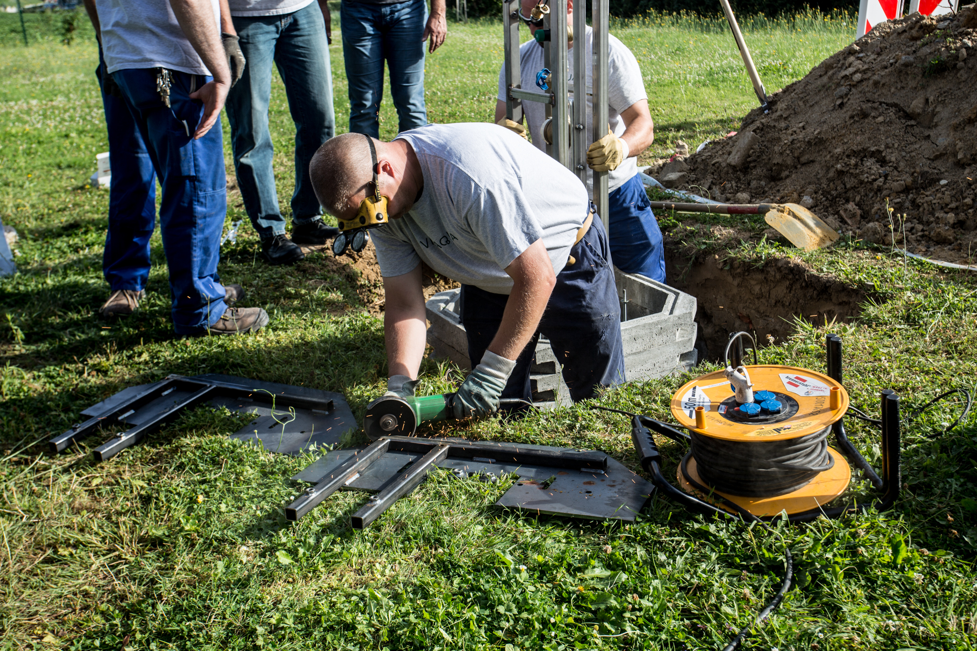


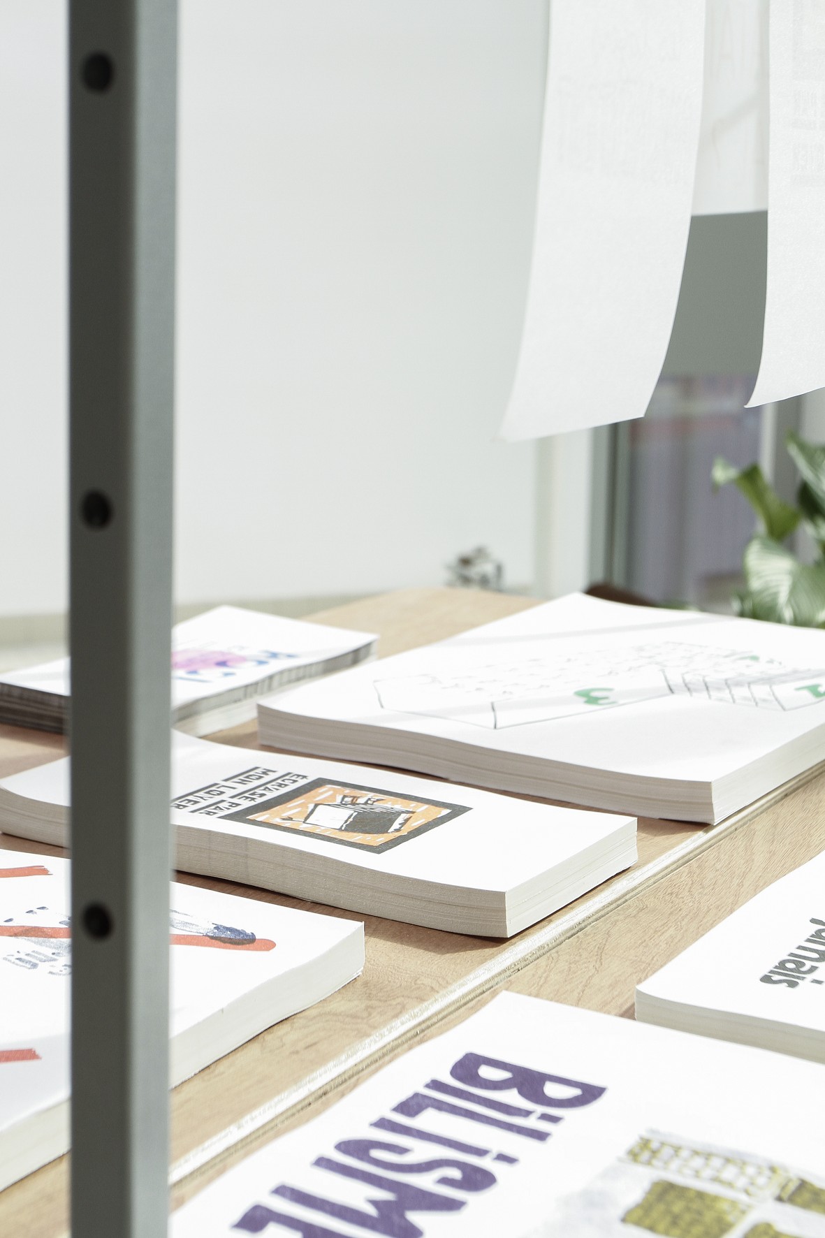
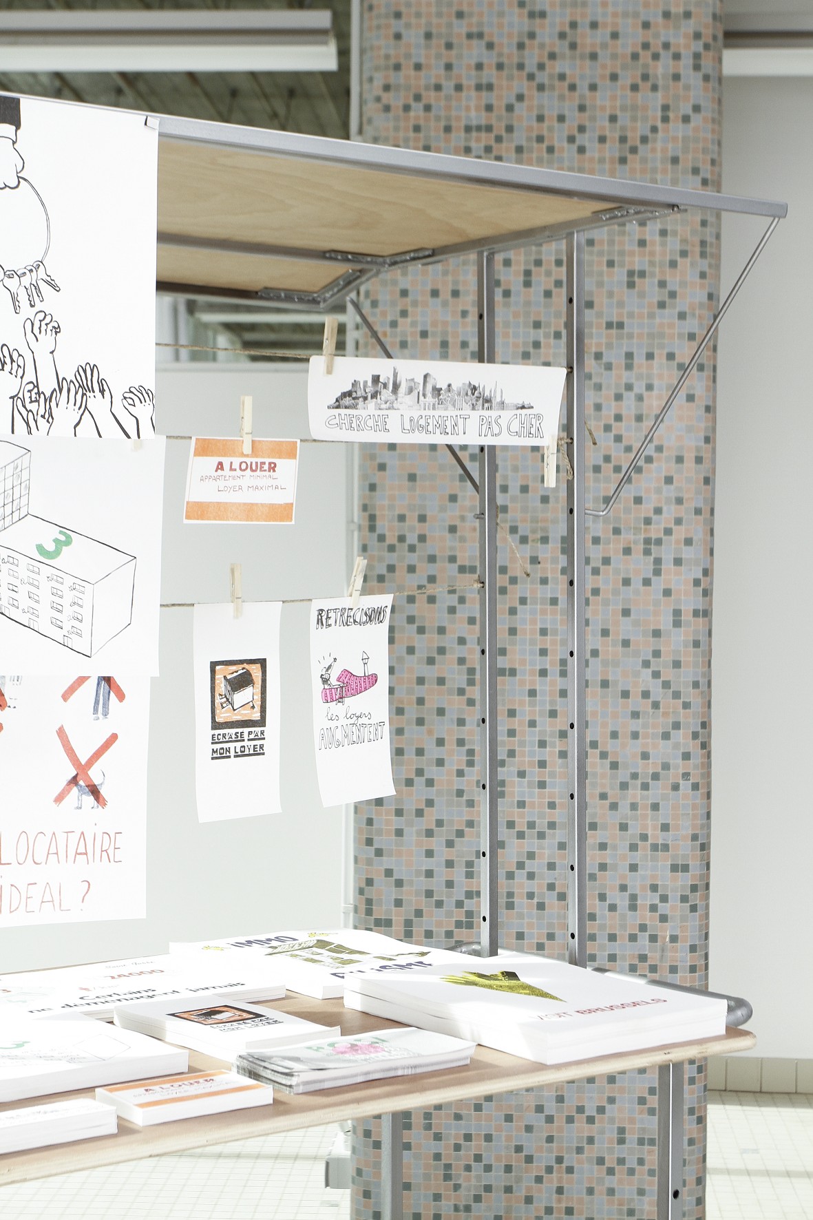
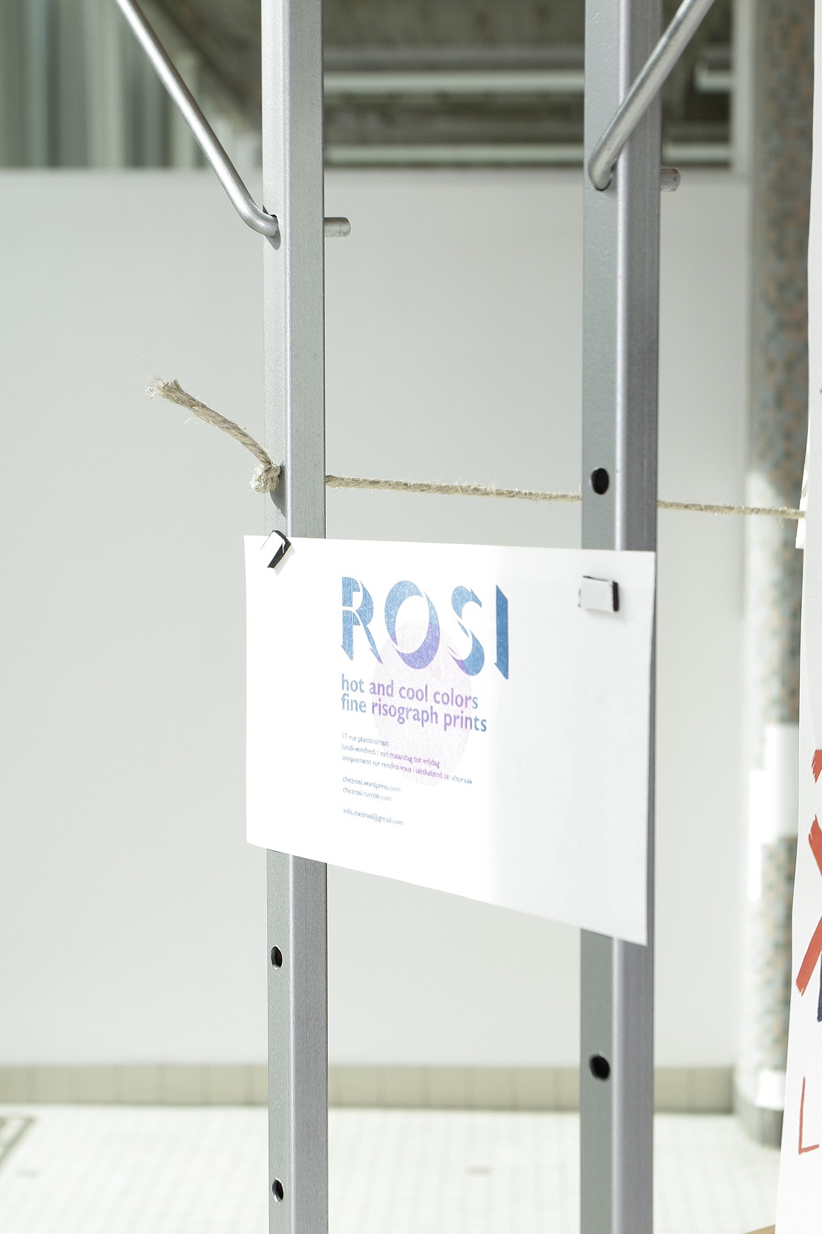
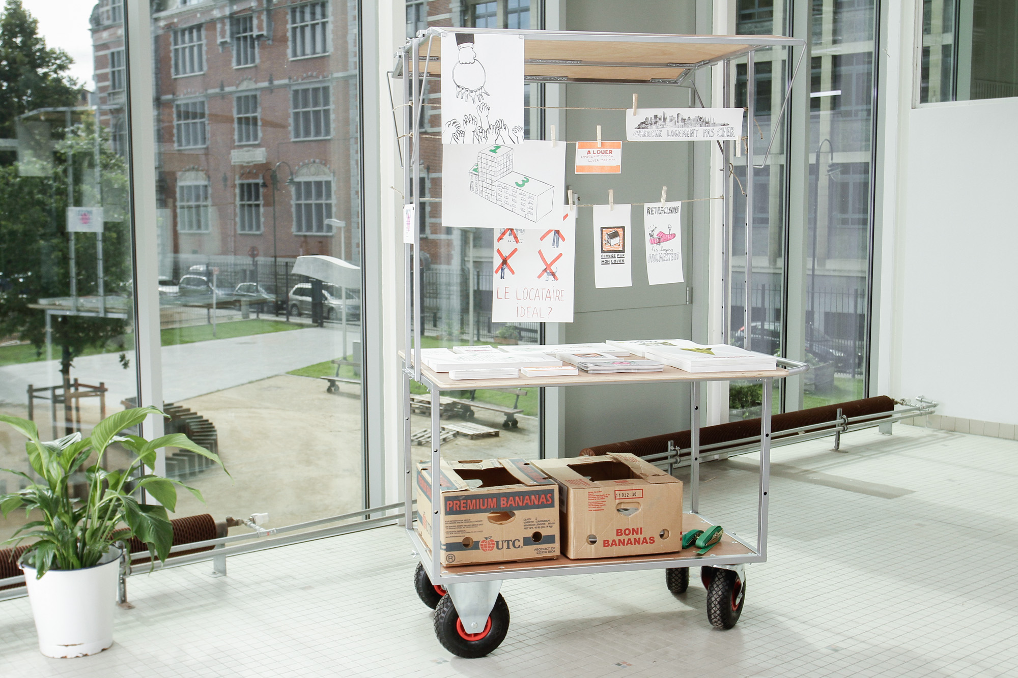
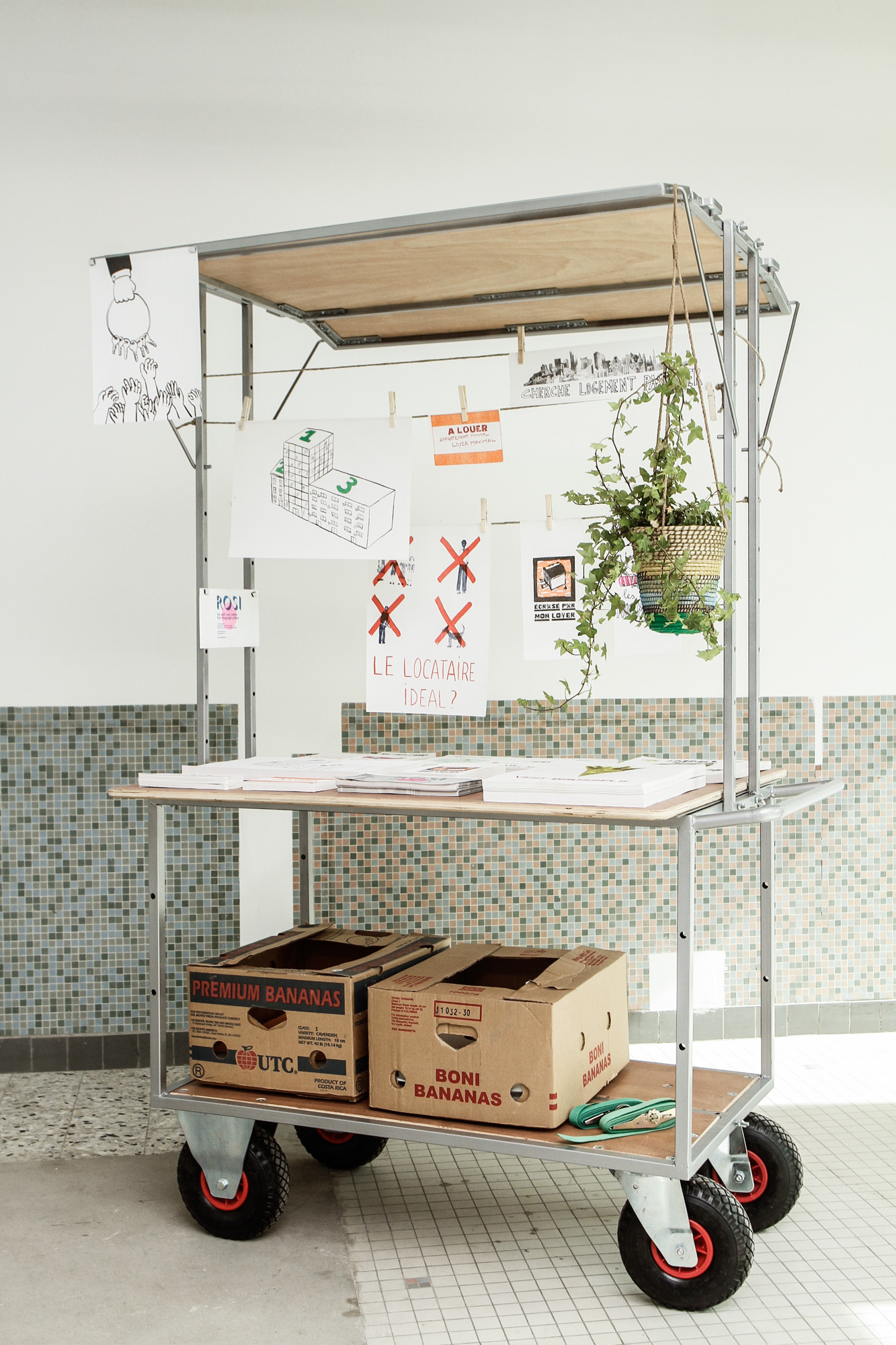
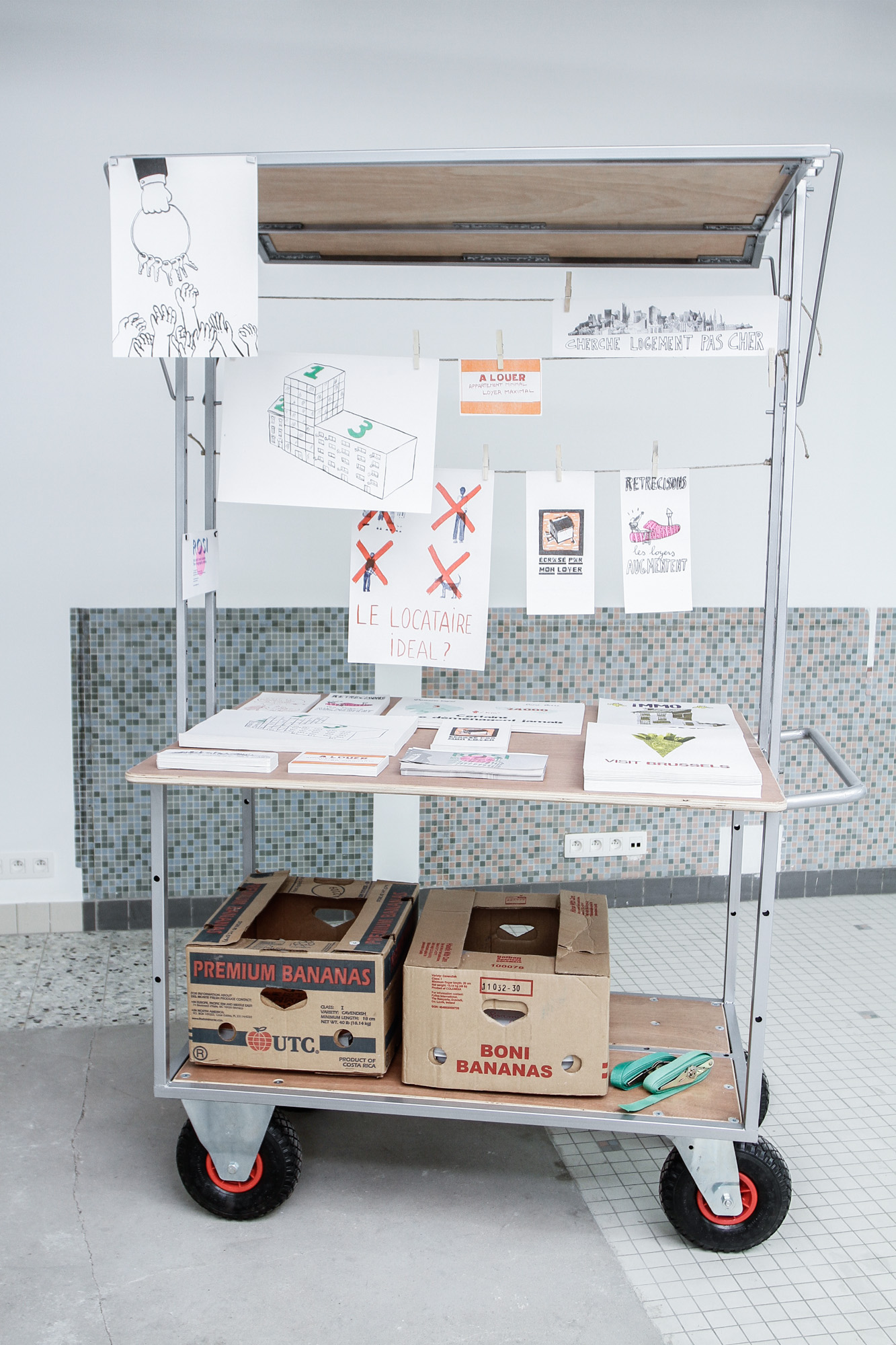
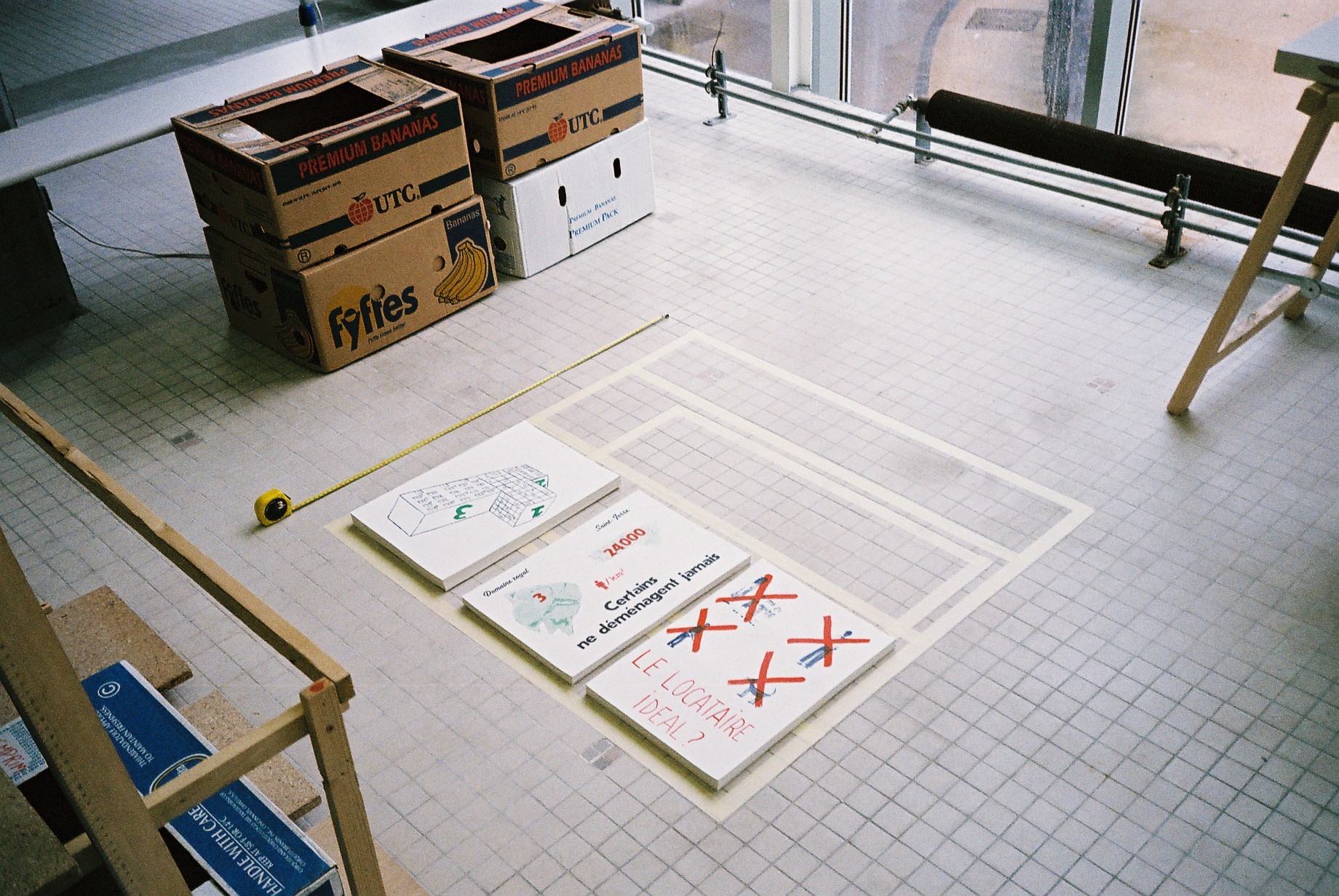
Stuutkeire
A foldable cart for the distribution of flyers at ROSI