Antoine architectural finishes
A simple, sample story.
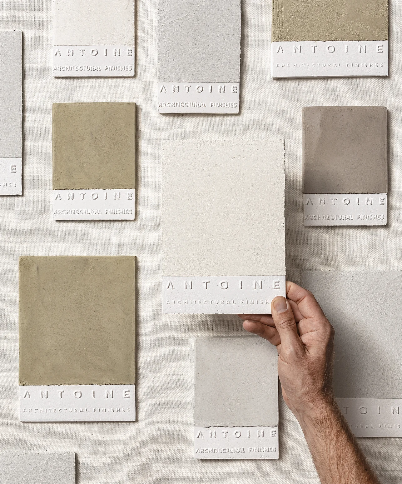
The story of a genuine sample meeting an architect, hoping to be caressed, kept, and then maybe chosen.
We have spent sometime listening to the brand, to its lean towards the beautiful imperfections; to it’s raw/natural story, its textures, and wanted to reflect it in a simple sample that is different from others, and would attract and be kept by an architect who receives un-storable amounts of samples. A sample that is genuine, and therefore out of plaster, lightweight, imperfect, covered then with natural paint, Antoine's architectural finish. The sample has Antoine’s name embossed from its surface, waiting to be felt with the run of the fingers, poetic to the touch, just like Antoine's textures.
Collaboration with Joost Vanhecke
Photos by: Piet Goethals
One line. Two lines. A horizon line.
A library for Antoine. A display of a sample story. For a line of architectural finishes. For Milan design week. In the heart of a collaboration with collective BRUT.
The materials of the library _from dark to light, from heavy to light_ are steel for the structure and plaster coated with an Antoine finish for the shelves, just like the simple samples, only bigger.
The structure, an assembly of two frames, one straight one tilted, allows the samples to be displayed in a vertically tilted position, standing on one shelve while resting on the other.
Photos by: Eline Willaert
Photo by: Alexander Popelier


